Seaborn
- Matplotlib 기반 통계 시각화 라이브러리로, 구성, 분포, 관계 등 통계적인 정보나 데이터를 살피는데 적합한 라이브러리
- 쉬운 문법과 깔끔한 테마 디자인으로 많은 사람들이 선호
- 일반적으로 import seaborn as sns 로 사용
- 시각화의 목적과 방법에 따라 API를 분류하여 제공
- Categorical API
- Distribution API
- Relational API
- Regression API
- Matrix API
Seaborn의 구조
-
Countplot로 살펴보는 공통 파라미터
- Categorical API의 대표적인 시각화로 범주를 이산적으로 세서 막대그래프를 그려주는 함수
-
x, y,data
-
기본적으로 seaborn은 데이터를 넣고 데이터에 대한 column을 넣는 것
-
두 축 모두 자료형이 같다면 원하는 대로 방향 설정이 이루어 지지 않는 경우가 생기는데, 이 때는 oriented를 사용하여 v또는 h를 사용하여 방향을 전환한다
-
order를 이용하여 순서를 지정할 수 있다.
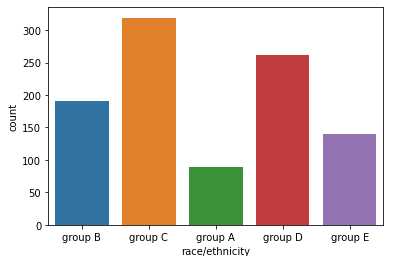
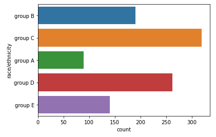
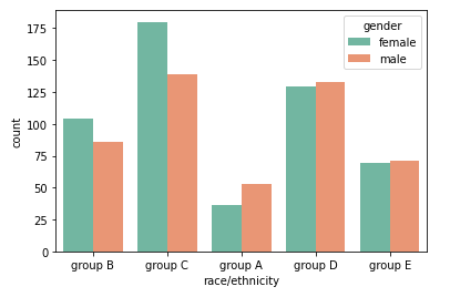
import seaborn as sns
sns.countplot(x="race/ethnicity", data=student) # 가로방향
sns.countplot(y="race/ethnicity", data=student) # 세로방향

# order로 순서 지정
sns.countplot(x='race/ethnicity',data=student,
              order=sorted(student['race/ethnicity'].unique()))
-
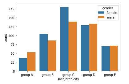
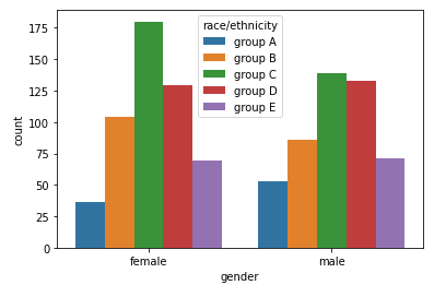
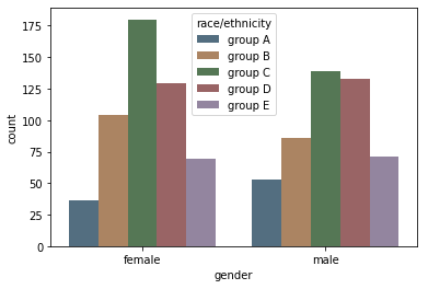
- hue, hue_order
-
hue는 색을 의미하며, 데이터의 구분 기준을 정하여 색상을 통해 구분한다.
-
hue_order는 색을 구분하면서 순서를 지정할 때 사용한다.
# hue
sns.countplot(x='race/ethnicity',data=student,hue='gender',
              order=sorted(student['race/ethnicity'].unique()))
# hue_order
sns.countplot(x='gender',data=student,
              hue='race/ethnicity',
              hue_order=sorted(student['race/ethnicity'].unique()),color='red')
-
- palette / color
-
palette를 이용해 색상 변경 가능
-
연속된 색상을 지정하고 싶으면 color로 단일 색상 지정
# palette
sns.countplot(x='race/ethnicity',data=student,
              hue='gender', palette='Set2')

# color
sns.countplot(x='gender',data=student,
              hue='race/ethnicity', color='red')
-

- saturate
-
채도라고 생각하면 되며, 많이 사용하지는 않는다
sns.countplot(x='gender',data=student,
              hue='race/ethnicity',
              hue_order=sorted(student['race/ethnicity'].unique()),
              saturation=0.3)
-
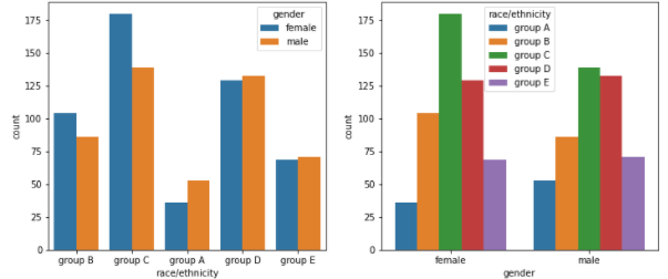
- ax
-
ax를 지정하여 원하는 위치에 seaborn plot을 그릴 수 있다
fig, axes = plt.subplots(1, 2, figsize=(12, 5))

sns.countplot(x='race/ethnicity',data=student,hue='gender',ax=axes[0])

sns.countplot(x='gender',data=student,hue='race/ethnicity',
              hue_order=sorted(student['race/ethnicity'].unique()),ax=axes[1])
plt.show()
-
Categorical API
-
Categorical API를 사용하기 위해서는 describe()를 통해 통계량을 살펴봐야 한다.
-
describe의 count를 살펴봄으로 결측값의 유무를 알 수 있고, 평균과 표준편차를 통해 정규성을 띄는지 확인할 수 있다.
-
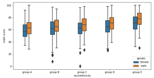
Box plot
-
분포를 살피는 대표적인 시각화
-
parameter
- width : 박스의 너비
- linewidth : 사용되는 선의 두께
- fliersize : 이상값 점의 크기
-
박스의 맨 위와 아래 : 1 사분위수(Q1), 3 사분위수(Q3)
-
박스의 중앙 : 중앙값(median)
-
각각의 위, 아래 선 : 1.5 x IQR 보다 크거나 같은 값들 중 최대, 최소값
- IQR = 1 사분위수와 3 사분위수의 차이 (Q3 - Q1)
-
선을 벗어난 점들 : 이상값(outlier)
fig, ax = plt.subplots(1,1, figsize=(10, 5))

sns.boxplot(x='race/ethnicity', y='math score', data=student,hue='gender',
            order=sorted(student['race/ethnicity'].unique()),
            width=0.3,
            linewidth=2,
            fliersize=10,
            ax=ax)
plt.show()
-
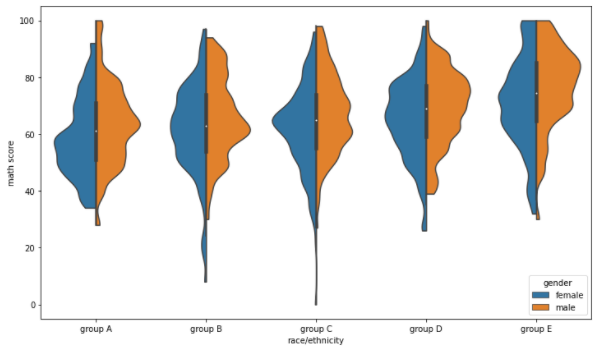
- Violin Plot
-
box plot은 대푯값을 잘 보여주지만 실제 분포를 표현하기에는 부족하다.
-
이러한 경우 곡선으로 표현된 Violin plot을 사용하면 실제 분포를 파악하기 용이하다.
-
하지만 실제로 데이터가 연속적이지 않지만 연속적으로 보이며, 없는 데이터가 있는 것처럼 보이는 오해를 불러오기 쉽다.
-
parameter
- bw : 분포 표현을 얼마나 자세하게 보여줄 것인가 (scott, silverman, float)
- cut : 끝부분을 얼마나 자를 것인가
- inner : 내부를 어떻게 표현할 것인가 (box, quartile, point, stick, None)
- split : 동시에비교
- scale : 각 바이올린의 종류 (area,count,width)
-
중간의 흰점 : median
-
두꺼운 막대로 보이는 값들 : Q1, Q3
-
가느다란 검정색 선 : 1.5 x IQR 보다 크거나 같은 값들 중 최대, 최소값
fig, ax = plt.subplots(1,1, figsize=(12, 7))
sns.violinplot(x='race/ethnicity', y='math score', data=student, ax=ax,
               order=sorted(student['race/ethnicity'].unique()),hue='gender',
               split=True,
               bw=0.2, cut=0)
plt.show()
-
- ETC
- boxenplot
- boxplot에서 부족했던 것들을 히스토그램처럼 여러개의 박스로 표현
- swarmplot
- scatter plot처럼 각각의 데이터를 하나의 점으로 표현
- stripplot
- 직선 막대 형태로 점을 뿌려 놓은 것으로 점이 얼마나 밀도 있게 분포되어 있는지 확인할 수 있다.
- boxenplot
Distribution API
-
단일확률분포와 결합확률분포 두 가지의 분포를 살펴볼 수 있다.
-
Univariate Distribution
- 단일 확률 분포
- histoplot
-
binwidth : 막대의 너비 조정
-
bins : 막대(구간)의 개수 조정
-
element : 다양한 표현 가능 (step, poly)
-
multiple : 여러 개의 분포 표현 가능(layer, dodge, stack, fill)
fig, ax = plt.subplots(figsize=(12, 7))
sns.histplot(x='math score', data=student, ax=ax,hue='gender',multiple='fill')
plt.show()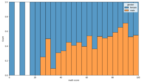
-
- kdeplot
-
연속확률밀도를 표현
-
hue : 색상
-
hue_order : 색상 별 순서 지정
-
multiple : 여러개의 분포 표현 가능
-
cumulative : 누적 밀도 함수처럼 쌓아서 표현
fig, ax = plt.subplots(figsize=(12, 7))
sns.kdeplot(x='math score', data=student, ax=ax,fill=True,hue='race/ethnicity',
            hue_order=sorted(student['race/ethnicity'].unique()))
						#,multiple="layer"))
plt.show()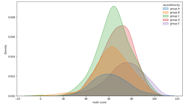
-
- ecdfplot
-
누적 밀도 함수를 표현
-
stat : 개수 또는 확률 어떤 것으로 쌓아 나갈 것인지 (count, proportion)
-
complementary : True이면 1부터 시작, False면 0부터 시작
fig, ax = plt.subplots(figsize=(12, 7))
sns.ecdfplot(x='math score', data=student, ax=ax,hue='gender',
             stat='count',complementary=True)
plt.show()
-
- rugplot
-
개별적으로는 추천하지 않으며, 데이터의 gap이 크거나 한정적인 공간에서 분포를 표현하기 위해 사용
fig, ax = plt.subplots(figsize=(12, 7))
sns.rugplot(x='math score', data=student, ax=ax)
plt.show()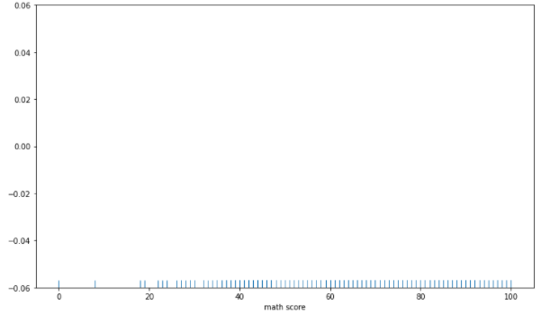
-
-
Bivariate Distirbution
-
결합 확률분포
-
scatter & histogram
- 히스토그램은 산점도보다 밀도를 표현하기 좋다fig, axes = plt.subplots(1,2, figsize=(12, 7)) ax.set_aspect(1) # scatter axes[0].scatter(student['math score'], student['reading score'], alpha=0.2) # historgram sns.histplot(x='math score', y='reading score',data=student, ax=axes[1], # color='orange',cbar=False,bins=(10, 20), ) plt.show()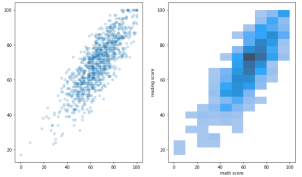
-
kedplot
fig, ax = plt.subplots(figsize=(7, 7))
ax.set_aspect(1)

sns.kdeplot(x='math score', y='reading score', data=student, ax=ax,fill=True,
#             bw_method=0.1
            )
plt.show()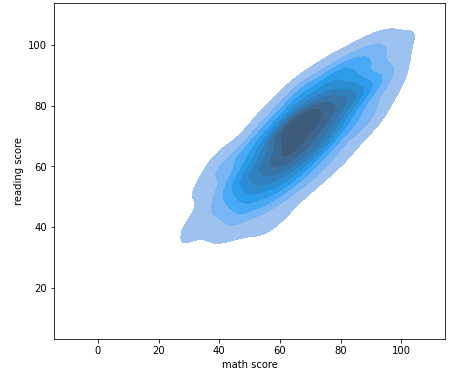
-
Relation & Regression API
- Scatter Plot
- style
- hue
- size
- 각각의 순서는 style_order,hue_order,size_order로 전달할 수 있다.
fig, ax = plt.subplots(figsize=(7, 7))
sns.scatterplot(x='math score', y='reading score', data=student,
#                style='gender', markers={'male':'s', 'female':'o'},
                hue='race/ethnicity',
#                 size='writing score',
               )
plt.show()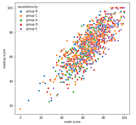
-
Line Plot
-
x축 y축과 데이터를 넣어주면 기본적인 line plot이 나타난다.
fig, ax = plt.subplots(1, 1,figsize=(12, 7))
sns.lineplot(x='year', y='Jan',data=flights_wide, ax=ax)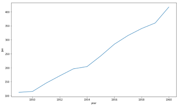
-
축을 지정하지 않으면 자동으로 각 컬럼에 대해 색과 선 스타일로 구분해서 그려준다
fig, ax = plt.subplots(1, 1,figsize=(12, 7))
sns.lineplot(data=flights_wide, ax=ax)
plt.show()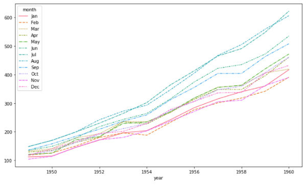
-
자동으로 평균과 표준편차로 오차범위를 보여주기도 한다.
fig, ax = plt.subplots(1, 1, figsize=(12, 7))
sns.lineplot(data=flights, x="year", y="passengers", ax=ax)
plt.show()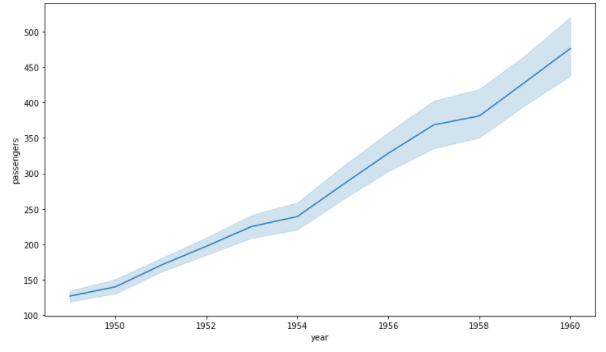
-
-
Reg Plot
-
회귀 선을 추가한 scatter plot
-
x_estimator : 평균과 같이 한 축의 한 개의 데이터만 보여줄 수 있다
-
x_bins : 보여주는 데이터의 개수를 지정할 수 있다.
-
order : 회귀식의 차수 또는 로그를 설정하여 표현할 수 있다.
fig, ax = plt.subplots(figsize=(7, 7))
sns.regplot(x='math score', y='reading score', data=student)
plt.show()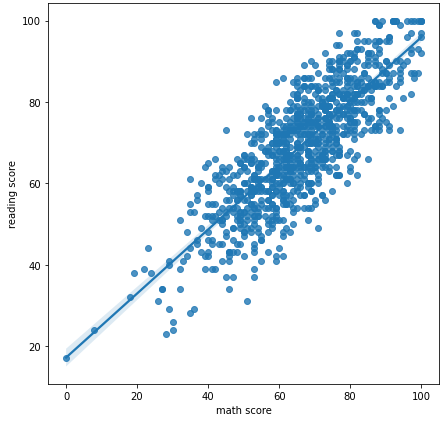
-
Matrix API
- Heatmap
- 대표적으로 상관관계 시각화에 많이 사용된다.
- vmin, vmax : 색의 범위 지정
- center : 가운데 center의 값을 지정
- cmap : colormap의 종류를 설정할 수 있으며 가독성을 높이는데 사용
- annot, fmt : 실제 값에 들어가는 내용을 표시
- linewidth : 칸 사이 간격을 조정
- sqare : 정사각형이 아닐 경우 정사각형으로 표현
fig, ax = plt.subplots(1,1 ,figsize=(12, 9))
sns.heatmap(heart.corr(), ax=ax, vmin=-1, vmax=1, center=0,cmap='coolwarm',
						annot=True, fmt='.2f',linewidth=0.1, square=True)
plt.show()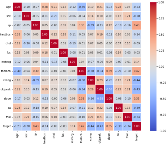
- 대칭인 경우 특정 모양에 따라 필요없는 부분을 지울 수 있다.
fig, ax = plt.subplots(1,1 ,figsize=(10, 9))

mask = np.zeros_like(heart.corr())
mask[np.triu_indices_from(mask)] = True

sns.heatmap(heart.corr(), ax=ax,vmin=-1, vmax=1, center=0,cmap='coolwarm',
            annot=True, fmt='.2f',linewidth=0.1, square=True, cbar=False,
            mask=mask)
plt.show()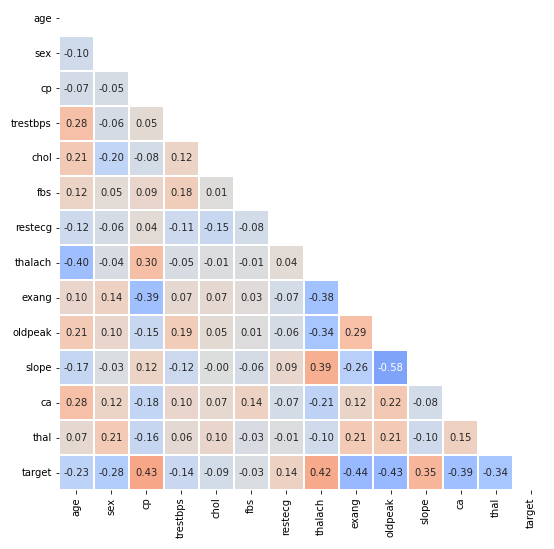
Multi Facet
-
하나의 차트가 아닌 여러 차트를 그려 정보량을 높이는 방법
-
Joint Plot
-
2개 feature의 결합 확률 분포와 함께 각각의 분포도 살필 수 있는 시각화
-
hue : 색상 설정
-
kind : 다양한 종류의 분포 설정
sns.jointplot(x='math score', y='reading score',data=student,
#               hue='gender',
              kind='reg', # { “scatter” | “kde” | “hist” | “hex” | “reg” | “resid” },
#               fill=True
             )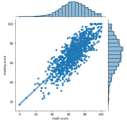
-
-
Pair Plot
-
원하는 feature에 대해 pair-wise 관계를 시각화
-
kind : 전체 서브 플롯 조정
-
diag_kind : 대각 서브 플롯 조정
sns.pairplot(data=iris, hue='Species', kind='hist')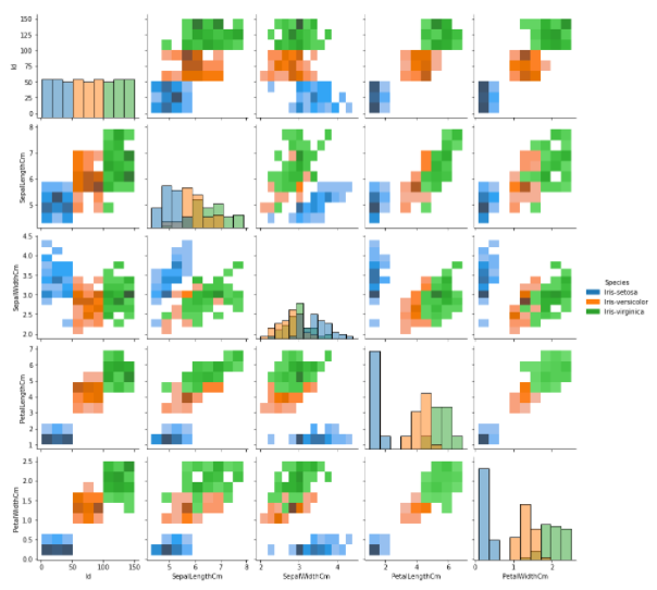
-
-
Facet Grid 사용하기
- feature 간의 관계 뿐만 아니라 feature의 category 간의 관계를 살필 때 사용한다.
- 각 행과 열의 category 설정으로 그래프의 개수가 조정된다.
- displot : Distribution
- replot : Relational
- lmplot : Regression
- catplot : Categorical
- API마다 함수의 이름만 다르지 Facet Grid를 사용하는 전체적인 구조는 같다.
-
col, row = 각 행과 열의 category 설정
-
kind : Categorical plot 종류 설정
sns.catplot(x="race/ethnicity", y="math score", hue="gender", data=student,
            kind='box', col='lunch', row='test preparation course')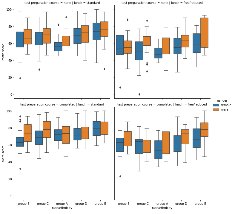
-
