Grid 이해하기
- default grid
-
기본적인 Grid는 축과 평행한 선을 사용하여 거리 및 값 정보를 보조적으로 제공한다.
-
다른 표현들을 방해하지 않도록 무채색으로 사용하며, 검정색 보다는 회색, 실선보다는 점선으로 사용한다
-
꼭 X, Y축 두 개의 Grid를 사용할 필요는 없고, 원하는 경우에 따라 하나씩 사용할 수도 있다.
-
ax.grid() parameter
- which : major, minor, both
- axis : x, y, both
- linestyle
- linewidth : 그래프의 사이즈에 따라 변의 두께나 선의 두께가 어색해 보이는 경우 조정
- zordernp.random.seed(970725) x = np.random.rand(20) y = np.random.rand(20) fig = plt.figure(figsize=(16, 7)) ax = fig.add_subplot(1, 1, 1, aspect=1) # scatter plot ax.scatter(x, y, s=150, c='#1ABDE9', linewidth=1.5, edgecolor='black', zorder=10) # minor ticks 설정 ax.set_xticks(np.linspace(0, 1.1, 12, endpoint=True), minor=True) # major ticks 설정 ax.set_xlim(0, 1.1) ax.set_ylim(0, 1.1) # 그리드 설정 ax.grid(zorder=0, linestyle='--',which='both') # ,axis='both', linewidth=2) ax.set_title(f"Default Grid", fontsize=15,va= 'center', fontweight='semibold') plt.tight_layout() plt.show()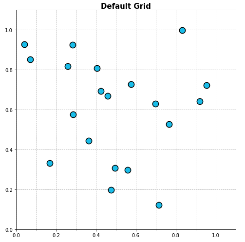
-
다양한 형태의 Grid
-
그리드 변경은 grid 속성을 변경하는 방법도 존재하지만 간단한 수식을 사용하면 쉽게 그릴 수 있다
-
X+Y = C를 사용한 Grid
-
Feature의 절대적 합이 중요한 경우에 사용한다
fig = plt.figure(figsize=(16, 7))
ax = fig.add_subplot(1, 1, 1, aspect=1)

ax.scatter(x, y, s=150,
           c=['#1ABDE9' if xx+yy < 1.0 else 'darkgray' for xx, yy in zip(x, y)],
           linewidth=1.5,
           edgecolor='black', zorder=10)

## Grid Part
## 0에서 2.2까지 12개의 구간으로 나누기
x_start = np.linspace(0, 2.2, 12, endpoint=True)

# 구간별 선 그리기
for xs in x_start:
    ax.plot([xs, 0], [0, xs], linestyle='--', color='gray', alpha=0.5, linewidth=1)

ax.set_xlim(0, 1.1)
ax.set_ylim(0, 1.1)

ax.set_title(r"Grid ($x+y=c$)", fontsize=15,va= 'center', fontweight='semibold')

plt.tight_layout()
plt.show()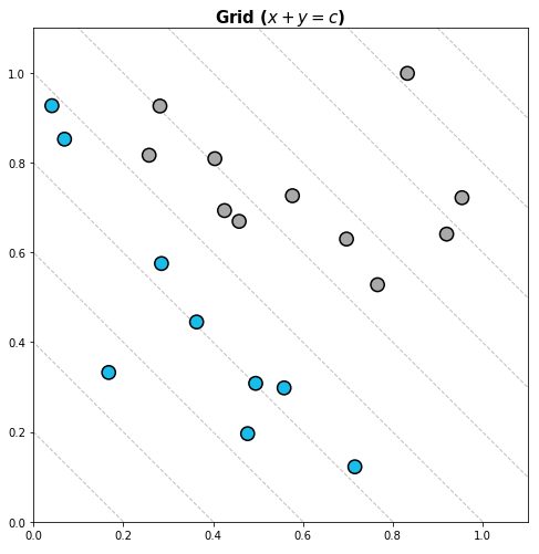
-
-
Y = CX를 사용한 Grid
-
가파를 수록 Y/X가 커지며 feature의 비율이 중요한 경우에 사용한다
fig = plt.figure(figsize=(16, 7))
ax = fig.add_subplot(1, 1, 1, aspect=1)

ax.scatter(x, y, s=150,
           c=['#1ABDE9' if yy/xx >= 1.0 else 'darkgray' for xx, yy in zip(x, y)],
           linewidth=1.5,
           edgecolor='black', zorder=10)

## Grid Part
## 0부터 90도까지 10등분하기
radian = np.linspace(0, np.pi/2, 11, endpoint=True)

for rad in radian:
    ax.plot([0,2], [0, 2*np.tan(rad)], linestyle='--', color='gray', alpha=0.5, linewidth=1)

ax.set_xlim(0, 1.1)
ax.set_ylim(0, 1.1)

ax.set_title(r"Grid ($y=cx$)", fontsize=15,va= 'center', fontweight='semibold')

plt.tight_layout()
plt.show()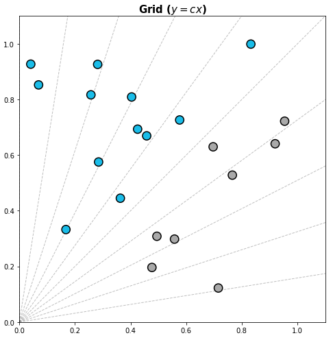
-
-
를 사용한 Grid
-
동심원을 사용한 Grid로서 특정 지점으로부터 거리를 살펴볼 수 있다.
-
점들의 유사성을 알 수 있으며, 클러스터링에 사용시 가독성이 좋다.
fig = plt.figure(figsize=(16, 7))
ax = fig.add_subplot(1, 1, 1, aspect=1)

ax.scatter(x, y, s=150,
           c=['darkgray' if i!=2 else '#1ABDE9'  for i in range(20)] ,
           linewidth=1.5,
           edgecolor='black', zorder=10)

## Grid Part
## 원의 반지름 설정
rs = np.linspace(0.1, 0.8, 8, endpoint=True)

## 2번째 데이터 중심으로 원 그리기
for r in rs:
    xx = r*np.cos(np.linspace(0, 2*np.pi, 100))
    yy = r*np.sin(np.linspace(0, 2*np.pi, 100))
    ax.plot(xx+x[2], yy+y[2], linestyle='--', color='gray', alpha=0.5, linewidth=1)

    ax.text(x[2]+r*np.cos(np.pi/4), y[2]-r*np.sin(np.pi/4), f'{r:.1}', color='gray')

ax.set_xlim(0, 1.1)
ax.set_ylim(0, 1.1)

ax.set_title(r"Grid ($(x-x')^2+(y-y')^2=c$)", fontsize=15,va= 'center', fontweight='semibold')

plt.tight_layout()
plt.show()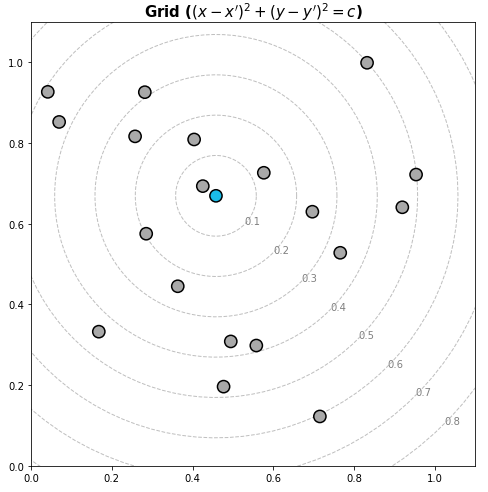
-
심플한 처리
- 선 추가하기
-
axhline() : x좌표와 평행한 선 그리기 (가로선)
-
axvline() : y좌표와 평행한 선 그리기 (세로선)
-
전체적인 가로,세로 선을 그리는 경우 일반적인 plot보다 이 방법이 더 빠르다.
-
하지만 선의 길이를 min, max로 조정하여 그려야 하는 경우에는 일반적인 plot이 더 편하다
# 선과 색을 통해 특정 부분 강조하기
fig, ax = plt.subplots(figsize=(10, 10))
ax.set_aspect(1)

math_mean = student['math score'].mean()
reading_mean = student['reading score'].mean()

# 평균점을 기준으로 가로 세로선 그리기
ax.axvline(math_mean, color='gray', linestyle='--')
ax.axhline(reading_mean, color='gray', linestyle='--')

# 각 과목의 평균보다 이상이면 royal blue색상 나머지는 gray 색상
ax.scatter(x=student['math score'], y=student['reading score'],
           alpha=0.5,
           color=['royalblue' if m>math_mean and r>reading_mean else 'gray'  for m, r in zip(student['math score'], student['reading score'])],
           zorder=10,
          )

ax.set_xlabel('Math')
ax.set_ylabel('Reading')

ax.set_xlim(-3, 103)
ax.set_ylim(-3, 103)
plt.show()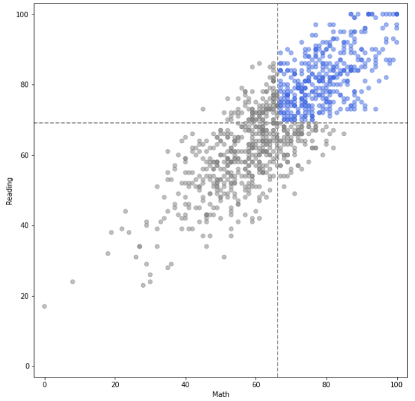
-
- 면(Span) 추가하기
-
선과 마찬가지로 가로 세로 면을 추가할 수 있으며 길이를 조정할 수 있다.
-
axhspan : 가로 면 추가
-
axvspan : 세로 면 추가
# 면을 통해 특정 부분 강조하기
fig, ax = plt.subplots(figsize=(8, 8))
ax.set_aspect(1)

math_mean = student['math score'].mean()
reading_mean = student['reading score'].mean()

ax.axvspan(-3, math_mean, color='gray', linestyle='--', zorder=0, alpha=0.3)
ax.axhspan(-3, reading_mean, color='gray', linestyle='--', zorder=0, alpha=0.3)

ax.scatter(x=student['math score'], y=student['reading score'],
           alpha=0.4, s=20,
           color=['royalblue' if m>math_mean and r>reading_mean else 'gray'  for m, r in zip(student['math score'], student['reading score'])],
           zorder=10,
          )

ax.set_xlabel('Math')
ax.set_ylabel('Reading')

ax.set_xlim(-3, 103)
ax.set_ylim(-3, 103)
plt.show()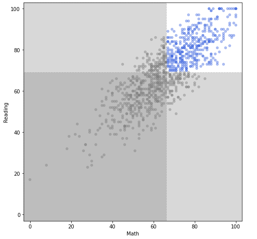
-
- Spines 추가하기
-
ax.spines
- set_visible : 축이 보이는 유무
- set_linewidth : 축의 두께
- set_position : 축의 위치 자체를 바꿀 수 있다fig = plt.figure(figsize=(12, 9)) ax = fig.add_subplot(aspect=1) x = np.linspace(-np.pi, np.pi, 1000) y = np.sin(x) ax.plot(x, y) ax.set_xlim(-np.pi, np.pi) ax.set_ylim(-1.2, 1.2) ax.set_xticks([-np.pi, -np.pi/2, 0, np.pi/2, np.pi]) ax.set_xticklabels([r'$\pi$', r'-$-\frac{\pi}{2}$', r'$0$', r'$\frac{\pi}{2}$', r'$\pi$'],) # 위쪽과 오른쪽 축 삭제 ax.spines['top'].set_visible(False) ax.spines['right'].set_visible(False) # 아래쪽과 왼쪽 축 가운데로 위치 변경 ax.spines['left'].set_position('center') ax.spines['bottom'].set_position('center') plt.show()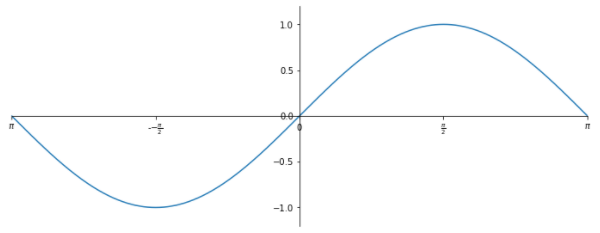
-
Setting 바꾸기
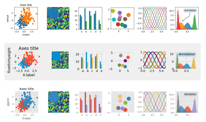
- Theme
- 아무런 설정이 없이 사용한다면 기본적으로 default를 사용하며, 대표적으로 ggplot, fivethirtyeight를 사용한다.
# 전체적인 테마 설정
mpl.style.use('seaborn')

# 한 그래프에 대해서만 설정
with plt.style.context('fivethirtyeight'):
    plt.plot(np.sin(np.linspace(0, 2 * np.pi)))
plt.show()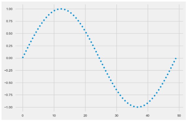
- mpl.rc
- rc라는 것은 대부분 라이브러리에서 setting을 설정할 때 사용
plt.rcParams['lines.linewidth'] = 2 # 선 굵기 설정
plt.rcParams['lines.linestyle'] = ':' # 선 스타일 설정
plt.rc('lines', linewidth=2, linestyle=':') # 이런식으로도 가능
plt.rcParams.update(plt.rcParamsDefault) # 설정값 초기화
- rc라는 것은 대부분 라이브러리에서 setting을 설정할 때 사용
