시계열 데이터
: 시간의 흐름에 대해 특정 패턴과 같은 정보를 가지고 있는 경우를 시계열 데이터라고 한다.
보통 데이터 분석에서 개요 정도 레벨에서 접근하는 시계열은 Forecast이다.
시계열 데이터에서 주기성을 가지고 있는 데이터를 다루는 경우를 Seasonal Time Series라 한다.
트렌드를 먼저 찾고, 트렌드를 뺀 주기적 특성을 찾는다.
1. 설치
- mac(m1)
- conda install pandas-datareader
- pip install fbprophet
- 윈도우, mac(intel)
-
Visual C++ Build Tool 먼저 설치
-
conda install pandas-datareader
-
pip install prophet
from pandas_datareader import data
from prophet import Prophet
위 코드가 문제없이 실행된다면 설치가 된 것
-
함수 기초
- 가장 기초적인 모양의 def 정의
- 이름(sum)과 같이 입력 인자(a,b)를 정해준다
- 출력(return)을 작성
- 함수를 사용하려면 호출을 해줘야함
- global 변수를 def 내에서 사용하고 싶다면 global로 선언
- 전역변수(golbal) : 함수 밖에서 정의된 변수
- 지역변수(local) : 함수 안에서 정의된 변수
#기본 형태
def sum(a, b):
    return a + b

sum(2,3) #호출

#전역변수, 지역변수 사용
a = 1 #전역변수(gobal)

def edit_a(i):
    global a
    a=i #지역변수(local)

edit_a(2)
a
출력값 : 2

def edit_a(i):
    a = i

edit_a(5)
print(a)
출력값 : 2
#golbal을 사용하지 않아서 함수 밖의 a와 함수 안의 a는 다른 변수이다.
내가 만든 함수를 모듈로 저장
$$ y = asin(2\pi ft + t_0) + b $$
달러2개 기호 안에 식을 쓰면 수식으로 자동변환됨
그래프 기본 형태
import matplotlib.pyplot as plt
import numpy as np
%matplotlib inline

def plotSinWave(amp, freq, endTime, sampleTime, startTime, bias):
    # """
    # 독스트링
    # """
    """
    plot sine wave
    y = a sin(2pi f t + t_0) + b
    """
    time = np.arange(startTime, endTime, sampleTime)
    result = amp * np.sin(2 * np.pi * freq * time + startTime) + bias

    plt.figure(figsize=(12,6))
    plt.plot(time,result)
    plt.grid(True)
    plt.xlabel('time')
    plt.ylabel('sin')
    plt.title(str(amp) + '*sin(2*pi' + str(freq) + '*t+' + str(startTime) + ')+' + str(bias))
    plt.show()

plotSinWave(2, 1, 10, 0.01, 0.5, 0)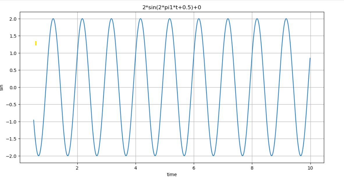
- 위 함수에 변수가 너무 많아서 변수에 맞게 값을 넣어주기가 번거로로움
- 그래서 함수를 만들때 변수를 넣어두고, 실행할때는 변수없이 함수만 불러옴
def plotSinWave(**kwargs):
"""
plot sine wave
y = a sin(2pi f t + t_0) + b
"""
endTime = kwargs.get('endTime', 1)
sampleTime = kwargs.get('sampleTime', 0.01)
amp = kwargs.get('amp', 1)
freq = kwargs.get('freq', 1)
startTime = kwargs.get('startTime', 0)
bias = kwargs.get('bias', 0)
figsize = kwargs.get('figsize', (12, 6))
time = np.arange(startTime, endTime, sampleTime)
result = amp * np.sin(2 * np.pi * freq * time + startTime) + bias
plt.figure(figsize=(12,6))
plt.plot(time,result)
plt.grid(True)
plt.xlabel('time')
plt.ylabel('sin')
plt.title(str(amp) + '*sin(2*pi' + str(freq) + '*t+' + str(startTime) + ')+' + str(bias))
plt.show()
plotSinWave()
#약간 모양을 변경하고 싶으면 조건을 넣으면 됨
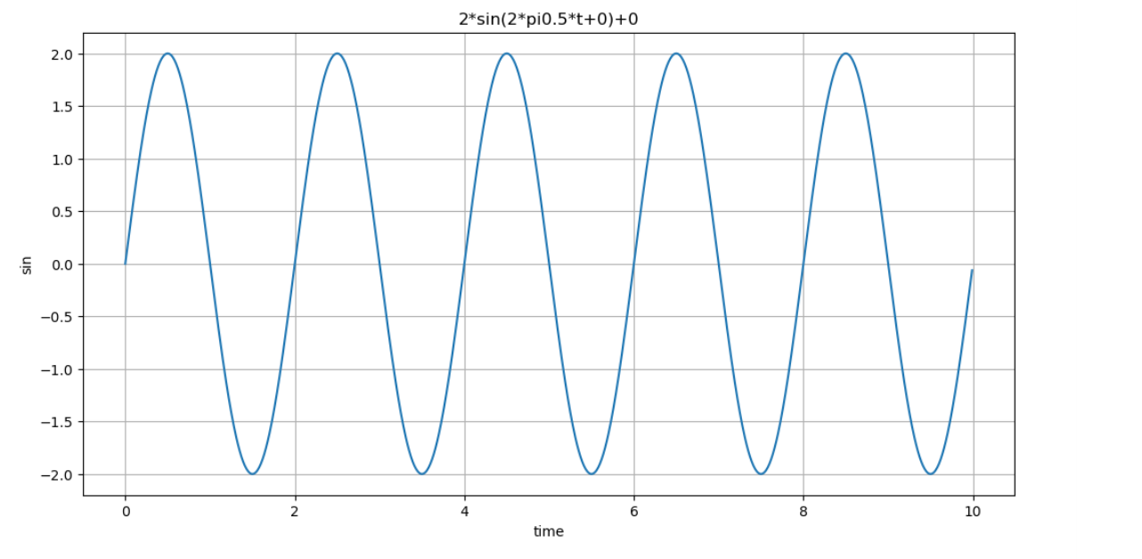
plotSinWave(amp=2, freq=0.5, endTime=10)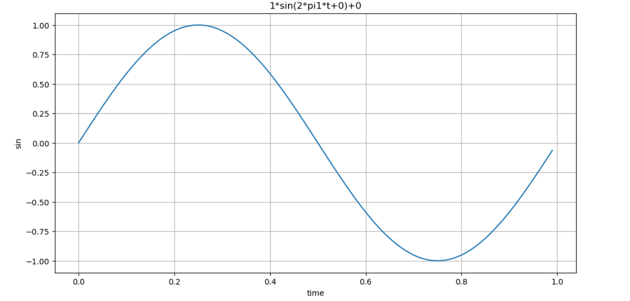
drawSinWave.py로 만들어서 모듈화
%%writefile ./drawSinWave.py

import numpy as np
import matplotlib.pyplot as plt

def plotSinWave(**kwargs):
    """
    plot sine wave
    y = a sin(2pi f t + t_0) + b
    """
    endTime = kwargs.get('endTime', 1)
    sampleTime = kwargs.get('sampleTime', 0.01)
    amp = kwargs.get('amp', 1)
    freq = kwargs.get('freq', 1)
    startTime = kwargs.get('startTime', 0)
    bias = kwargs.get('bias', 0)
    figsize = kwargs.get('figsize', (12, 6))


    time = np.arange(startTime, endTime, sampleTime)
    result = amp * np.sin(2 * np.pi * freq * time + startTime) + bias

    plt.figure(figsize=(12,6))
    plt.plot(time,result)
    plt.grid(True)
    plt.xlabel('time')
    plt.ylabel('sin')
    plt.title(str(amp) + '*sin(2*pi' + str(freq) + '*t+' + str(startTime) + ')+' + str(bias))
    plt.show()

if __name__ == '__main__':
    print('hello world~!!')
    print('this is test graph!!')
    plotSinWave(amp=1, endTime=2)

import drawSinWave as dS #모듈 불러오기
dS.plotSinWave()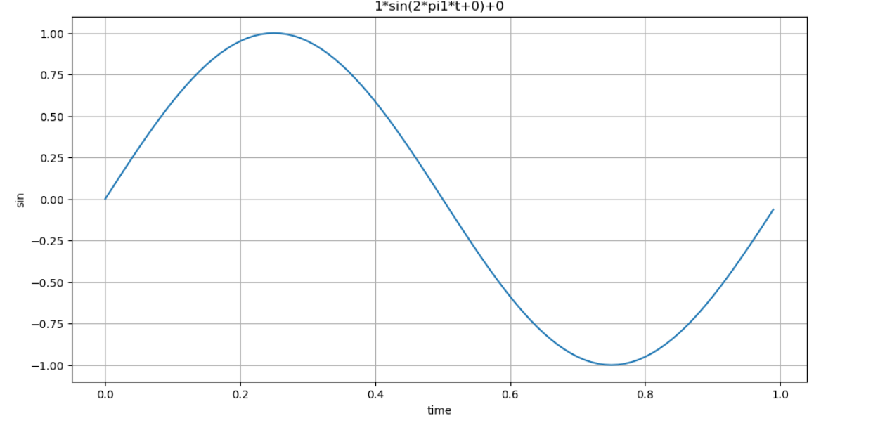
그래프 한글 설정 모듈화
%%writefile ./set_matplotlib_hangul.py

import platform
import matplotlib.pyplot as plt
from matplotlib import rc

if platform.system() == 'Darwin':
    rc('font', family='Arial Unicode MS')
elif platform.system() == 'Windows':
    rc('font', family='Malgun Gothic')

plt.rcParams['axes.unicode_minus'] = False

import set_matplotlib_hangul #이 모듈을 호출해서 사용하면 따로 한글 지정 코드를 쓰지 않아도 됨
2. Prophet 기초
import pandas as pd
import numpy as np
import matplotlib.pyplot as plt
%matplotlib inline
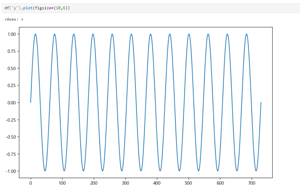
time = np.linspace(0, 1, 365*2)
result = np.sin(2*np.pi*12*time)
ds = pd.date_range('2018-01-01', periods=365*2, freq='D')
df = pd.DataFrame({'ds':ds, 'y':result})
df.head()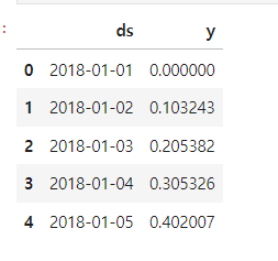
위 그래프에서 prophet을 이용하여 예측값을 그려보면
그래프1
from prophet import Prophet
m = Prophet(yearly_seasonality=True, daily_seasonality=True)
m.fit(df); #일부 값만 간단하게 불러오기 위해서 세미콜론 붙임

future = m.make_future_dataframe(periods=30)
forecast = m.predict(future)

m.plot(forecast); 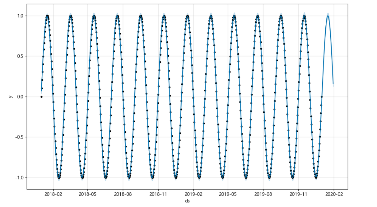
점으로 표시해둔 그래프는 기존 데이터로 그려진 그래프이고, 점이 없는 그래프가 예측값을 그린 그래프이다.
위 그래프보다 조금 더 복잡한 그래프를 그려보면 다음과 같다.
그래프2
time = np.linspace(0, 1, 365*2)
result = np.sin(2*np.pi*12*time) + time

ds = pd.date_range('2018-01-01', periods=365*2, freq='D')
df = pd.DataFrame({'ds':ds, 'y':result})

df['y'].plot(figsize=(10,6))

m = Prophet(yearly_seasonality=True, daily_seasonality=True)
m.fit(df)
future = m.make_future_dataframe(periods=30)
forecast = m.predict(future)
m.plot(forecast);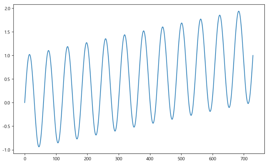
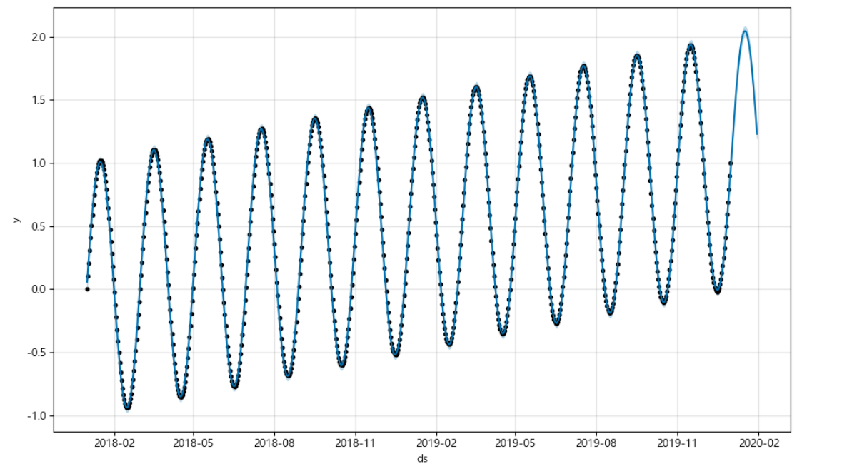
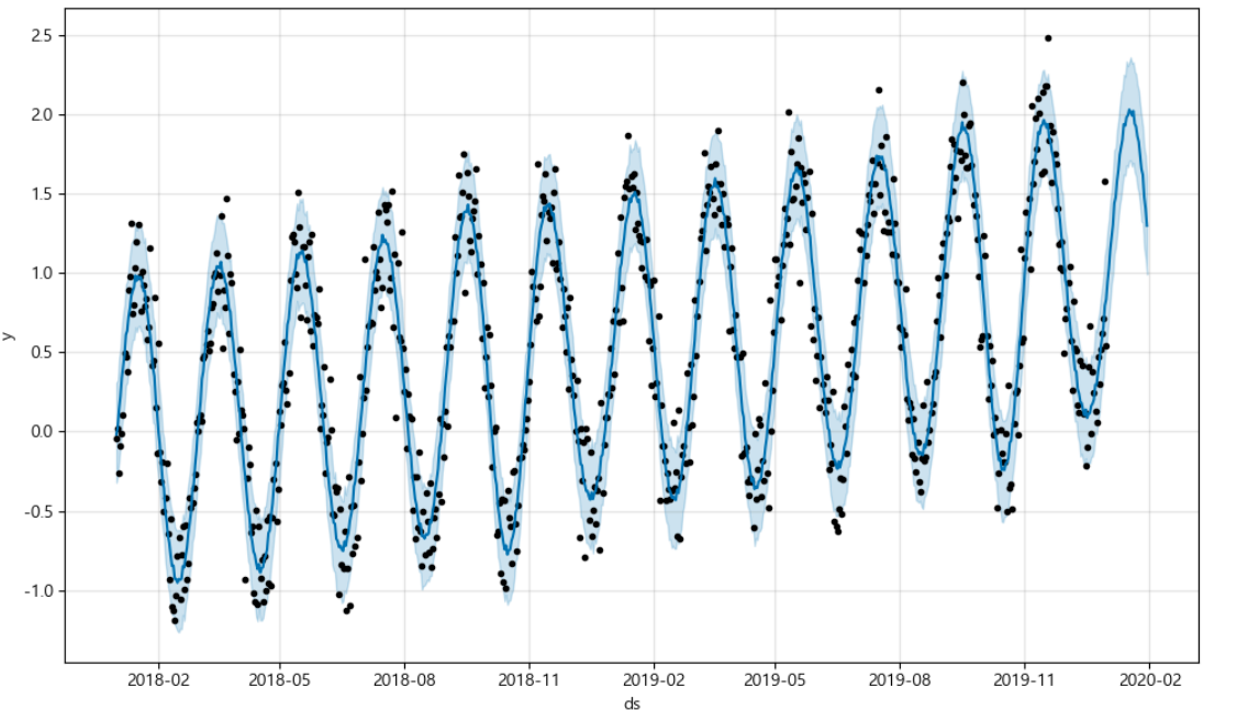
그래프3
time = np.linspace(0, 1, 365*2)
result = np.sin(2*np.pi*12*time) + time + np.random.randn(365*2)/4

ds = pd.date_range('2018-01-01', periods=365*2, freq='D')
df = pd.DataFrame({'ds':ds, 'y':result})
df['y'].plot(figsize=(10,6))

m = Prophet(yearly_seasonality=True, daily_seasonality=True)
m.fit(df)
future = m.make_future_dataframe(periods=30)
forecast = m.predict(future)
m.plot(forecast);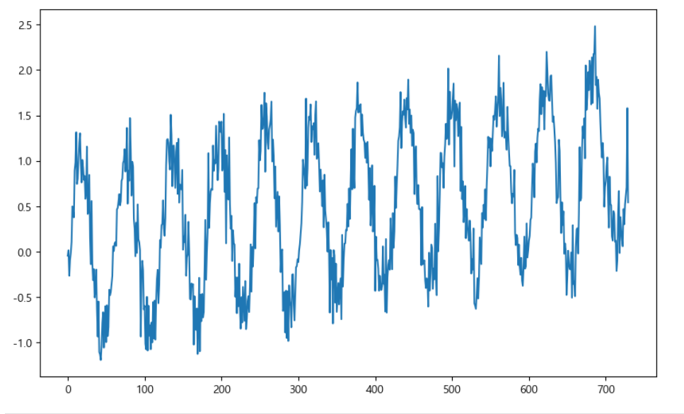
3. 시계열 데이터 실전 이용해보기
- https://pinkwink.kr/
위 사이트에서 날짜별 방문자 수 데이터로 그래프를 그려보자
import pandas as pd
import pandas_datareader as web
import numpy as np
import matplotlib.pyplot as plt
from prophet import Prophet
from datetime import datetime

%matplotlib inline

pinkwink_web = pd.read_csv(
    '../data/05_PinkWink_Web_Traffic.csv',
    encoding='utf-8',
    thousands=',',
    names=['data', 'hit'],
    index_col=0
)
#pinkwink_web.info()
pinkwink_web = pinkwink_web[pinkwink_web['hit'].notnull()]
pinkwink_web.head()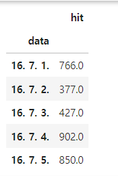
# 전체 데이터 그려보기
# 2016년 중반 ~ 2017년 중반 방문자 수
pinkwink_web['hit'].plot(figsize=(12,4), grid=True);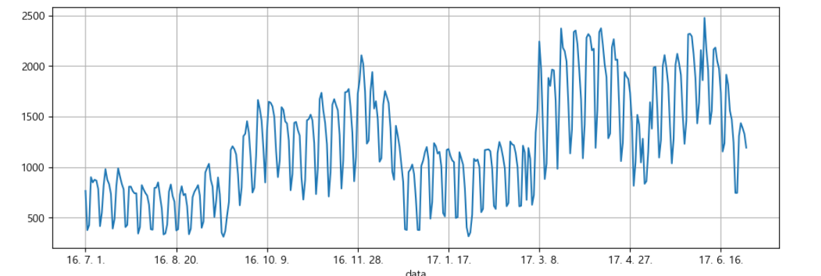
파란색 점 : 원 데터
# trend 분석을 시각하기 위한 x축 값 만들기
time = np.arange(0, len(pinkwink_web))
traffic = pinkwink_web['hit'].values
fx = np.linspace(0, time[-1], 1000) # time[-1]=364

# 에러를 계산할 함수
# trend를 얼마나 잘 반영하는지를 보기 위한 정량적 지표
def error(f,x,y):
    return np.sqrt(np.mean((f(x)-y)**2))
    #RMSE(Root Mean Square Error): error의 제곱에 평균에 루트를 씌움

#1,2,3,15차 함수 생성
fp1 = np.polyfit(time, traffic, 1)
f1 = np.poly1d(fp1)

f2p = np.polyfit(time, traffic, 2)
f2 = np.poly1d(f2p)

f3p = np.polyfit(time, traffic, 3)
f3 = np.poly1d(f3p)

f15p = np.polyfit(time, traffic, 15)
f15 = np.poly1d(f15p)

#그래프 그리기
plt.figure(figsize=(12,4))
plt.scatter(time,traffic, s=10)
plt.plot(fx, f1(fx), lw=4, label='f1')
plt.plot(fx, f2(fx), lw=4, label='f2')
plt.plot(fx, f3(fx), lw=4, label='f3')
plt.plot(fx, f15(fx), lw=4, label='f15')

plt.grid(True, linestyle='-', color='0.75')
plt.legend(loc=2)
plt.show()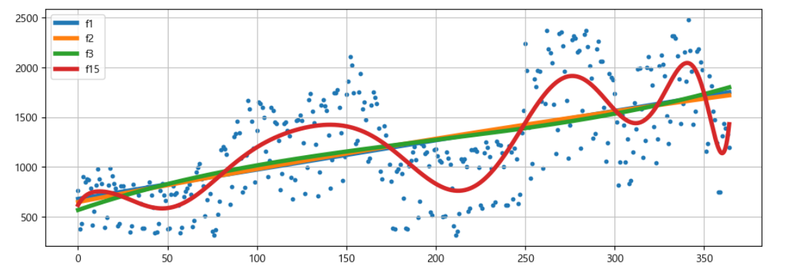
df = pd.DataFrame({'ds':pinkwink_web.index, 'y':pinkwink_web['hit']})
df.reset_index(inplace=True)
df['ds'] = pd.to_datetime(df['ds'], format='%y. %m. %d.')
del df['data']
df.head()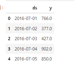
# 60일에 해당하는 데이터 예측
m = Prophet(yearly_seasonality=True, daily_seasonality=True)
m.fit(df)
future = m.make_future_dataframe(periods=60)
future.tail()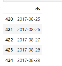
예측 결과는 상한/하한의 범위를 포함해서 다른 여러 정보가 얻어진다
forecast = m.predict(future) 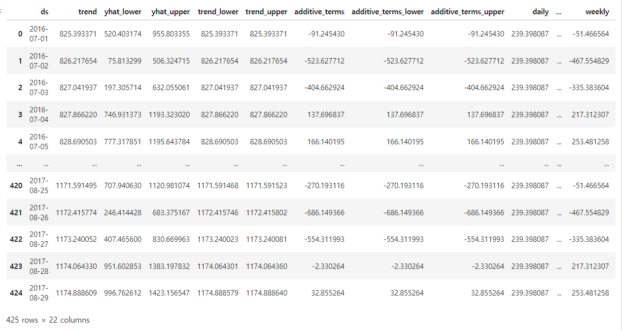
필요한 컬럼만 지정
forecast[['ds', 'yhat', 'yhat_lower', 'yhat_upper']].tail()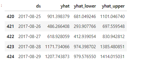
m.plot(forecast); 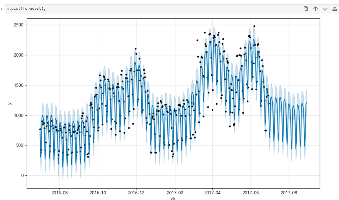
m.plot_components(forecast) #components : 트렌드를 분석해줌트렌드 대비 요일별, 월별, 시간별 방문자 수 그래프
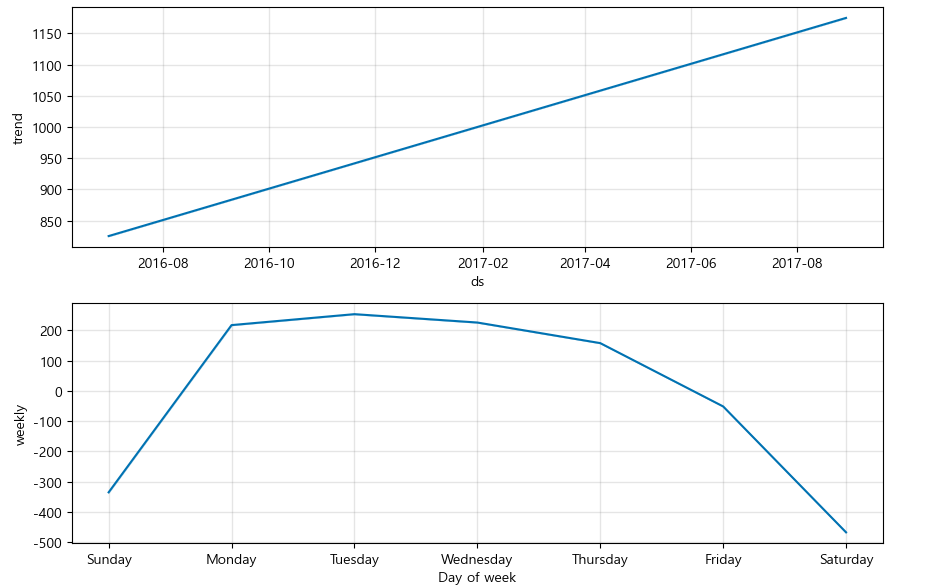
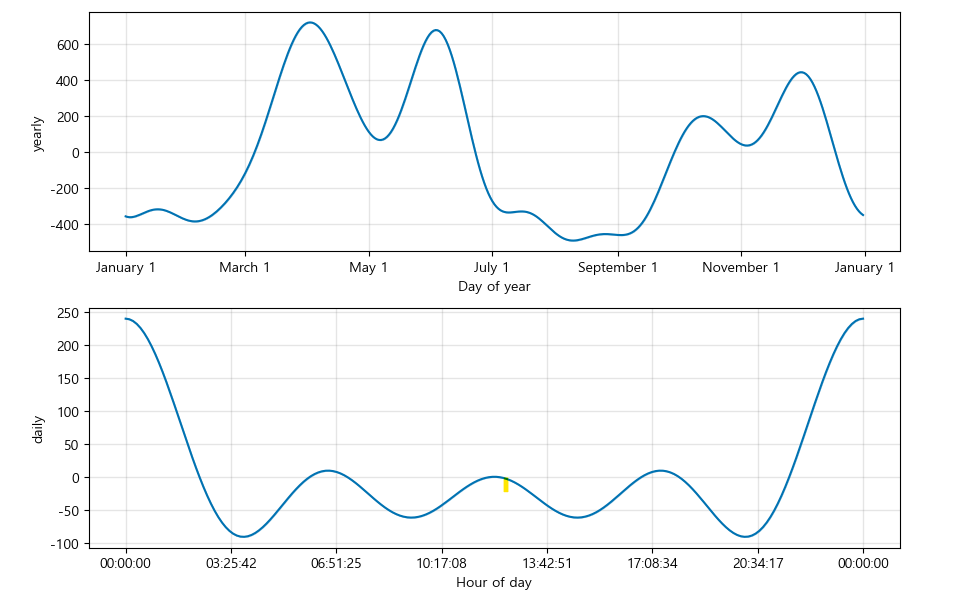
위 그래프를 보면 일주일간 방문자 수의 트렌트를 알 수 있고, 월별로 4월, 6월에 방문자 수가 유독 높다는 것을 알 수 있다. 이를 통해 방문자 수가 높아진 이유를 파악해보면서 방문자 수를 늘리기 위한 분석을 해볼 수 있을 것 같다.
기본 트렌드 분석 그래프에서 파악하기 어려웠던 것들을 components 결과로 보면 알 수 있다.