웹에서의 화면 구현 방법(web site publishing- 웹 사이트 공개)
1. 구성(웹 서버 구축 :c(lient)/s(erver))(중요)
클라이언트(client program) 서버(server program)
web
browser (직접 제작) web server(*.html- 특정 디렉토리에 있는 html 문서를 공개해주는 서버 (원치않는 디렉토리가 보이는 것은 해킹)
브라우저가 url을 통하여 서버에 요청 -> 그 후 웹서버에 html태그(문서)를 넘겨받는다.
url(Uniform Resource Locator : 복합어(유니폼된 복합어의 위치)) - url 구조 숙지!
통신 프로토콜(http/https) + 포트
http - 일반 웹 서버 요청(전송되는 데이터 해킹하면 보임)
https - 보안 웹 서버 요청(안 보임)
포트 - 프로그램과 연결되는 번호(http - 80포트 사용(생략가능) /아파치 톰캣 8080 -> 변경가능, https -437 기본적으로 사용 -> 생략가능)
*.html 페이지 구성(html(주로 사용)/htm)
html - 컨텐츠의 구성 (ex. 메모장), 태그와 태그의 속성
css - 컨텐츠의 디자인 (디자인), 셀렉터/속성/값 통하여 디자인 구축 (css 확장자)
js - 컨텐츠의 기능 (기능) (js 확장자)
w3c(html 하면서 알아둬야할 사이트)
css 적용 방법
Inline - tag 옆에서 적용
Internal - head 내에서 적용 (가장 많이 사용)
기본 구성 : 셀렉터 {속성:값; 속성:값; ...}
External - 외부에 파일에서 적용 (2번 확장시킨 것)
w3schools을 참고해서 정리
background ... Box model(중요)
Box Model(표 ~ 레이아웃)
width/height
border
padding/margin
display/ float ->이런 것들 통하여 레이아웃을 만들어낼 수 있다.
1. Box Model
button - 표
https://cssbuttongenerator.com/ 참조하여 만듦
text-aligh-last:"방향" = 마지막 줄 위치 지정("justify"는 단어마다 균등분배)수평정렬
vertical-align:"방향" = 이미지 위치 지정(baseline이 default)
text-decoration:"" = 텍스트에 밑줄 추가(위치,색깔,스타일 조정,없애기 가능)
<head>
    <style type="text/css">
        #i1 {text-decoration:overline;}
        #i2 {text-decoration-line:line-through;
        text-decoration-color: red;
        text-decoration-style: dotted;}
    </style>
</head>
<body>
    <a href="https://www.nate.com">네이트 바로 가기</a>
    <br><br>
    <div id="i1">Hello Decoration</div>
    <div id="i2">Hello Decoration</div>
</body>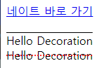
a: 태그에도 사용 가능하다(link,hover 등)
        a:link {text-decoration: none;}
        a:hover {text-decoration: underline;}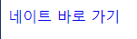
->밑줄 지워진 것을 볼 수 있다(hover인해 마우스를 대면 글자 밑에(underline)밑줄 생김)
text의 다양한 기능
<head>
    <style type="text/css">
        #i1 {text-transform: uppercase;}  --> 대문자
        #i2 {text-transform: lowercase;} --> 소문자
        #i3 {text-transform: capitalize;} --> 각 단어 첫 글자만 대문자(중요)
    </style>
</head>
<body>
    <div id="i1">This is some text</div>
    <div id="i2">This is some text</div>
    <div id="i3">This is some text</div>
</body>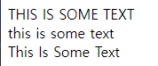
       #i1 {text-indent: 50px;}  --> 들여쓰기
        #i2 {letter-spacing: 3px;}  --> 글자 폭
        #i3 {letter-spacing: -3px;} --> 글자 폭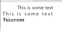
        #i2 {word-spacing: 10px;} --> 단어 간격
        #i3 {word-spacing: -5px;} --> 단어 간격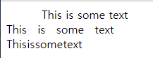
        #i2 {line-height: 0.8;} --> 라인 간격
        #i3 {line-height: 5.8;} --> 라인 간격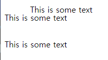
그림자 효과 주기
#i1 {text-shadow: 5px 5px rgb(10, 68, 230);} --> 그림자 효과만 준 것
#i2 {text-shadow: 5px 5px 5px rgb(10, 68, 230);} --> 흐림 효과 추가
#i3 {text-shadow: 0 0 3px #ff0000;} --> 더 정교하게?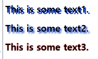
(shadow 효과는 박스에서도 적용 가능하다 : box-shadow)
<head>
    <style type="text/css">
        div {
            width:300px;
            height:100px;
            background-color: coral;
            box-shadow: 10px 10px 5px lightblue;
        }
    </style>
</head>
<body>
    <h1>The box-shadow</h1>
    <div>A div element with a 5px blurred, lightblue box-shadow</div>
</body>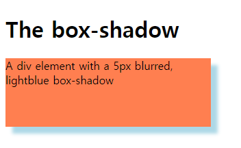
박스 응용 - 카드 만들기
<head>
    <style type="text/css">
        div.polaroid {
            width:250px;
            text-align:center;
            box-shadow: 0 4px 8px 0 rgba(0, 0, 0, 0.3),  -->rgba에서 a는 투명도
            0 6px 20px 0 aqua; --> box-shadow는 오른쪽 그림자, 아래 그림자, 전체 그림자, 비스듬(대각) 전체 그림자 순이다)
        }

        div.container {
            padding:10px;
        }
    </style>
</head>
<body>
    <div class="polaroid">
        <img src="../images/rock600x400.jpg" width="250">
        <div class="container">
            <p>Hardanger, Norwau</p>
        </div>
    </div>
</body>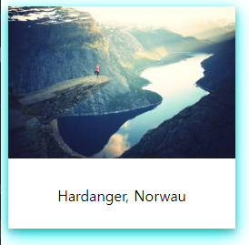
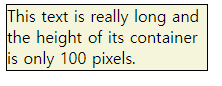
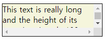
overflow - 영역 내 기준을 지을 수 있다.
<head>
    <style type="text/css">
        div {
            background-color: beige;
            width:200px;
            height:65px;
            border: 1px solid black;

            overflow:visible -->default값
            overflow:hidden -->잘라내기(숨김)
            overflow:scroll --> 스크롤기능
            overflow:auto --> 글자 수에 따라 스크롤 생기거나 안생기게 하기
        }
    </style>
</head>
<body>
    <div>This text is really long and the height of its container is
         only 100 pixels. Therefore, a scrollbar is added to help
         the reader to scroll the content.</div>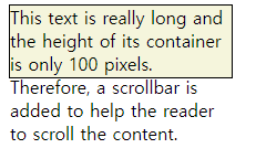
네비게이션 바 만들기(horizontal 버전(0)/ vertical버전은 세로로 리스트 되어있음)
<head>
    <style type="text/css">
       ul {
        list-style-type:none;
        margin:0;
        padding:0;
        overflow:hidden;
        background-color: #333;
       }

       li {
        float:left;
       }

       li a {
        display:block;
        color:white;
        text-align: center;
        padding:14px 16px;    -->폭 넓이 여백
        text-decoration: none;
       }

       li a:hover:not(.active) {    --> active 부분 빼고 변경한다는 뜻
        background-color: green;
       }
    </style>
</head>
<body>
    <ul>
        <li><a class="active" href=#home>Home
        </a></li>
        <li><a href="#news">News</a></li>
        <li><a href="#contact">Contact</a></li>
        <li><a href="#about">About</a></li>
    </ul>
</body>
collapse(선 겹치기)
<head>
    <style type="text/css">
        table {
            width:600px;
            border: 1px solid black;
            border-collapse: collapse; -->border선 겹치게 하기
        }

        th, td { border: 1px solid black;}

        th {
            height: 50px;
            background-color: blueviolet;
            color:wheat
        }
    </style>
</head>
<body>
    <table>
        <tr>
            <th>option1</th>
            <th>option2</th>
        </tr>
        <tr>
            <td>10</td>
            <td>11</td>
        </tr>
        <tr>
            <td>10</td>
            <td>11</td>
        </tr>
    </table>
</body>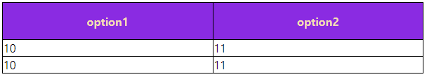
layer - 배치 조작(absolute)
<head>
    <style type="text/css">
        div {
            width:100px;
            height: 100px;
            border: 1px solid coral;
            text-align: center;
        }

        #i1 {
            position: absolute;  -->영역을 조정할 수 있다.
            top:0px;
            left:0px;
            background-color: blueviolet;
        }

        #i2 {
            position: absolute;
            top:50px;
            left: 50px;
            background-color: rgb(19, 224, 53);
        }

        #i3 {
            position: absolute;
            top:100px;
            left: 100px;
            background-color: rgb(16, 12, 235);
        }
    </style>
</head>
<body>
    <div id="i1">layer 1</div>
    <div id="i2">layer 2</div>
    <div id="i3">layer 3</div>
</body>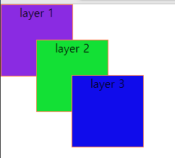
-->겹치는 순서는 맨 나중에 쓴 것이 맨 위로 간다. 이를 z-index로 사용하면 인위적으로 바꿀 수 있다.
<head>
    <style type="text/css">
        div {
            width:100px;
            height: 100px;
            border: 1px solid coral;
            text-align: center;
        }

        #i1 {
            position: absolute;
            top:0px;
            left:0px;
            background-color: blueviolet;
            z-index:1    -->상대적 숫자 기준으로 적용
        }

        #i2 {
            position: absolute;
            top:50px;
            left: 50px;
            background-color: rgb(19, 224, 53);
            z-index:3
        }

        #i3 {
            position: absolute;
            top:100px;
            left: 100px;
            background-color: rgb(16, 12, 235);
            z-index:2
        }
    </style>
</head>
<body>
    <div id="i1">layer 1</div>
    <div id="i2">layer 2</div>
    <div id="i3">layer 3</div>
</body>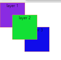
layer - 상대적 배치 조작(relative)
위 코드에서 absolute를 relative로 변경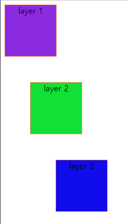
layer - 특정 위치에 고정(fixed)
<head>
    <style type="text/css">
        #i1 {
            position: fixed;   --> top 0,right 20 좌표에 고정된다(스크롤로 줄이든 늘이든 그 좌표로 따라감)
            top:0px;
            right:20px;
            width:300px;
            border:1px solid coral;
            ;
        }
    </style>
</head>
<body>
    <div id="i1">Layer 1</div>
</body>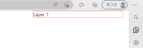
layer - 특정 위치에 붙여서 고정(sticky)
fixed와 차이점은 fixed는 처음부터 고정이 된 채로 있다(스크롤로 내리든 줄이든 첨부터 위치가 고정되어있음,문장 위치 무시하고 지정된 위치로 감)
sticky는 해당 문장 위치에서 내려갔을 때부터 고정 시작(문장 위치에서 넘어갔을 때 고정 시작)
        #i1 {position: sticky;  -->top 10px 위치에 붙여서 고정(스크롤로 내려가도 따라옴)
        top:10px;
        padding: 5px;
        background-color: #cae8ca;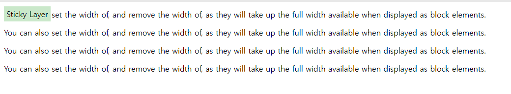
-> fixed : 처음부터 지정 위치에 고정되어있음(문장 위치 무시)
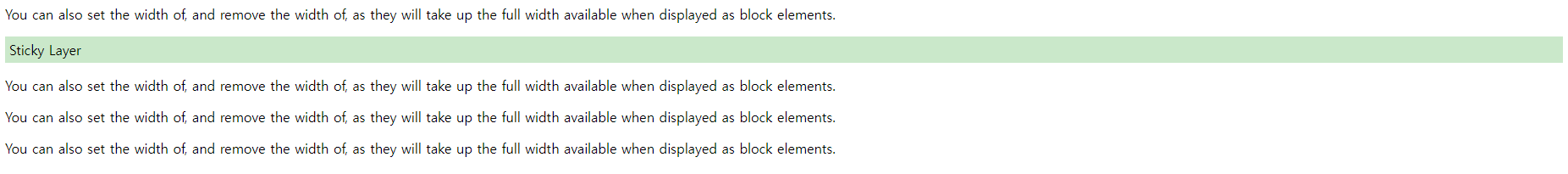
-> sticky : 저 위치에서 해당 sticky layer가 안보이게 되면 fixed 효과가 시작된다.
추가적인 css 기능들
이동(transform: translate)
<head>
    <style type="text/css">
        div {
            width:300px;
            height: 100px;
            border: 1px solid coral;
        }
        #i2 {transform: translate(-50px, 100px);}
    </style>
</head>
<body>
    <div id="i1">Translate 1</div>
    <div id="i2">Translate 2</div>
</body>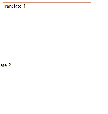
회전(transfomr: rotate)
#i2 {transform: rotate(90deg);}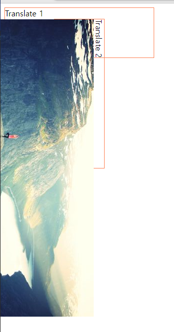
애니메이션(동작) 효과(transition)
<head>
    <style type="text/css">
        div {
            width:100px;
            height: 100px;
            border: 1px solid coral;

            transition: width 2s, height 2s;
        }
        #i1:hover { -->마우스를 댔을 때 2초동안 300px까지 늘어난다.
            width:300px;
            height:300px;
        }
    </style>
</head>
<body>
    <div id="i1">Transition</div>
</body>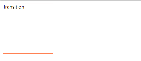
-->조금씩 늘어나는 중...
div {
            width:100px;
            height: 100px;
            border: 1px solid coral;

            transition: transform 2s;
        }
        #i1:hover {
           transform: rotate(180deg);
-->회전도 애니메이션 효과를 줄 수 있음(위 코드에서 폭 넓이 지우고 rotate만 해주기)
색깔 변경하기(@keyframes 변수)
<head>
    <style type="text/css">
        @keyframes anim{
            /*빨간색 -->노란색으로 색이 바뀌는 애니메이션 실행*/
            from    {background-color: red;}
            to      {background-color: yellow;}

        }

        #i1 {
            width:100px;
            height: 100px;
            background-color: red;
            animation-name: anim; /*애니메이션 이름*/
            animation-duration: 4s; /*애니메이션 시간*/
        }
    </style>
</head>
<body>
    <div id="i1">Animation</div>
</body>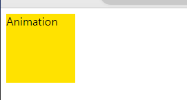
--> 빨간색에서 노랑색으로 4초 사이에 변경되는 애니메이션이다.
퍼센트 별로 색깔 변경하기(위치 설정 가능)
<head>
    <style type="text/css">
        @keyframes anim{
           0%   {background-color: red; left:0px; top:0px;}
           25%  {background-color: yellow; left:200px; top:0px;}
           50%  {background-color: blue; left:200px; top:200px;}
           75%  {background-color: green; left:0px; top:200px;}
           100% {background-color: turquoise; left:0px; top:0px;}
        }

        #i1 {
            position: relative;
            width:100px;
            height: 100px;
            background-color: red;
            animation-name: anim; /*애니메이션 이름*/
            animation-duration: 20s; /*애니메이션 시간*/
        }
    </style>
</head>
<body>
    <div id="i1">Animation</div>
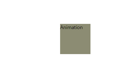
->진행 퍼센트별로 색깔이 변화하면서 해당 위치로 이동한다.
숨겨진 글씨 보이게 하기
<head>
    <style type="text/css">
        .tooltip .tooltiptext {
            visibility: hidden;      -->숨겼다가
            width:120px;
            background-color: black;
            color:#fff;
            text-align: center;
            border-radius: 6px;
            padding:5px 0;


        /*position the tooltip*/
        position: absolute;
        z-index:1;
        }

        .tooltip:hover .tooltiptext {
            visibility: visible;    -->마우스 대면 보이게 하기
        }
    </style>
</head>
<body>
    <h2>Basic Tooltip</h2>

    <p>Move the mouse over the text below:</p>

    <div class="tooltip">Hover over me
        <span class="tooltiptext">Tooltip text</span>
    </div>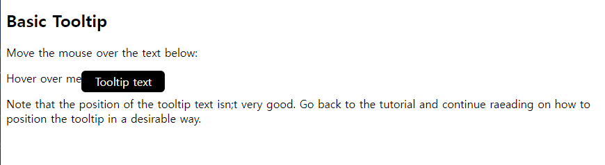
--> 저 tooltiptext는 마우스를 때면 없어진다