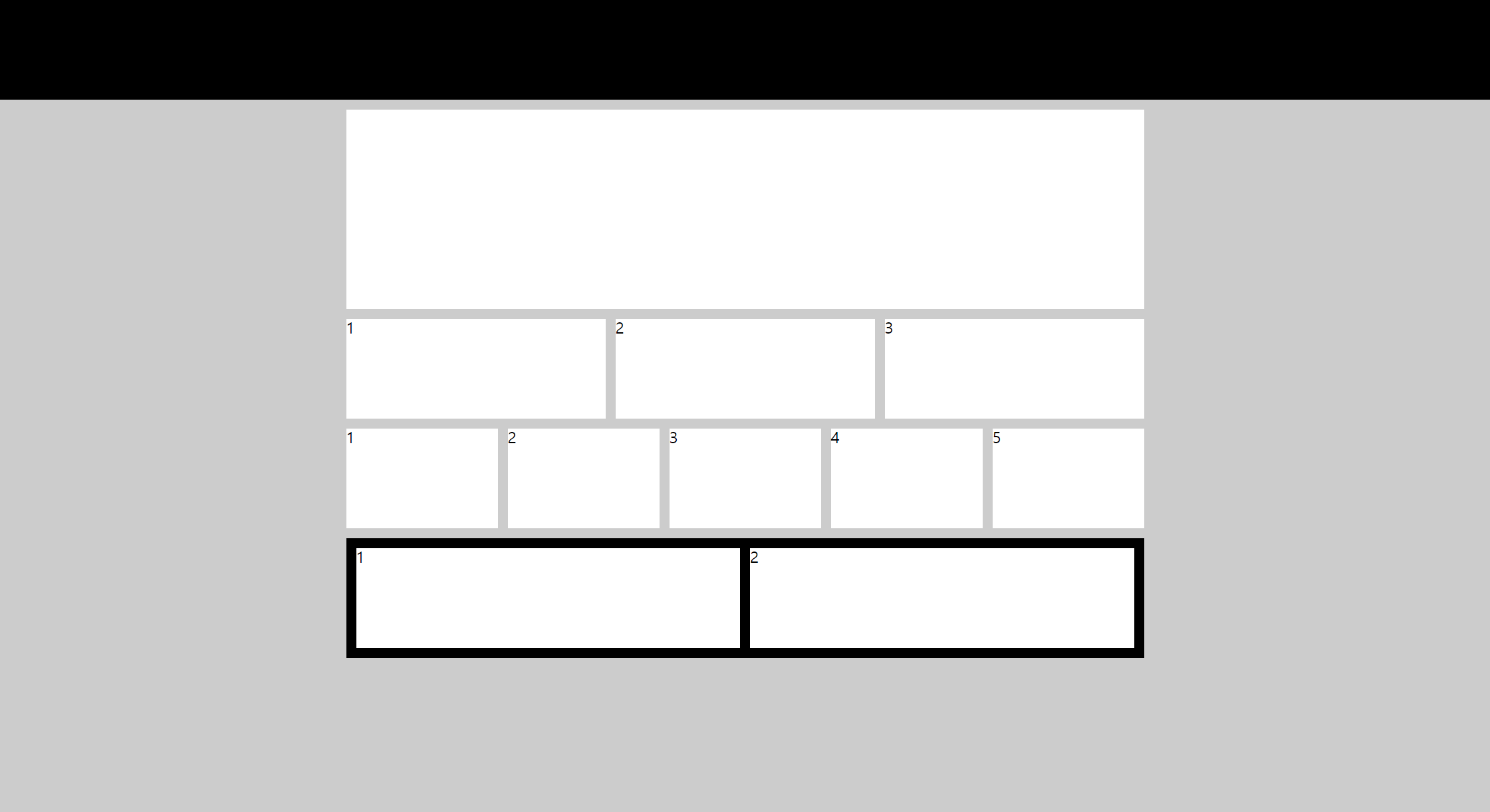
수업 2주차 grid 와 flex 로 시안 따라 만들기
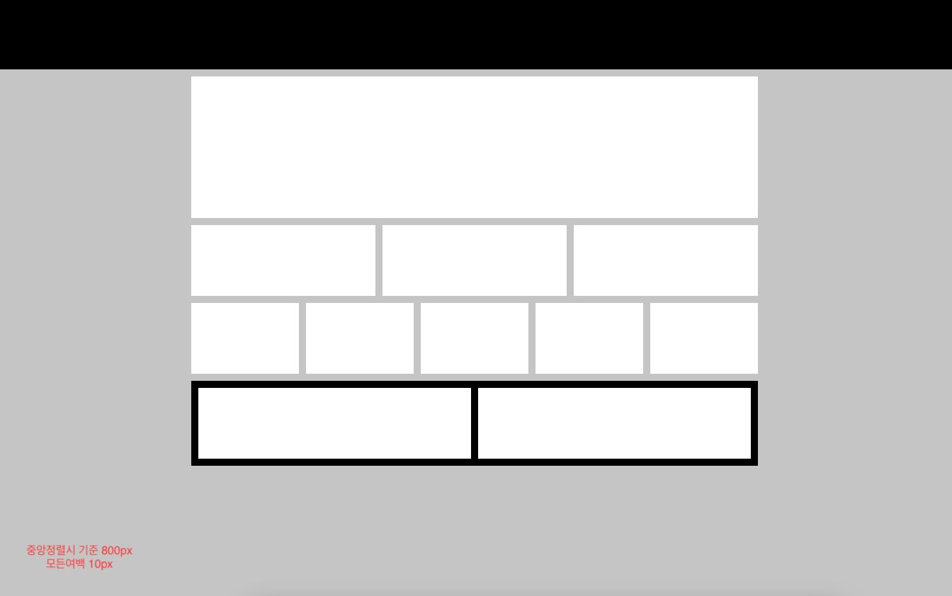
첫번째 flex 로 구현하기
<!DOCTYPE html>
<html lang="en">
<head>
  <meta charset="UTF-8">
  <meta http-equiv="X-UA-Compatible" content="IE=edge">
  <meta name="viewport" content="width=device-width, initial-scale=1.0">
  <title>test1-flex</title>
  <link rel="stylesheet" href="./reset.css">
  <style>
    header{
      background: #000;
      height: 100px;
    }
    body{background: #ccc;}
    main{
      display: flex;
      flex-direction: column;
      gap: 10px;
      width: 800px;
      margin: 0 auto;
    }
    .box1{
      margin-top: 10px;
      background: #fff;
      height: 200px;
    }
    .box2{
      display: flex;
      gap: 10px;
      height: 100px;
    }
    .box2 div{
      background: #fff;
      flex: 1;
    }

    /* .box3{
      display: flex;
      gap: 10px;
      height: 100px;
    }
    .box3 div{
      flex: 1;
      background: #fff;
    } */

    .box3{
      display: flex;
    }
    .box3 > *{
      flex: 1;
      height: 100px;
      background: #fff;
    }
    .box3 > *+*{
      margin-left: 10px;
    }

    .box4{
      display: flex;
      justify-content: space-between;
      padding: 10px;
      background: #000;
    }
    .box4 div{
      width: calc(50% - 5px);
      height: 100px;
      background: #fff;
    }
  </style>
</head>
<body>
  <header></header>
  <main>
    <section class="box1"></section>
    <section class="box2">
      <div>1</div>
      <div>2</div>
      <div>3</div>
    </section>
    <section class="box3">
      <div>1</div>
      <div>2</div>
      <div>3</div>
      <div>4</div>
      <div>5</div>
    </section>
    <section class="box4">
      <div>1</div>
      <div>2</div>
    </section>
  </main>
  <footer></footer>
</body>
</html>
두번째 grid 로 구현하기
<!DOCTYPE html>
<html lang="en">
<head>
  <meta charset="UTF-8">
  <meta http-equiv="X-UA-Compatible" content="IE=edge">
  <meta name="viewport" content="width=device-width, initial-scale=1.0">
  <title>Document</title>
  <link rel="stylesheet" href="./reset.css">
  <style>
    header{
      height: 100px;
      background: #000;
      margin-bottom: 10px;
    }
    body{
      background: #ccc;}
    main{
      display: flex;
      flex-direction: column;
      gap: 10px;
      width: 800px;
      margin: 0 auto;
    }

    .box1{
      background: #fff;
      height: 200px;
    }
    .box2{
    display: grid;
    grid-template-columns:repeat(3,1fr);
    gap: 10px;
    height: 100px;
    }

    .box2 > div{
      background: #fff;
    }

    .box3{
    display: grid;
    grid-template-columns: repeat(5,1fr);
    gap: 10px;
    height: 100px;
    }

    .box3 > div{
      background: #fff;
    }
    .box4{
    padding: 10px;
    background: #000;
    display: grid;
    grid-template-columns: repeat(2,1fr);
    gap: 10px;
    height: 100px;
    }

    .box4 > div{
      background: #fff;
    }

    footer{
      height: 100px;
      background: #000;
      margin-top: 10px;
    }

  </style>
</head>
<body>
  <header>header</header>
  <main>
    <section class="box1">box</section>
    <section class="box2">
      <div>1</div>
      <div>2</div>
      <div>3</div>
    </section>
    <section class="box3">
      <div>1</div>
      <div>2</div>
      <div>3</div>
      <div>4</div>
      <div>5</div>
    </section>
    <section class="box4">
      <div>1</div>
      <div>2</div>
    </section>
  </main>
  <footer>footer</footer>
</body>
</html>
최종 결과물