수업 2주차 grid 와 flex 로 시안 따라 만들기
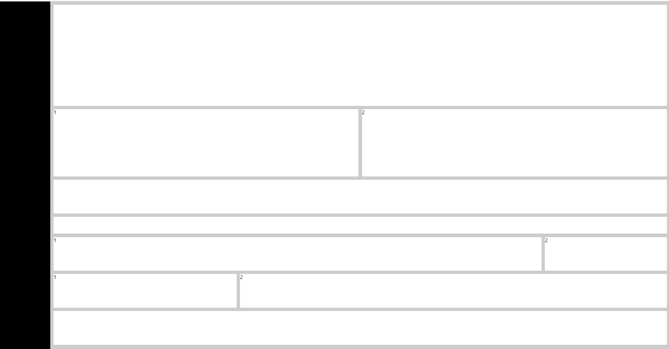
첫번째 flex로 구현하기
<!DOCTYPE html>
<html lang="en">
<head>
<meta charset="UTF-8">
<meta http-equiv="X-UA-Compatible" content="IE=edge">
<meta name="viewport" content="width=device-width, initial-scale=1.0">
<title>Document</title>
<link rel="stylesheet" href="./reset.css">
</head>
<style>
/* 핵심은 body에 flex 주고 flex-direction에 column주기 */
body{display: flex; flex-direction: column; background: #ccc;}
header{position: fixed;
width: 150px;
height: 100%;
background: #000;}
main{
margin: 10px 10px 10px 160px;
}
main > div{
margin-bottom: 10px;
}
main > div:last-child{margin-bottom: 0;}
.box1{height: 300px;background: #fff;}
.box3{height: 100px;background: #fff;}
.box4{height: 50px;background: #fff;}
.box7{height: 100px;background: #fff;}
.box2{display: flex;gap: 10px;}
.box2 div{flex: 1;
background: #fff;height: 200px;}
.box5{display: flex;gap: 10px;}
.box5 div{flex: 8;
height: 100px;background: #fff;}
.box5 div:last-child{flex: 2;}
.box6{display: flex;gap: 10px;}
.box6 div{
background: #fff;
height: 100px;
flex: 30%;
}
.box6 div:last-child{flex: 70%;}
</style>
<body>
<header>header</header>
<main>
<div class="box1"></div>
<div class="box2">
<div>1</div>
<div>2</div>
</div>
<div class="box3"></div>
<div class="box4"></div>
<div class="box5">
<div>1</div>
<div>2</div>
</div>
<div class="box6">
<div>1</div>
<div>2</div>
</div>
<div class="box7"></div>
</main>
</body>
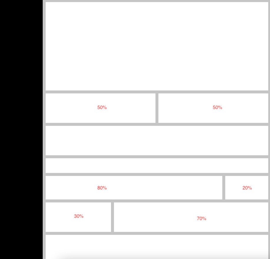
</html>두번째 grid로 구현하기
코드를 입력하세요최종 결과물