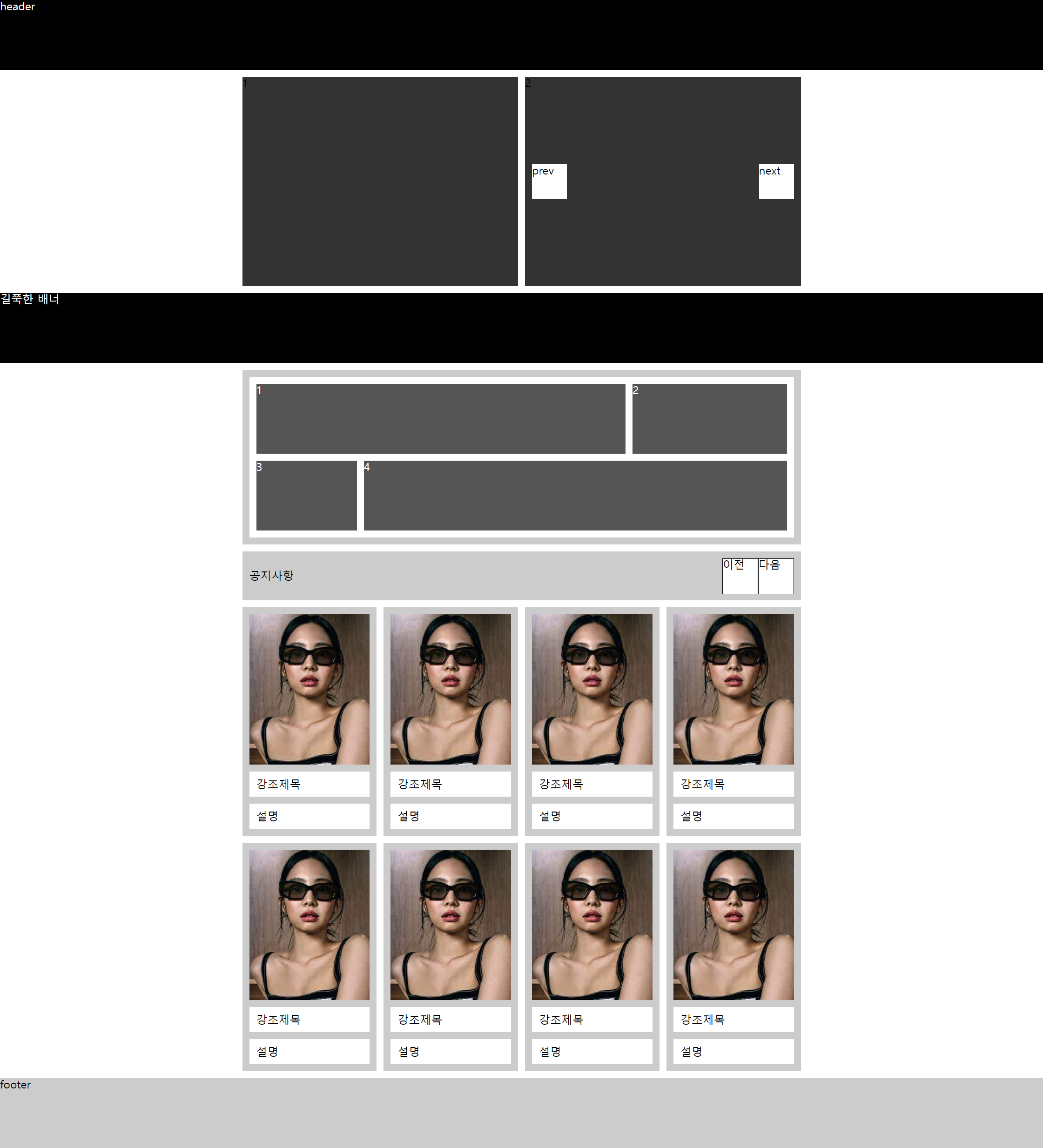
수업 2주차 grid 와 flex 로 시안 따라 만들기
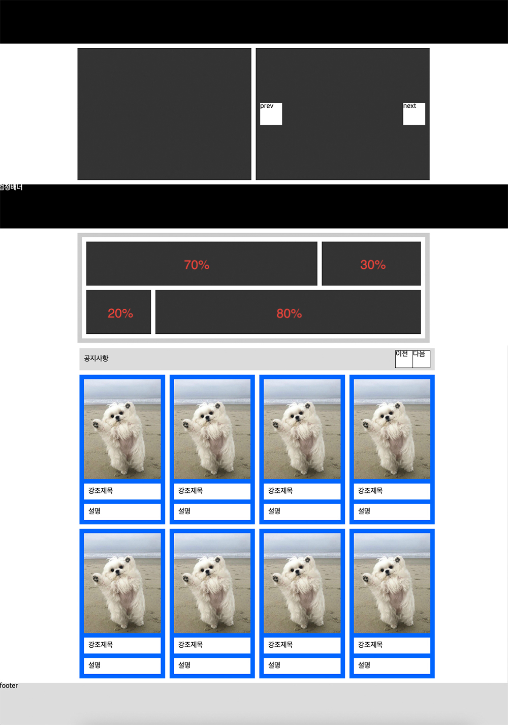
첫번째 'flex & grid' 로 구현하기
<!DOCTYPE html>
<html lang="en">
<head>
  <meta charset="UTF-8">
  <meta http-equiv="X-UA-Compatible" content="IE=edge">
  <meta name="viewport" content="width=device-width, initial-scale=1.0">
  <title>Document</title>
  <link rel="stylesheet" href="./reset.css">
</head>
<style>
  header, .box2{
    height: 100px;
    background: #000;
    color: #fff;
  }
  .inner{
    width: 800px;
    margin: 0 auto;
  }
  .box1{
    display: flex;
    gap: 10px;
    margin: 10px 0;
    height: 300px;

  }
  .box1 div{
    position: relative;
    flex: 1;
    background: #333;
  }

.box1 .btn{
  position: absolute;
  top: 50%;
  transform: translateY(-50%);
  width: 50px;
  height: 50px;
  background: #fff;
}
.box1 .btn.prev{left: 10px;}
.box1 .btn.next{right: 10px;}
</style>
<body>
  <header>header</header>
  <main>
    <div class="inner">
      <div class="box1">
        <div>1</div>
        <div>2
          <a href="" class="btn prev">prev</a>
          <a href="" class="btn next">next</a>
        </div>
      </div>
    </div>
    <div class="box2">길쭉한 배너</div>
    <style>
      /* flex
      .box3{
        padding: 10px;
        margin: 10px 0;
        background: #ccc;
      }
      .box3 ul{
        display: flex;
        flex-wrap: wrap;
        gap: 10px;
        padding: 10px;
        background: #fff;
      }
      .box3 ul li{
        height: 100px;
        background: #f00;
      }
      .box3 ul li:nth-child(1){
        width: calc(70% - 5px);
      }
      .box3 ul li:nth-child(2){
        width: calc(30% - 5px);
      }
      .box3 ul li:nth-child(3){
        width: calc(20% - 5px);
      }
      .box3 ul li:nth-child(4){
        width: calc(80% - 5px);
      } */

      /* grid */
      .box3{
        margin: 10px auto;
        padding: 10px;
        background: #ccc;
      }
      .box3 ul{
        padding: 10px;
        background: #fff;
        display: grid;
        grid-template-columns: repeat(10,1fr);
        grid-template-rows: repeat(2,100px);
        gap: 10px;
      }
      .box3 ul li{
        background: #555;
        color: #fff;
      }

    .box3 ul li:nth-child(1){ grid-column: span 7;}
    .box3 ul li:nth-child(2){ grid-column: span 3;}
    .box3 ul li:nth-child(3){ grid-column: span 2;}
    .box3 ul li:nth-child(4){ grid-column: span 8;}
    </style>
    <div class="inner">
      <div class="box3">
        <ul>
          <li>1</li>
          <li>2</li>
          <li>3</li>
          <li>4</li>
        </ul>
      </div>
      <style>
        .box4{
        height: 50px;
        background: #ccc;
        display: flex;
        justify-content: space-between;
        padding: 10px;
        margin-bottom: 10px;
        }
        .box4 h1{line-height: 50px;}
        .wrap{display: flex;}
        .wrap a{
        border: 1px solid #000;
        width: 50px;height: 50px;
        background: #fff;}
      </style>
      <div class="box4">
        <h1>공지사항</h1>
        <div class="wrap">
          <a href="prev" class="">이전</a>
          <a href="next" class="">다음</a>
        </div>
      </div>
      <style>
        .box5{
        }
        .box5 ul{
        display: grid;
        grid-template-columns: repeat(4,1fr);
        grid-template-rows: repeat(2,auto);
        gap: 10px;
        }
        .box5 ul li{}
        .box5 ul a{
        display: flex;
        flex-direction: column;
        gap: 10px;
        background: #ccc;
        padding: 10px;
        }
        .box5 ul img{}
        .box5 ul strong{
        background: #fff;
        padding: 10px;
        }
        .box5 ul p{
        background: #fff;
        padding: 10px;
        }
      </style>
      <div class="box5">
        <ul>
          <li>
            <a href="">
              <img src="./img3.jpg" alt="">
              <strong>강조제목</strong>
              <p>설명</p>
            </a>
          </li>
          <li>
            <a href="">
              <img src="./img3.jpg" alt="">
              <strong>강조제목</strong>
              <p>설명</p>
            </a>
          </li>
          <li>
            <a href="">
              <img src="./img3.jpg" alt="">
              <strong>강조제목</strong>
              <p>설명</p>
            </a>
          </li>
          <li>
            <a href="">
              <img src="./img3.jpg" alt="">
              <strong>강조제목</strong>
              <p>설명</p>
            </a>
          </li>
          <li>
            <a href="">
              <img src="./img3.jpg" alt="">
              <strong>강조제목</strong>
              <p>설명</p>
            </a>
          </li>
          <li>
            <a href="">
              <img src="./img3.jpg" alt="">
              <strong>강조제목</strong>
              <p>설명</p>
            </a>
          </li>
          <li>
            <a href="">
              <img src="./img3.jpg" alt="">
              <strong>강조제목</strong>
              <p>설명</p>
            </a>
          </li>
          <li>
            <a href="">
              <img src="./img3.jpg" alt="">
              <strong>강조제목</strong>
              <p>설명</p>
            </a>
          </li>
        </ul>
      </div>
    </div>
  </main>
  <style>
    footer{
      margin-top: 10px;
      height: 100px;
      background: #ccc;
    }
  </style>
  <footer>footer</footer>
</body>
</html>
최종 결과물