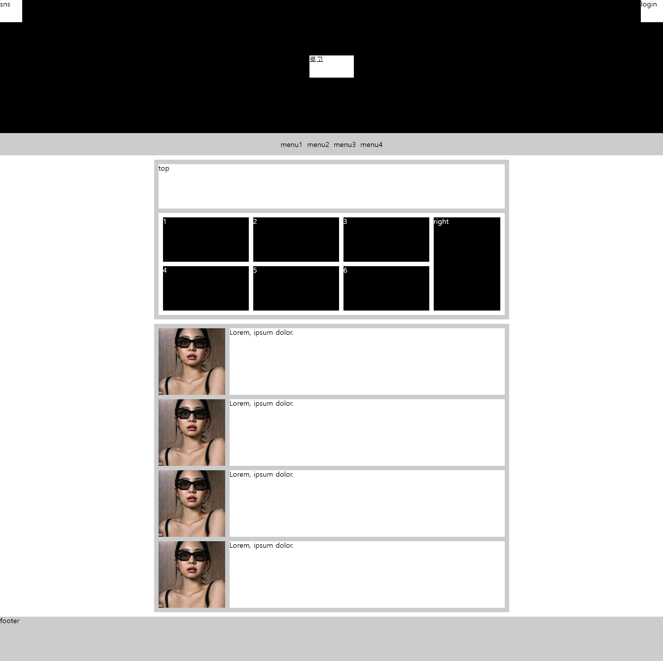
수업 2주차 grid 와 flex 로 시안 따라 만들기
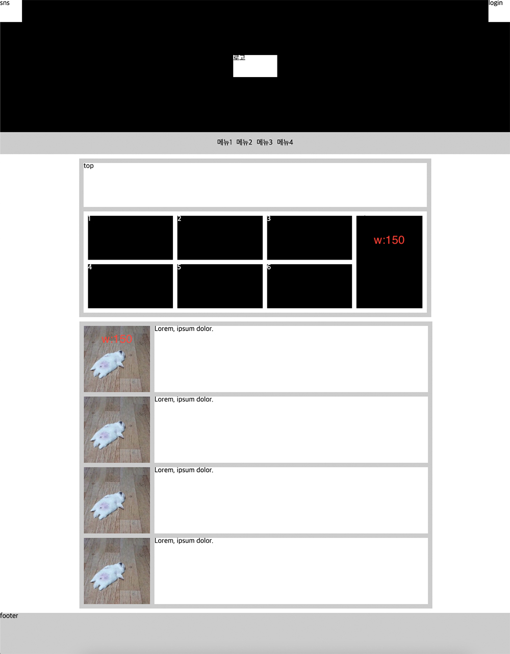
'flex & grid' 로 구현하기
<!DOCTYPE html>
<html lang="en">
<head>
  <meta charset="UTF-8">
  <meta http-equiv="X-UA-Compatible" content="IE=edge">
  <meta name="viewport" content="width=device-width, initial-scale=1.0">
  <title>Document</title>
  <link rel="stylesheet" href="./reset.css">
</head>
<style>
  header{
    position: relative;
    height: 300px;
    background: #000;
  }
  header h1{
    position: absolute;
    top: 50%;left: 50%;
    transform: translate(-50%, -50%);
    width: 100px;
    height: 50px;
    background: #fff;
  }
  header h1 a{
    display: block;
    height: 100%;
  }

  header > div{width: 50px;height: 50px;background: #fff;}

  header .sns{float: left;}
  header .login{float: right;}

  .gnb{
    background: #ccc;
  }
  .gnb ul{
    display: flex;
    justify-content: center;
    gap: 10px;
    line-height: 50px;
  }

main{
width: 800px;
margin: 0 auto;
}
/* flex
 .box2{
  margin: 10px 0;
  padding: 10px;
  background: #ccc;
}
.box2 .top{
  background: #fff;
  height: 100px;
  margin-bottom: 10px;
}

.box2 .bottom{
  padding: 10px;
  background: #fff;
  display: flex;
}
.box2 .left{
  color: #fff;
  flex: 1;
  display: flex;
  flex-wrap: wrap;
  gap: 10px;
  margin-right: 10px;
}
.box2 .left li{
  width: calc((100% - 20px)/3);
  height: 100px;
  background: #000;
}
.box2 .right{
  width: 150px;
  background: #000;
  color: #fff;
} */

.box2{
  padding: 10px;
  background: #ccc;
  margin: 10px 0;
}
.box2 .top{
  height: 100px;
  background: #fff;
  margin-bottom: 10px;
}
.box2 .bottom{
  padding: 10px;
  background: #fff;
  display: flex;
}
.box2 .left{
  flex: 1;
  margin-right: 10px;
  display: grid;
  grid-template-columns: repeat(3,1fr);
  grid-template-rows: repeat(2,100px);
  gap: 10px;
  color: #fff;
}
.box2 .left li{
  background: #000;
}
.box2 .right{
  width: 150px;
  background: #000;
  color: #fff;
}

</style>
<body>
  <header>
    <h1><a href="">로고</a></h1>
    <div class="sns">sns</div>
    <div class="login">login</div>
  </header>
  <nav class="gnb">
    <ul>
      <li><a href="">menu1</a></li>
      <li><a href="">menu2</a></li>
      <li><a href="">menu3</a></li>
      <li><a href="">menu4</a></li>
    </ul>
  </nav>
  <main>
    <section class="box2">
      <div class="top">top</div>
      <div class="bottom">
        <ul class="left">
          <li>1</li>
          <li>2</li>
          <li>3</li>
          <li>4</li>
          <li>5</li>
          <li>6</li>
        </ul>
        <div class="right">right</div>
      </div>
    </section>
    <style>
      .box3{
        padding: 10px;
        background: #ccc;
      }
      .box3 ul{
        display: flex;
        flex-direction: column;
        gap: 10px;
      }
      .box3 ul li{}
      .box3 ul a{
        display: flex;
      }
      .box3 ul img{
        width: 150px;
        height: 150px;
        object-fit: cover;
        margin-right: 10px;
      }
      .box3 ul p{
        background: #fff;
        flex: 1;
      }
    </style>
    <section class="box3">
      <ul>
        <li>
          <a href="">
            <img src="./img3.jpg" alt="">
            <p>Lorem, ipsum dolor.</p>
          </a>
        </li>
        <li>
          <a href="">
            <img src="./img3.jpg" alt="">
            <p>Lorem, ipsum dolor.</p>
          </a>
        </li>
        <li>
          <a href="">
            <img src="./img3.jpg" alt="">
            <p>Lorem, ipsum dolor.</p>
          </a>
        </li>
        <li>
          <a href="">
            <img src="./img3.jpg" alt="">
            <p>Lorem, ipsum dolor.</p>
          </a>
        </li>
      </ul>
    </section>
  </main>
  <style>
    footer{
      height: 100px;
      background: #ccc;
      margin-top: 10px;
    }
  </style>
  <footer>footer</footer>
</body>
</html>
최종 결과물