calc()
: CSS 속성의 값으로 계산식을 지정할 수 있다.
width: calc(100% - 80px);이렇게 사용이 가능하다.
- 0으로 나누면 HTML 구문분석기에서 오류가 발생한다.
+와-연산자는 부호 앞뒤로 공백이 있어야 한다.
- 가령,
calc(50% -8px)은 백분율 값과 음수의 px로 해석하여 유효하지 않다.*와/연산자는 좌우 공백을 요구하지 않지만,
일관성을 유지하기에 사용하는 것이 좋다.
+ ( 덧셈 )
: 합
- ( 뺄셈 )
: 차
x ( 곱셈 )
: 하나 이상의 피연산자가 숫자여야 한다.
/ ( 나눗셈 )
: 오른쪽 피연산자는 무조건 숫자여야 한다.
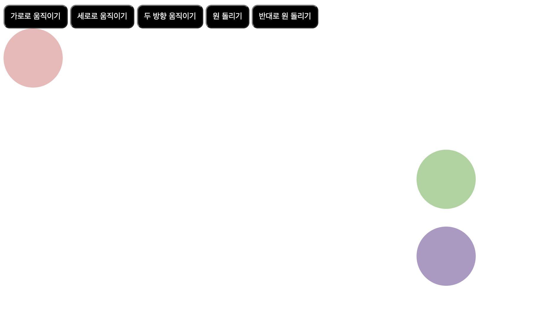
원돌리기 추가
<head>
<style>
    circle {
        position: absolute;
        padding: 50px;
        background-color: rgb(237, 184, 184);
        border-radius: 50px;
        transition-duration: 5000ms;
    }
    button {
        background-color: black;
        color: rgb(255, 255,255);
        padding: 10px;
        border-radius: 10px;
    }
    button:nth-child(1):active ~ .circle{
        margin-left: 100%;
        transform: translateX(100%);
        background-color: rgb(230, 131, 131);
    }
    button:nth-child(2):active ~ .circle{
        margin-top: 100%;
        transform: translateY(100%);
    }
    button:nth-child(3):active ~ .circle{
        margin-left: 100%;
        margin-top: 100%;
        transform: translate(100%);
        background-color: rgb(83, 10, 10);
    }
    .all {
        position: absolute;
        top: 50%;
        left: 50%;
        transition-duration: 5000ms;
        transform: translate(-50%, -50%);
    }
    .circle1  {
        padding: 50px;
        background-color: rgb(168, 211, 156);
        border-radius: 50px;
        margin-bottom: 30px;
    }
    .circle2 {
        padding: 50px;
        background-color: rgb(173, 153, 197);
        border-radius: 50px;
    }
    button:nth-child(4):active ~ .all {
       transform: translate(-50%, -50%) rotate(1080deg);
    }
    button:nth-child(5):active ~ .all {
           transform: translate(-50%, -50%) rotate(-1080deg);
    }
</style>
</head>
<body>
    <button class="button1">가로로 움직이기</button>
    <button class="button2">세로로 움직이기</button>
    <button class="button3">두 방향 움직이기</button>
    <button class="button4">원 돌리기</button>
    <button class="button4">반대로 원 돌리기</button>
    <div class="circle"> </div>
    <div class="all">
        <div class="circle1"></div>
        <div class="circle2"></div>
    </div>
</body>
transform: translate(-50%, -50%) rotate(1080deg);
- translate의 속성이 all의 박스에 있는 속성과 겹쳐서 rotate가 all클래스의 translate 자리에 들어가버리기 때문에 여기에도 명시를 해주어야 먹힌다.
transition-delay
: 실제로 transition을 발생시키기 전까지 지연시키는 것.
- 단위 ms / s 사용