transform 함수
: 요소의 형태나 위치를 변화시키기 위해 사용한다.
- 띄우기로 구분하여 여러 함수 사용 가능.
<style>
    div {
        top: 50%;
        left: 50%;
        width: 300px;
        height: 300px;
        background-color: rgb(50, 150, 250);
        position: absolute;
    }
</style>
<body>
    <div></div>
</body>

얘가 top: 50%; left: 50%; 이라는 속성을 사용했음에도 왜 중앙배치가 되지 않을까 ?
top은 윗변을 기준으로 50% 떨어지고 left는 왼쪽변을 기준으로 50% 떨어진다.
그래서 왼쪽 위 꼭짓점이 된 것 처럼 보여서 중앙배치가 되지 않은 것처럼 보이는 것이다.
 <style>
        div:nth-child(1) {
            top: 50%;
            left: 50%;
            width: 300px;
            height: 300px;
            background-color: rgb(50, 150, 250);
            position: absolute;
        }
        div:nth-child(2) {
            bottom: 50%;
            right: 50%;
            width: 300px;
            height: 300px;
            background-color: red;
            position: absolute;
        }
</style>
<body>
    <div></div>
    <div></div>
</body>
bottom : 50% right: 50%;을 적용시키게 되면 오른쪽 아래가 꼭짓점이 된 것처럼 배치가 된다.
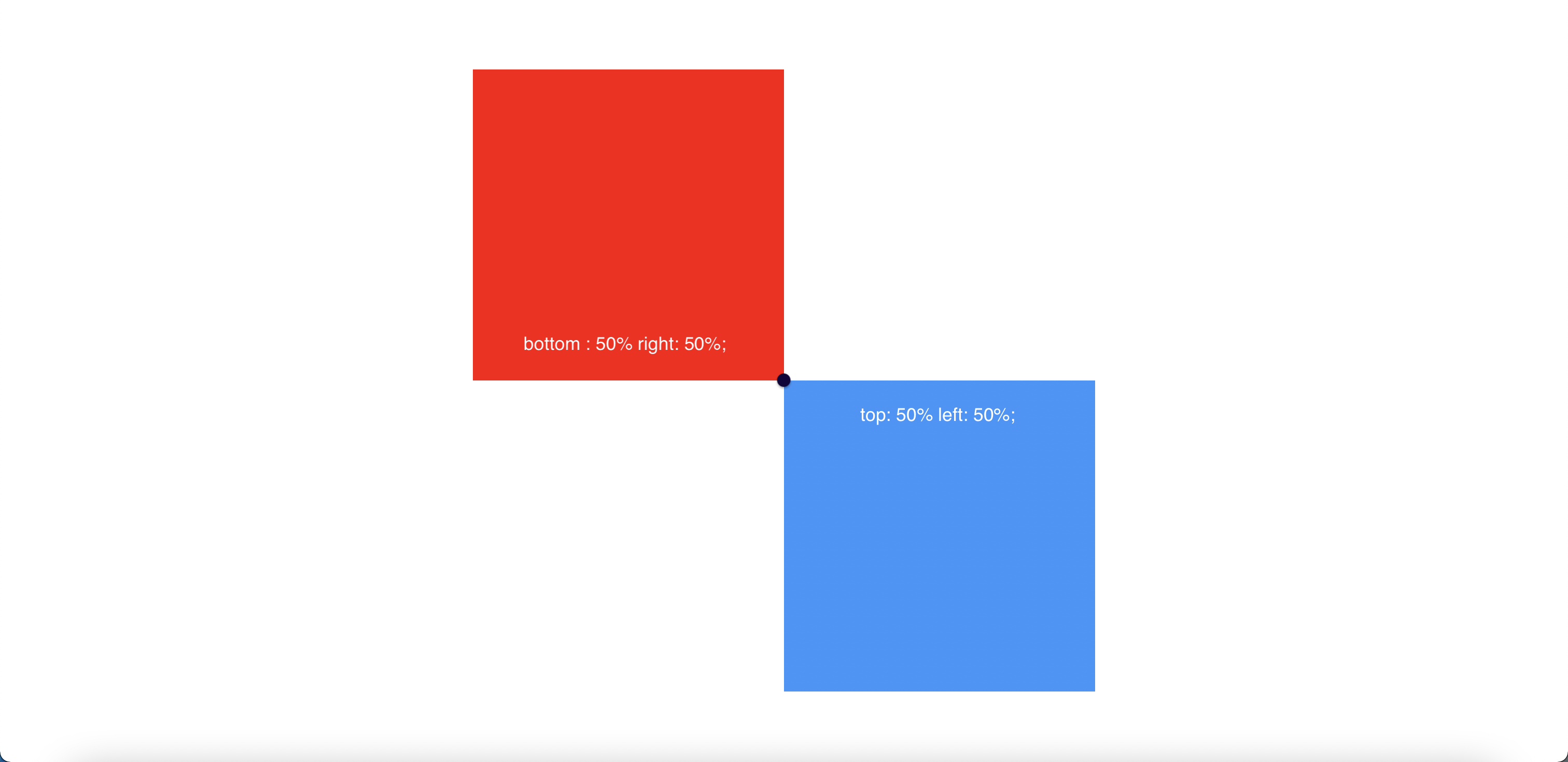
중앙배치가 되지않는 이유에 대해서는 알아보았고 그렇다면 중앙배치를 하려면 어떻게 해야할까?
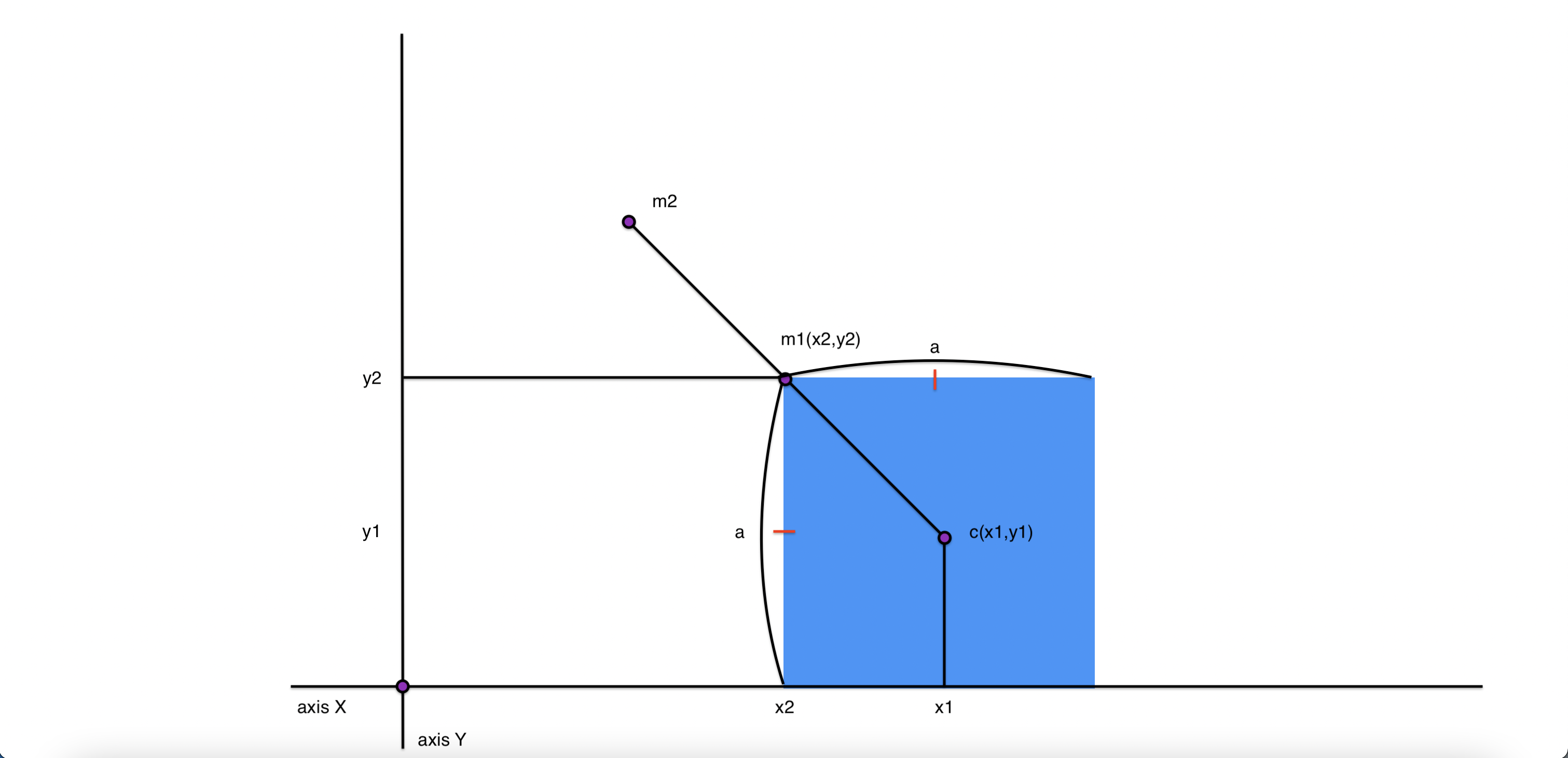
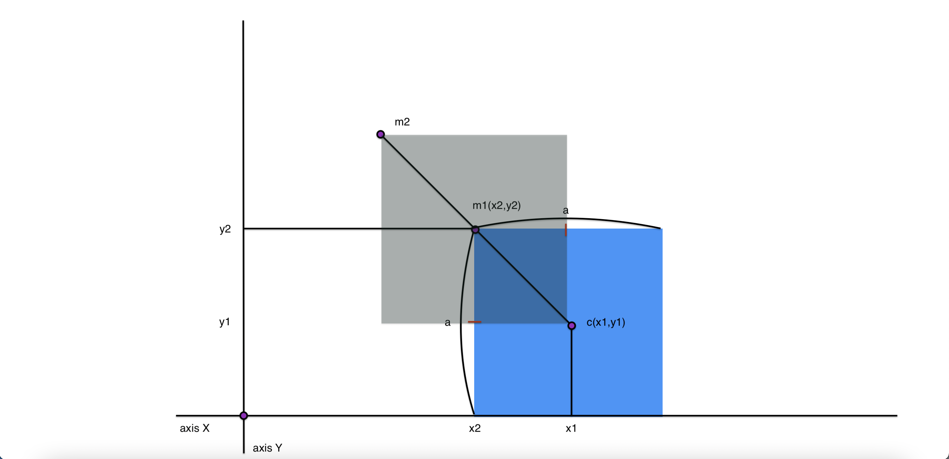
m1 -> m2 를 옮길때 점c는 x축, y축으로 얼마씩 움직어야하는가 ?
m1 ->  m2 : ( - (1/2) a , (1/2) a ) = △x
c  ->  m1 : ( -a, a ) = △y
문제를 해결하기 위해 CSS 속성 하나를 알고 넘어가자.
translate(a,b)
: x축으로 a만큼, y축으로 b만큼
- a나 b에 %값이 들어가면 각 값은 가로길이, 세로길이의 비율이 된다.
translateX(a)
: x축으로 a만큼
- a에 %값이 들어가면 각 값은 가로길이의 비율이 된다.
translateY(b)
: y축으로 b만큼
- b에 %값이 들어가면 각 값은 세로길이의 비율이 된다.
위의 수학적 도출 결과에 따라서 css에 적용해보면
transform: translate(-150px, -150px);
- 점 c가 m1자리로 옮겨지면서 중앙배치가 된다.
transform: translate(-50%, -50%);도 동일한 결과가 도출된다.

rotate 함수
: 회전할 때 사용하는 함수
rotate(a)
: a만큼 회전함. 반드시 deg 단위 사용.
transform: translate(-50%, -50%) rotate(45deg);

scale(a)
: a비율 만큼 확대/축소한다. 기본 값 1(100%)
-------------------------------------------
filter
: 이미지나 요소에 효과주기
filter 함수 (띄우기로 여러개 사용 가능)
blur(a)
: a 길이 만큼 흐리게함
filter: blur(10px);

contrast(a)
: a비율 만큼 대비 조절 기본값 1(100%)
filter: contrast(50%)

grayscale(a)
: a비율 만큼 채도(역) 조절 기본값 0(0%)
filter: grayscale(1);

brightness(a)
: a비율 만큼 밝기 조절 기본값 1(100%)
filter: brightness(200%)

invert(a)
: a비율 만큼 반전 기본값 0(100%)
filter: invert(100%)

transition
: 요소가 영향을 받는 선택자가 변경될 때 변경되는 css 속성에 대해 변화가 완료되기 까지 걸리는 시간과 방법에 대해 정의한다.
 <style>
        img {
            width: 300px;
        }

        img:hover {
            filter: blur(10px) grayscale(100%);
        }
</style>
- hover 시 변화


transition-duration
: transition이 완료되기 까지 걸리는 시간 지정. ms 혹은 s 단위 사용.
transition-duration: 1000ms;- hover시
filter: blur(10px) grayscale(100%);가
먹히기까지 1초가 소요된다. 변해가는 과정이 보인다.

transition-timing-function
: 변화가 생긴 속성이 적용되는데 사용될 함수 지정.
ease-in
: 시작은 느리게 끝은 빠르게
ease-out
:시작은 빠르게 끝은 느리게
ease-in-out
: 시작과 끝은 느리게 중간은 빠르게
ease
: ease-in-out 이랑 비슷한데 시작이 좀 더 빠름.
linear
: 선형
cubic-bezier
: 사용자 지정 입방체 베지어곡선에 따름.
- 모든 함수는 시간대비(0~ tran'-dur') 속성 변화 완료율(%)에 따른 2~3차 방정식으로 풀이 될 수 있다.
transition-property
: 변화하는 속성을 제한한다.
- 속성을 콤마로 구분하여 여러개를 사용할 수 있음. 기본값 all
!!!
transition을 적용하는 모든 속성은 중간값이 있어야한다.
- 가령, display나 postion은 적용되지 않으며 width나 height같은 경우 또한 auto에서 리터럴로 적용할 수 없다.
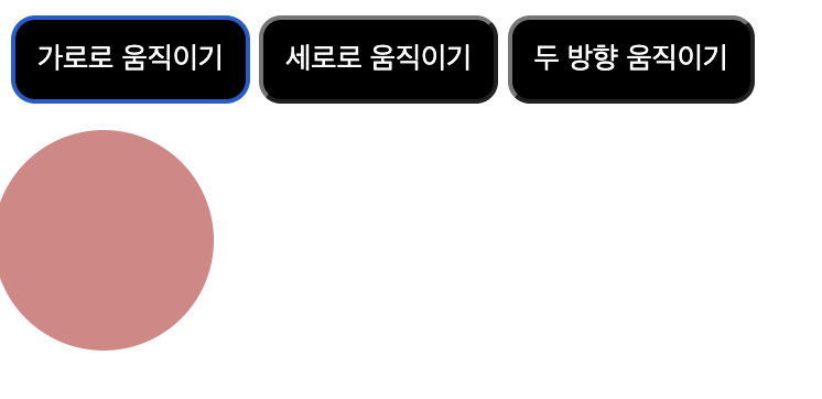
버튼을 눌러 원움직이기 예제
< 조건 >
- width, height를 사용하지 않는다.
- 버튼을 꾹 누르고 있는 동안 움직이게 한다.
- 원이 움직일때 색상을 변경하게 한다.
- 가로로 움직이기, 세로로 움직이기, 두 방향 움직이기 총 3개의 버튼을 만든다.
<head>
    <style>
       div {
            position: absolute;
            padding: 50px;
            top: 60px;
            left: 0;
            background-color: rgb(218, 132, 132);
            border-radius: 50px;
            transition-duration: 5000ms;
        }

        button {
            background-color: black;
            color: rgb(255, 255,255);
            padding: 10px;
            border-radius: 10px;
        }

        button:nth-child(1):active ~ div{
            margin-left: 100%;
            transform: translateX(100%);
            background-color: rgb(83, 10, 10);
        }

        button:nth-child(2):active ~ div{
            margin-top: 100%;
            transform: translateY(100%);
        }

        button:nth-child(3):active ~ div{
            margin-left: 100%;
            margin-top: 100%;
            transform: translate(100%);
            background-color: rgb(83, 10, 10);
        }
    </style>
</head>
<body>
    <button class="button1">가로로 움직이기</button>
    <button class="button2">세로로 움직이기</button>
    <button class="button3">두 방향 움직이기</button>
    <div> </div>
</body>