오늘은 display: grid에 대해 알아볼텐데 처음으로는 왜 grid가 필요한지에 대해 알아보자
flexbox는 격자모양을 만들때 지정해 줘야 할 것이 너무 많다 예를들면
html
<!DOCTYPE html>
<html>

<head>
  <meta charset="utf-8">
  <meta name="viewport" content="width=device-width">
  <title>repl.it</title>
  <link href="day03.css" rel="stylesheet" type="text/css" />
</head>

<body>
  <div class="father">
    <div class="child">1</div>
    <div class="child">2</div>
    <div class="child">3</div>
    <div class="child">4</div>
    <div class="child">5</div>
  </div>
</body>

</html>
css
.father {
  padding-left: 50px;
  padding-top: 50px;
  width: 300px;
  height: 110px;
  display: flex;
  flex-wrap: wrap;
  justify-content: space-between;
  align-content: space-between;
}

.child {
  flex-basis: 30%;
  background-color: peru;
  color: #fff;
  font-size: 50px;
  text-align: center;
}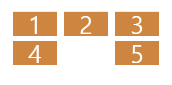
이렇게 5개의 div가 있으면 justify-content와 align-content를 통해 사이 공간을 균등하게 배분할 수는 있지만 위아래의 공간의 배분은 child의 height를 확인한 후 father에게 적절히 계산된 height를 주어야한다
또한, 5번을 2번 밑에 내려놓고 싶다면 5번에 margin이나 padding등 어떤 방법이든 단독적으로 무언가를 주어야 한다는 번거로움이 있다
이렇기 때문에 우리는 grid가 필요하다
grid도 flexbox와 동일하게 parent element에게 주어야 한다
그리고 고등학교 교육과정 이상을 수료했다면 행렬에 관한 기본적인 지식은 있을텐데
(교육과정이 바뀌었다면 죄송합니다)
grid에도 행(row)과 열(column)이 존재하므로 이를 지정해주어야 한다
먼저 column에 관해서 배워보도록 하자
.father {
  display: grid;
  grid-template-columns: 50px 50px 100px 200px 200px;
}

.child {
  background-color: peru;
  color: #fff;
  font-size: 50px;
  text-align: center;
}
위와 같이 grid-template-columns에 내가 원하는 column의 수만큼 width를 지정해주면

위와같은 결과를 얻을 수 있다
각각의 column들 사이에 공간을 주고싶다면
column-gap: 10px;을 father에 추가해주면

각 div사이에 10px의 공간이 생긴 것을 볼 수 있다
만약 column이 3개이고 row들 사이에 공간을 주고싶다면
row-gap: 20px;을 father에 추가해주면 된다(div, column의 갯수도 수정해줘야 된다)
만약 row-gap과 column-gap이 같다면
gap: 10px;이런식으로 gap이라는 property 하나만으로 해결이 가능하다
row도 column과 마찬가지로 grid-template-rows property 로 언제든 수정이 가능하다
다음으로는 grid-template-areas에 대해 알아보도록 할텐데 그전에 한가지 귀찮음을 해소하도록 하자
grid-template-rows와 grid-template-columns가 각각 크기가 같을 때 반복적으로 입력하는게 너무 귀찮다
하지만 외국 강의를 들어본 사람들이라면 꼭 한번쯤 들어본 얘기가 있을 것이다 ???: I'm lazy, so···
그렇다 개발자는 귀차니즘이 많은 사람이 꽤나 많은 것 같다(나를 포함)
그래서 이런 반복적인 인을 해결하기 위한 함수들이 존재한다
여기서는 repeat이다
grid-template-rows와 grid-template-columns를 사용할 때 반복된다면
grid-template-rows: repeat(4, 100px);
grid-template-columns: repeat(4, 200px);
위와 같이 repeat함수 안에 반복되는 횟수와 사이즈를 적어주면 된다
그러면 width: 100px; height: 200px;이 4개씩 4줄로 반복된 형태를 볼 수 있다
이제 grid-template-areas에 대해 알아보도록 하자
html
<!DOCTYPE html>
<html>

<head>
  <meta charset="utf-8">
  <meta name="viewport" content="width=device-width">
  <title>repl.it</title>
  <link href="day03.css" rel="stylesheet" type="text/css" />
</head>

<body>
  <div class="father">
    <div class="header"></div>
    <div class="content"></div>
    <div class="nav"></div>
    <div class="footer"></div>

  </div>
</body>

</html>
css
.father {
  display: grid;
  margin-top: 30px;
  margin-left: 30px;
  grid-template-columns: repeat(4, 100px);
  grid-template-rows: repeat(4, 200px);
}

.header {
  background-color: blue;
}

.content {
  background-color: red;
}

.nav {
  background-color: green;
}

.footer {
  background-color: purple;
}
위와 같은 상황에서 grid-template-areas를 통해 내가 원하는대로 grid를 디자인해보도록 하자
그러면 먼저 각 grid 영역에 이름을 붙여줘야하는데 이를 grid-area property를 통해 할 수 있다
그 후에 grid-template-areas를 통해 각 영역을 지정해 보도록 하자
.father {
  display: grid;
  margin-top: 30px;
  margin-left: 30px;
  grid-template-columns: repeat(4, 100px);
  grid-template-rows: repeat(4, 200px);
  grid-template-areas:
    "header header header header"
    "content content content nav"
    "content content content nav"
    "footer footer footer footer";
}

.header {
  background-color: blue;
  grid-area: header;
}

.content {
  background-color: red;
  grid-area: content;
}

.nav {
  background-color: green;
  grid-area: nav;
}

.footer {
  background-color: purple;
  grid-area: footer;
}
이렇게 하면 위와 같이 원하는 영역에 원하는 element들을 배치할 수 있다
근데 grid-template-areas를 사용하기 싫을 수도 있지 않은가? 그러면 다른방식으로 같은 것을 만들어 보도록 하자
이 property는 children element에게 부여하는 것인데 grid-column-start와 grid-column-end등이 있다
여기서 start와 end를 보고 column의 시작과 끝인가? 라는 생각을 할 수 있는데 여기서의 시작과 끝은 line이다
.father {
  display: grid;
  margin-top: 30px;
  margin-left: 30px;
  grid-template-columns: repeat(4, 100px);
  grid-template-rows: repeat(4, 100px);
}

.header {
  background-color: blue;
  grid-column-start: 1;
  grid-column-end: 2;
}

.content {
  background-color: red;
}

.nav {
  background-color: green;
}

.footer {
  background-color: purple;
}
위와 같이 1로 시작해서 2로 끝나게 한다면

아무런 변화를 얻을 수 없다
왜냐하면 start와 end는 line을 의미하니까
여기서 line은 무엇인가?
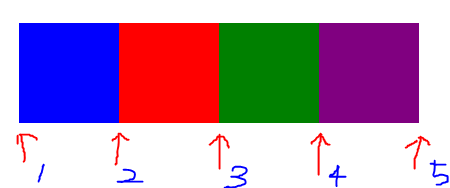
column에서의 line은 위와 같다
따라서 1번에서 시작해서 2번에서 끝나기 때문에 아무런 변화가 없는 것이다
.father {
  display: grid;
  margin-top: 30px;
  margin-left: 30px;
  grid-template-columns: repeat(4, 100px);
  grid-template-rows: repeat(4, 100px);
}

.header {
  background-color: blue;
  grid-column-start: 1;
  grid-column-end: 3;
}

.content {
  background-color: red;
}

.nav {
  background-color: green;
}

.footer {
  background-color: purple;
}
1번에서 시작해서 3번으로 끝나도록 지정하자 원하는 대로 column의 확장이 일어났다
그렇다면 row는? grid-row-start와 grid-row-end로 똑같이 지정하면 된다(귀찮으니 설명하지 않겠다는 뜻이다)
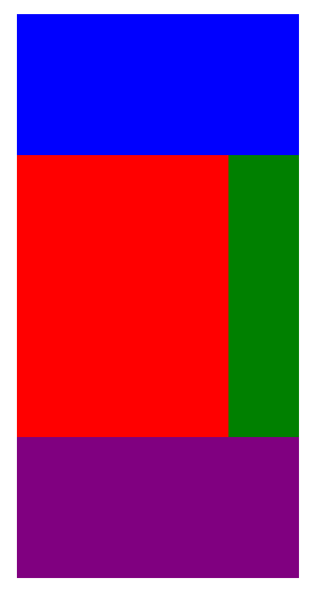
아까와 같이 header, content, nav, footer를 배치하려면
.father {
display: grid;
margin-top: 30px;
margin-left: 30px;
grid-template-columns: repeat(4, 100px);
grid-template-rows: repeat(4, 100px);
}
.header {
background-color: blue;
grid-column-start: 1;
grid-column-end: 5;
}
.content {
background-color: red;
grid-column-start: 1;
grid-column-end: 4;
grid-row-start: 2;
grid-row-end: 4;
}
.nav {
background-color: green;
grid-row-start: 2;
grid-row-end: 4;
}
.footer {
background-color: purple;
grid-column-start: 1;
grid-column-end: 5;
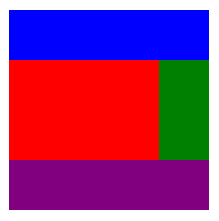
}위와 같이하면 아래와 같은 모습을 얻을 수 있을 것이다(height가 200px에서 100px로 줄어서 조금 다르게 보일 수 있다)
근데 개발자들은 대부분 뭐다? 게으르다 ! 그래서 이것들의 shortcut이 당연히 존재한다
왜냐면 시작과 끝을 쓰는 건 귀찮기 때문이다
grid-column-start: 1;
grid-column-end: 4;

/* same as the two lines above */
grid-column: 1 / 4;
근데 이렇게 언제 시작해서 언제 끝나는지 line의 수를 세는 것 조차 귀찮을 때(처음부터 끝까지)
/* 1이 시작이고 4가 끝일 때 */
grid-column: 1 / 4;

/* same as the lines above */
grid-column: 1 / -1;-를 붙이면 반대방향에서 부터 시작된다고 생각하면 된다
(column의 경우 기본 시작점이 왼쪽 끝이므로 오른쪽 끝으로 이동)
이 방법도 싫다면 span을 사용할 수 있다
span은 몇개의 cell을 갖고있는지 알려주는 것이라고 생각하면 된다
(여기서의 cell은 각각의 사각형 하나하나이다)
grid-column: 1 / -1;

/* same as the lines above */
grid-column: span 4;span을 쓰고싶은데 시작점이 1이 아니라 2부터라면?
grid-column: 2 / span 4;이렇게 간단하게 쓸 수 있게 되었다 그리고 물론 이 모든 방법이 column뿐만아니라 row에서도 작동됨을 명심하자
혹 작명하는 걸 즐기는 사람이라면(?) column과 row의 line에 이름을 지어줄 수 있다
grid-template-columns: repeat(2, 100px);

/* same as the lines above */
grid-template-columns: [first-line] 100px [second-line] 100px [third-line];
이 두개의 value는 같은 것을 의미한다 단지 이름만 생겼을 뿐
그치만 나는 사용하지 않을 것 같다 이름을 지어주는 것 자체가 창작의 고통이고 귀찮다
다음으로 개인적으로 grid의 꽃이라고 생각하는 fr(fraction)에 대해 알아보자
fr은 기본적으로 사용 가능한 공간을 뜻하고 이를 repeat과 함께 사용해
grid-template-columns: repeat(4, 1fr);이라고 property를 주면 해당 부분이 사용 가능한 공간을 4분할해서 균등하게 나눠 갖는 것을 볼 수 있다
fr은 사용 가능한 공간을 나눠갖는다 이는 비례식과 같이 생각하면 된다
공간을 4:3:2:1로 갖고싶다면
grid-template-columns: 4fr 3fr 2fr 1fr;로 비례적으로 공간을 부여할 수 있다
이는 반응형에서 유용하게 사용될 수 있다
예를들면 100px로 지정해놨다면 핸드폰에서도 100px로 보여 너무 클 것이다
이를 위해 @keyframes를 쓴다? 솔직히 나는 귀찮다 그래서 나온게 fr이다
여기서도 지름길은 존재하는데 바로 grid-template다
grid-template: <rows>, <columns>, <line-name>, ···대부분의 것들을 한번에 해결할 수 있다
예를들어
.grid {
  display: grid;
  gap: 5px;
  height: 50vh;
  grid-template:
    "header header header header" 1fr
    "content content content nav" 2fr
    "footer footer footer footer" 1fr / 1fr 1fr 1fr 1fr;
}

.header {
  background-color: #2ecc71;
  grid-area: header;
}
.content {
  background-color: #3498db;
  grid-area: content;
}
.nav {
  background-color: #8e44ad;
  grid-area: nav;
}
.footer {
  background-color: #f39c12;
  grid-area: footer;
}
위와 같이 row의 사이즈를 1:2:1로 지정해줬고, columns의 사이즈는 1:1:1:1로 지정해줬다
grid-template의 장점은 초보자가 봐도 이해하기 쉽고, 반응형으로 만들기도 쉽다는 것이다
기본적인 지식만 있다면 브라우저에 어떤식으로 출력될지 바로 눈에 들어올 것이다
flexbox를 비웠다면 justify-items와 align-itmes에 대해 익숙할 것이다
grid도 이 property들에 영향을 받는다(심지어 부모에게 주는 것도 똑같음)
justify-items와 align-items default는 stretch다
모든 자식들이 늘어나서 grid를 채우게 한다고 이해하면 될 것 같다
(value를 start, center, end로 바꿔서 결과를 확인해보길 바란다)
추가로 place-items라느 property가 있는데 y, x value를 갖는다
이는 justify-items와 align-items의 shortcut으로 y = align-items, x = justify-items을 뜻한다
따라서
justify-items: stretch;
align-items: center;

/* same as the two lines above */
place-items: center stretch;
위와 같이 간단하게 표현할 수 있다(확인은 본인이 스스로 해주면 고마울 것 같다)
다음으로는 item과 content에 대해 알아보도록 하자
justify-contents와 align-items을 보면 item과 content이라는 내용이 나오는데 먼저 두개의 개념을 알아두도록 하자
content는 whole grid(전체 그리드), item은 each one of the cell(각각의 셀 하나하나)라는 의미로 받아들이면 좋을 것 같다
justify와 align의 개념은 flex box에서 배웠듯이 main axis와 cross axis의 의미로 받아들이면 된다
그러면 이제부터 하나하나 알아보도록 하자
먼저 justfy-contents는 default가 start다
html
<!DOCTYPE html>
<html>
  <head>
    <meta charset="utf-8">
    <meta name="viewport" content="width=device-width">
    <title>repl.it</title>
    <link href="style.css" rel="stylesheet" type="text/css" />
  </head>
  <body>
      <div class="grid">
          <div class="header"></div>
          <div class="content"></div>
          <div class="nav"></div>
          <div class="footer"></div>
      </div>

    <form>
        <button class="top_nav">top</button>
    </form>
    <script src="script.js"></script>
  </body>
</html>
css
.grid {
    display: grid;
    background-color: black;
    grid-template-columns: repeat(4, 100px);
    grid-template-rows: repeat(4, 100px);
    gap: 10px;
}

.header {
    background-color: purple;
}

.content {
    background-color: blue;
}

.nav {
    background-color: red;
}

.footer {
    background-color: ivory;
}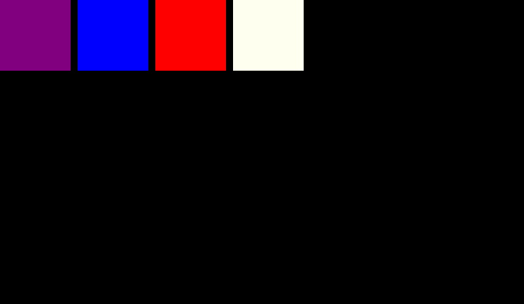
기본값을 확인하기 위해서는 .grid에 justify-contents: start;를 넣어도 변화가 없는 것을 통해 알 수 있을 것이다
당연히 align-contents: start;가 align-contents의 default라는 것을 느낌상(?)알 수 있다
그리고 justify-items와 align-items의 default는 stretch다
각 cell들이 배경색으로 꽉 채우고 있다는 걸로 짐작할 수 있는데 의심이 많은 분들은 다른 value들로 확인해보길 바란다
당연하게도 shortcut인 place-contents와 place-items는 각각 default가 start와 stretch다
혹시 각 cell들을 하나하나 변경하고 싶다면
.grid {
    width: 100%;
    height: 100%;
    display: grid;
    background-color: black;
    grid-template-columns: repeat(4, 100px);
    grid-template-rows: repeat(4, 100px);
    gap: 10px;
}

.header {
    background-color: purple;
    align-self: start;
}

.content {
    background-color: blue;
}

.nav {
    background-color: red;
}

.footer {
    background-color: ivory;
}
위와 같이 child element에게 직접 align-self등을 줘서 조절할 수 있다
(당연히 shortcut으로 palce-self가 있다는 건 여러분의 센스로 깨달았을 것이라 생각한다)
마지막으로 그리드의 꽃(?) auto에 대해서 알아보도록 하자
html
<!DOCTYPE html>
<html>
  <head>
    <meta charset="utf-8">
    <meta name="viewport" content="width=device-width">
    <title>repl.it</title>
    <link href="style.css" rel="stylesheet" type="text/css" />
  </head>
  <body>
      <div class="grid">
          <div class="items">1</div>
          <div class="items">2</div>
          <div class="items">3</div>
          <div class="items">4</div>
          <div class="items">5</div>
          <div class="items">6</div>
          <div class="items">7</div>
          <div class="items">8</div>
          <div class="items">9</div>
          <div class="items">10</div>
          <div class="items">11</div>
          <div class="items">12</div>
          <div class="items">13</div>
          <div class="items">14</div>
          <div class="items">15</div>
          <div class="items">16</div>
          <div class="items">17</div>
          <div class="items">18</div>
          <div class="items">19</div>
          <div class="items">20</div>
      </div>

    <form>
        <button class="top_nav">top</button>
    </form>
    <script src="script.js"></script>
  </body>
</html>
css
.grid {
    display: grid;
    background-color: black;
    grid-template-columns: repeat(4, 100px);
    grid-template-rows: repeat(4, 100px);
    gap: 10px;
}

.items:nth-child(2n) {
    background-color: green;
}

.items:nth-child(2n-1) {
    background-color: lightblue;
}
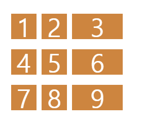
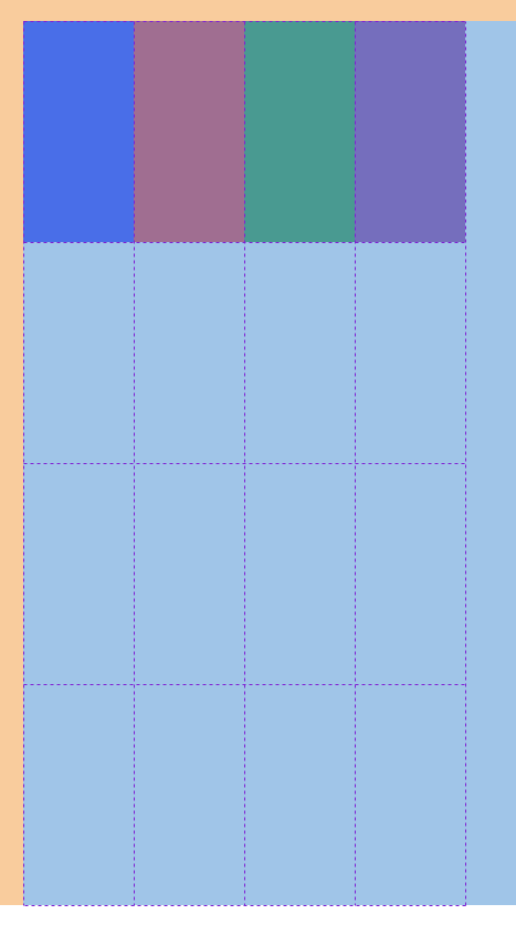
위와 같이 row가 한 줄 부족해서 마지막 줄이 짤리는 모습을 볼 수 있다
이를 해결하기 위해서 .grid에 grid-auto-rows: 100px;을 넣어주면 간단히 해결된다
이 auto라는 것은 처음에 template로 내가 4행을 지정했지만 만약에 내가 예상한 것 보다 cell의 수가 많아진다면 height: 100px;의 행을 자동으로 추가해주겠다는 뜻이다
그럼 이제 grid-auto-columns에 대해 알아보려하는데 그보다 먼저 알아야 할것이
grid-auto-flow라는 property다
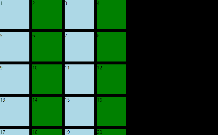
처음으로 돌아가보면 17~20번의 div는 계획에 없던 지정되지 않은 cell들이지만 강제적으로 만들어지고 있는데 이게 grid-auto-flow의 default다
근데 나는 row가 아닌 column이 자동으로 만들어 졌으면 좋겠다
그러면 .grid에 grid-auto-flow: column을 추가해 쉽게 변경할 수 있다
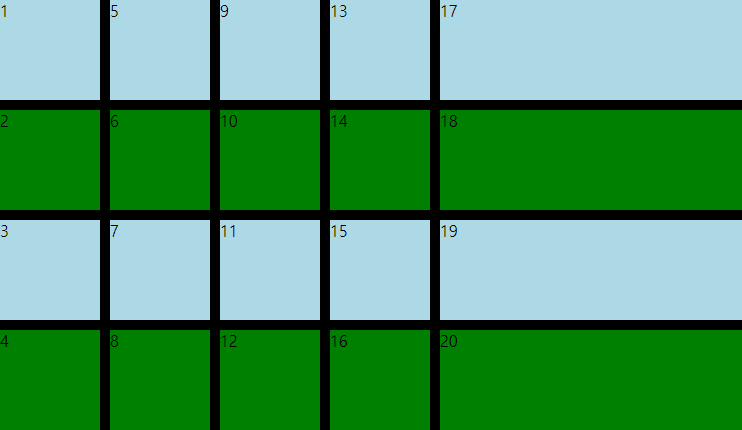
하지만 여기서 주의할 점은 위와 같이 order가 변경되어 세로로 순서가 나열된다는 점이다
그리고 기본적으로 auto로 만들어진 것들은 각 item들의 property가 stretch로 되어있기 때문에 이를 변경하고 싶으면 width(or height)를 지정해주어야 한다
이제 몇가지 keyword와 function들만 알면 grid의 기본적인 것은 거의 다 숙지했다고 할 수 있다
minmax는 element가 얼마나 작게 혹은 크게 크기를 가질 수 있는지에 대한 keyword다
예를들면 grid-template-columns: repeat(10, 1fr)은 browser의 크기에 따라 width가 달라지게 될 것이다
이는 원치않게 cell들이 찌그러질 수 있단 소리인데 이를 위해 minmax가 존재한다
browser의 크기에 영향을 받지 않기 위해 grid-template-columns: repeat(10, minmax(100px, 1fr)로 value를 수정해주면 browser의 크기가 작으면 가로 스크롤이 생기면서 width: 100px;이라는 최소크기를 유지해줄 것이다
다음 배워볼 것은 auto-fit, auto-fill인데 이는 repeat함수에서만 사용이 가능하다
html
<!DOCTYPE html>
<html>
  <head>
    <meta charset="utf-8">
    <meta name="viewport" content="width=device-width">
    <title>repl.it</title>
    <link href="style.css" rel="stylesheet" type="text/css" />
  </head>
  <body>
    auto-fill
    <div class="grid_1">
        <div>1</div>
        <div>2</div>
        <div>3</div>
        <div>4</div>
        <div>5</div>
    </div>
    auto-fit
    <div class="grid_2">
        <div>1</div>
        <div>2</div>
        <div>3</div>
        <div>4</div>
        <div>5</div>
    </div>
  </body>
</html>
css
.grid_1 {
    display: grid;
    gap: 10px;
    grid-template-columns: repeat(5, minmax(100px, 1fr));
}

.grid_2 {
    display: grid;
    gap: 10px;
    grid-template-columns: repeat(5, minmax(100px, 1fr));
}

.grid_1 div,
.grid_2 div {
    background-color: lightblue;
}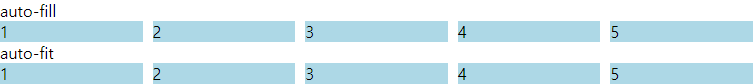
위와 같은 상황에서 repeat함수에 auto-fit과 auto-fill을 사용하면
.grid_1 {
    display: grid;
    gap: 10px;
    grid-template-columns: repeat(auto-fill, minmax(100px, 1fr));
}

.grid_2 {
    display: grid;
    gap: 10px;
    grid-template-columns: repeat(auto-fit, minmax(100px, 1fr));
}

.grid_1 div,
.grid_2 div {
    background-color: lightblue;
}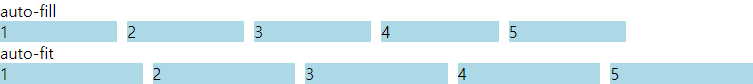
혹시 무엇이 달라졌는지 보이는가?
auto-fill은 browser의 크기에 따라 가능한 많은 양의 cell들을 만들어 줄 것이다
지금은 columns에 auto-fill을 주었으니까 가능한 많은 양의 column을 만드는 것이다
auto-fit은 각 cell들을 browser의 크기에 맞춰주는 역할을 한다
columns에 auto-fit을 주었으니까 width가 가변적으로 변하면서 화면에 딱 맞는 5개의 cell을 볼 수 있을 것이다
결국 auto-fit과 auto-fill은 특정한 숫자를 적어 줄 필요가 없어지는 것이다
그리고 이는 responsive web을 만들때 매우 유용하게 쓰일 것이다
대망의 마지막은 min-content와 max-content에 대한 이야기다
기본적으로 min-content와 max-content는 fr과 같이 사이즈다
min-content가 가능한 만큼 cell크기에 맞춰 작아진다는 말이고 max-content는 그 반대이다
html
<!DOCTYPE html>
<html>
  <head>
    <meta charset="utf-8">
    <meta name="viewport" content="width=device-width">
    <title>repl.it</title>
    <link href="style.css" rel="stylesheet" type="text/css" />
  </head>
  <body>
    <div class="grid">
        <div>this is a very long text :)</div>
        <div>this is a very long text :)</div>

    </div>
    <form>
        <button class="top_nav">top</button>
    </form>
    <script src="script.js"></script>
  </body>
</html>
css
.grid {
    color: white;
    display: grid;
    gap: 10px;
    grid-template-columns: min-content max-content;
    grid-auto-rows: 100px;
    margin-bottom: 30px;
}

.grid div {
    background-color: black;
}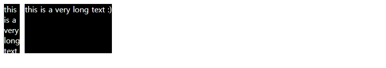
보여지는 것처럼 column의 사이즈가 가능한 최소의 사이즈를 갖는 cell과 가능한 최대의 사이즈를 갖는 cell이 만들어졌다
이 기능이 없었다면 당신은 직접 pixel size를 확인했어야 됐겠지만 min-content랑 max-content 덕분에 그럴 필요가 없어졌다
당신은 이제 기본적인 display: grid;에 대한 내용을 숙지하였다
무엇을 만들고 싶은가?
reference