flexbox에 관한 내용을 다뤄보려고 한다
이를 위해서는 먼저 inline-block에 대해 알아야 할텐데
block과 inline의 성질을 둘 다 갖는 것이라고 이해하면 되는데 예를들면
html
<!DOCTYPE html>
<html lang="en">

<head>
  <meta charset="UTF-8">
  <meta http-equiv="X-UA-Compatible" content="IE=edge">
  <meta name="viewport" content="width=device-width, initial-scale=1.0">
  <link rel="stylesheet" href="style.css">
  <title>Document</title>
</head>

<body>
  <div class="box">1</div>
  <div class="box">2</div>
  <div class="box">3</div>
</body>

</html>
css
.box {
width: 200px;
height: 200px;
background-color: peru;
display: inline-block;
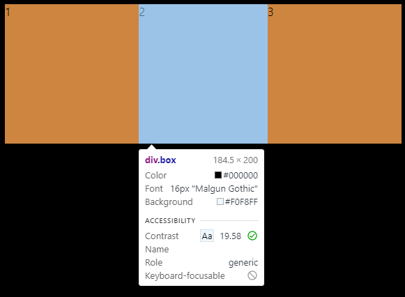
}각각 위와 같이 입력하면
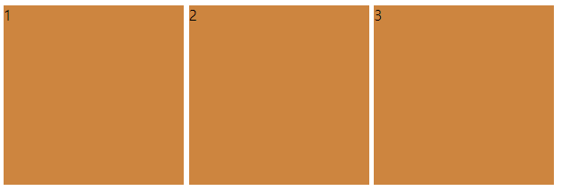
위와 같이 원치않은 빈공간들이 생긴다
나는 margin을 준적도 position을 줘서 이동한적도 없는데 멋대로 저런 공간이 생겨났다
이외에도 반응형웹사이트를 만들었을 때 각각의 div사이의 공간을 자동으로 균등하게 배분하고 싶다던지 할 때 굉장히 골치가 아픈데 이를 해결해준 것이 flex이다
flex를 사용하기 위해서는 무조건 parent element에게 주어야 한다는 것이다
html
<!DOCTYPE html>
<html lang="en">

<head>
  <meta charset="UTF-8">
  <meta http-equiv="X-UA-Compatible" content="IE=edge">
  <meta name="viewport" content="width=device-width, initial-scale=1.0">
  <link rel="stylesheet" href="style.css">
  <title>Document</title>
</head>

<body>
  <div class="father">
    <div class="box">1</div>
    <div class="box">2</div>
    <div class="box">3</div>
  </div>
</body>

</html>
css
body {
background-color: black;
}
.father {
display: flex;
}
.box {
width: 200px;
height: 200px;
background-color: peru;
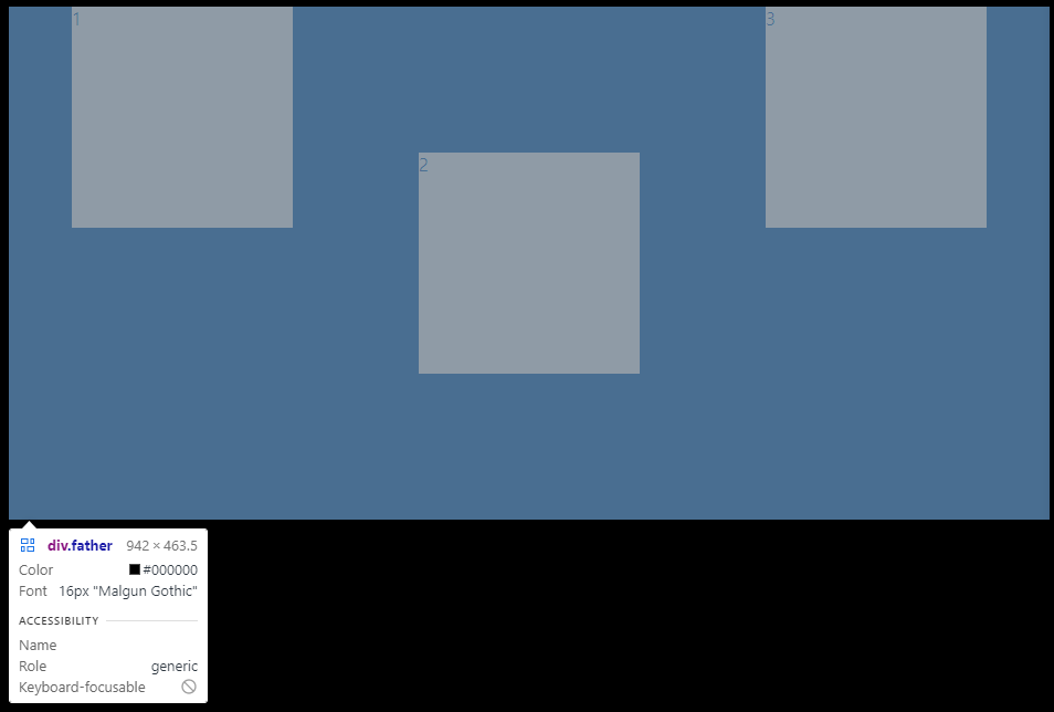
}위와 같이 class="father"를 만들어줘서 거기에 display: flex;를 해줘야한다
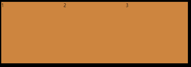
그러면 inline-block과는 다르게 사이에 있던 간격이 사라진 것을 볼 수 있다
flex에서 기본적으로 방향은 flex-direction property로 바꿀 수 있는데 default value는 row이고 방향은 horizontal(수평)방향이다
이렇게 방향을 정하면 row방향을 조정하려면 justify-content로 column방향을 조정하려면 align-items로 조정하면 된다
만약 flex-direction: column을 하게되면 row방향이 vertical이 되므로 이때는 align-items로 조정하고 column방향을 justify-content로 조정하면 된다
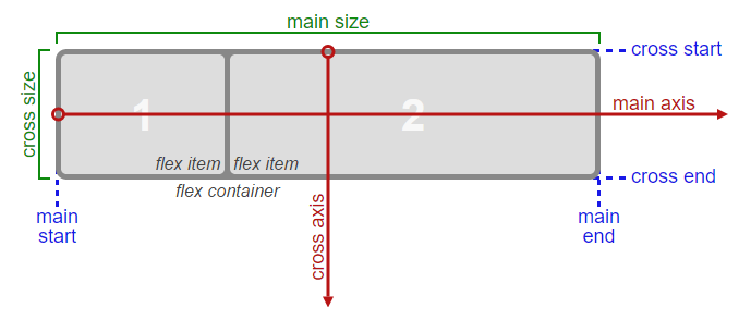
위 그림은 flex-direction: row일때의 axis다
이는 flex-direction: column으로 뒤바뀔 수 있다는 걸 염두해두자
많은 사람들이 item들을 center로 보내고 싶어하는데 align-items를 center로 보내고싶다면 먼저 height(or width)를 지정해주어야 한다는 것을 잊지말자
예를들어
html
<!DOCTYPE html>
<html lang="en">

<head>
  <meta charset="UTF-8">
  <meta http-equiv="X-UA-Compatible" content="IE=edge">
  <meta name="viewport" content="width=device-width, initial-scale=1.0">
  <link rel="stylesheet" href="style.css">
  <title>Document</title>
</head>

<body>
  <div class="father">
    <div class="box">1</div>
    <div class="box">2</div>
    <div class="box">3</div>
  </div>
</body>

</html>
css
body {
background-color: black;
}
.father {
display: flex;
justify-content: center;
align-items: center;
}
.box {
width: 200px;
height: 200px;
background-color: peru;
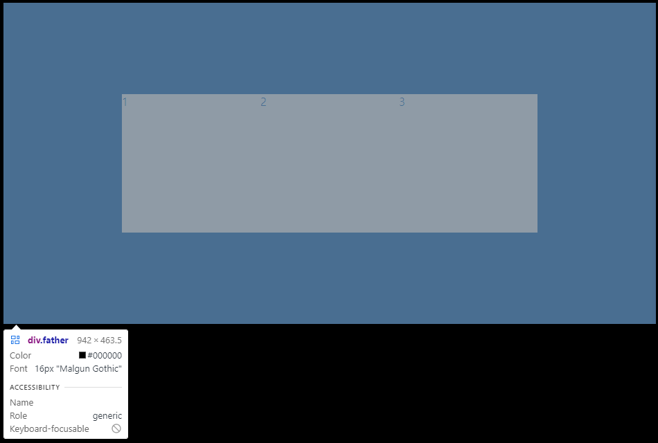
}로 main axis와 cross axis를 center로 지정해 줬지만 결과물을 보면
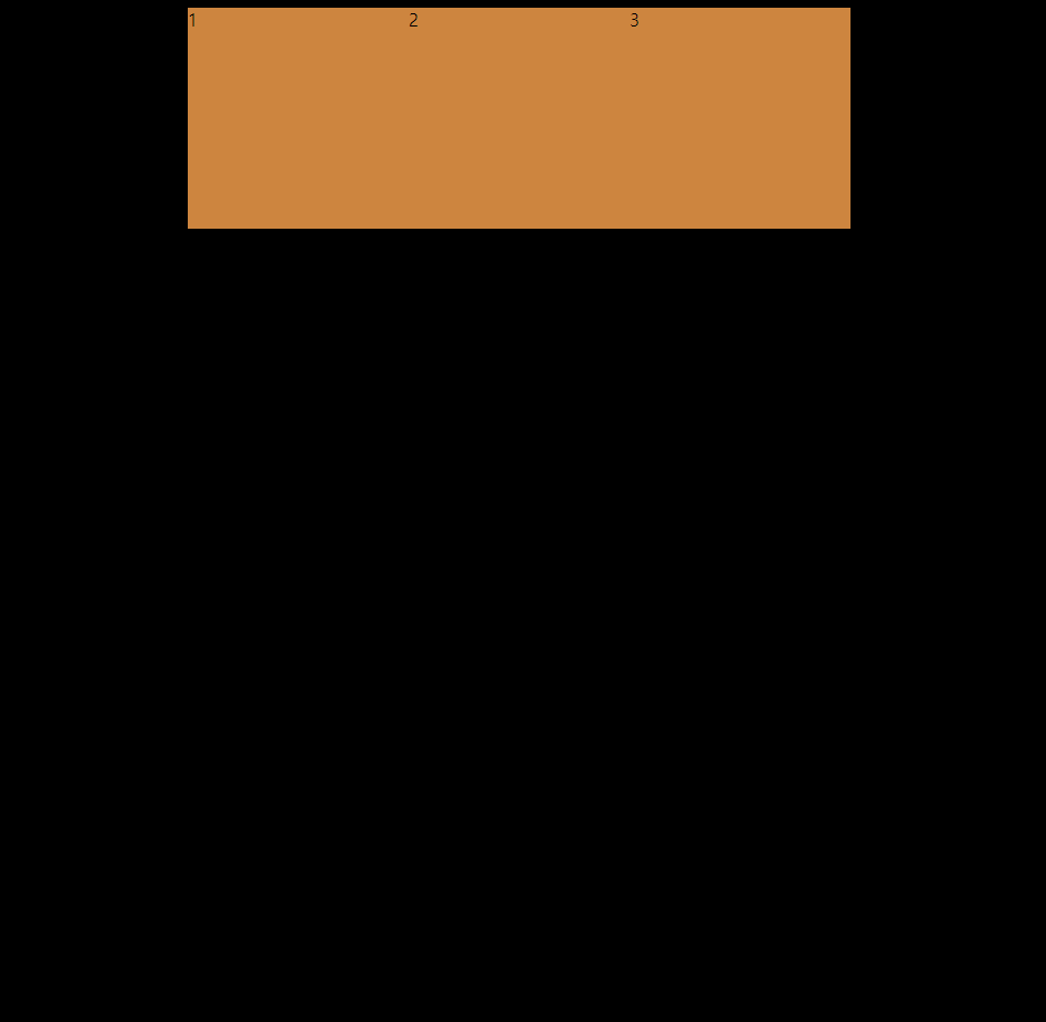
내가원하는 곳으로 가지 않았다
이는 cross axis의 사이즈가 box의 height와 동일하기 때문이므로 이를 움직이기 위해서는 flex father에게 height를 주어야 한다
css
body {
  background-color: black;
}

.father {
  display: flex;
  justify-content: center;
  align-items: center;
  height: 50vh;
}

.box {
  width: 200px;
  height: 200px;
  background-color: peru;
}
inspector로 확인해보면 이렇게 50vh의 높이에서의 가운데정렬이 된 것을 볼 수 있다
또 다른 flexbox의 특성으로는 item들이 모두 같은 줄에 있도록 유지한다는 특성이다
이는 때로 우리를 열받게(?)만드는데 예를들면
html
<!DOCTYPE html>
<html lang="en">

<head>
  <meta charset="UTF-8">
  <meta http-equiv="X-UA-Compatible" content="IE=edge">
  <meta name="viewport" content="width=device-width, initial-scale=1.0">
  <link rel="stylesheet" href="style.css">
  <title>Document</title>
</head>

<body>
  <div class="father">
    <div class="box">1</div>
    <div class="box">2</div>
    <div class="box">3</div>
    <div class="box">4</div>
    <div class="box">5</div>
    <div class="box">6</div>
    <div class="box">7</div>
    <div class="box">8</div>
  </div>
</body>

</html>
css
body {
  background-color: black;
}

.father {
  display: flex;
  justify-content: space-around;
  height: 50vh;
}

.box {
  width: 200px;
  height: 200px;
  background-color: peru;
}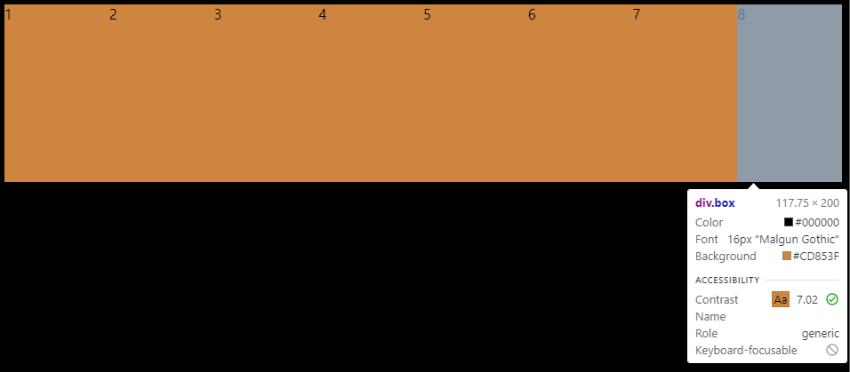
나는 분명 width: 200px을 주었는데 한줄에 나열되는 특성으로 인해 space-around도 묵살되었고 각 box의 width는 117.75가 되었다
(설정된 해상도와 browser의 크기마다 보여지는 값은 달라짐)
내가 지정한 크기를 유지하고 싶다면 이런식의 꾸겨넣기(?)는 원치 않을 것이다
이는 flex-wrap으로 해결할 수 있고 default는 nowrap이다
body {
  background-color: black;
}

.father {
  display: flex;
  justify-content: space-around;
  height: 50vh;
  flex-wrap: wrap;
}

.box {
  width: 200px;
  height: 200px;
  background-color: peru;
}
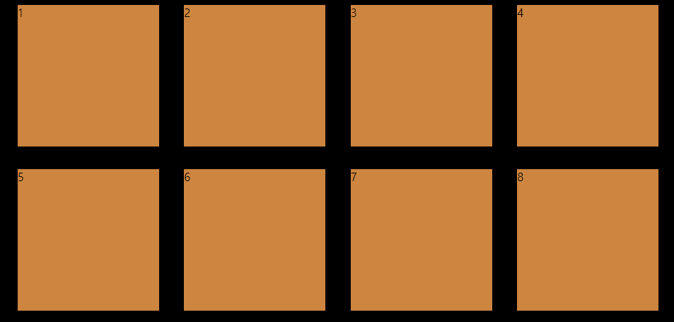
위와 같이 flex-wrap: wrap을 통해 내가 지정한 크기를 유지할 수 있게 되었다
하지만 여기서도 마음에 안드는 부분이 있다
나는 첫째줄과 둘째줄 사이의 공간을 지정해 준적이 없는데 저 공간이 떨어져 있는 이유는 무엇인가?
이를 수정하기 위해서는 align-content를 사용하면 된다 default는 space-around이므로
body {
  background-color: black;
}

.father {
  display: flex;
  justify-content: space-around;
  height: 50vh;
  flex-wrap: wrap;
  align-content: flex-start;
}

.box {
  width: 200px;
  height: 200px;
  background-color: peru;
}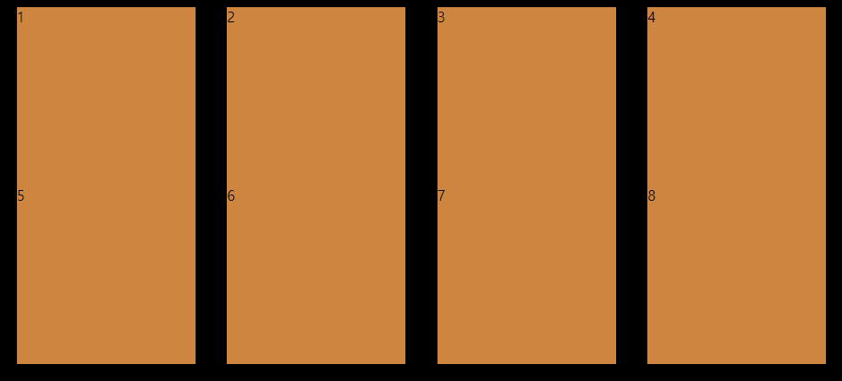
위와 같이 flex-start로 수정할 수 있다
만약 nowrap의 상태에서 browser의 화면을 줄였을 때 좀 더 많이 찌그러지는 element를 내가 지정할 수 있을까?
이를 위해서 flex-shrink를 알아야 하는데 먼저 flex-shrink의 default는 1이다
그리고 이는 flex children에게 주어야한다는 점이다
html
<!DOCTYPE html>
<html lang="en">

<head>
  <meta charset="UTF-8">
  <meta http-equiv="X-UA-Compatible" content="IE=edge">
  <meta name="viewport" content="width=device-width, initial-scale=1.0">
  <link rel="stylesheet" href="style.css">
  <title>Document</title>
</head>

<body>
  <div class="father">
    <div class="box">1</div>
    <div class="box">2</div>
    <div class="box">3</div>
  </div>
</body>

</html>
css
body {
  background-color: black;
}

.father {
  display: flex;
  justify-content: space-around;
  align-items: center;
}

.box {
  width: 200px;
  height: 200px;
  background-color: peru;
}

.box:nth-child(2) {
  background-color: aliceblue;
  flex-shrink: 2;
}
두번째 box에 flex-shrink: 2를 주자 browser의 크기를 줄이니 2번째 box가 좀 더 많이 줄어드는 것을 알 수 있다
얼마나 많이 줄어들었을까? 정답은 다른 element들 보다 2배많이 줄어들었다
flex-grow는 flex-shrink와 반대로 작용한다(grow란 말 그대로 공간이 있으면 자란다)
flex-grow의 default는 0이다 이를 확인하는 건 여러분 스스로에게 맡기기로 하겠다(살짝 힘들어짐)
flex-grow와 flex-shrink는 responsive web design을 할 때 굉장히 유용하게 사용될 것이다
마지막으로 flex-basis에 대해 배워보자
flex-basis는 찌그러지거나 늘어나기 전 주어지는 width와 비슷한 개념이라 생각하면 된다
왜 비슷한 개념인가? flex-basis는 main axis에 적용되기 때문에 flex-direction으로 main axis의 방향을 바꾸면 flex-basis의 적용방향도 바뀌기 때문이다
여기까지 flex father에서 어떻게 flex children을 배치하는가에 대해서였다
이제부터는 flex children을 직접적으로 움직이는 것을 배워보자
첫번째는 align-self property를 사용해야되는데 예를들면
html
<!DOCTYPE html>
<html lang="en">

<head>
  <meta charset="UTF-8">
  <meta http-equiv="X-UA-Compatible" content="IE=edge">
  <meta name="viewport" content="width=device-width, initial-scale=1.0">
  <link rel="stylesheet" href="style.css">
  <title>Document</title>
</head>

<body>
  <div class="father">
    <div class="box">1</div>
    <div class="box">2</div>
    <div class="box">3</div>
  </div>
</body>

</html>
css
body {
  background-color: black;
}

.father {
  display: flex;
  justify-content: space-around;
  height: 50vh;
}

.box {
  width: 200px;
  height: 200px;
  background-color: peru;
}

.box:nth-child(2) {
  align-self: center;
}
2번째 box에만 align-self값을 주게되면
보이는 것과 같이 2번째 box에만 align-items: center를 준 것과 같은 일이 나타난다
또 다른 방법은 order를 사용하는 것이다
css
body {
  background-color: black;
}

.father {
  display: flex;
  justify-content: space-around;
  height: 50vh;
}

.box {
  width: 200px;
  height: 200px;
  background-color: peru;
}

.box:nth-child(2) {
  order: 1;
}
이번엔 2번째 box에만 order: 1을 주게되면
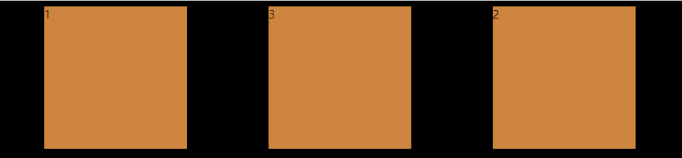
html에서는 1, 2, 3의 순서지만 browser상에서는 1, 3, 2가 된다
그 이유는 무엇인가?
이유는 간단하다 모든 flexbox들의 default value는 order: 0이다 그래서 먼저 그들(여기서는 1과 3)을 나열하고 그 뒤에 order: 1인 2를 나열했기 때문에 위와 같은 결과가 나온 것이다
order는 어떤이유에서든 html을 바꿀 수 없는 상황일 때 유용할 것이다
여기까지가 flex children에게 줄 수 있는 (정렬에 관한) 유일한 두가지의 property였다
- align-self
- order
flex box에 대한 기본적인 개념은 끝났다
좀 더 깊게 다뤄보고 싶은 사람 혹은 연습이 필요한 사람은 reference를 참고하길 바란다
reference
learn flexbox with game
flexbox froggy