👉🏼 @Keyframes & 애니메이션
CSS 애니메이션에서 가장 중요한 요소는 @keyframes(이하 키프레임즈)이다. CSS 문법 중 하나로 애니메이션이 만들어지는 부분이다. 키프레임즈를 타임라인 안의 하나의 스테이지(구간)들 이라고 생각하면 된다. 키프레인즈 안에서 스테이지들을 정의하고 각 구간마다 다른 스타일을 적용시킬 수 있다.
👉🏻 @Keyframe
예시를 하나 들어서 css에 키프레임즈를 만들어보자.
@keyfames tutsFade{
  0%{
    opacity: 1;
  }
  100%{
    opacity: 0;
  }
}

//퍼센티지 대신
@keyframes tutsFade{
  from{
    opacity: 1;
  }
  to{
    opacity: 0;
  }
}

//이걸 줄여서 쓸 수도 있다.
@keyframes tutsFade{
  to{
    opacity: 0;
  }
}
👉🏽 Animation
애니메이션 속성은 예전에 키프레임즈로 불리면 CSS 선택자 안에 존재했다. 애니메이션은 여러개의 속성을 가질 수 있다.
animation-name: @keyframes이름animation-duration: 타임프레임, 애니메이션 시작부터 마지막까지 총 시간animation-titming-function: 애니메이션 속도 조절 (linear, ease, ease-in, ease-out, ease-in-out, cubic-bezier)animation-delay: 애니메이션이 시작하기 전 지연시간animation-direction: loop방향 (정방향으로 반복, 역방향으로 반복, 번갈아가며 반복)animation-iteration-count: 반복 횟수animation-fill-mode: 애니메이션 시작/끝 상태 제어(none, forwards, backwards, both)
.element {
  animation-name: tutsFade;
  animation-duration: 4s;
  animation-delay: 1s;
  animation-iteration-count: infinite;
  animation-timing-function: linear;
  animation-direction: alternate;
}

//이걸 줄여서
.element {
  animation: tutsFade 4s 1s infinite linear alternate;
}
1초의 지여닛간 후 4초의 애니메이션 길이를 가진 loop방향을 번갈아가면서 선형 속도로 무한 반복 깜빡이는 효과
👉 Vendor Prefixes 더하기
벤더 프리픽스를 사용하여 각 브라우저 지원이 최대한 잘 되도록 설정해준다.
- 크롬 & 사파리:
-webkit- - 파이어폭스:
-moz- - 오페라:
-o- - 인터넷 익스플로러:
-ms-
애니메이션 속성과 벤더 프리 함께 사용하기
.element {
    -webkit-animation: tutsFade 4s 1s infinite linear alternate;
    -moz-animation: tutsFade 4s 1s infinite linear alternate;
    -ms-animation: tutsFade 4s 1s infinite linear alternate;
    -o-animation: tutsFade 4s 1s infinite linear alternate;
    animation: tutsFade 4s 1s infinite linear alternate;
}

@-webkit-keyframes tutsFade { /* your style */ }
@-moz-keyframes tutsFade { /* your style */ }
@-ms-keyframes tutsFade { /* your style */ }
@-o-keyframes tutsFade { /* your style */ }
@keyframes tutsFade { /* your style */ }
👉🏾 여러개 애니메이션 적용
애니메이션을 여러개 사용하려면 쉼표(,)를 이용해 분리할 수 있다.
.element {
  animation: tutsFade 4s 1s infinite linear alternate, //이 부분
             tutsRotate 4s 1s infinite linear alternate;
}
@keyframes tutsFade {
  to {
    opacity: 0;
  }
}
@keyframes tutsRotate {
  to {
    transform: rotate(180deg);
  }
}
예시
👉🏻 사각형에서 원형 구현하기
//html파일에서 div생성한다
<div></div>

// css 적용
div {
  width: 200px;
  height: 200px;
  background-color: coral;
}

//키프레임 선언
div {
  width: 200px;
  height: 200px;
  background-color: coral;
}

//스테이지마다 스타일 설정. border-radius를 사용해 모서리를 갂음
@-webkit-keyframes square-to-circle {
  0%  {
    border-radius:0 0 0 0;
  }
  25%  {
    border-radius:50% 0 0 0;
  }
  50%  {
    border-radius:50% 50% 0 0;
  }
  75%  {
    border-radius:50% 50% 50% 0;
  }
  100% {
    border-radius:50%;
  }
}

//그런 다음 배경색 설정
@keyframes square-to-circle {
  0%  {
    border-radius:0 0 0 0;
    background:coral;
  }
  25%  {
    border-radius:50% 0 0 0;
    background:darksalmon;
  }
  50%  {
    border-radius:50% 50% 0 0;
    background:indianred;
  }
  75%  {
    border-radius:50% 50% 50% 0;
    background:lightcoral;
  }
  100% {
    border-radius:50%;
    background:darksalmon;
  }
}

//div에 동작추가
@keyframes square-to-circle {
  0%  {
    border-radius:0 0 0 0;
    background:coral;
    transform:rotate(0deg);
  }
  25%  {
    border-radius:50% 0 0 0;
    background:darksalmon;
    transform:rotate(45deg);
  }
  50%  {
    border-radius:50% 50% 0 0;
    background:indianred;
    transform:rotate(90deg);
  }
  75%  {
    border-radius:50% 50% 50% 0;
    background:lightcoral;
    transform:rotate(135deg);
  }
  100% {
    border-radius:50%;
    background:darksalmon;
    transform:rotate(180deg);
  }
}

//애니메이션 추가
div {
  width: 200px;
  height: 200px;
  background-color: coral;
  animation: square-to-circle 2s 1s infinite alternate;
}- animation-name: square-to-circle
- animation-duration: 2s
- animation-delay: 1s
- animation-iteration-count: infinite
- aniamtion-direction: alternate
:: timing-function 추가
애니메이션의 속도를 제어할 수 있다. 정교한 값이 필요한 경우가 있어 수동으로 계산하기보다는 사이트를 통해 자동으로 계산해주는 값을 이용하는게 더 편하고 더 정교하며 더 효율적이다.
ref. https://matthewlein.com/tools/ceaser
cubic-bezier function으로 탄성있는 고무공같은 효과를 추가하려 할 때
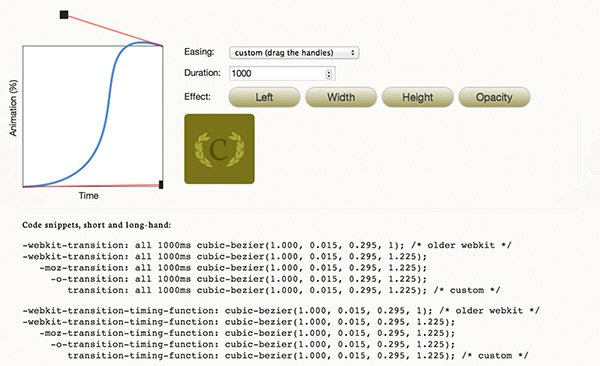
//베지어 곡선을 원하는대로 만든 후 스니펫으로 애니메이션의 timing-function값을 교체
div {
width: 200px;
height: 200px;
background-color: coral;
animation: square-to-circle 2s 1s infinite cubic-bezier(1,.015,.295,1.225) alternate;
}
//완성된 css
div {
width: 200px;
height: 200px;
background-color: coral;
animation: square-to-circle 2s .5s infinite cubic-bezier(1,.015,.295,1.225) alternate;
}
@keyframes square-to-circle {
0% {
border-radius:0 0 0 0;
background:coral;
transform:rotate(0deg);
}
25% {
border-radius:50% 0 0 0;
background:darksalmon;
transform:rotate(45deg);
}
50% {
border-radius:50% 50% 0 0;
background:indianred;
transform:rotate(90deg);
}
75% {
border-radius:50% 50% 50% 0;
background:lightcoral;
transform:rotate(135deg);
}
100% {
border-radius:50%;
background:darksalmon;
transform:rotate(180deg);
}
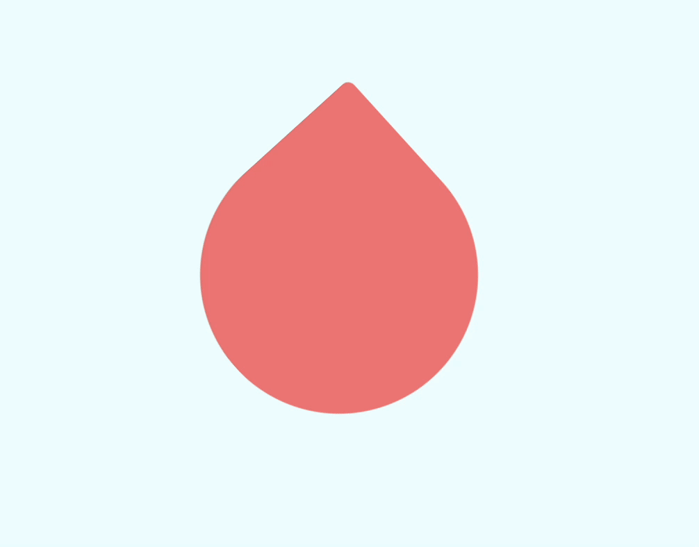
}👉🏽 결과

不怕慢, 只怕站