BTC Correlation
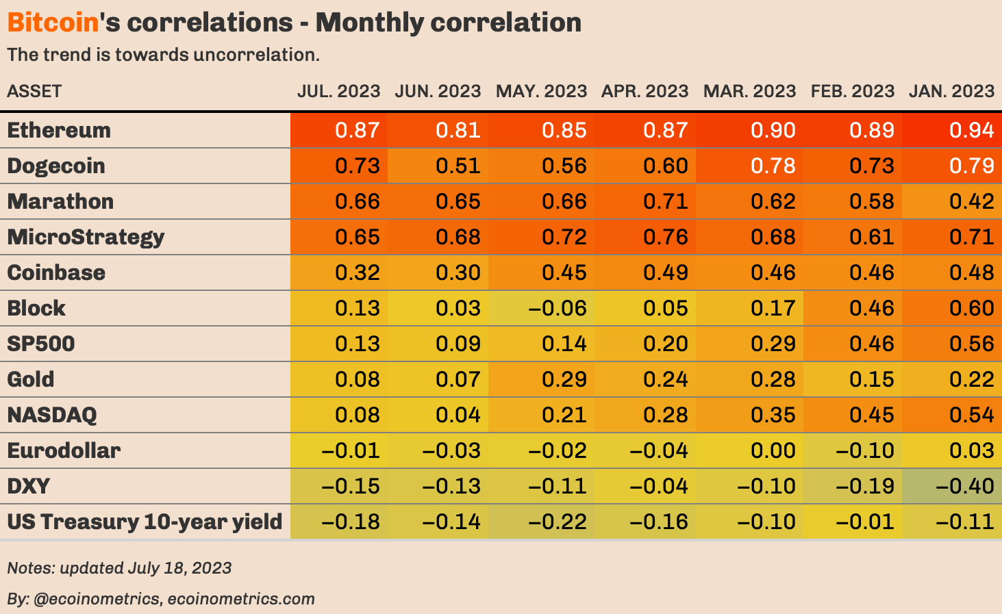
Bitcoin is now in uncorrelated territory with
• the NASDAQ
• the SP500
• Gold
• the US Dollar index
• US Treasury yield
• BTC adjacent stocks
• …
Bitcoin is running on its own narrative at this point.
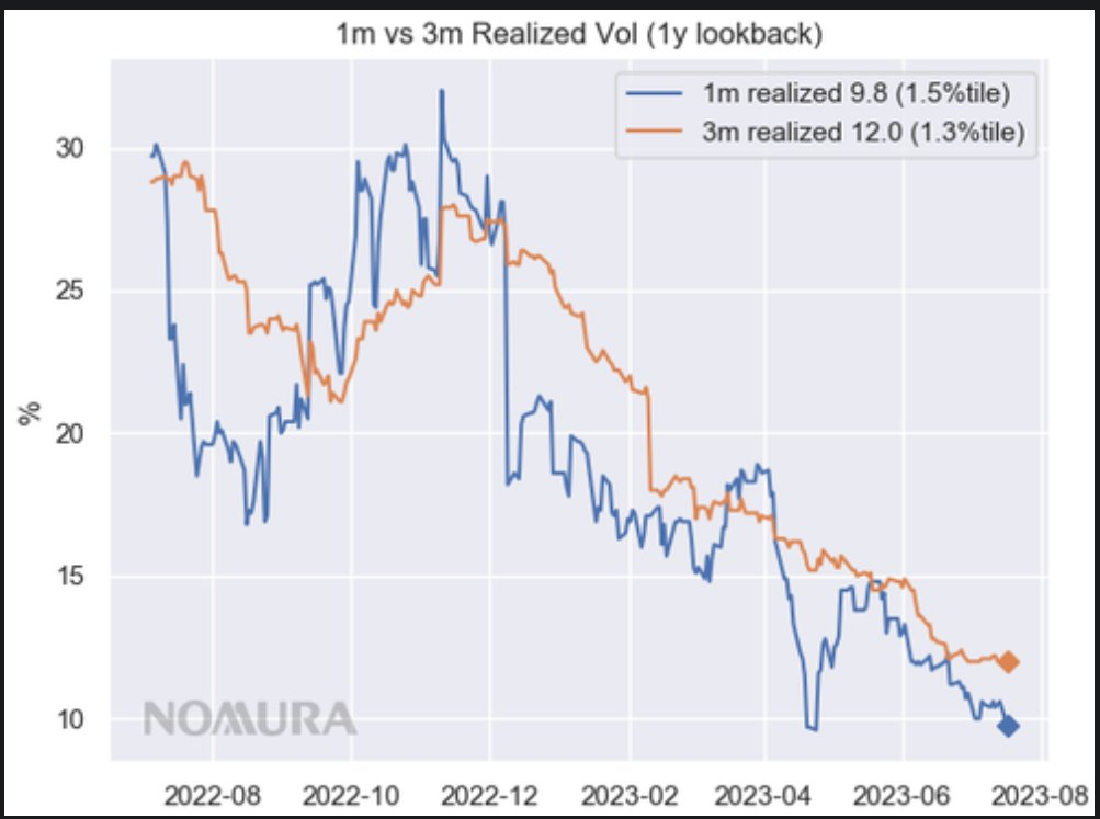
Volatility Spread
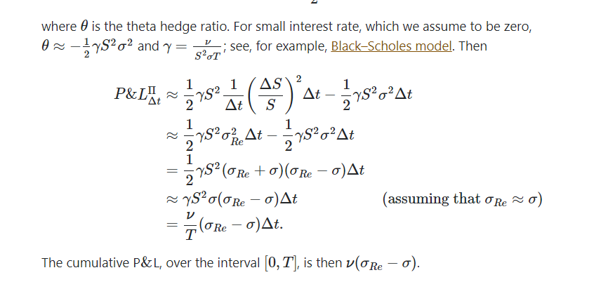
A simple way to understand volatility spread trading:
See the below picture.
1, you see this number called Vega when you hold options positions.
2, your total pnl is vega*(realized vol-implied vol)
3, you need to hedge and make sure your delta stays zero.
say if your vega now is 1.2K and implied vol is around 43, and your hedge approximately every hour or so, realizing vol during the span of 10 days to 33. then your total loss is 1.2K(33-43)==10K, But if btc vol spikes back to 100, then your PnL is 1,2K(100-43).
trying to find charts on Vol for free but did not, anyways, both realized and implied are on the low side. do with this info as you please.
ARKM
Today, @ArkhamIntel's intelligence marketplace launched with an airdrop to over 47,000 users.
In total, over $16.4m was distributed in an interesting pattern.
In this thread, we'll analyze the intriguing details of the $ARKM airdrop distribution.
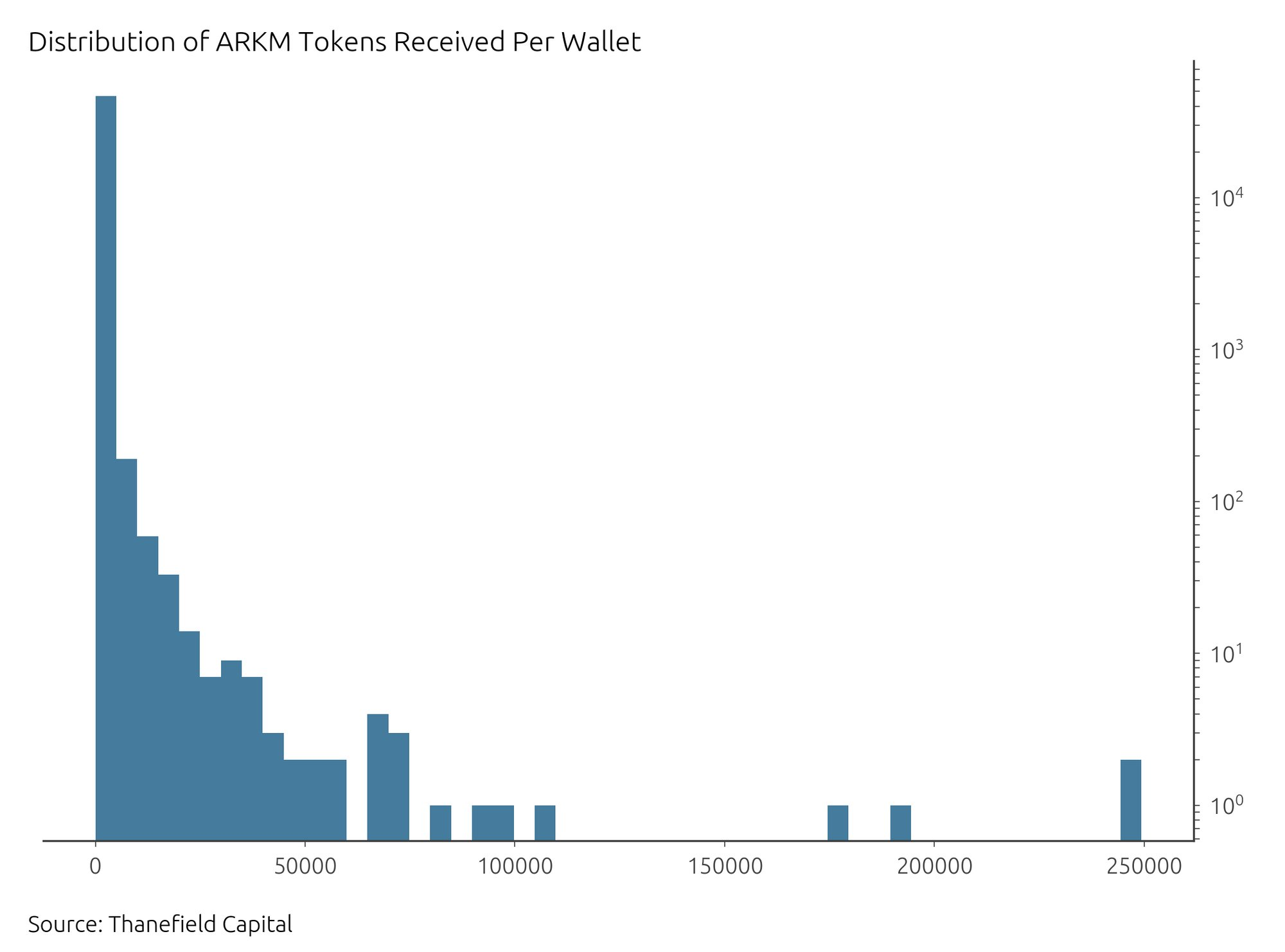
From the 46,998 wallets that took part in the airdrop, the average number of $ARKM tokens received per wallet was 522.5, with the median being much lower at around 197.4.
This wide gap underlines the skewed distribution, with a few wallets taking a lion's share of the tokens.
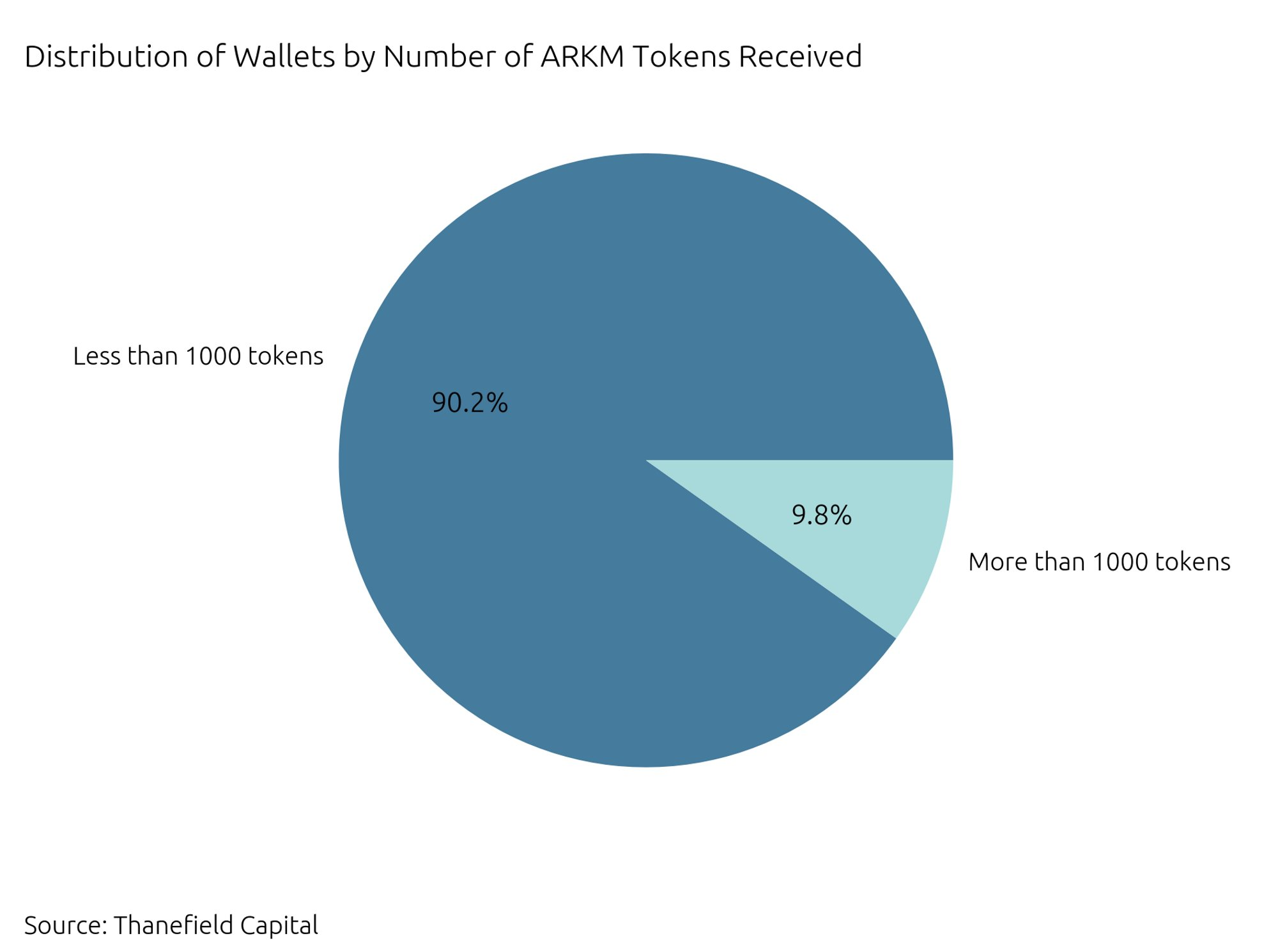
A breakdown of the distribution reveals that approximately 90.11% of all wallets received less than 1000 $ARKM tokens, while just around 0.33% of wallets received more than 10,000 tokens.
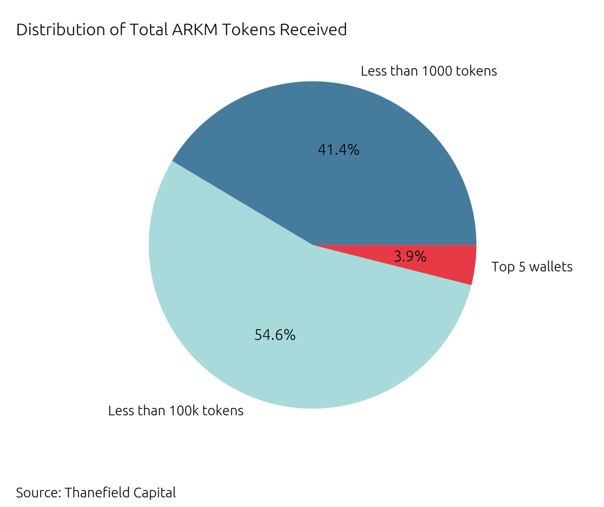
Digging deeper into the distribution of the actual tokens, we find a striking contrast: the overwhelming majority of wallets, those with less than 1000 tokens, received only 41.4% of the total tokens.
This highlights the $ARKM concentration within a small subset of wallets.
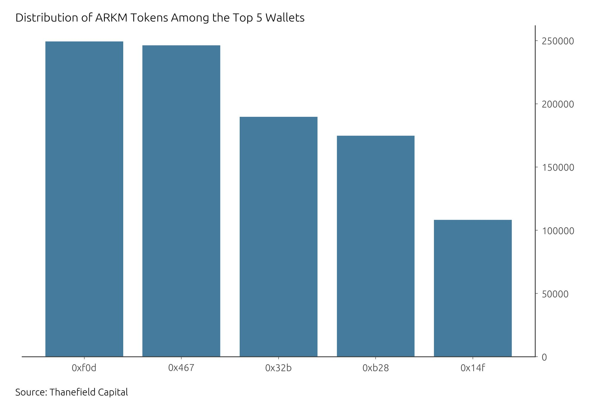
Five wallets stand out in this scenario, each receiving over 100k $ARKM tokens, collectively worth almost $600k.
They account for 1M tokens, making up 3.94% of all claimed tokens and 0.7% of the circulating supply.
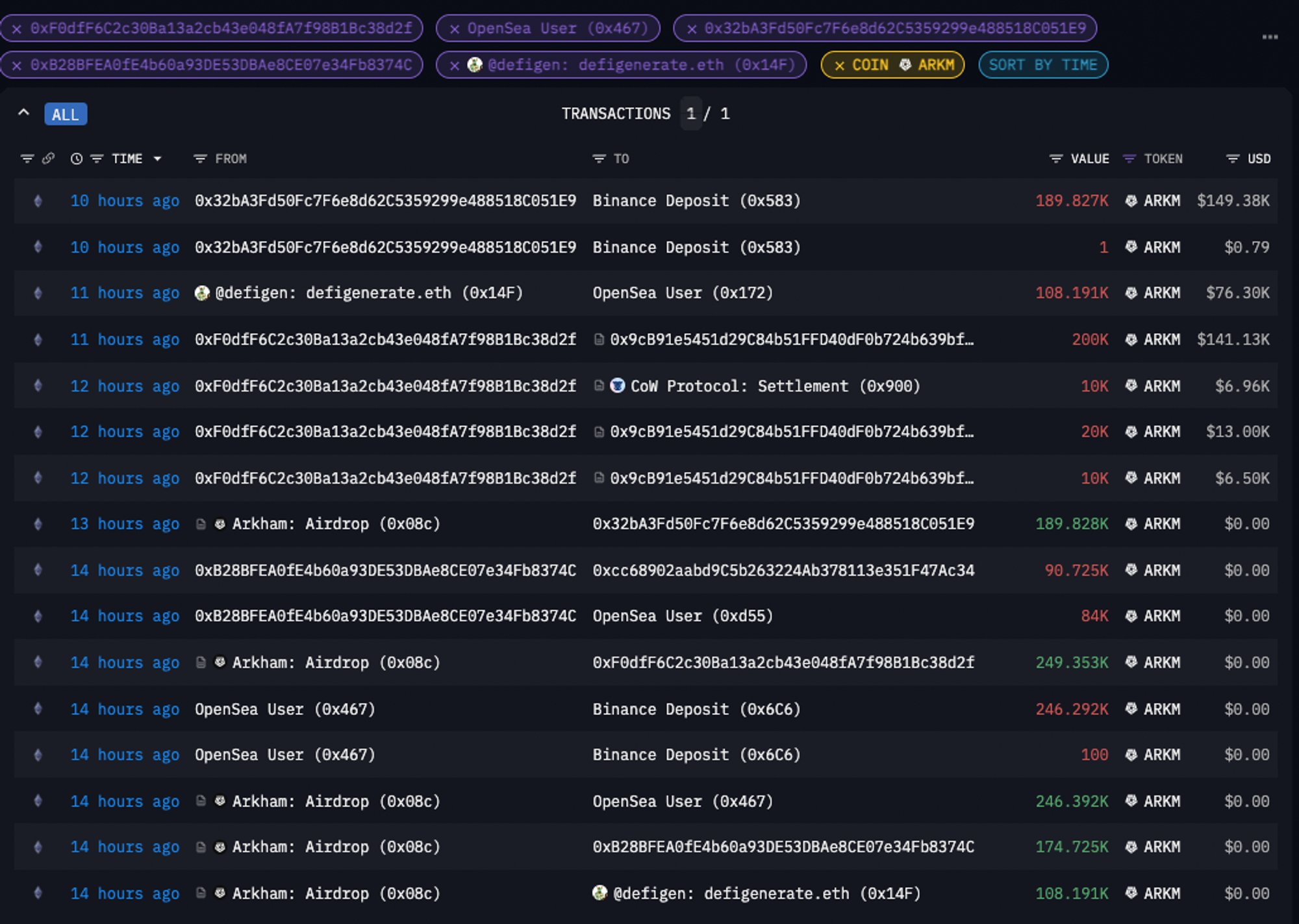
Notably, most of them didn't waste any time - they quickly sold their tokens on Uniswap or transferred them to exchanges, which could significantly affect the token's liquidity and price.
To conclude, the $ARKM airdrop reveals the skewed nature of token distributions.
Despite many recipients, a small pool of wallets received the lion's share of tokens, most of which were quickly offloaded for large profits.
Source Tweet - An Ape's Prologue
SDEX
This chart that will go down in the books of finance&history, a true reflection of the derivative´s power, their disconnection from reality and their ability to drag the entire market like a big snowball where risk is ignored for the benefit of the last squeezed drop of the lemon
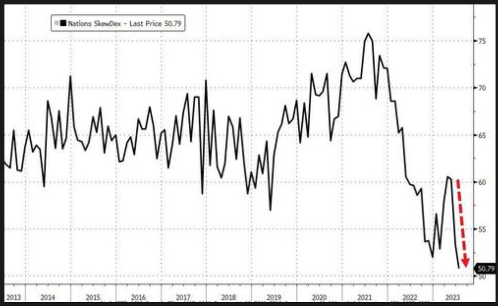
SDEX is now at all time lows. SDEX is a measure of put skew and/or hedging demand, and this all time low suggests long put demand has cratered. SDEX Index is calculated by comparing the IV of a 30-day atm put option to the implied volatility of a 30-day otm put option
UK Company
UK ON TRACK FOR MOST COMPANY INSOLVENCIES SINCE 2009
The Insolvency Service, a government agency, said 2,163 companies were declared insolvent in June, up 27% on a year earlier although down from May's 2,553, which was the highest since monthly records began in January 2019.
Mortgage Rates
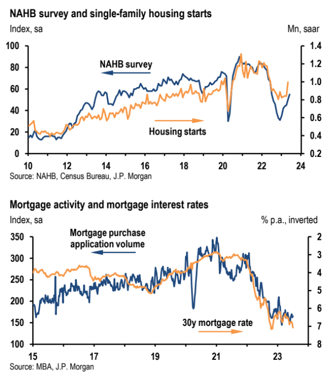
"With mortgage rates having moved up about 30bp over the past month as the Fed has signaled additional tightening this year, we look for a more modest increase [to 56] in July homebuilder sentiment."
JPMorgan
Source Tweet - Daily Chartbook
Retail Sales
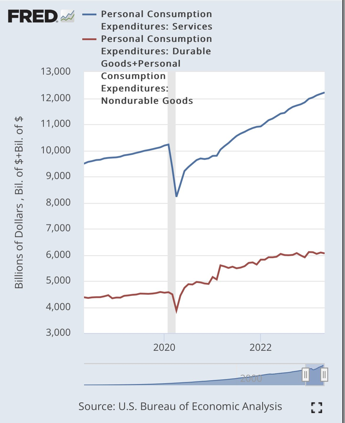
Todays retail sales numbers will suggest a much softer read on consumption than the reality.
Nominal demand for goods (which retail sales covers) has been largely flat for over a year while demand for the 2x larger service sector has continued on:
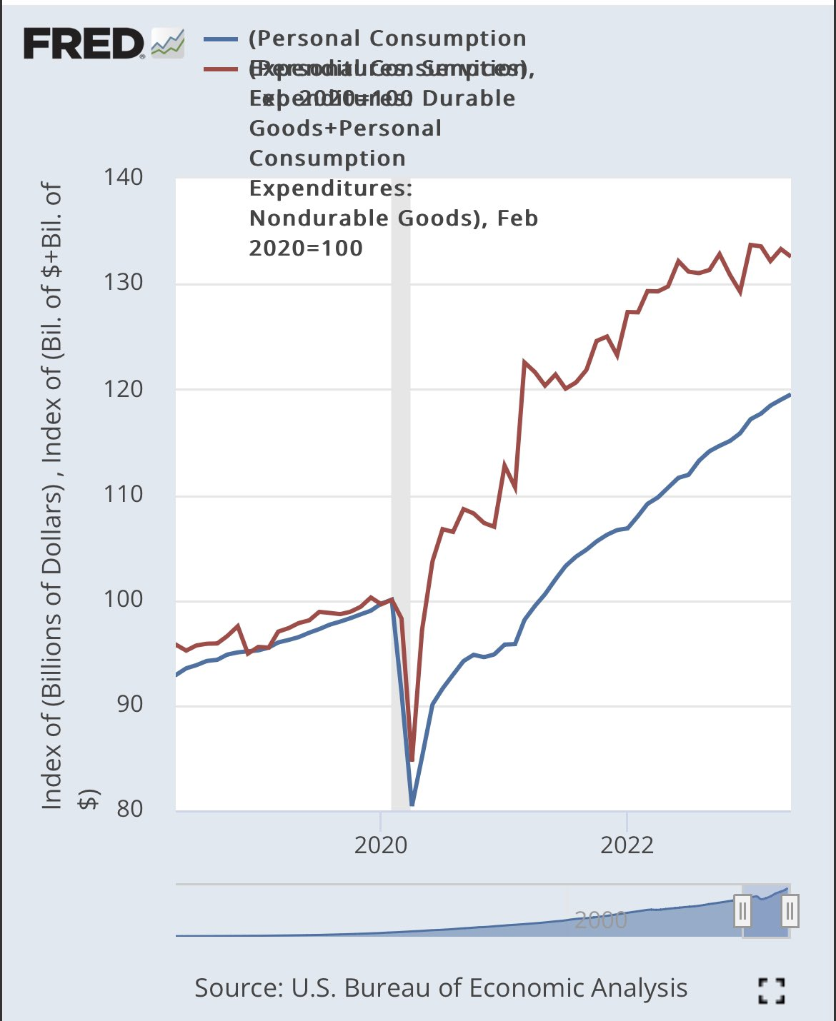
The big reason why goods have flattened out while services has continued to grow is a reversion from the pandemic period surge in goods demand relative to services.
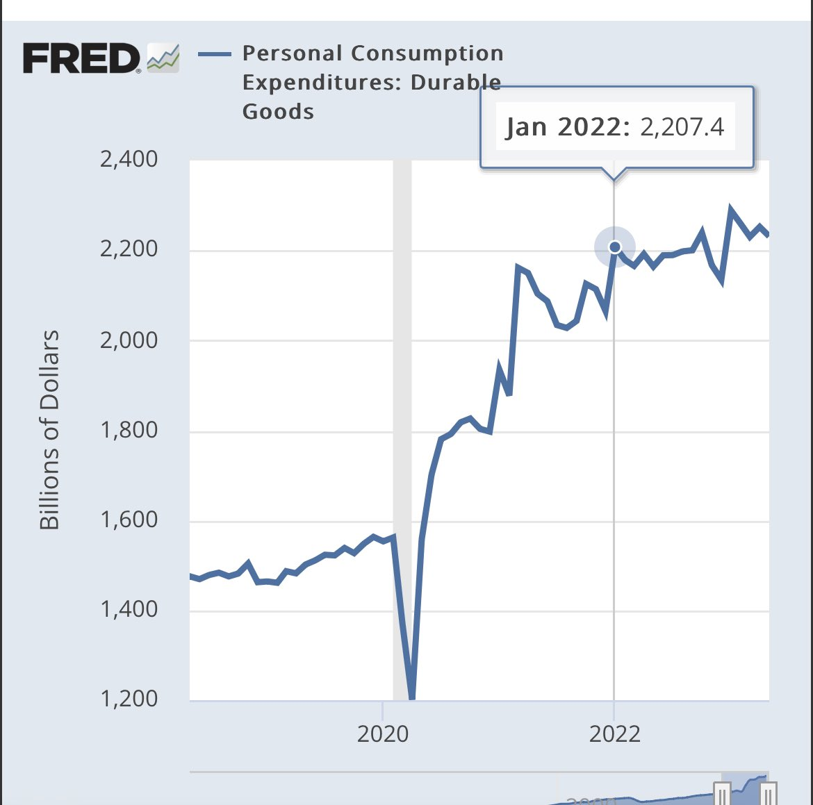
Normally you would want to look goods demand because it is often credit financed. Because of that it’s a leading indicator of overall demand and activity.
But if you look at credit sensitive durables, it’s clear it flattened out before tightening and has been flat since.
Instead what we are looking at with the weakness in retail sales is still the ongoing post pandemic distortions that still to this day are impacting demand not normal leading cyclical dynamics.
Those takes framing this as just cyclically leading miss this critical perspective.
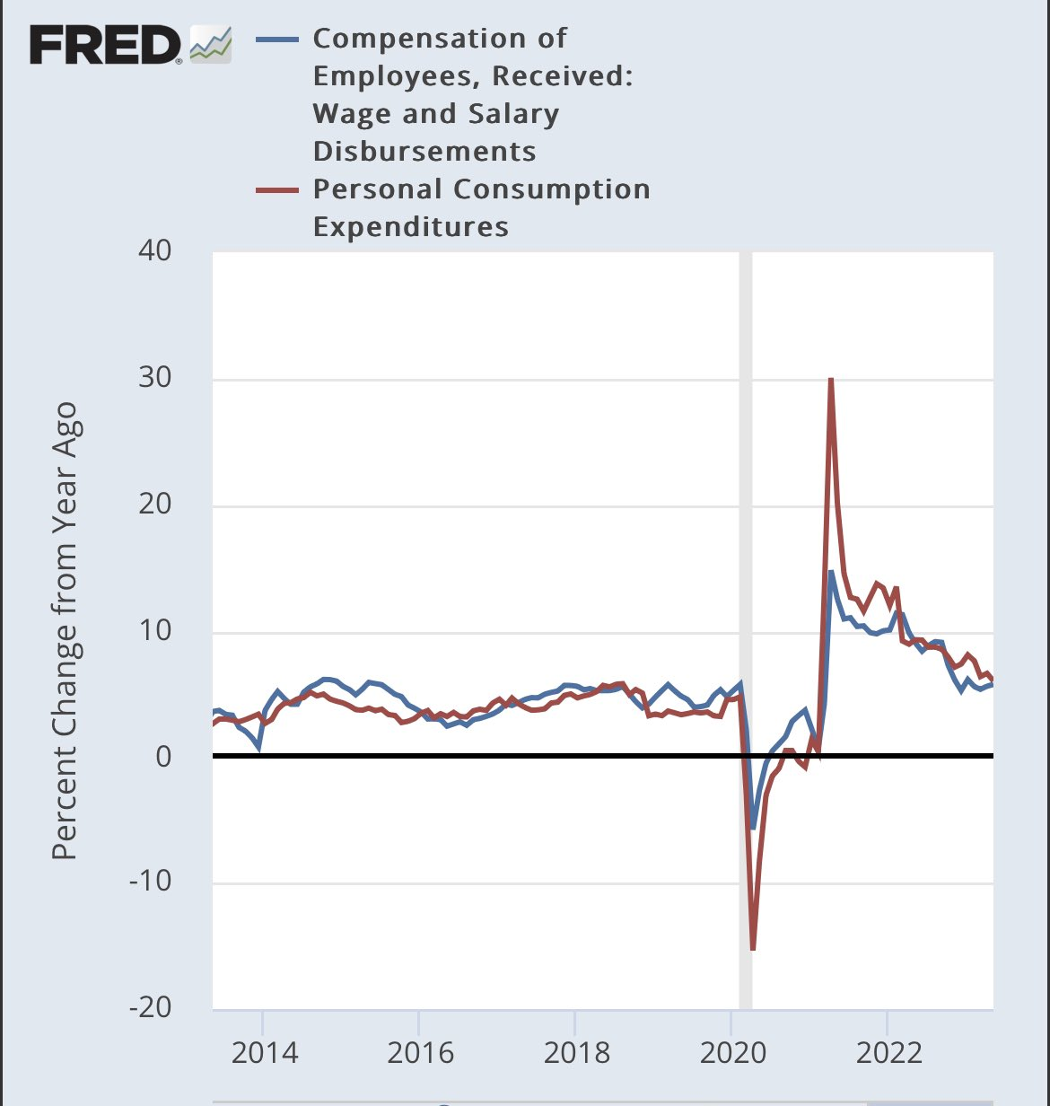
That’s why in this cycle it’s much better to start with nominal income growth which is largely matching nominal demand growth rather than getting sucked into specific sectors to determine what’s leading and what is not.
And what that shows is demand and income growth at ~6%.
And that kind of demand just is too high relative to the productive capacity of the economy to keep inflation at bay.
Federal Home Loan Bank (FHLB)
The banking system's "dash for cash" that began in March has likely stopped.
I went through Federal Home Loan Bank (FHLB) data and made 4 charts that indicate an easing of funding pressures on U.S. banks
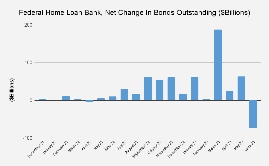
CHART #1:
After huge surge in March, FHLB net issuance of bonds has declined and even went massively negative in June.
This means FHLB no longer has to secure new net funding to make loans ("advances") to banks.
Net issuance = (total bond issuance) - (redemptions)
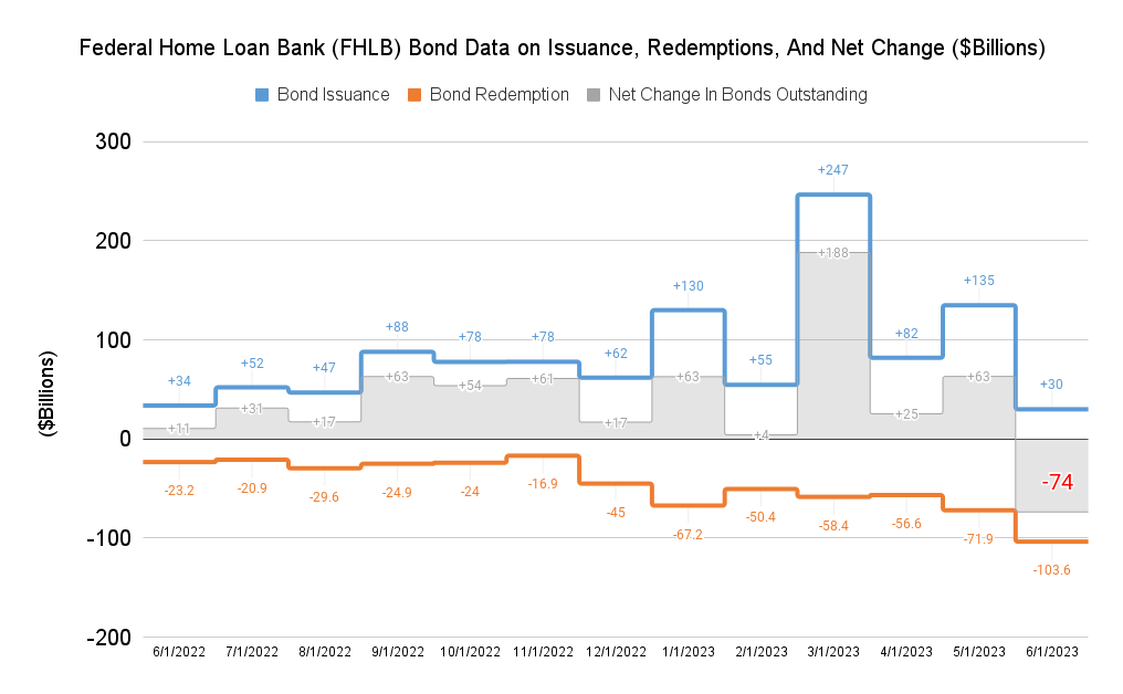
CHART #2:
For June, bond redemptions (orange line) exceeded new bond issuance (blue line), so the FHLB did a "buyback" of sorts on its bonds.
A net negative reading isn't rare... but this is the MOST negative net reading since my data set began in 2010
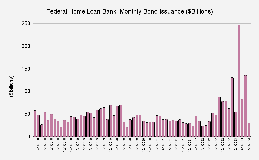
CHART #3:
In April I posted a somewhat dramatic-looking chart that showed a huge spike in FHLB bond issuance.
Here is the updated version, which looks much less scary!
Note: this is gross, not net (doesn't take redemptions into account)
Before I post fourth & final chart, I'd like to explain why I'm looking at FHLB's funding (FHLB liabilities) rather than banking system's FHLB borrowings (FHLB assets).
The reason is that data on FHLB advances is very lagged, whereas bond issuance data is more current
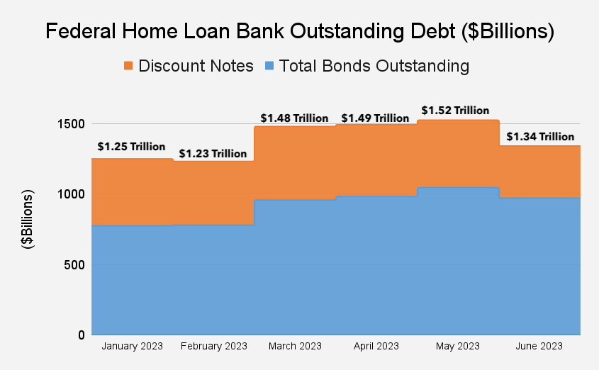
CHART #4
This is the kicker... TOTAL FHLB debt outstanding declined ~$180 Billion decline in June... this indicates banks likely paying back precautionary borrowings they drew on in March
"total debt" = bonds (in blue) +discount notes (shorter-term paper, in orange).
For more on Federal Home Loan Bank System, check out my interview with
@ProfKateJudge:
THE LITTLE-KNOWN ENTITY THAT'S LENT OVER $1 TRILLION TO U.S. BANKS (10X THE FED)
Analysis Articles