PP-프로파일링(코드 실습)
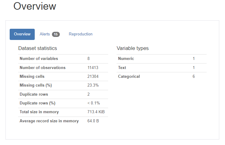
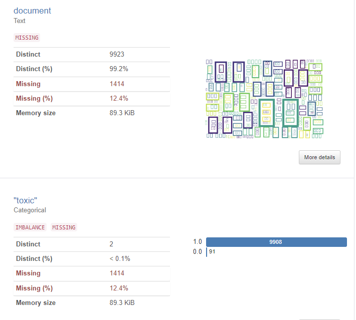
3 데이터 프로파일링을 위한 파이썬 패키지
3.1 klib
- Pandas 데이터프레임을 기반으로 데이터전처리 및 프로파일링을 제공해주는 패키지
- 데이터 품질평가, 전처리, 관계 시각화를 목적으로 사용
- 속도가 매우 빠르며 다양한 시각화 기능을 제공
설치
pip install klib
pip install pandas
pip install seaborn

import warnings

# hide warnings
warnings.filterwarnings("ignore")

import klib
import pandas as pd
import seaborn as sns

df = sns.load_dataset("titanic")
df.head()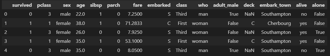
# 결측치에 대한 프로파일링 플롯
klib.missingval_plot(df)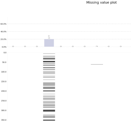
# 양의 상관관계 플롯
klib.corr_plot(df, split='pos')
# 음의 상관관계 플롯
klib.corr_plot(df, split='neg')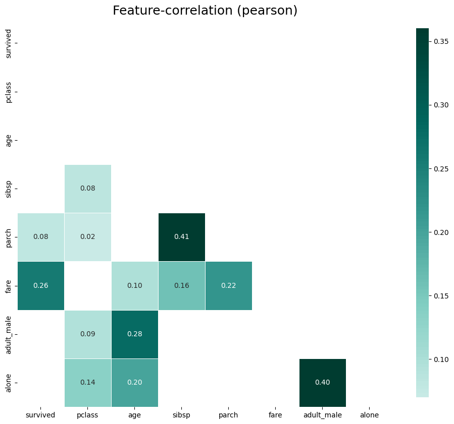
- 위의 그림은 양의 상관관계 그래프
- 색상이 어두울수록 상관관계가 크다는 의미
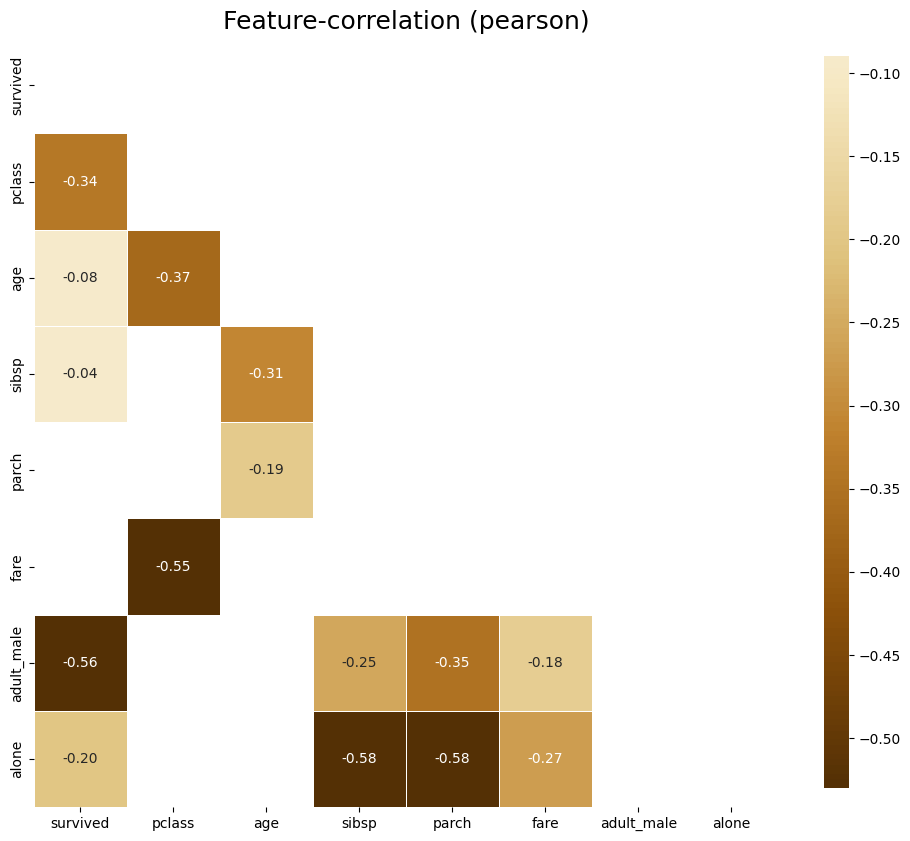
- 위의 그림은 음의 상관관계 그래프
- 마찬가지로 색상이 어두울수록 상관관계가 크다는 의미
# default representation of correlations with the feature column
klib.corr_plot(df, target='age') # age를 기준으로한 다른 피쳐들과의 상관계수를 나타낸 그래프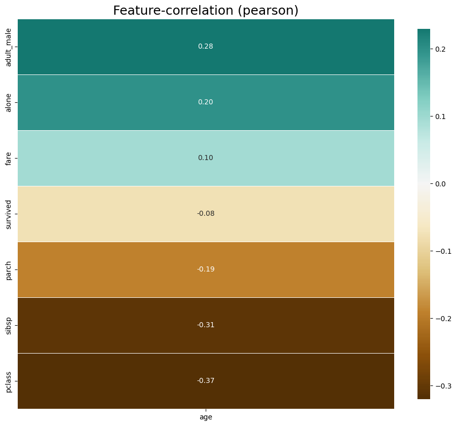
- 위의 그림을 보면 age와 adult_male은 양의 상관관계가 높고, pclass와는 음의 상관관계가 높다
klib.corr_plot(df, target='fare') # fare를 기준으로한 다른 피쳐들과의 상관계수를 나타낸 그래프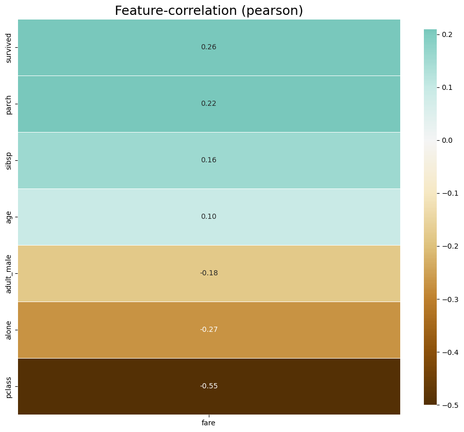
- 위의 그림을 보면 fare는 pclass와는 음의 상관관계가 높은 반면, survived과는 약한 양의 상관관계를 가짐
# default representation of a distribution plot, other settings include fill_range, histogram, ...
klib.dist_plot(df) # 히스토그램 그리기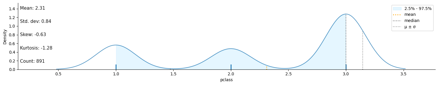
df_cleaned = klib.data_cleaning(df) # 데이터 클렌징↳ df_cleaned 결과
Shape of cleaned data: (784, 15) - Remaining NAs: 692


Dropped rows: 107
     of which 107 duplicates. (Rows (first 150 shown): [47, 76, 77, 87, 95, 101, 121, 133, 173, 196, 198, 201, 213, 223, 241, 260, 274, 295, 300, 304, 313, 320, 324, 335, 343, 354, 355, 358, 359, 364, 368, 384, 409, 410, 413, 418, 420, 425, 428, 431, 454, 459, 464, 466, 470, 476, 481, 485, 488, 490, 494, 500, 511, 521, 522, 526, 531, 560, 563, 564, 568, 573, 588, 589, 598, 601, 612, 613, 614, 635, 636, 640, 641, 644, 646, 650, 656, 666, 674, 692, 696, 709, 732, 733, 734, 738, 739, 757, 758, 760, 773, 790, 792, 800, 808, 832, 837, 838, 844, 846, 859, 863, 870, 877, 878, 884, 886])

Dropped columns: 0
     of which 0 single valued.     Columns: []
Dropped missing values: 177
Reduced memory by at least: 0.06 MB (-75.0%)
3.2 ydata-profiling
- interactive한 프로파일링 기능을 통합한 패키지
- pandas profiling에서 최근 ydata-profiling으로 이름 변경
- 주요 특징
- 컬럼 데이터타입 자동 감지, 경고 요약, 단변량&다변량 분석, 시계열에 대한 다양한 통계정보 포함, 텍스트 분석, 파일 및 이미지 분석, 데이터 세트 비교, 유연한 출력 형식 등..
3.2-1 ydata-profiling 활용
ydata-profiling 패키지 및 ipywidgets 설치하기
pip install ydata-profiling ipywidgets필요한 패키지 import하기
import numpy as np
import pandas as pd
from ydata_profiling import ProfileReport
테스트 데이터 생성하기
df = pd.DataFrame(np.random.rand(100, 5), columns=["a", "b", "c", "d", "e"])
print(df.head())
↳ 테스트 데이터 생성 결과
          a         b         c         d         e
0  0.995817  0.268284  0.563712  0.569891  0.489493
1  0.054562  0.586358  0.311612  0.794190  0.076927
2  0.801426  0.570937  0.747227  0.812121  0.881083
3  0.032467  0.155426  0.434115  0.641922  0.912143
4  0.498620  0.106867  0.099020  0.988647  0.054433
프로파일링 리포트 생성
profile = ProfileReport(df, title="Ydata Profiling Report")

#profile.to_widgets() # jupyter notebook에서 위젯으로 보기
profile.to_notebook_iframe() # HTML 보고서와 유사한 방식으로 셀에 직접 포함
profile.to_file("my_profiling_report.html") # HTML로 별도 저장
↳ 리포트 생성 결과
하..진짜 주피터노트북에서 자꾸 에러나서 아래부터는 colab으로 함 ㅠㅠ
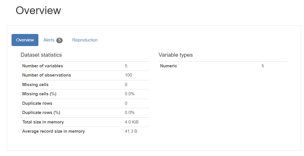
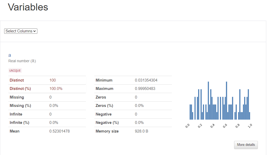
- 위와 같은 데이터들을 전반적으로 요약한 결과물들이 문서 형태로 한눈에 볼 수 있게 출력됨
3.2-2 결측치가 있는 데이터(titanic)
import seaborn as sns
import pandas as pd
# Seborn 데이터 세트 로드
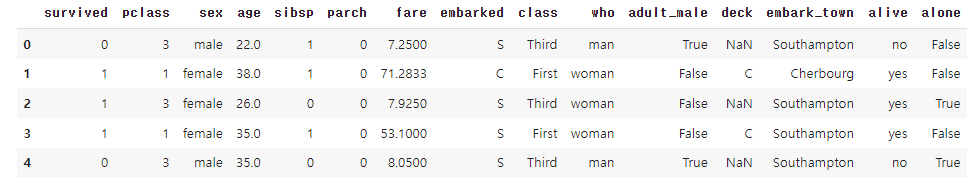
df_titanic = sns.load_dataset('titanic')
df_titanic.head()↳ 결과
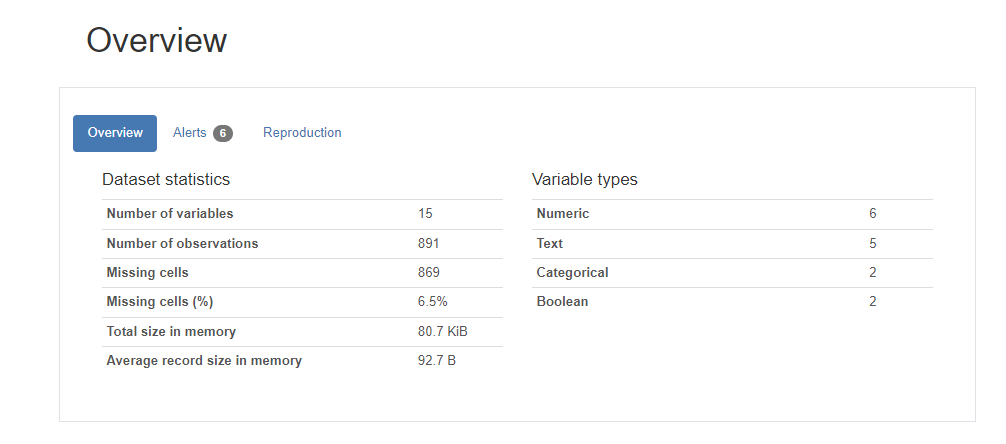
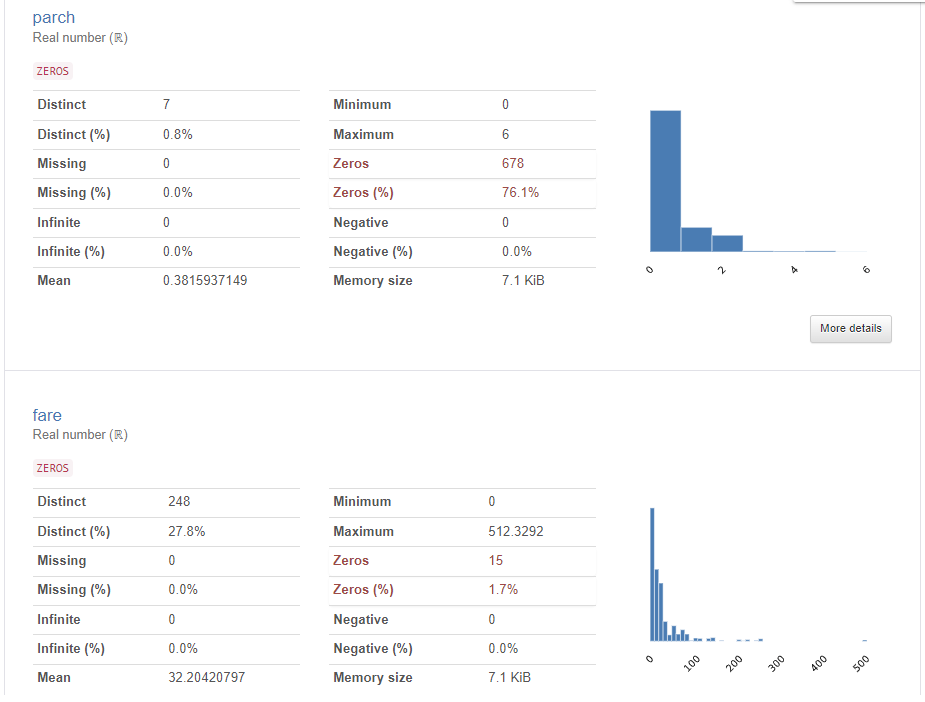
위의 titanic 데이터에 대한 프로파일링 리포트 생성하기
# titanic 데이터세트는 시간이 오래 걸려 최소수준의 분석만 실행
profile = ProfileReport(df_titanic, title = "Titanic 데이터에 대한 프로파일링 보고서", minimal=True)

profile.to_notebook_iframe()
profile.to_file("titanic_profiling_report.html") # HTML로 별도 저장
↳ 결과
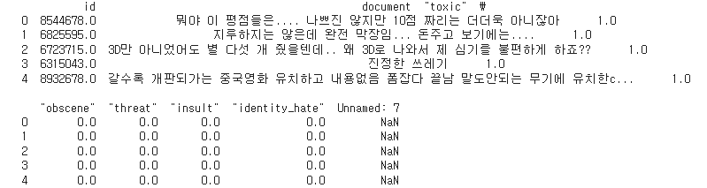
3.2.3 NLP를 위한 네이버 영화 리뷰 데이터
- Github 페이지에서 ko_test.csv 다운로드 함
- Google Drive와 연결하여 데이터나 파일에 대한 접근허용해준다!!
import pandas as pd

movie_df = pd.read_csv('ko_test_label.csv', sep = ',')
#print(movie_df.info())
#print(movie_df.shape)
print(movie_df.head(5))
↳ 결과
위의 영화리뷰에 대한 프로파일링 리포트 생성하기
pf_movie = ProfileReport(movie_df, title="네이버 영화 리뷰 데이터에 대한 프로파일링 보고서")
# pf_movie.to_widgets() # jupyter notebook에서 위젯으로 보기
pf_movie.to_notebook_iframe()
pf_movie.to_file("review_profiling_report.html") # HTML로 별도 저장
↳ 결과
3.3 PyGWalker
- PyGWalker(“Pig Walker”로 발음)는 시각화를 통한 탐색적 데이터 분석을 위한 Python 라이브러리
- 판다스 데이터프레임을 시각적으로 보기 위한 Tableau 스타일 사용자 인터페이스로 제공
- 간단한 끌어서 놓기 작업으로 데이터를 분석하고 패턴을 시각화 가능함
PyGWalker 설치하기
pip install "pygwalker[notebook]" --pre필요한 패키지 import하기
import pandas as pd
import pygwalker as pyg
Pandas 데이터프레임으로 PyGWalker 실행함
import seaborn as sns
# Seborn 데이터 세트 로드
df_titanic = sns.load_dataset('titanic')

gwalker = pyg.walk(df_titanic).display_on_jupyter()
↳ 결과
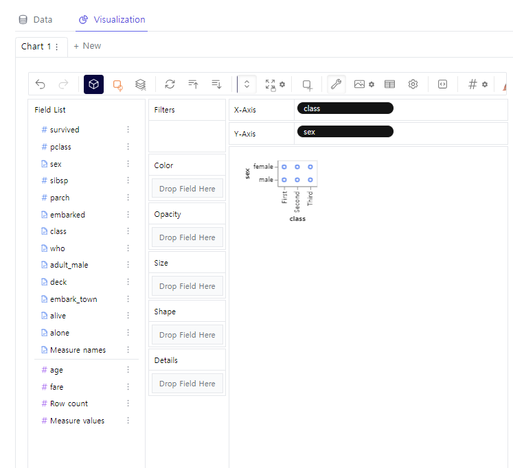
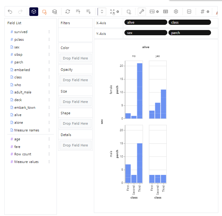
- 위 사진과 같이 x축, y축별로 왼쪽에서 변수를 끌어다가 놓을 수 있음
- 파이썬으로는 일일히 코딩하기 힘들지만 PyGWalker를 사용하면 마우스로 X,Y축에 놓일 변수들만 클릭하면 됨
- polars가 판다스보다 대용량 데이터를 처리할 수 있음
DataFrame을 polars로 변경하여 pygwalker 실행
import polars as pl

titanic_pl = pl.from_pandas(df_titanic)
gwalker = pyg.walk(titanic_pl).display_on_jupyter()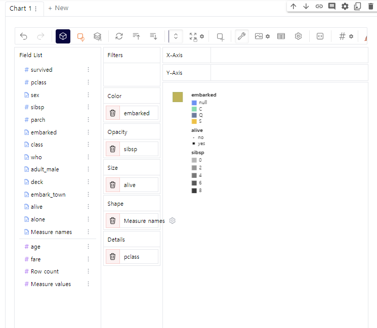

나의 기록장