● 기본으로 제공되는 모달 사용하기
1) 코드 작성
※ lwc013OpenModal.html
<template>
<div class="wrap">
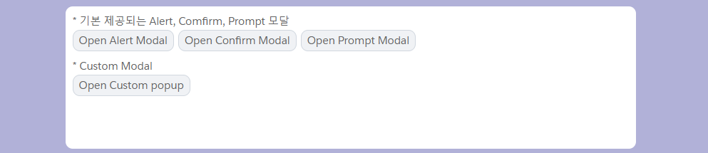
<p class="sub-title">* 기본 제공되는 Alert, Comfirm, Prompt 모달</p>
<div class="basic-section">
<button class="custom-btn" onclick={handleAlertClick}>Open Alert Modal</button>
<button class="custom-btn" onclick={handleConfirmClick}>Open Confirm Modal</button>
<button class="custom-btn" onclick={handlePromptClick}>Open Prompt Modal </button>
</div>
</div>
</template>※ lwc013OpenModal.js
import { LightningElement, track} from 'lwc';
import LightningAlert from 'lightning/alert';
import LightningConfirm from 'lightning/confirm';
import LightningPrompt from 'lightning/prompt';
export default class Lwc013OpenModal extends LightningElement {
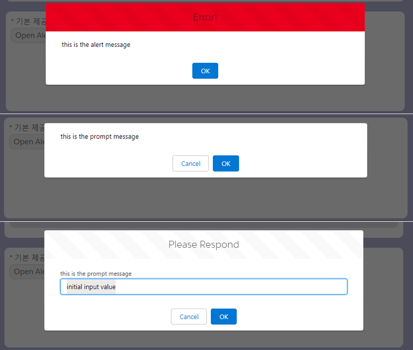
async handleAlertClick() {
await LightningAlert.open({
message: 'this is the alert message',
theme: 'error', // a red theme intended for error states
label: 'Error!', // this is the header text
});
//Alert has been closed
}
async handleConfirmClick() {
const result = await LightningConfirm.open({
message: 'this is the prompt message',
variant: 'headerless',
label: 'this is the aria-label value',
// setting theme would have no effect
});
//Confirm has been closed
//result is true if OK was clicked
//and false if cancel was clicked
}
handlePromptClick() {
LightningPrompt.open({
message: 'this is the prompt message',
//theme defaults to "default"
label: 'Please Respond', // this is the header text
defaultValue: 'initial input value', //this is optional
}).then((result) => {
console.log('handlePromptClick result : ', result);
//Prompt has been closed
//result is input text if OK clicked
//and null if cancel was clicked
});
}
}※ lwc013OpenModal.css
.wrap{
    width: 100%;
    max-width: 800px;
    min-height: 200px;
    margin: 10px auto;
    padding: 10px;
    position: relative;
    background-color: #FFF;
    border-radius: 10px;
}
.basic-section{
    display: flex;
    gap: 6px;
}
.custom-section{
    margin-top: 10px;
}
.wrap .sub-title{
    font-size: 15px;
    color: #636363;
}
.wrap .custom-btn{
    background-color: #f0f2f5;
    border: 1px solid #d1d7df;
    border-radius: 10px;
    font-size: 15px;
    color: #636363;
    padding: 3px 8px;
}
.wrap .custom-btn:hover{
    background-color: #797d83;
    border-color: #797d83;
    color: #ffffff;
}
2) 화면 확인

출처 > lwc - alert, confirm, prompt
● custom Modal 만들기
1) 코드 추가
※ lwc013OpenModal.html
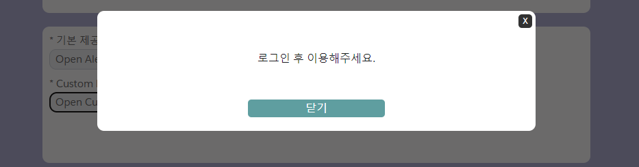
 <!-- Custom Modal -->
        <div class="custom-section">
            <p class="sub-title">* Custom Modal</p>
            <button title="Open popup" class="custom-btn"
            onclick={showModalBox}>Open Custom popup</button>

            <!-- modal start -->
            <template if:true={isShowModal}>
            <!-- slds modal design : https://www.lightningdesignsystem.com/components/modals/ -->
            <section role="dialog" tabindex="-1" aria-labelledby="modal-heading-01" aria-modal="true"
            aria-describedby="modal-content-id-1" class="slds-modal slds-fade-in-open">
                <div class="slds-modal__container">
                    <div class="custom-modal-wrap">
                        <div class="modal-body">
                            <span onclick={hideModalBox} class="close-btn">X</span>
                            <p>로그인 후 이용해주세요.</p>
                        </div>
                        <div class="modal-footer">
                            <button class="modal-footer-btn" onclick={hideModalBox}>닫기</button>
                        </div>
                    </div>
                </div>
            </section>
            <div class="slds-backdrop slds-backdrop_open"></div>
            </template>
            <!-- modal end -->
        </div>
※ lwc013OpenModal.js
@track isShowModal = false;

 showModalBox() {
        this.isShowModal = true;
    }

    hideModalBox() {
        this.isShowModal = false;
    }
※ lwc013OpenModal.css
.custom-modal-wrap{
    background-color: #FFF;
    border-radius: 10px;
    padding: 20px 10px;
    position: relative;
}
.custom-modal-wrap .modal-body{
    min-height: 100px;
    display: flex;
    align-items: center;
    justify-content: center;
}
.custom-modal-wrap .close-btn{
    width: 20px;
    height: 20px;
    position: absolute;
    top: 5px;
    right: 5px;
    cursor: pointer;
    display: flex;
    align-items: center;
    justify-content: center;
    background-color: #323232;
    color: #FFF;
    font-size: 12px;
    border-radius: 5px;
}
.custom-modal-wrap .modal-footer-btn{
    width: 200px;
    margin: 10px auto 0;
    display: block;
    background-color: cadetblue;
    border: none;
    border-radius: 5px;
    color: #FFF;
}
2) 화면 확인
custom Modal 참고 링크 > Modal / Popup Example Lightning Web component(LWC)
custom modal 디자인은 예제를 위해 만든 것으로, 상황과 디자인에 맞게 변형해서 사용해주세요.
slds Modal 링크 > slds modal design

개인 공부 기록용.