🔥 HTML/CSS를 활용한 3D flip 버튼 만들기
🔥 버튼 보러가기
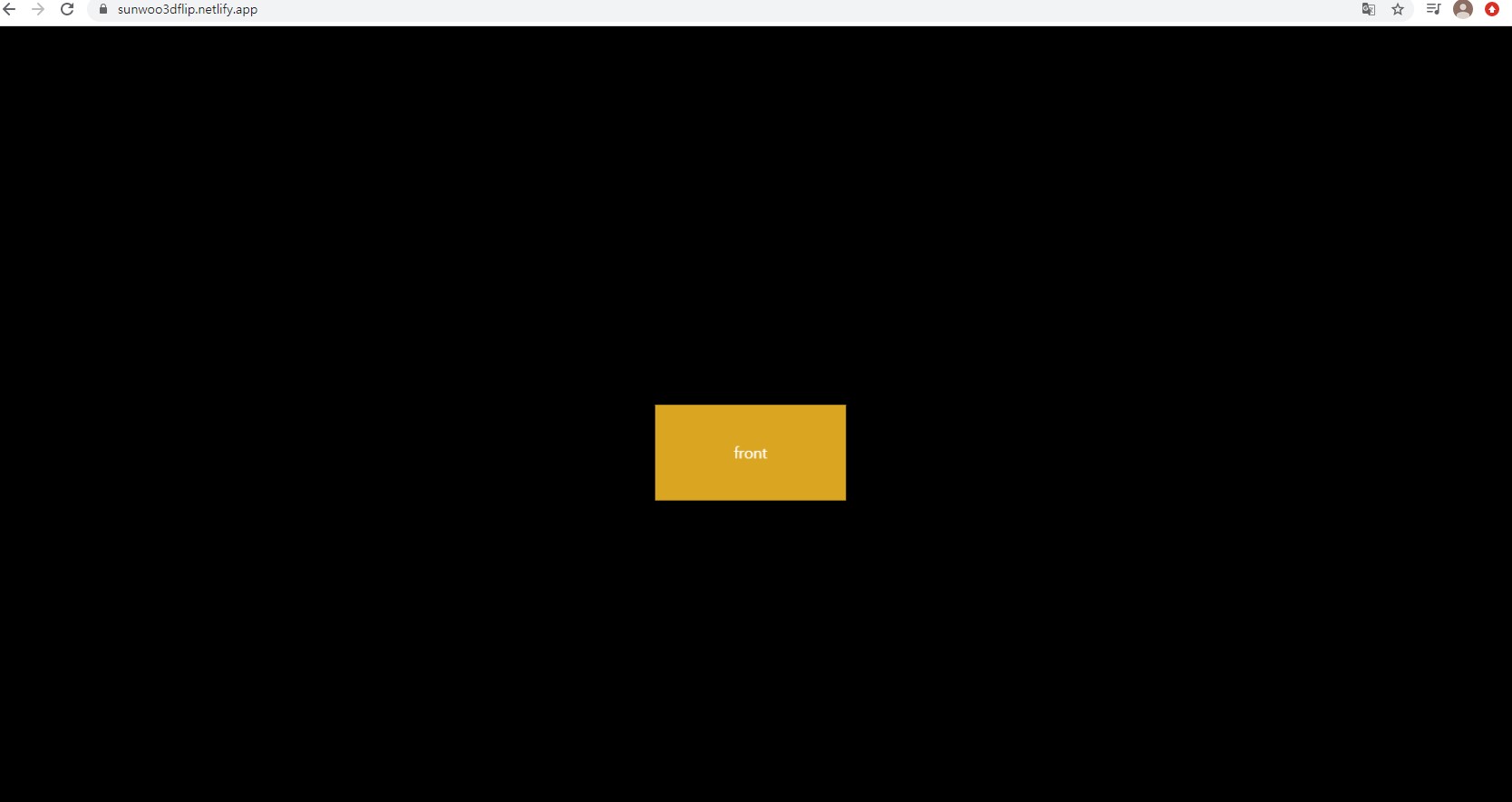
1. 📖 뼈대 만들기
✍ code
<!DOCTYPE html>
<html lang="en">
<head>
    <meta charset="UTF-8">
    <meta http-equiv="X-UA-Compatible" content="IE=edge">
    <meta name="viewport" content="width=device-width, initial-scale=1.0">
    <title>3D Flip button</title>
    <link href="style.css" rel="stylesheet">
</head>
<body>
    <div class="container">
        <div class="flip-btn">
            <div class="front">front</div>
            <div class="back">back</div>
        </div>
    </div>
</body>
</html>
굉장히 간단하다.
2. 📖 꾸며주기 & 효과 넣기
✍ code
* {
    margin: 0;
    padding: 0;
    box-sizing: border-box;
}

body {
    background-color: black;
}

.container{
    position: absolute;
    left: 50%;
    top: 50%;
    transform: translate(-50%, -50%);
    perspective: 1000px;
}
perspective는 원근감을 생기게하는 요소. 숫자가 작을수록 더 원근감 올라감. 최상위 태그에 써야함.
.flip-btn {
    width: 200px;
    height: 100px;
    color: white;
    text-align: center;
    line-height: 100px;
텍스트가 한 줄 일때, 요소의 height 값과 line-height 값이 같으면 수직 중앙 정렬 됨.
   transform-style: preserve-3d;
   transition: .5s;
   cursor: pointer;
}
transform-style: preserve-3d (3d공간에 배치. z축이 생김)
transition: .5s (0.5초에 걸쳐서 이벤트 실행)
.flip-btn:hover{
    transform: rotateX(-90deg);
}hover: 마우스 포인터가 올라갈때 이벤트
.front {
    background-color: goldenrod;
    height: 100px;
    transform: translateZ(50px);
}

.back {
    background-color: darkgoldenrod;
    height: 100px;
    transform: rotateX(90deg) translateZ(150px);
    /* X축으로 90도를 돌려서 위쪽 방향이 Z축이 됨.*/
}
comment
다음에는 완전한 3D의 형태로 만들고 커서로 회전 가능한 형태를 만들어 볼 예정이다. 또한, 클릭 시 이벤트가 실행되는 기능도 넣어보고 싶다.

꿈꾸는중