css(9)_flexbox
flexbox
- 유연하게 동작하는 개념이라고 보자
- 블록 요소의 div같은 태그들을 inline요소들로 자유롭게 배치가 가능하다
(둘러싸고 있는 container의 지정된 너비 안에서 ) - 1차원 직선의 형태들을 나열하기 위해 나온 개념
- 아이템들의 부모에 마법을 주는 것이다 ✨
이를 공부하기위한 용어
- flex cotainer :바깥쪽에 아이템들을 둘러싸고 있는 (부모)
- flex item : container 안에 들어있는 아이템들 (자식)
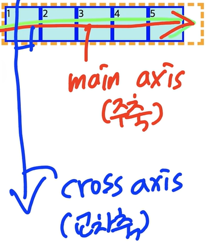
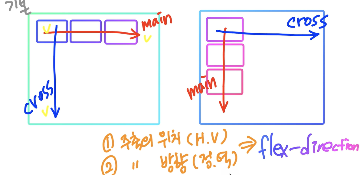
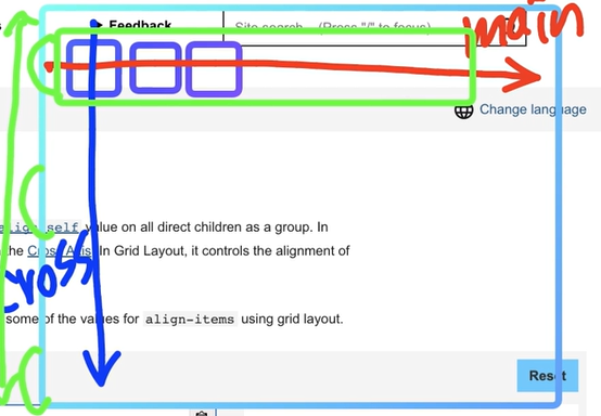
- main axis : 메인이 되는 축 (주축)
- coss axis : 교차 축
기본 값 -> 축 방향도 변경이 가능하다
diplay의 종류
1)display -outside
- 우리가 기존에 배운 display : blcock, inline , inline - block 이렇게가 있는데 이들은 박스 끼리 의 관계
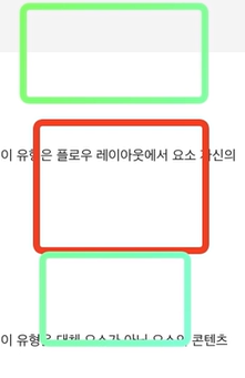
빨간 박스를 기준으로 바깥 앞,뒤 초록 박스 요소들간의 관계를 정의한 것
2) display - inside : 컨테이너 안의 요소를 어떻게 다룰지를 정의하는 것
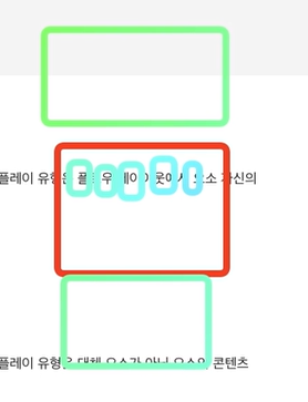
빨간 박스 안에 있는 요소들을 어떻게 배치할것인지를 정의하는 것
🙆♀️display 를 설정하는건 컨테이너에다가 display 속성을 정의하는 것이라는 걸 잊지말자 , 이제 배우는 요소들이 container 에 적용하는 것인지 items 에 적용하는것임을 구분지어서 생각하자
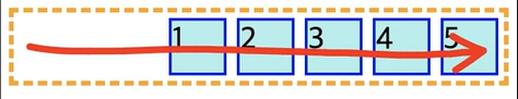
Container - flex-direction
- 컨테이너 내의 아이템을 배치할 때 사용할 주축 및 방향을 지정 및 변경할 수 있다
- 1) 주축의 위치를 수평, 수직 을 결정
- 2) 주축의 방향을 정방향으로 갈건지 역방향으로 갈건지를 설정할 수 있다
Values
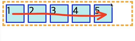
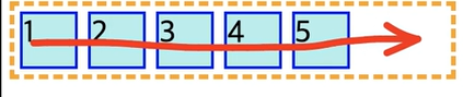
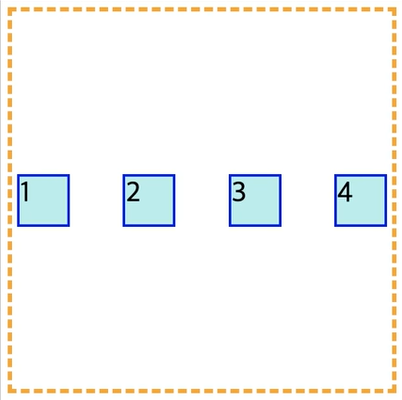
- row : 기본값 주축의 시작점과 끝점이 콘텐츠 방향과 동일 (👉)
/*flex-direction은 container 속성이기에 컨테이너에 지정*/

.container{
	border: 5px dashed yellow ;
	display:flex;
    flex-direction: row;
}

.item{
	width: 50px;
    height: 50px;
    margin: 5px;
   	background-color: paleturquoise;
    border: 3px solid blue;
   	font-size:30px;
}
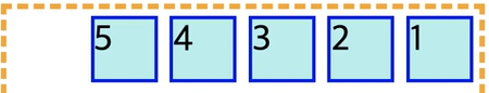
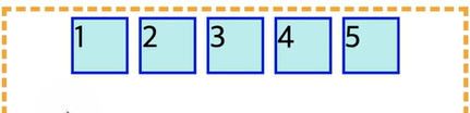
- row - reverse : row와 동일하게 동작하지만 시작점과 끝점이 반대에 위치(👈)
.container{
	border: 5px dashed yellow ;
	display:flex;
    flex-direction: row-reverse;
}
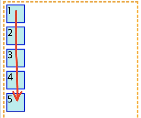
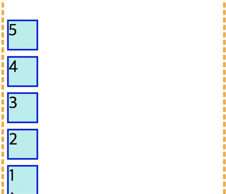
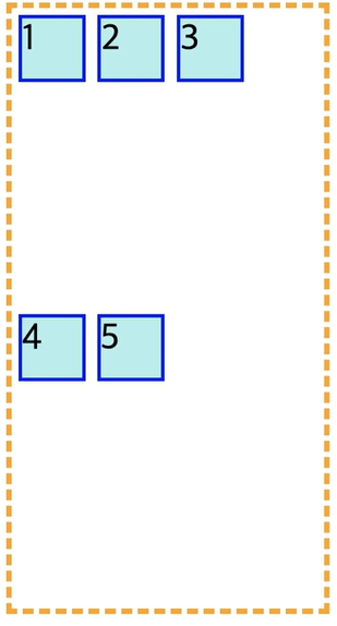
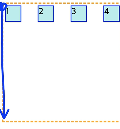
- column : 플렉스 컨테이너의 주축이 블록 축과 동일 주축의 시작점과 끝점이 , 글작성 모드의 이전 지점 및 이후 지점과 동일합니다 (👎)
.container{
	border: 5px dashed yellow ;
	display:flex;
    flex-direction: column;
}
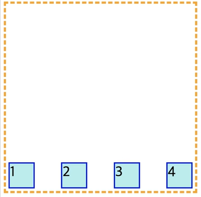
- column-reverse : column 과 동일하게 동작하지만 시작점과 끝점이 반대에 위치 (👍)
.container{
	border: 5px dashed yellow ;
	display:flex;
    flex-direction: column-reverse;
}
Container - flex-wrap
- 요소들을 강제로 한줄에 배치되게 할 것인지, 또는 가능한 영역 내에서 벗어나지 않고 여러 행으로 나누어서 표현할지를 결정하는 요소
values
-
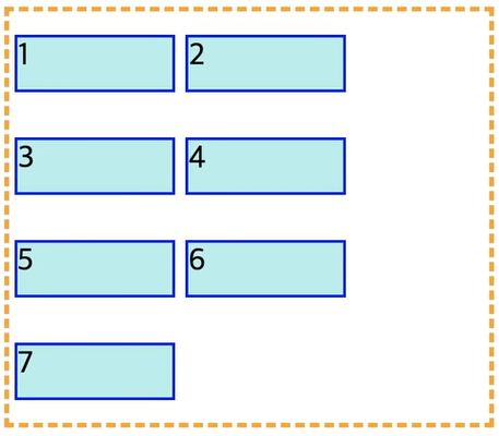
nowrap : 기본 설정값으로 ,flex-container 부모 요소의 영역을 벗어나더라도 flex-item 요소들을 한 줄에 배치한다 시작점은 flex-direction에 의해 결정된 방향으로 적용
-
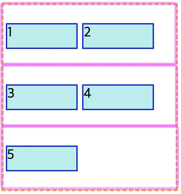
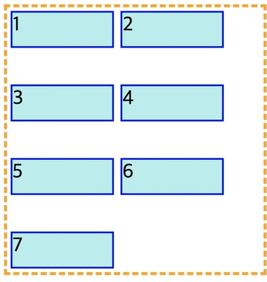
wrap : flex-item요소들이 내부 로직에 의해 분할되어 여러 행에 걸쳐서 배치 일반적으로 위에서 아래로 쌓이는 순서 , item 들이 자신의 너비와 높이를 잃지 않으려고 랩핑을 해준다고 이해하자
.container{
	border: 5px dashed yellow ;
	display:flex;
    flex-wrap: wrap;
}

.item{
	width: 50px;
    height: 50px;
    margin: 5px;
   	background-color: paleturquoise;
    border: 3px solid blue;
   	font-size:30px;
}
-> item 들이 자신의 width 을 유지하기 때문에 나열이 container 의 너비보다 커지면 다음 줄로 넘어간다
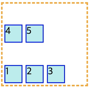
- warp-reverse : wrap 속성과 동일하지만, 요소가 나열되는 시작점과 끝점의 기준이 반대로 배치됨
.container{
	border: 5px dashed yellow ;
	display:flex;
    flex-wrap: wrap-reverse;
}
Container - flex-flow
- 단축 속성이다
- flex-direction 과 flex-wrap 의 속성을 사용한다
flex-flow : row wrapContainer - justify-content
- 주축을 기준으로 아이템들을 어떻게 정렬할 건지에 대한 정의
- 주죽을 기준으로 시작부분인지 끝부분인지를 생각해야한다
flex-start
.container{
	border: 5px dashed yellow ;
	display:flex;
    justify-content:flex-start;
}

.item{
	width: 50px;
    height: 50px;
    margin: 5px;
   	background-color: paleturquoise;
    border: 3px solid blue;
   	font-size:30px;
}
- 1번 박스의 위치가 flex-start 의 시작이다
flex-end
- 주축이 끝나는 위치에 정렬을 한다
.container{
	border: 5px dashed yellow ;
	display:flex;
    justify-content:flex-end;
}
flex-center
.container{
	border: 5px dashed yellow ;
	display:flex;
    justify-content:center;
}
-> 주축을 기준으로 가운데 정렬이된다
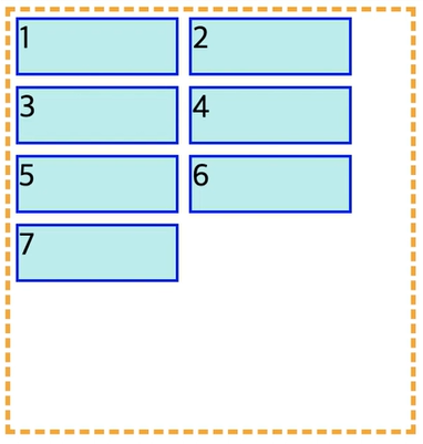
space-between
- 가운데 있는 애들이 알아서 간격을 잡고 있다고 보면된다
- 주축을 기준으로 flex-start 와 flex-end에 여백없이 자리를 잡게되고
.container{
	border: 5px dashed yellow ;
	display:flex;
    justify-content:space-between;
}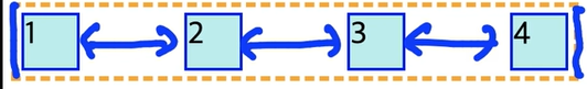
-> 파란색 부분의 간격이 똑같다
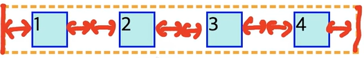
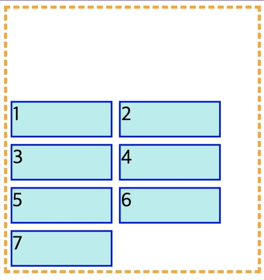
space-around
- 각각 요소 앞뒤로 동일한 간격을 추가하게된다
.container{
	border: 5px dashed yellow ;
	display:flex;
    justify-content:space-around;
}
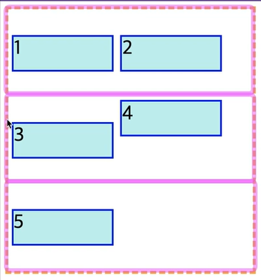
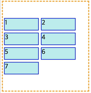
container-align-items
- 덩어리 한줄 자체를 어디에 정렬할지를 정의
jusitify-content 와 align-items 의 차이점
-
justify-content는 연두색 박스 안에서 아이템들을 어떻게 정렬할건지에 대한 이야기
-
align -items 는 전체 컨테이너에서 연두색을 어디에 정렬할건지를 이야한다
.container{
	border: 5px dashed yellow ;
	display:flex;
    flex-wrap:warp;
    align-items : center;
}
- align-items 는 여러 줄로 나눠지게된다면 각각을 한줄의 요소로 생각하고 적용이된다
strech
- Flex 항목은 너비 및 높이 제약 조건을 고려하면서 항목 여백 상자의 교차 크기가 선과 동일하도록 늘어난다.
flex-start
- 교차축의 시작 점에 자리 잡게 되는 것을 볼수 있다
.container{
	border: 5px dashed yellow ;
	display:flex;
    justify-content:space-between;
    align-items: flex-start;
}

.item{
	width: 50px;
    height: 50px;
    margin: 5px;
   	background-color: paleturquoise;
    border: 3px solid blue;
   	font-size:30px;
}
flex-end
- 교차축의 끝 점에 자리 잡게 되는 것
flex-center
- 전체 중에서 가운데로 들어가게 된다
container-align-content
- 여러 줄에 대한 교차축에대한 정렬을 만드는 방법 (교차축이 기준이다)
flex-start
- 교차축의 시작 점에 붙는다
.container{
	border: 5px dashed yellow ;
	display:flex;
    justify-content:space-between;
    flex-wrap: wrap;
    align-content: flex-start;
}

.item{
	width: 150px;
    height: 50px;
    margin: 5px;
   	background-color: paleturquoise;
    border: 3px solid blue;
   	font-size:30px;
}
flex-end
flex-center
space-between
space-around
- 앞뒤의 간격이 생긴다
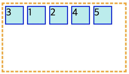
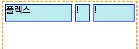
Item - order
-
flex 혹은 grid 아이템에서 현재 아이템의 배치 순서를 지정한다
-
기본값 0 -> 0이라면 html 의 코드 순서를 따라가게된다
-
마이너스 값도 사용 가능 기본값들 보다 앞으로 사용하고 싶을 때 사용
-
화면에 보이는 순서에만 영향을 준다 (탭 키 동작과는 무관함)
.container{
	border: 5px dashed yellow ;
	display:flex;
    flex-wrap: flex;
}

.item{
	width: 50px;
    height: 50px;
    margin: 5px;
   	background-color: paleturquoise;
    border: 3px solid blue;
   	font-size:30px;
}

.item:nth-child(3){
	order:-1
}
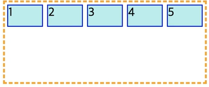
item-flex-grow
- flex-item 요소들이 본인이 차지할수 있는 것보다 많은 자리를 차지할수도 적은 자리를 차지하게 할 수도 있다
- 남은 공간을 item들끼리 나눠서 사용할 수 있다
- 0부터 그 이상의 숫자를 value로 사용할 수 있다
- 컨테이너의 공간보다 아이템들이 작아서 나머지 요소들이 나눠갖느것
현재 item들이 각자의 h.w 를 가지고 배치된 모습
.container{
	border: 5px dashed yellow ;
	display:flex;
    flex-wrap: flex;
}

.item{
	width: 50px;
    height: 50px;
    margin: 5px;
   	background-color: paleturquoise;
    border: 3px solid blue;
   	font-size:30px;
    flex-grow : 1;
}
flex-grow: 1로 설정하면 각자 아이템들이 남은 공간을 1씩 나눠서 갖는다
flex 박스를 전부 다 같은 값으로만 설정하지 않을 수 있다
.item:nth-child(2){
	flex-grow: 2;
}

.itme:nth-child(3){
	flex-grow : 1
}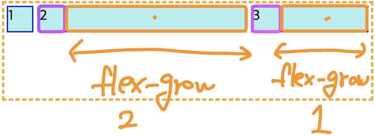
📌 동적으로 만드는 헤더나 너비게이션 바를 사용하는데 주로 사용된다
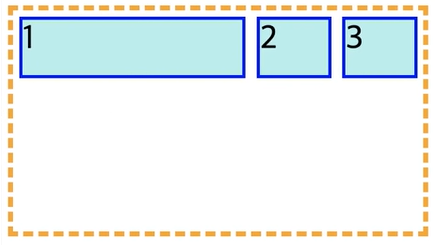
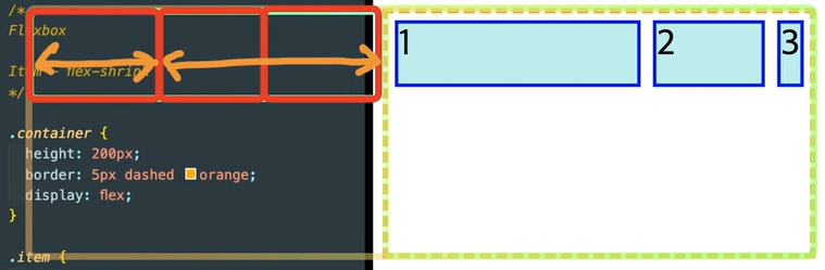
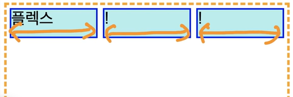
item-flex-shrink
- grow 는 늘어나는데 비해 shrink는 줄어든다고 보자
- item들보다 container 가 너무 작아서 이 안에 들어갈수없는 상황
- 기본값 1 -> 지정해주지 않아도 display: flex 컨테이너면 이미 가지고 있다
.container{
hegiht: 200px;
border: 5px dashed yellow ;
display:flex;
flex-wrap: flex;
}
.item{
width: 50px;
height: 50px;
margin: 5px;
background-color: paleturquoise;
border: 3px solid blue;
font-size:30px;
}
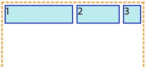
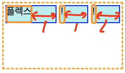
.item:nth-child(1){
flex-shrink:0;
}
📌 1번만 크기가 줄어들지 않고 자신의 content 박스의 크기를 지키고 있음 줄어든 크기를 2,3 번이 1번꺼까지 나눠가져서 더 줄어들고 있다
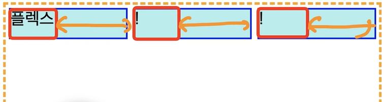
.item:nth-child(3){
	flex-shrink:2;
}
📌 3번이 줄어드는 크기가 훨씬 더 빠르다 줄어든 영역을 2번과 3번이 나눠서 줄어들었다
item-flex-basis
- flex-basis은 flex 아이템의 초기 크기를 결정
.container{
	hegiht: 200px;
	border: 5px dashed yellow ;
	display:flex;
}

.item{
	width: 50px;
    height: 50px;
    margin: 5px;
   	background-color: paleturquoise;
    border: 3px solid blue;
   	font-size:30px;

    flex-grow:1;
}
-> 주황색 영역을 맞춰줘야지 같은 크기로 grow 가 먹ㅎㄹ 수 있는 것이다
.container{
	hegiht: 200px;
	border: 5px dashed yellow ;
	display:flex;
}

.item{
	width: 50px;
    height: 50px;
    margin: 5px;
   	background-color: paleturquoise;
    border: 3px solid blue;
   	font-size:30px;

    flex-grow:1;
    flex-basis: 100px;
}
-> 주황색 영역이 grow : 1 해서 1:1:1로 지정될것이다 , 빨간색 영역이 flex-basis : 100px 지정해준 부분이다
.container{
	hegiht: 200px;
	border: 5px dashed yellow ;
	display:flex;
}

.item{
	width: 50px;
    height: 50px;
    margin: 5px;
   	background-color: paleturquoise;
    border: 3px solid blue;
   	font-size:30px;

    flex-grow:1;
    flex-basis: 0;
}
-> 기본 베이스 영역이 1로 아이템들 가로길이 그 자체가 1:1:1이 되는 것이다
.item:nth-child(1){
	flex-grow:5;
}

.item:nth-child(2){
	flex-grow:1;
}

.item:nth-child(3){
	flex-grow:3;
}
-> flex-basis 를 0으로 설정했기 때문에 기본 아이템들이 차지하는 영역이 0으로 같고 이들을 각각 5,1,3 (contentbox 기준) 으로 늘어나도록 설정된 결과를 확인할 수 있다
📌flex-grow 나 flex-shrink 를 설정할 때 flex-basis 을 설정을 해줘야지 원하는 만큼 정확하게 늘어나고 줄어들고의 비율이 계산될것이다
item- flex
- flex-grow, flex-shrink, flex-basis 의 단축 속성이다
- 하나의 플렉스 아이템이 자신의 컨테이너가 차지하는 공간에 맞추기 위해 크기를 키우거나 줄이는 방법을 설정하는 속성
- flex-basis 는 지정하지 않는다고 해서 초기값으로 설정되지 않는다
초기값
- flex-grow:0
- flex-shrink:1
- flex-basis : auto
- 값이 한개 일 때 그 값은 다음 중 하나
- number 을 지정하면 flex-grow- length 혹은 percentage를 지정하면 flex-basis
🚨 주의해야할 점
flex : 1 2 (0) ;한개 또는 두개의 단위 없는 숫자 값을 사용할 때 flex-basic의 값은 auto가 아니라 0이됩니다(0이 여야지 비율을 계산하는게 더 편하기는 하다 완벽하게 비율 요소를 잡아주기 때문에!! )
- 값이 두개일 때, 첫 번째 값은 number여야하며 flex-grow가 됩니다. 두번 째 값은 다음 중 하나여야 합니다
- number 은 지정하면 flex-shrink 입니다- length, percentage 또는 auto를 지정하면 flex-basis 입니다
- 값이 세개 일 때는 다음 순서를 따라하 합니다
- 1. flex-grow 에 사용할 number- flex-shrink 에 사용할 number
- flex-basis에 사용할 length, percetage, 또는 auto
item-align-self
- 아이템에 쓸수있는 속성
  .container{
      border: 5px dashed yellow ;
      display:flex;
      flex-wrap:warp;
      align-items : center;
  }
이러한 상태에서 4번만 위로 붙여주고 싶다면
- 별도로 작성해주면 align-item을 무시하고 적용할수있게된다
.item:nth-child(4){
align-self: flex-start;
}