
pivot_table
- pandas pivot table
index, columns, values, aggfuc
데이터를 손쉽게 정리하여 한눈에 보기 위해 pivot 사용
인덱스와 컬럼, 값을 설정하여 정리할 수 있다.
# pivot_table 실습
!pip install openpyxl
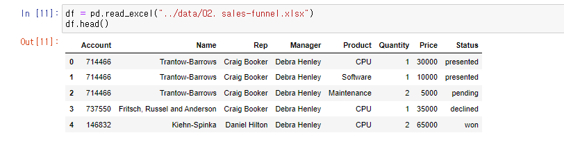
df = pd.read_excel("../data/02. sales-funnel.xlsx")
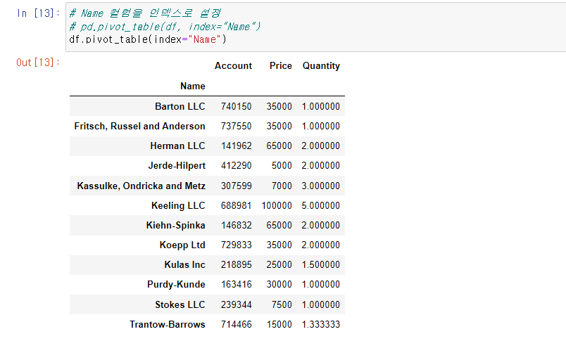
# Name 컬럼을 인덱스로 설정
# pd.pivot_table(df, index="Name")
df.pivot_table(index="Name")
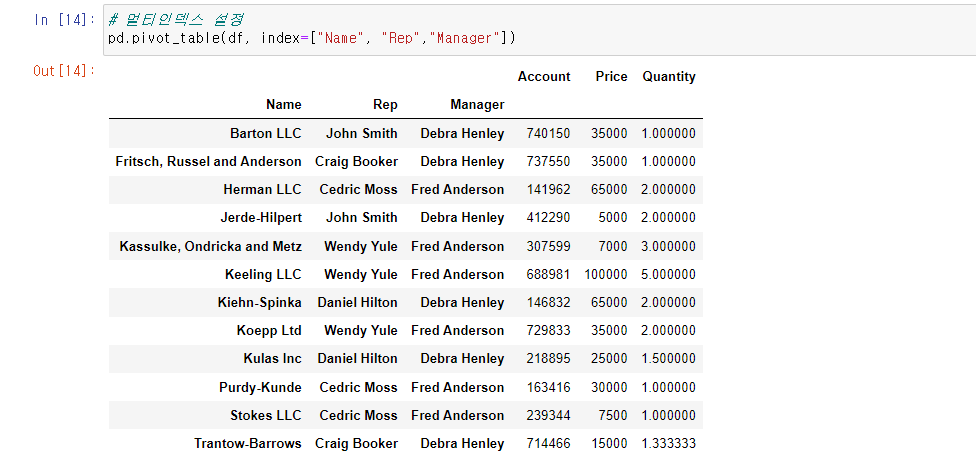
# 멀티인덱스 설정
pd.pivot_table(df, index=["Name", "Rep","Manager"])
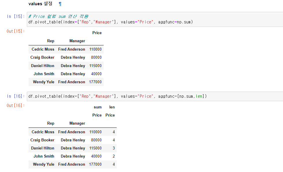
# Price 컬럼 sum 연산 적용
df.pivot_table(index=["Rep","Manager"], values="Price", aggfunc=np.sum)
df.pivot_table(index=["Rep","Manager"], values="Price", aggfunc=[np.sum,len])
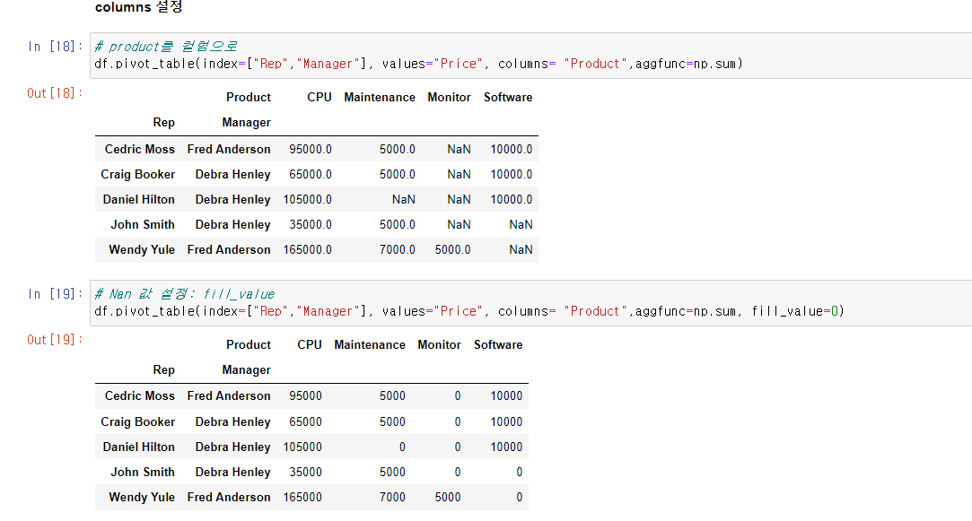
# product를 컬럼으로
df.pivot_table(index=["Rep","Manager"], values="Price", columns= "Product",aggfunc=np.sum)
# Nan 값 설정: fill_value
df.pivot_table(index=["Rep","Manager"], values="Price", columns= "Product",aggfunc=np.sum, fill_value=0)
df.pivot_table(index=["Rep","Manager","Product"], values=["Price","Quantity"],aggfunc=np.sum, fill_value=0)
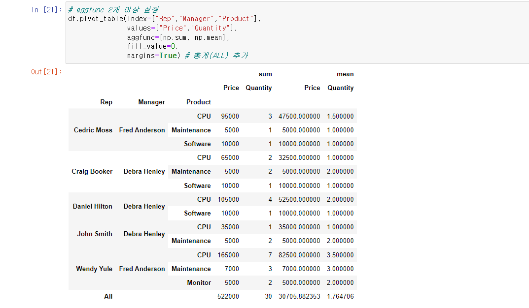
# aggfunc 2개 이상 설정
df.pivot_table(index=["Rep","Manager","Product"],
values=["Price","Quantity"],
aggfunc=[np.sum, np.mean],
fill_value=0,
margins=True) # 총계(ALL) 추가GoogleMaps
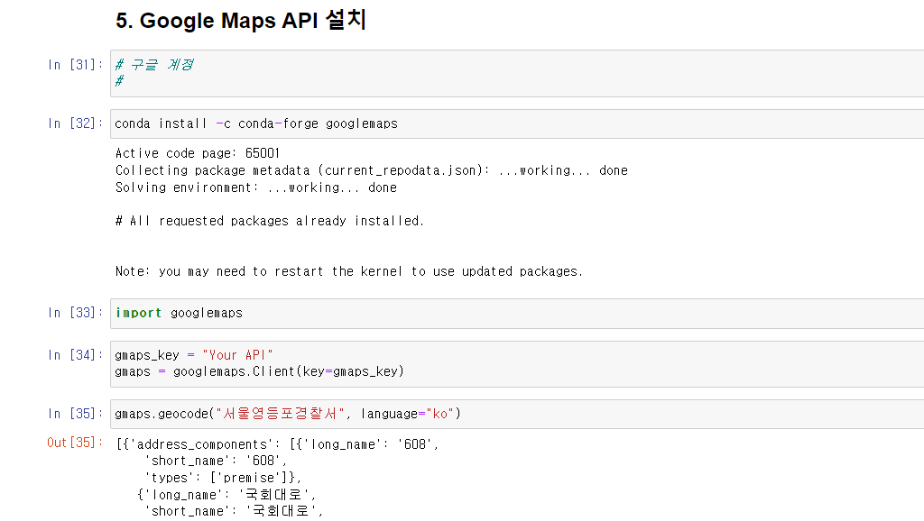
- 구글 클라우드에서 계정을 만들고 구글 맵 API를 발급 받아야 GoogleMaps 사용가능, GoogleMaps 패키지 설치
gmaps.geocode()으로 원하는 장소의 위치정보(위도, 경도, 주소 등)가져올 수 있다. (매우 편함 굿)
# googlemaps 실습
import googlemaps
gmaps_key = "Your API"
gmaps = googlemaps.Client(key=gmaps_key)
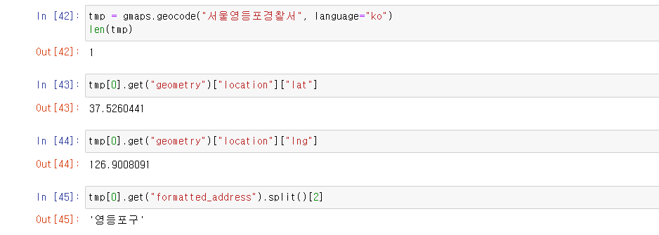
gmaps.geocode("서울영등포경찰서", language="ko")
tmp[0].get("geometry")["location"]["lat"]
tmp[0].get("geometry")["location"]["lng"]
tmp[0].get("formatted_address").split()[2]
crime_station["구별"] = np.nan
crime_station["lat"] = np.nan
crime_station["lng"] = np.nan
crime_station.head()python 반복문
pandas에 잘 맞춰진 반복문용 명령 iterrows()
pandas 데이터 프레임은 대부분 2차원
이럴때 for문을 사용하면, n번째라는 지정을 반복해서 가독률이 떨어짐
pandas 데이터 프레임으로 반복문을 만들떄 iterrows()옵션을 사용하면 편함
받을때, 인덱스와 내용으로 나누어 받는것만 주의
for n in range(0,10):
    print(n**2)
# 위 코드를 한줄로: list comprehension
[n**2 for n in range(0,10)]
Seaborn
Seaborn은 Matplotlib을 기반으로 다양한 색상 테마와 통계용 차트 등의 기능을 추가한 시각화 패키지이다. 다양한 차트기능을 포함하고 있으며 내장 데이터 프레임도 가지고 있어 연습하기 좋다.
- boxplot
- swarmplot
- lmplot
- heatmap
- pairplot
# seaborn 실습
import seaborn as sns
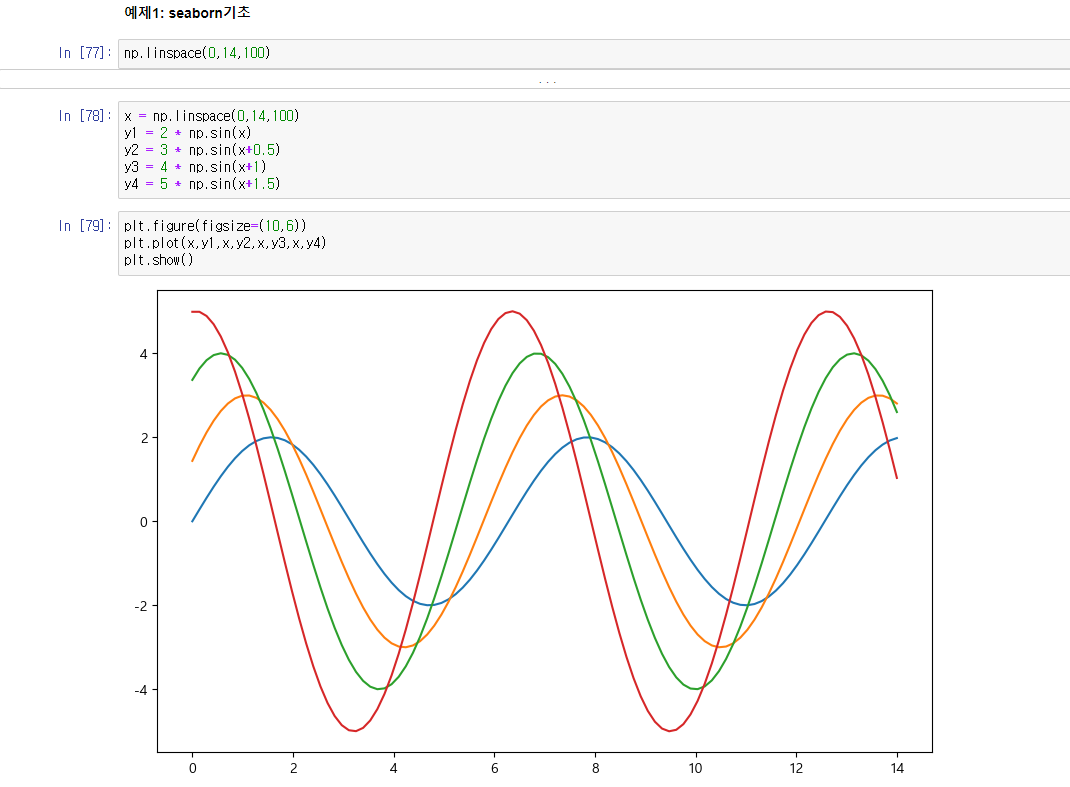
np.linspace(0,14,100)
x = np.linspace(0,14,100)
y1 = 2 * np.sin(x)
y2 = 3 * np.sin(x+0.5)
y3 = 4 * np.sin(x+1)
y4 = 5 * np.sin(x+1.5)
plt.figure(figsize=(10,6))
plt.plot(x,y1,x,y2,x,y3,x,y4)
plt.show()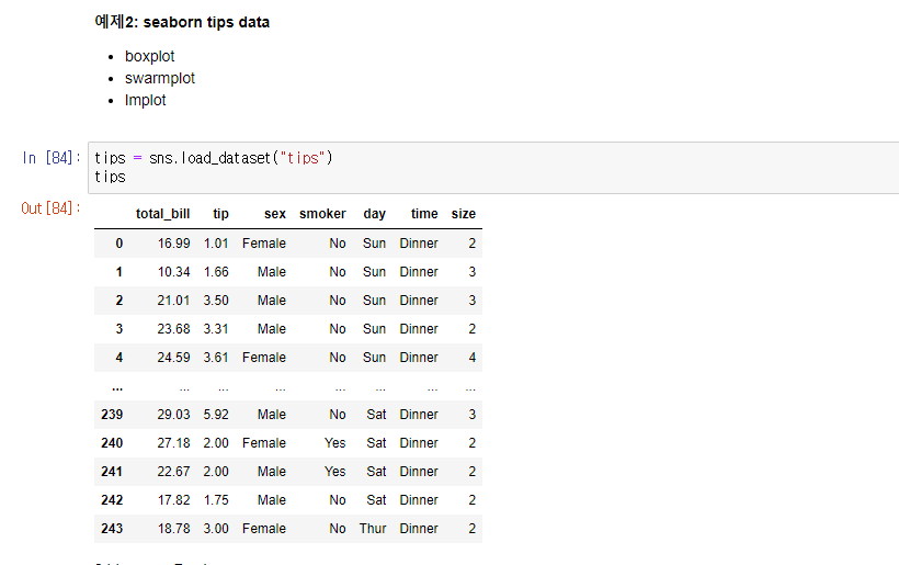
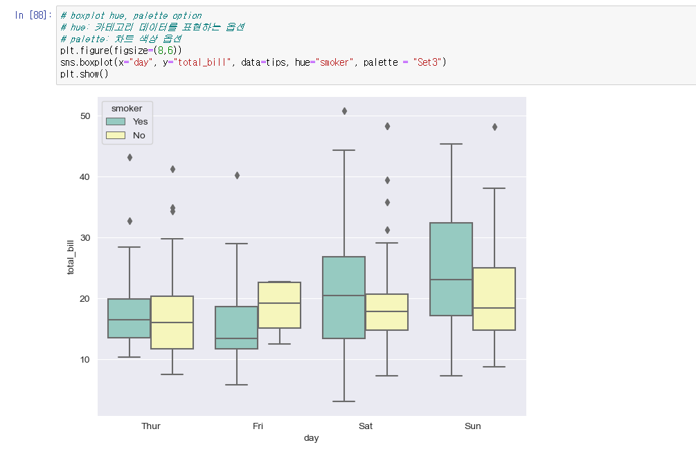
# boxplot hue, palette option
# hue: 카테고리 데이터를 표현하는 옵션
# palette: 차트 색상 옵션
tips = sns.load_dataset("tips")
plt.figure(figsize=(8,6))
sns.boxplot(x="day", y="total_bill", data=tips, hue="smoker", palette = "Set3")
plt.show()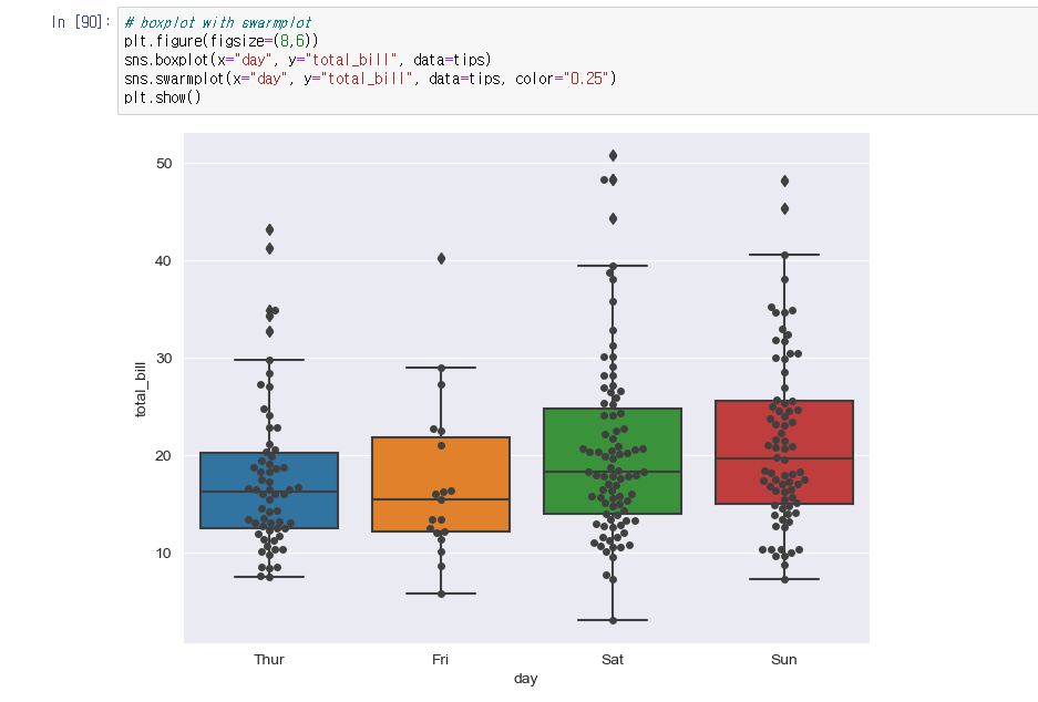
# boxplot with swarmplot
plt.figure(figsize=(8,6))
sns.boxplot(x="day", y="total_bill", data=tips)
sns.swarmplot(x="day", y="total_bill", data=tips, color="0.25")
plt.show()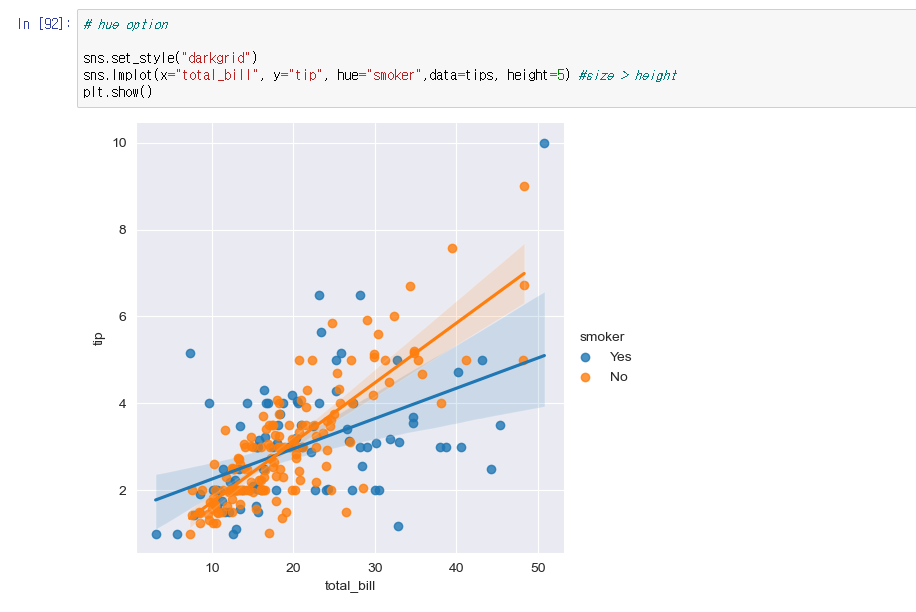
# lmplot: total_bill과 tip 사이 관계 파악
# hue option
sns.set_style("darkgrid")
sns.lmplot(x="total_bill", y="tip", hue="smoker",data=tips, height=5) #size > height
plt.show()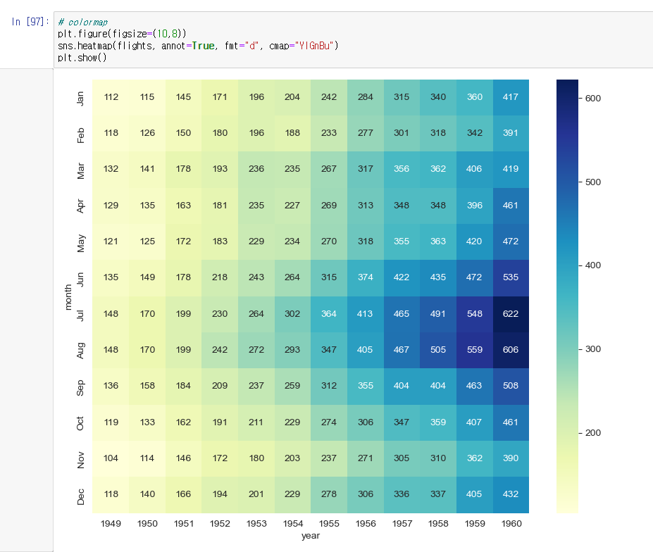
# heatmap, colormap
flights = sns.load_dataset("flights")
flights = flights.pivot(index="month", columns="year",values="passengers")
plt.figure(figsize=(10,8))
sns.heatmap(flights, annot=True, fmt="d", cmap="YlGnBu") # annot="True" 데이터 값 표시, fmt="d" 정수형 표현
plt.show()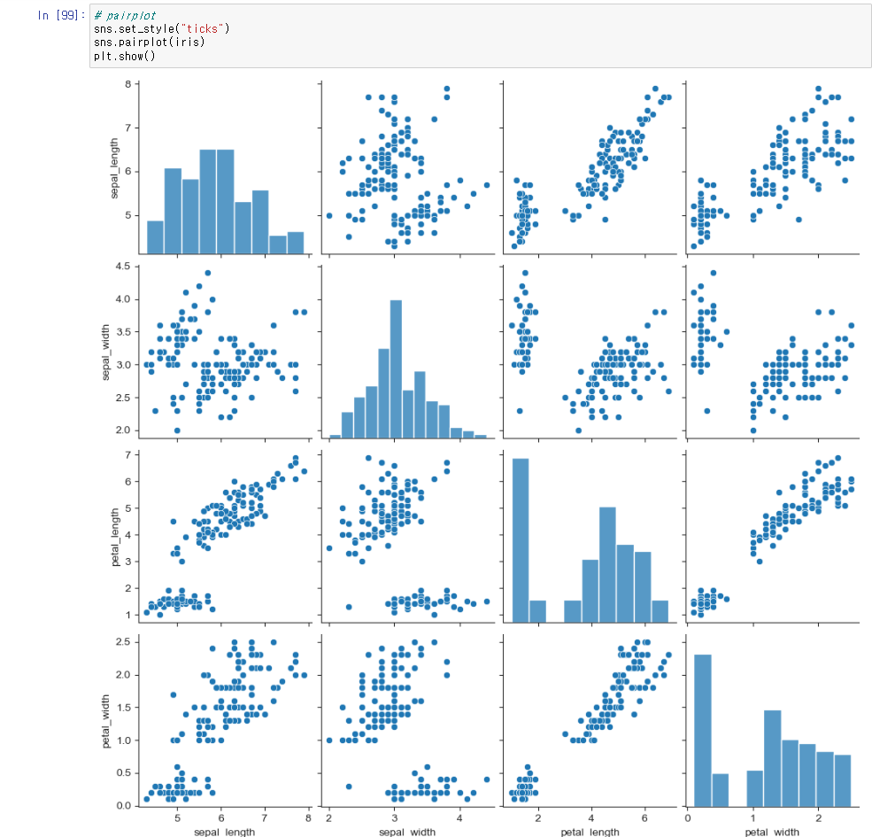
# pairplot
iris = sns.load_dataset("iris")
sns.set_style("ticks")
sns.pairplot(iris)
plt.show()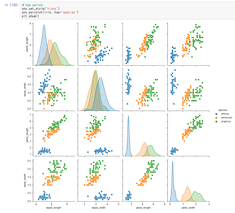
# hue option
sns.set_style("ticks")
sns.pairplot(iris, hue="species")
plt.show()

# 원하는 컬럼만 pairplot
sns.pairplot(iris, x_vars=["sepal_length", "sepal_width"], y_vars=["petal_length", "petal_width"], hue="species")
plt.show()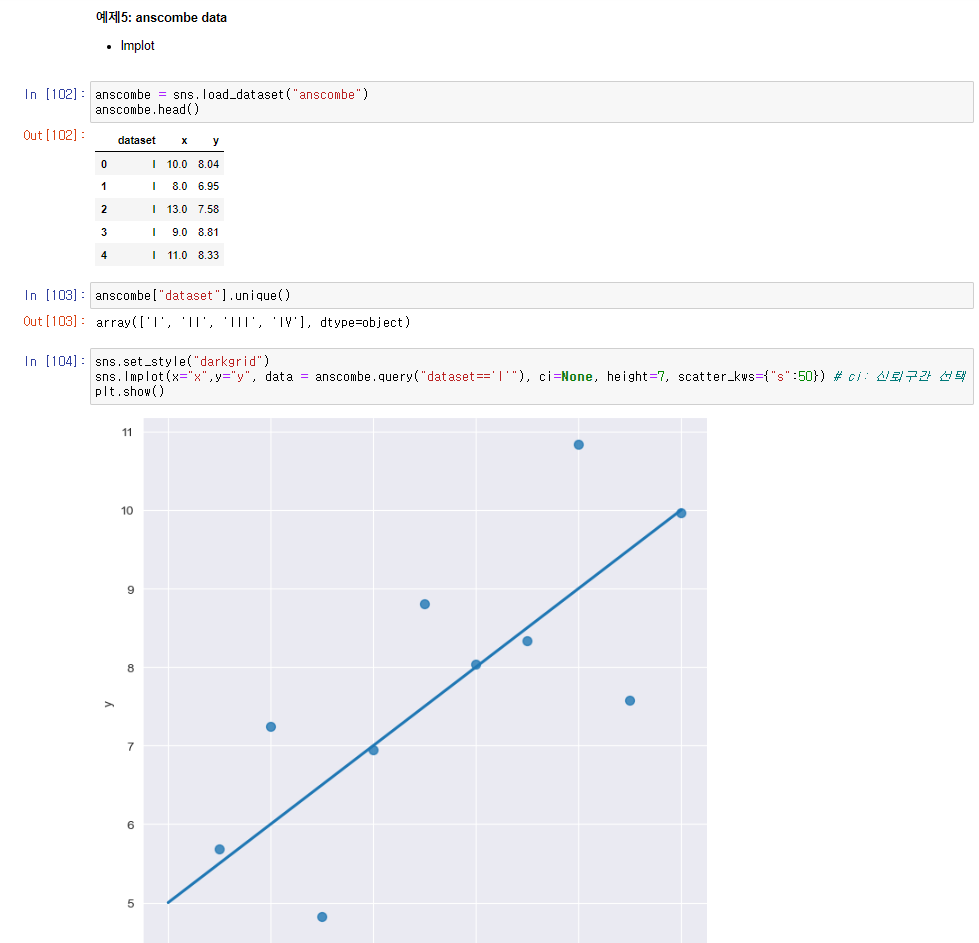
# anscombe data lmplot
anscombe = sns.load_dataset("anscombe")
sns.set_style("darkgrid")
sns.lmplot(x="x",y="y", data = anscombe.query("dataset=='I'"), ci=None, height=7, scatter_kws={"s":50}) # ci: 신뢰구간 선택
plt.show()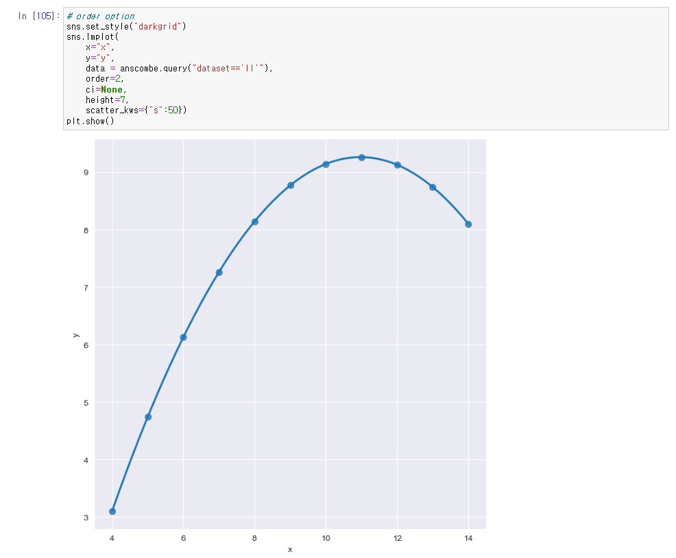
# order option
sns.set_style("darkgrid")
sns.lmplot(
    x="x",
    y="y",
    data = anscombe.query("dataset=='II'"),
    order=2,
    ci=None,
    height=7,
    scatter_kws={"s":50})
plt.show()
Folium
folium은 python에서 제공하는 지도를 다루는 대표적인 라이브러리로 folium을 사용하여 지도를 생성하고 Marker를 추가하여 시각화하거나 원으로 범위를 표기하고 html 파일로 내보내기 등을 수행할 수 있다.
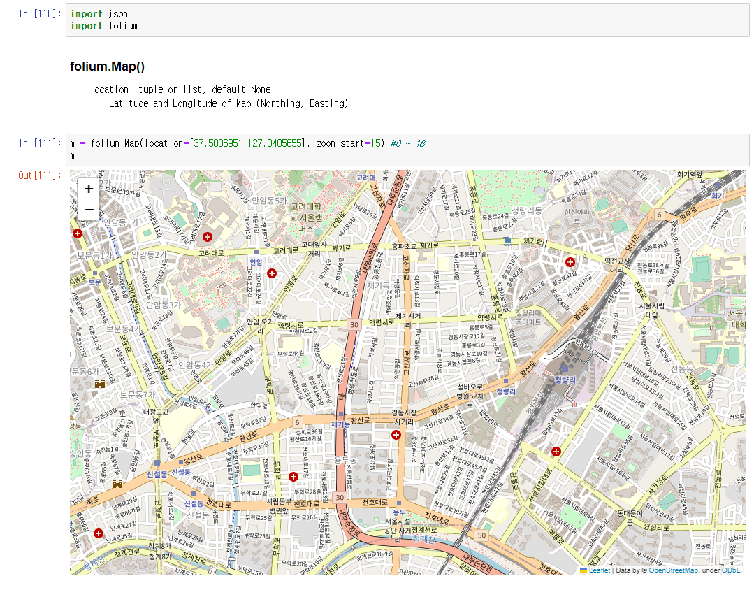
# folium 지도시각화
import json
import folium
m = folium.Map(location=[37.5806951,127.0485655], zoom_start=15) #0 ~ 18
m
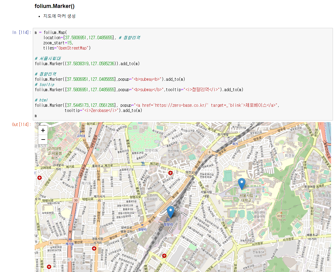
# 지도에 마커 생성
m = folium.Map(
location=[37.5806951,127.0485655], # 청량리역
zoom_start=15,
tiles="OpenStreetMap")
# 서울시립대
folium.Marker((37.5838319,127.0585236)).add_to(m)
# 청량리역
folium.Marker([37.5806951,127.0485655],popup="<b>subway<b>").add_to(m)
# tooltip
folium.Marker([37.5806951,127.0485655],popup="<b>subway</b>",tooltip="<i>청량리역</i>").add_to(m)
# html
folium.Marker([37.5445173,127.0561265], popup="<a href='https://zero-base.co.kr/' target=_'blink'>제로베이스</a>",
tooltip="<i>Zerobase</i>").add_to(m)
m
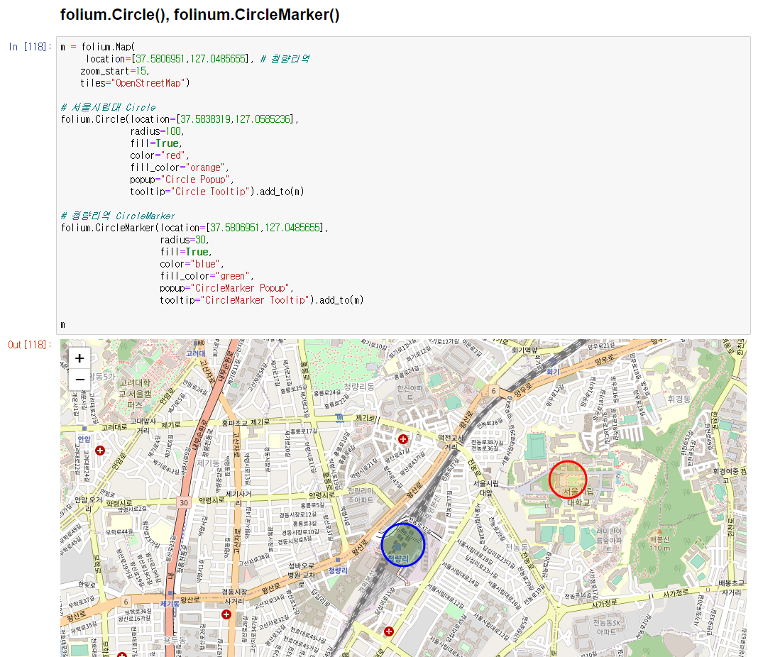
# folium.Circle(), folinum.CircleMarker()
m = folium.Map(
location=[37.5806951,127.0485655], # 청량리역
zoom_start=15,
tiles="OpenStreetMap")
# 서울시립대 Circle
folium.Circle(location=[37.5838319,127.0585236],
radius=100,
fill=True,
color="red",
fill_color="orange",
popup="Circle Popup",
tooltip="Circle Tooltip").add_to(m)
# 청량리역 CircleMarker
folium.CircleMarker(location=[37.5806951,127.0485655],
radius=30,
fill=True,
color="blue",
fill_color="green",
popup="CircleMarker Popup",
tooltip="CircleMarker Tooltip").add_to(m)
m
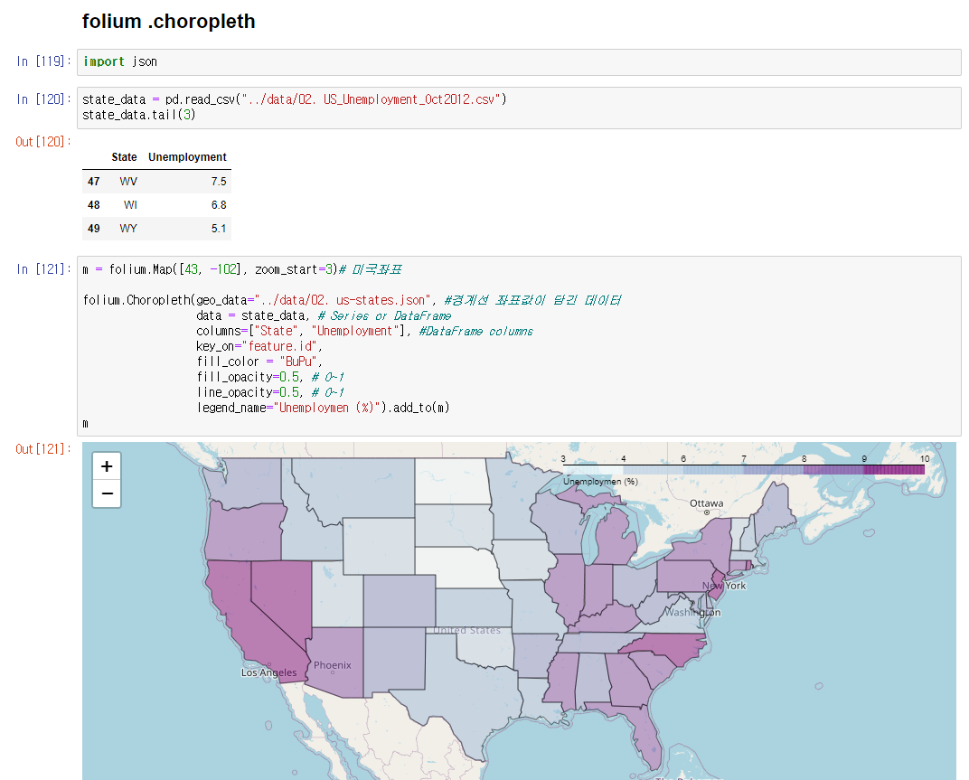
# folium .choropleth 경계선으로 색칠
m = folium.Map([43, -102], zoom_start=3)# 미국좌표
folium.Choropleth(geo_data="../data/02. us-states.json", #경계선 좌표값이 담긴 데이터
data = state_data, # Series or DataFrame
columns=["State", "Unemployment"], #DataFrame columns
key_on="feature.id",
fill_color = "BuPu",
fill_opacity=0.5, # 0~1
line_opacity=0.5, # 0~1
legend_name="Unemploymen (%)").add_to(m)
m
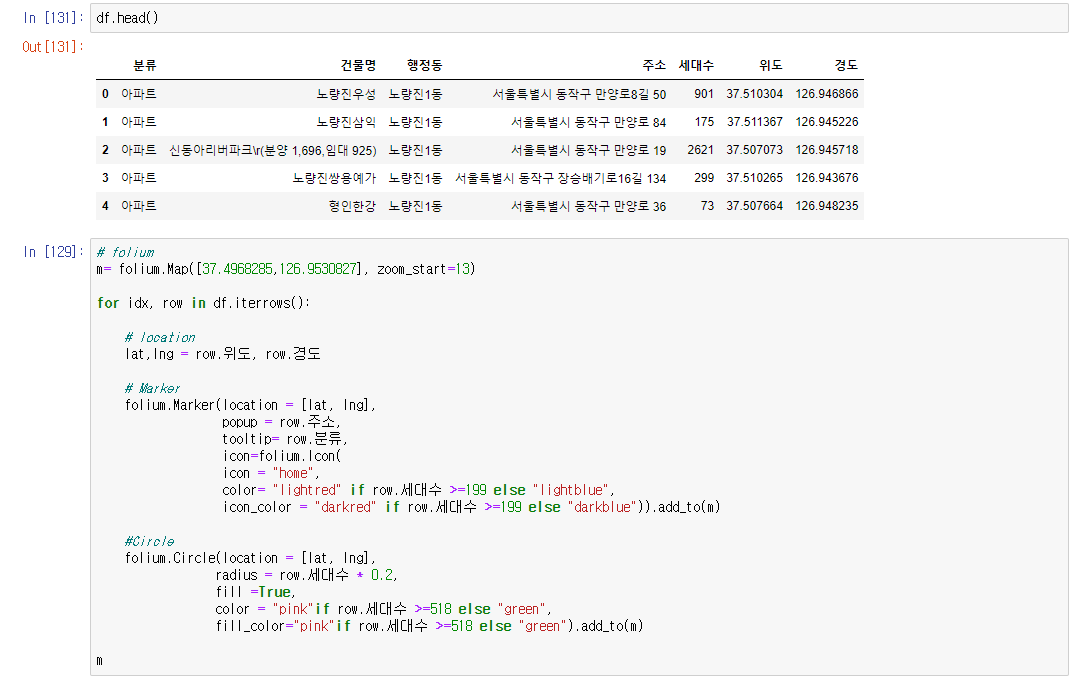
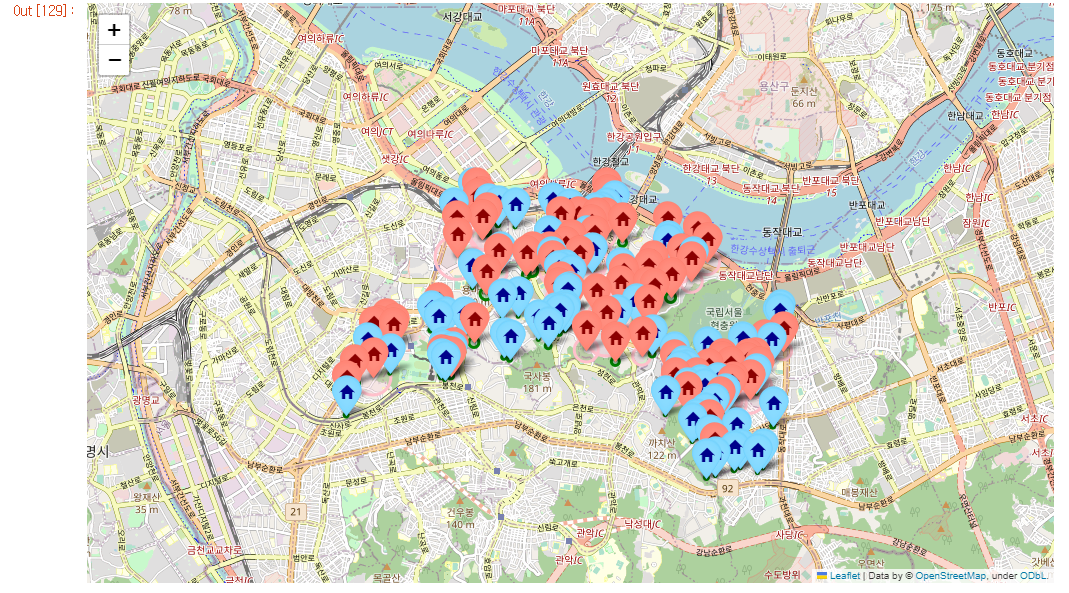
# 아파트 유형 시각화
# folium
m= folium.Map([37.4968285,126.9530827], zoom_start=13)
for idx, row in df.iterrows():
# location
lat,lng = row.위도, row.경도
# Marker
folium.Marker(location = [lat, lng],
popup = row.주소,
tooltip= row.분류,
icon=folium.Icon(
icon = "home",
color= "lightred" if row.세대수 >=199 else "lightblue",
icon_color = "darkred" if row.세대수 >=199 else "darkblue")).add_to(m)
#Circle
folium.Circle(location = [lat, lng],
radius = row.세대수 * 0.2,
fill =True,
color = "pink"if row.세대수 >=518 else "green",
fill_color="pink"if row.세대수 >=518 else "green").add_to(m)
m후기
pivot, google maps, seaborn, folium을 실습하였는데 다양한 시각화 툴을 배우니 신기하고 엄청 복잡할줄 알았는데 파이썬 모듈들이 매우 잘 되어있어서 생각보다 복잡하지않고 코드 몇줄이면 시각화가 가능해서 파이썬이 대단하다고 생각했다. 쉽다고는 안했다!..
이글은 제로베이스 데이터 취업스쿨의 강의자료 일부를 발췌하여 작성되었습니다.

데이터 공부합니다