출처 : 나의 첫 HTML&CSS 웹 디자인
1. 가운데정렬
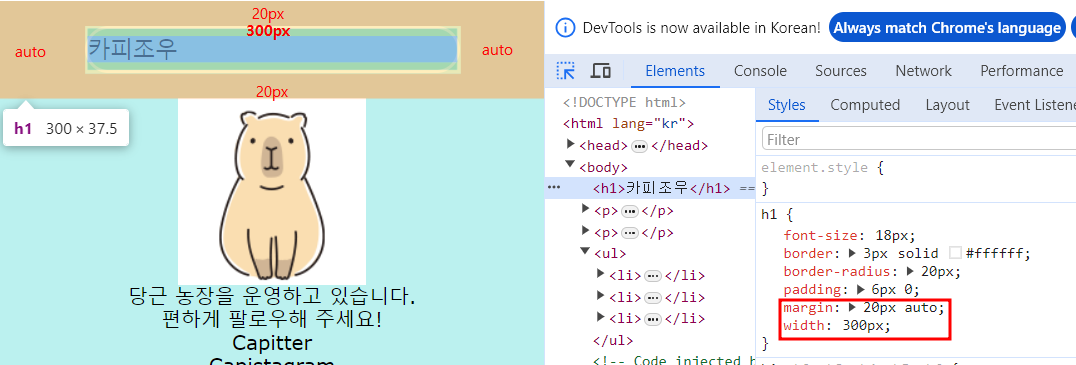
1) 블록박스 가운데정렬
- 요소의 폭(widht)를 지정한 후, 좌우marign auto
h1 {
    widht: 300px;
    margin: 0 auto;
}
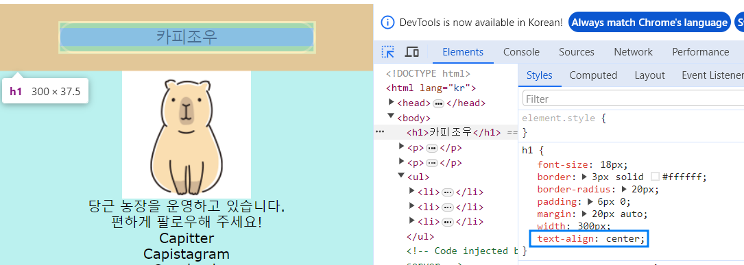
2) 인라인박스 가운데정렬
- 가운데 정렬을 할 요소가 포함된 부모의 블록박스에서
text-align:center;
h1 {
    text-align : center;
}
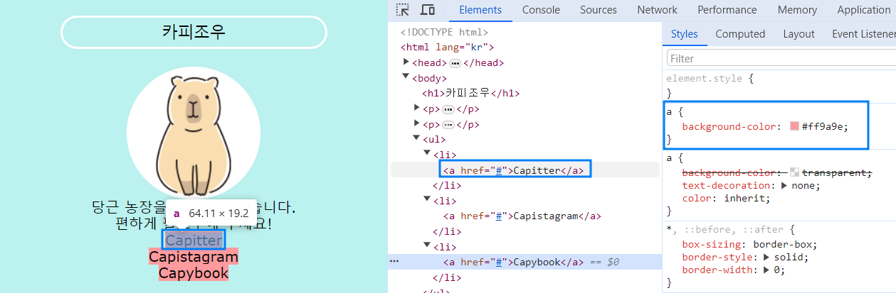
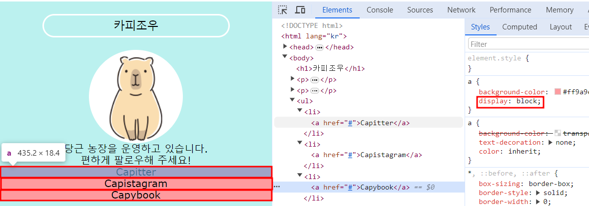
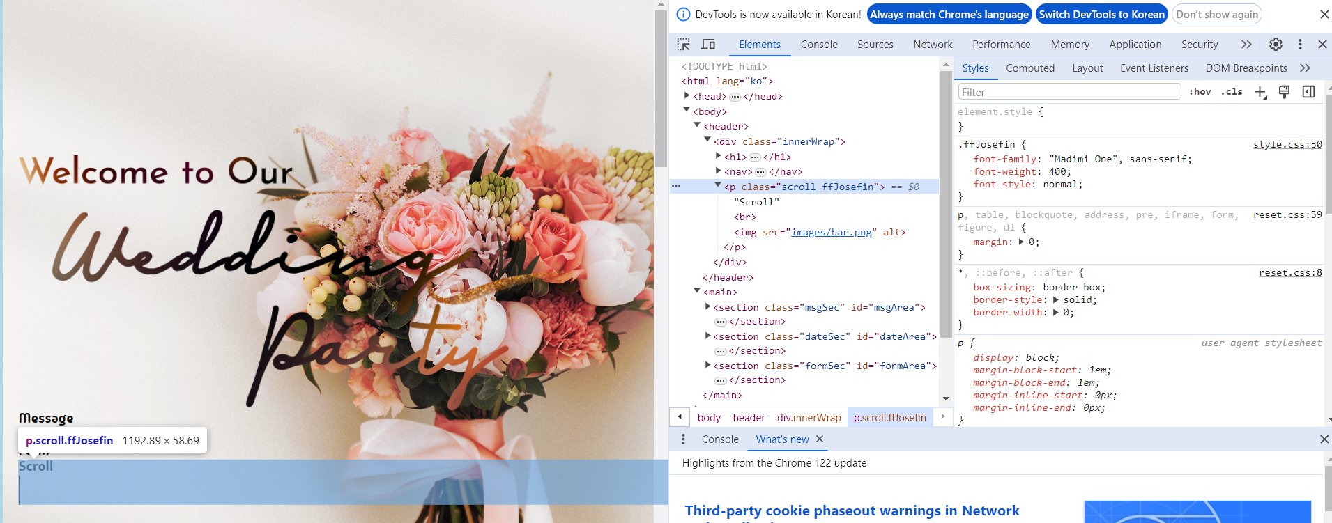
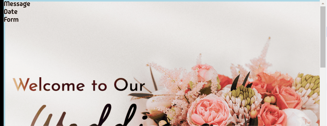
2. display: block
a {
    display: block;
}
1. 인라인요소
2. 블록요소
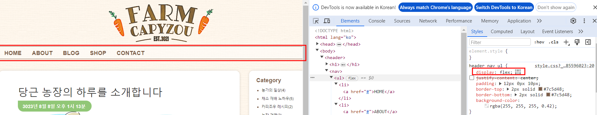
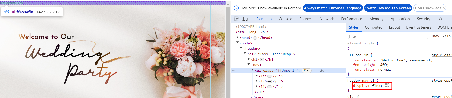
3-1. display: flex (nav 나란히 정렬)
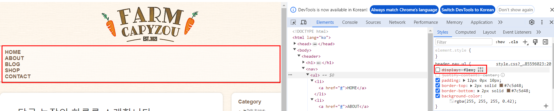
1. display: flex;
nav {
    display:flex;
}
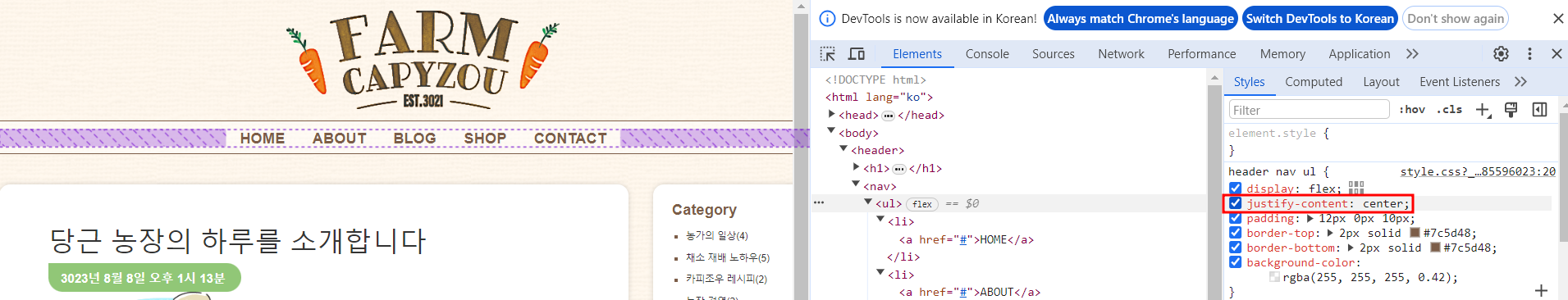
2. justify-content: center;
- 기본축 방향의 배치를 지정함
- 기본축의 초깃값은 가로(row)방향
center: 아이템을 메인축 중앙에 오도록 정렬nav { display:flex; justify-content: center; }
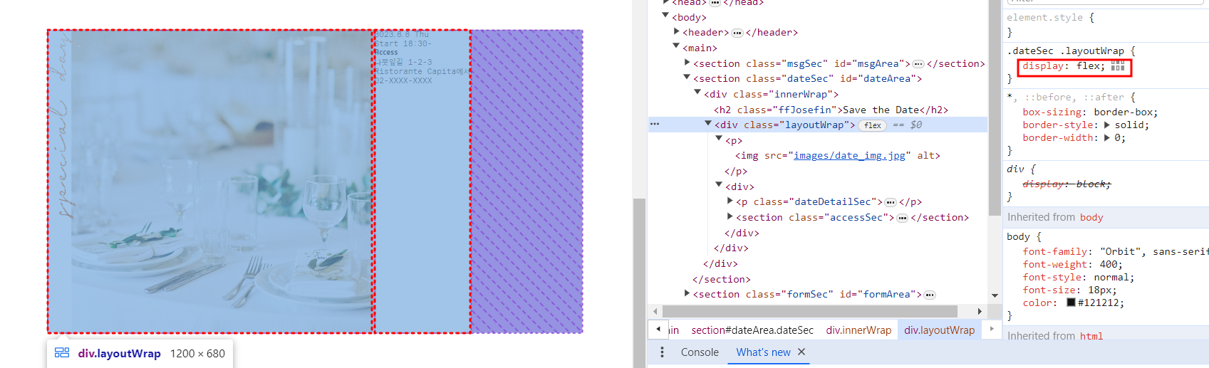
3-2. display: flex (컨텐츠 나란히 정렬)
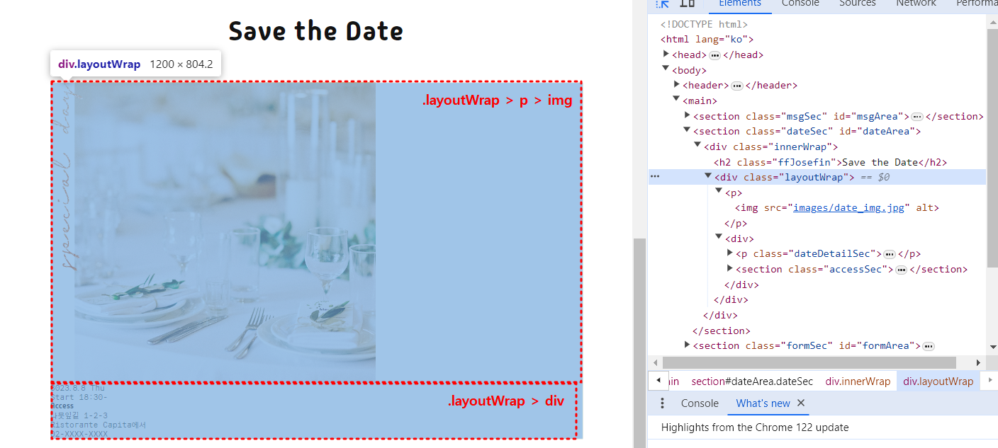
1. dispaly: flex;
.dataSec .layoutWrap {
    dispaly: flex;
}
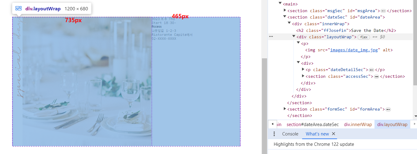
2. 가로 폭 지정
.dateSec .layoutWrap > p{
    flex-basis: 735px;
}
.dateSec .layoutWrap > div{
    flex-basis: 465px;
}
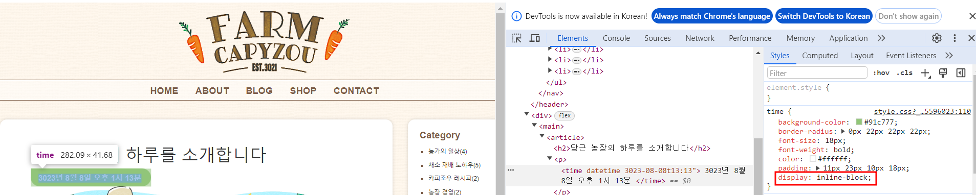
4. display: inline-block
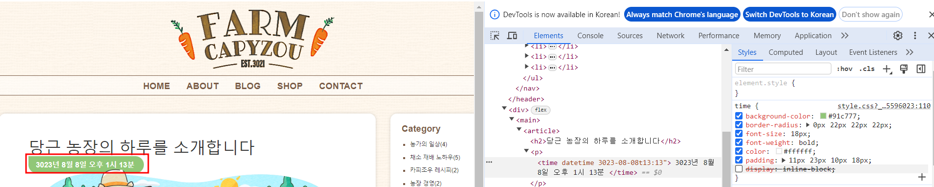
1.display: inline-block
- 인라인요소의 가로길이는 요소의 내용에 따라 가변적임, 여백지정불가
- 블록요소는 가로길이가 자동으로 조절되지않음, 여백(margin, padding)을 사방으로 지정할 수 있음
- inline-block : 가로길이는 유동적이고, 여백을 지정할 수 있음
time {
    display: inline-block;
}
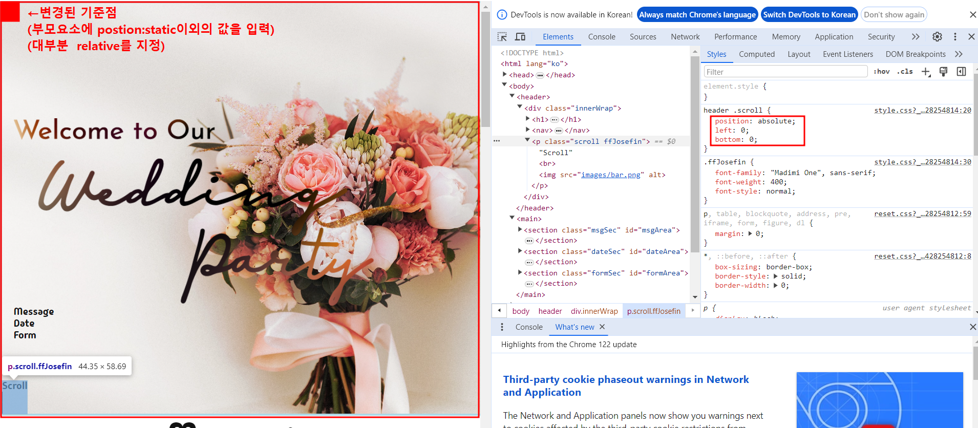
5. postion:absolute 기준점 변경하기
- postion 기본값은 static : left, top 등 위치를 지정해도 움직이지않음
- relative : 기준점은 왼쪽 위 꼭지점
- absolute : 기준점은 창의 왼쪽 위 꼭지점
1. 기준이 될 부모 설정
- 부모요소에 static 이외의 값을 지정 (보통 relative로 지정함)
header .innerWrap {
    height: 720px;
    position: relative;
}
2. 움직이고자 하는 자식요소에 positon:absoulte지정 후 위치설정
header .scroll {
    position: absolute;
    left: 0;
    bottom: 0;
}
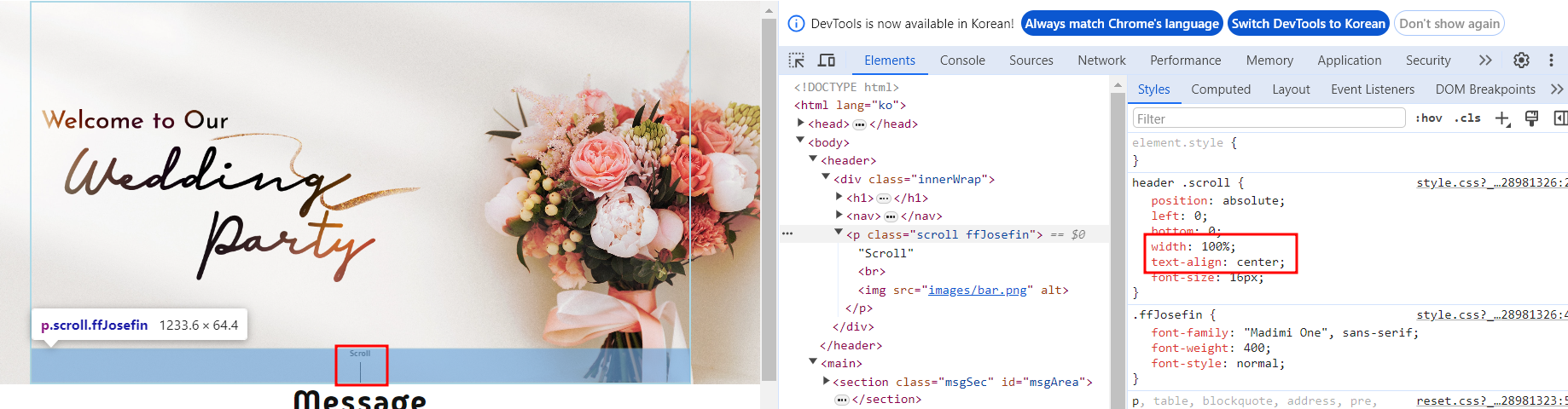
3. 가운데정렬을 위한 가로길이 지정
- 블록요소의 가로너비가득한 영역을 차지함이라는 성질을 잃어버림
- 가운데 정렬을 하려면 가로너비를 따로 지정해줘야함
header .scroll {
    position: absolute;
    left: 0;
    bottom: 0;
    width : 100%;
    text-align: center;
}
6. postion:fixed
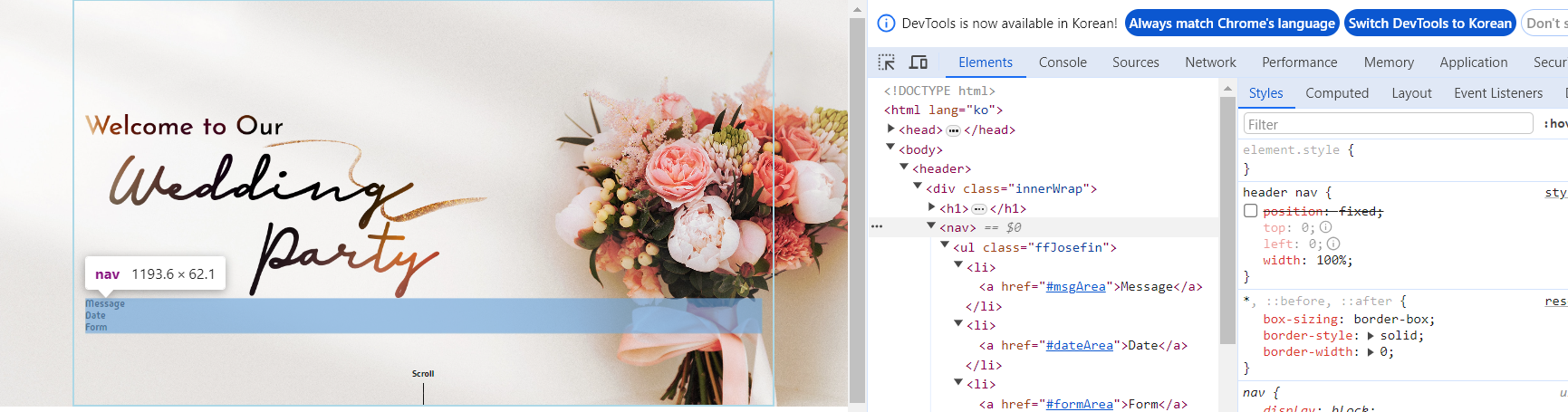
1. postion:fixed
- 스크롤을 움직여도 요소가 그 자리에 고정됨
- 위치의 기준점은 창의 왼쪽 위 꼭지점
- 블록요소의 가로너비가득한 영역을 차지함이라는 성질을 잃어버림
header nav {
    position: fixed;
    top: 0;
    left: 0;
}
2. 가로배치
header nav ul {
    display: flex;
}
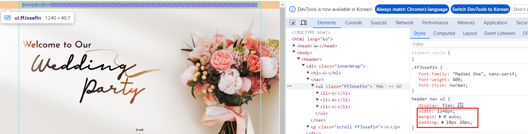
3. 위치조정
- width : 가로길이지정
- margin: 가운데정렬 (브라우저 전체를 기준으로 ul을 가운데정렬(주황색))
- padding: 글자와 요소사이의 내부여백 (초록색))
header nav ul {
    display: flex;
    width: 1240px;
    margin: 0 auto;
    padding: 10px 20px;
}
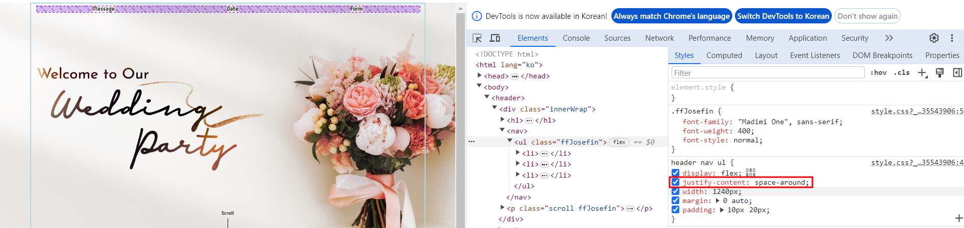
4. 균등배치
header nav ul {
    display: flex;
    justify-content: space-around;
    width: 1240px;
    margin: 0 auto;
    padding: 10px 20px;
}
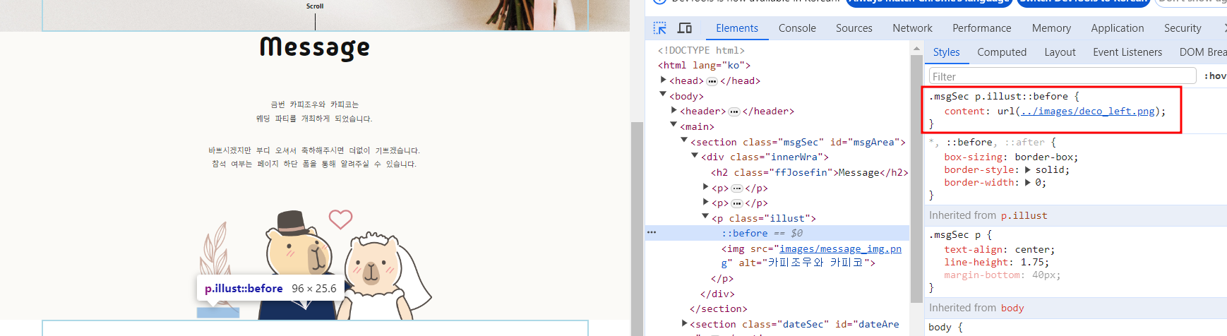
7. 가상요소선택자(::before, ::after)
1. ::before
.msgSec p.illust::before {
    content: url(../images/deco_left.png);
}
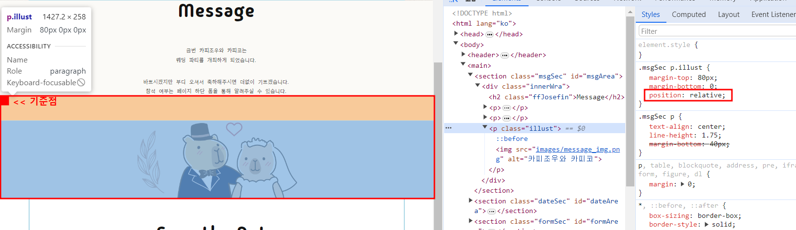
2. 부모요소에 position지정해서 기준점만들기
.msgSec p.illust {
    positon: relative;
}
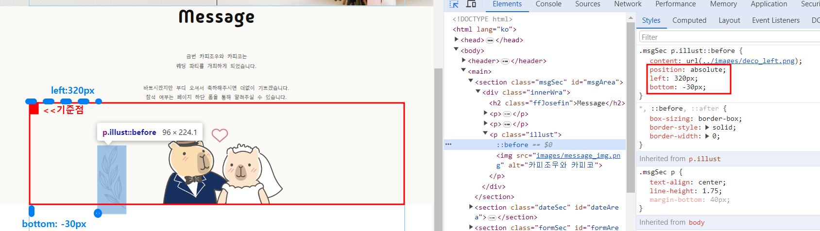
3. 위치조정
.msgSec p.illust::before {
    content:url(../images/deco_left.png);
    position: absolute;
    left: 320px;
    bottom: -30px;
}
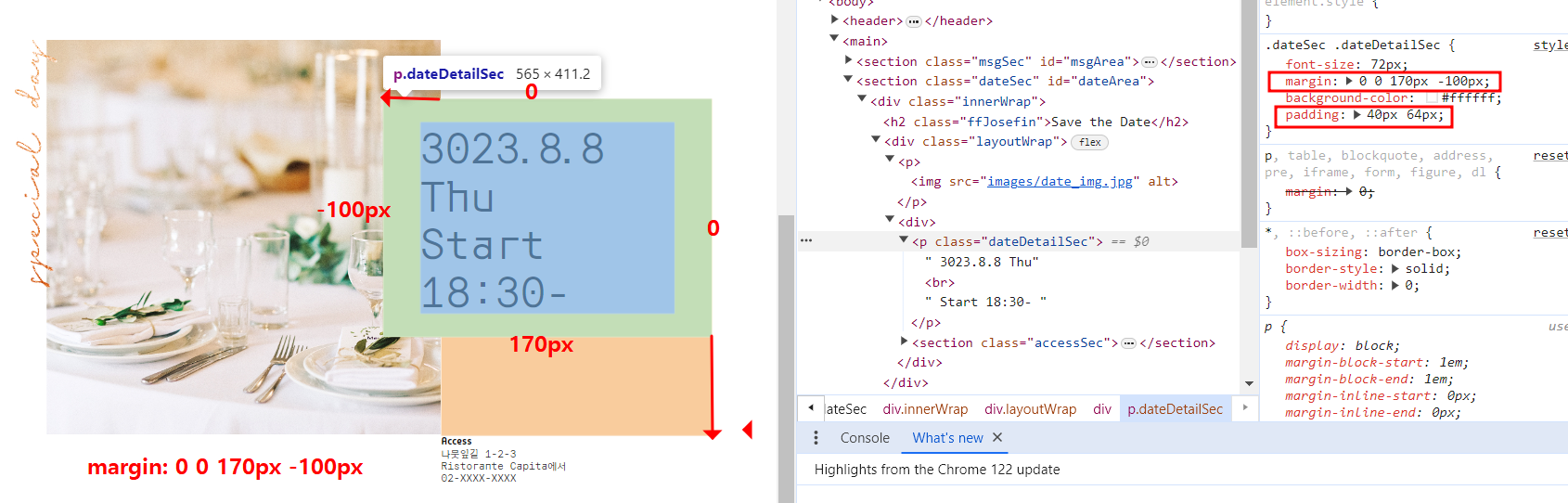
8. margin
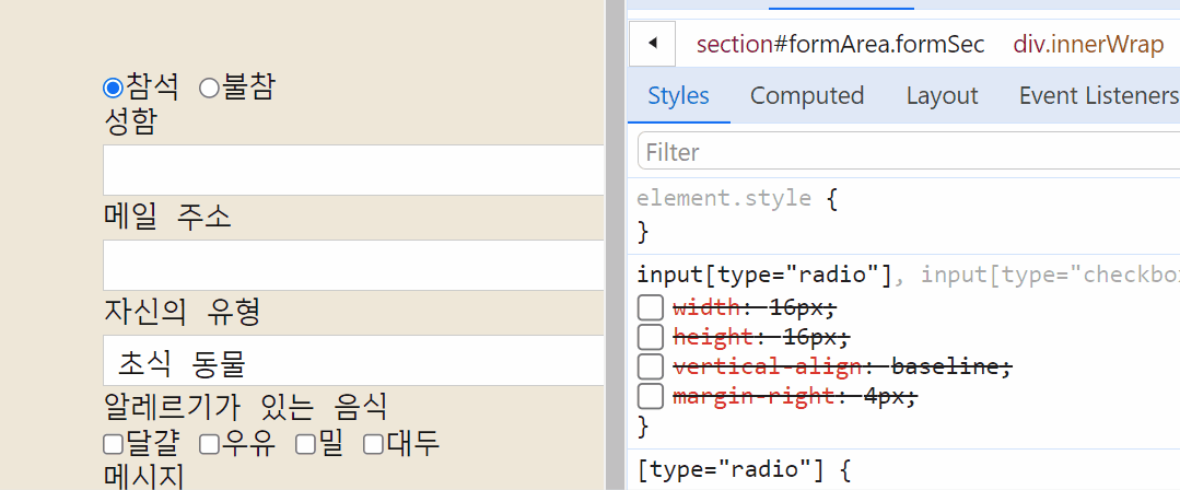
9. vertical-align 세로정렬
- 인라인박스끼리 세로 정렬을 맞춤
(radio, check, label 각 인라인요소들의 세로정렬)- width, height은 radio,
\check의 사이즈조정

씩씩하게 공부중 (22.11~)