Udemy Python Bootcamp Day 044
My Site
Divs
Div is a special HTML element that allows us to divide our content up on our website so that we can structure each div separately.
Divs, amongst other things, don't do anything unless you use CSS with it.
When I hover over the h1, it already shows you the entire space that it's taking up.
body {margin: 0;}

h1 {margin-top: 0;}
CSS Box Model
Thw width and the height of an element, you can also specify that it should have a border or not. The border is going to be a solid border using CSS, then you will see a default 3px border show up around your element.
You can expand the border size to say that the border width sould be 50px all round, so that's 50px on every single side.
CSS display property
The display property has four different values, Block, Inline, Inline-Block and None.
-
Block
Block elements are taking up essentially the whole width of the screen on a web page, so effectively blocking out any other elements from sitting next to it on the left or on the right.
Common Block Elements
- paragraghs<p>
- Headers<h1>through<h6>
- Divisions<div>
- List and list items<ol>,<ul>,<li>
- Forms<form> -
Inline
Inline display element only takes up as much space as it needs to in the height and in its width.
Connon Inline Elements
- Span<span>
- Images<img>
- Anchors<a> -
Inline-Block
p {display: inline-block;} -
None
None just gets rid of our element.p {display: none;} /* OR */ p {visibility: hidden;}Hiddenmakes that element disappear but it keeps its original position, and all the other elements still flow around it as if it's still there.
CSS Positioning
RULES
-
Content is Everything
Your content is the first thing that determines how large things gets displayed and what the height and the width will be. -
Order Comes From Code
This is how we've written our code in our HTML file and this is how it gets rendered, in that order. So, the default layout order is determined by your code. -
Children Sit On Parents
It's more towards the viewer and away from the screen. So, by default our HTML elements that are children, they will sit on tip of the parent element.
POSITION
-
Static
Static just means go along with the HTML and keep to the default HTML flow. -
Relative
To position the element that we select relative to how it would have been had it been static.
Relative positioning means that you're adding a margin relative to where the element should have been.img { position: relative; top: 50px; } -
Absolute
When you're using absolute positioning looks like you're giving it a margin relativeto the entire page which looks like you're changing the absolute position of it.
Absolute position means that you're adding a margin to its parent element.img { position: absolute; right: 30px; }
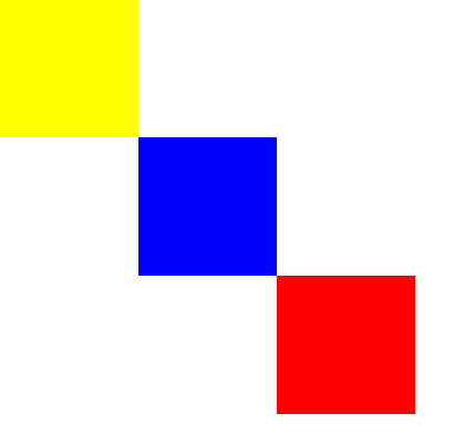
<body>
  <div class="red">
  </div>

  <div class="blue">
  </div>

  <div class="yellow">
  </div>
</body>
body {
margin: 0;
}
.red {
background-color: red;
width: 100px;
height: 100px;
position: absolute;
top: 200px;
left: 200px;
}
.blue {
background-color: blue;
width: 100px;
height: 100px;
position: absolute;
top: 100px;
left: 100px;
}
.yellow {
background-color: yellow;
width: 100px;
height: 100px;
}
- Fixed
It is fixed in its position relative to the body of the web site, and it dosen't move despite all scrolling.img { position: fixed; top: 0; }
Centering Elements
margin: auto;applied will center the element either vertical or horizontally.
Font
body {font-family: verdana, sans-serif;}This line of code does is that it sets the font family for all the text inside the body, but it first asks the browser to try and render all the text in the "Verdana" font.
Using Google Fonts
<head>
  <link rel="preconnect" href="https://fonts.googleapis.com">
  <link rel="preconnect" href="https://fonts.gstatic.com" crossorigin>
  <link href="https://fonts.googleapis.com/css2?family=Fredoka&family=Hubballi&family=Indie+Flower&display=swap" rel="stylesheet">
</head>
body {
font-family: 'Fredoka', sans-serif;
}
h1 {
font-family: 'Indie Flower', cursive;
}
h2 {
font-family: 'Hubballi', cursive;
}
h3 {
font-family: 'Hubballi', cursive;
}Font Sizing
16px = 100% = 1em
px is static. (사용하는 유저가 페이지 글자 크기를 키워도 커지지 않음)
The font size gets inherited and added on top of whatever it got from its parent except for px.
One of the things that we got in the latest version of CSS, which is the version that we're using currently or the version CSS 3. Inside CSS 3, there is something called the rem and that refers to the root em. So that means ignore all of the parent settings for the font size and just set it to this relative to the root.
Float & Clear
- Float
Float image to the left and all text will wrap aound ot on the right.
.img {float: right;}- Clear
For the paragraph, clear its left, which means make sure that left margin is clear and not wrapped around anything, then that basically prevents it from carrying out the default behavior.
.p {clear: left;}RECOMMEND to to only use float when really necessary and only use it for what it's meant, which is wrapping text around a certain element and don't use it for positioning.
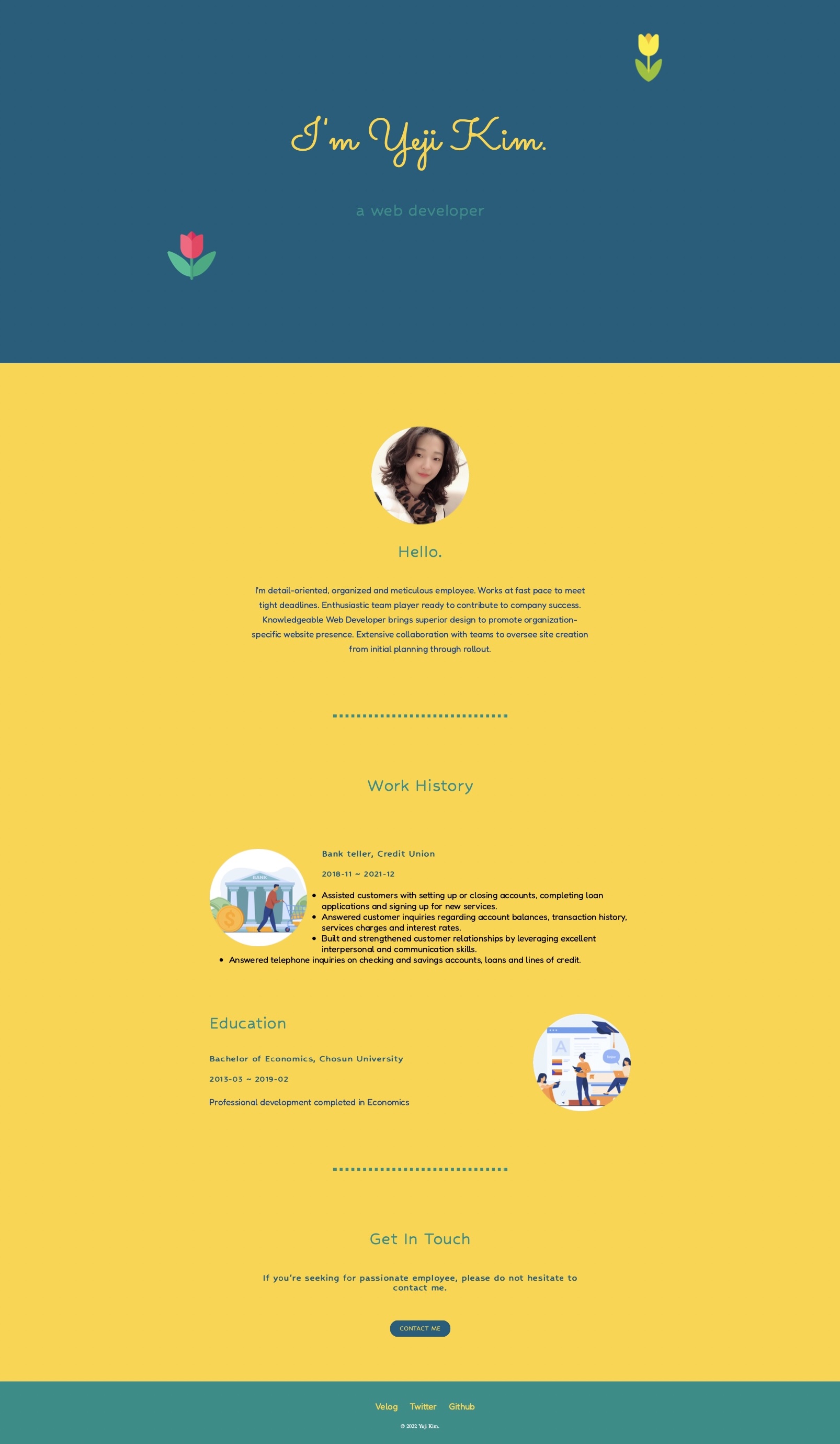
My Site
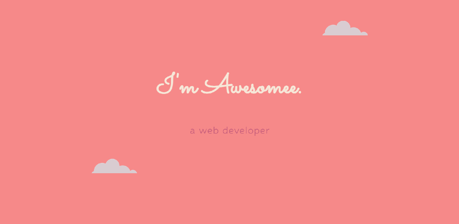
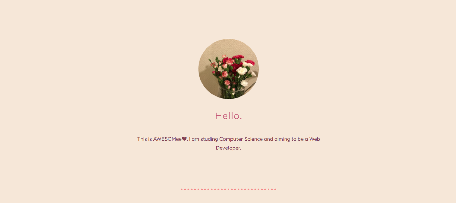
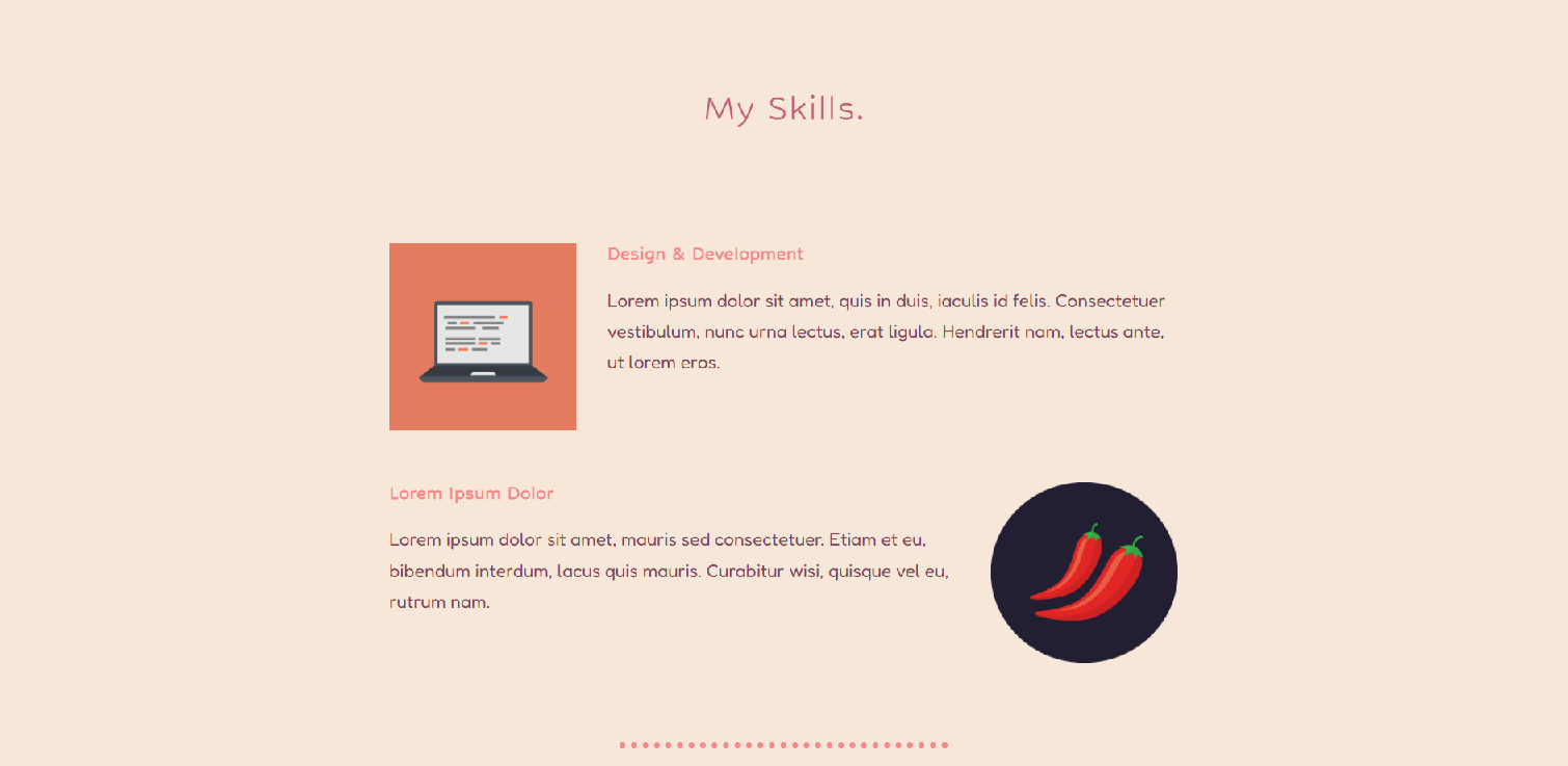
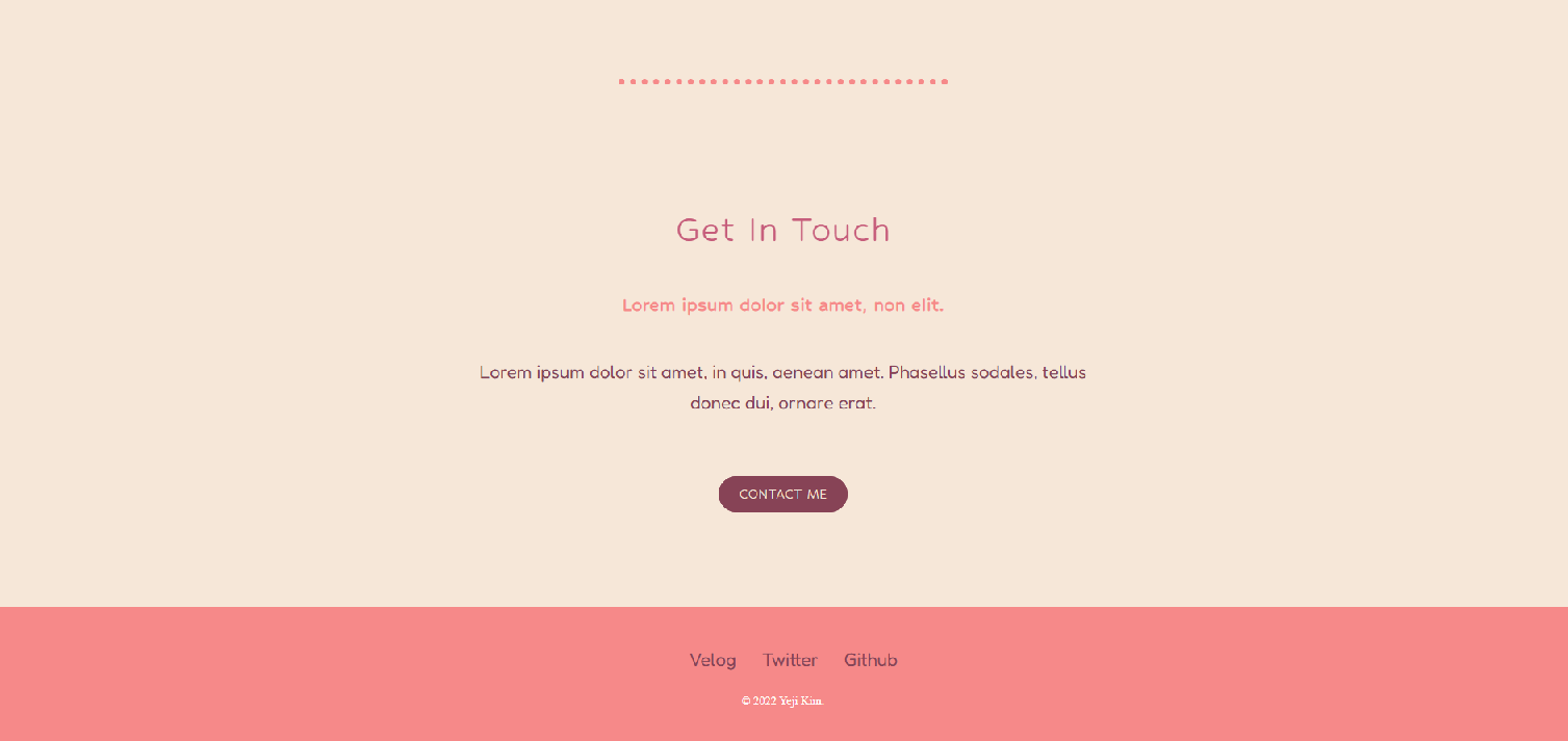
요런 느낌의 페이지....
근데 오늘 강의 역대급으로 길어서(강의 시간 2시간 55분/ 실제소요시간 6시간 15분) 페이지 안에 멘트 수정도 다 못하고 깃허브에 올리지도 못함...
심지어 optional challenge 하나 더 있는데 그건 도저히...
근데 결과물이 너무너무너무너무 예뻐서 사방팔방 자랑하고 싶어 미치겠음 ㅠㅠㅠ
근데 그러려면 이것처럼 이름이나 사진같은거 전부 수정해야하고....
무튼 이맛에 FE하는구나...
사실 저번 며칠 파이썬에 치였더니 FE 넘 재밌다.... FE가 더 끌리긴 하네요.....
컬러팔레트나 아이콘 사이트 등등이 눈 뒤집어지게 만들어 ㅠ
+) 2022.03.23
새롭게 수정을 해보았음 (+내용수정)