Matplotlib examples
Matpolotlib install
!pip install matplotlibimport matplotlib.pyplot as plt문제 1: 기본 라인 플롯 그리기
x = [1, 2, 3, 4, 5]
y = [2, 4, 6, 8, 10]

plt.plot(x, y)
plt.xlabel('X-axis')
plt.ylabel('Y-axis')
plt.title('Basic Line Plot')
plt.show()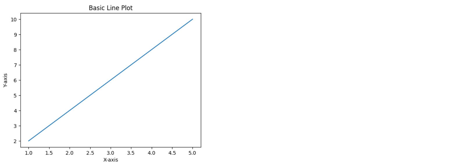
문제2 : 여러 개의 라인 플롯 그리기
x = [1, 2, 3, 4, 5]
y1 = [2, 4, 6, 8, 10]
y2 = [1, 4, 9, 16, 25]

plt.plot(x, y1, label='y = 2x')
plt.plot(x, y2, label='y = x^2')
plt.xlabel('X-axis')
plt.ylabel('Y-axis')
plt.title('Multiple Line Plots')
plt.legend()
plt.show()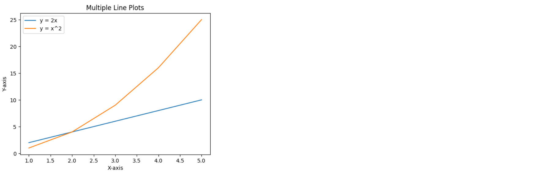
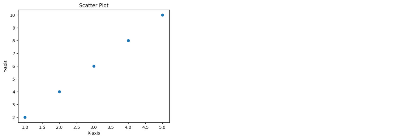
문제 3: 산점도(Scatter plot) 그리기
x = [1, 2, 3, 4, 5]
y = [2, 4, 6, 8, 10]

plt.scatter(x, y)
plt.xlabel('X-axis')
plt.ylabel('Y-axis')
plt.title('Scatter Plot')
plt.show()
문제 4: 바 차트(Bar chart) 그리기
categories = ['A', 'B', 'C', 'D', 'E']
values = [3, 7, 1, 5, 8]

plt.bar(categories, values)
plt.xlabel('Category')
plt.ylabel('Value')
plt.title('Bar Chart')
plt.show()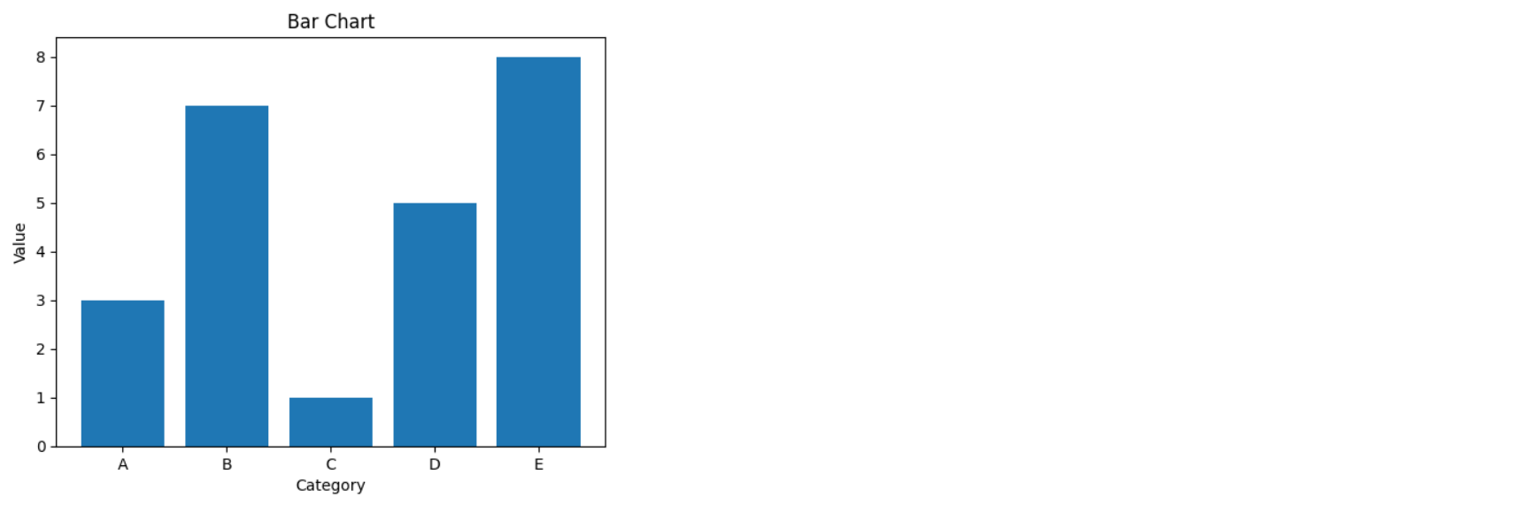
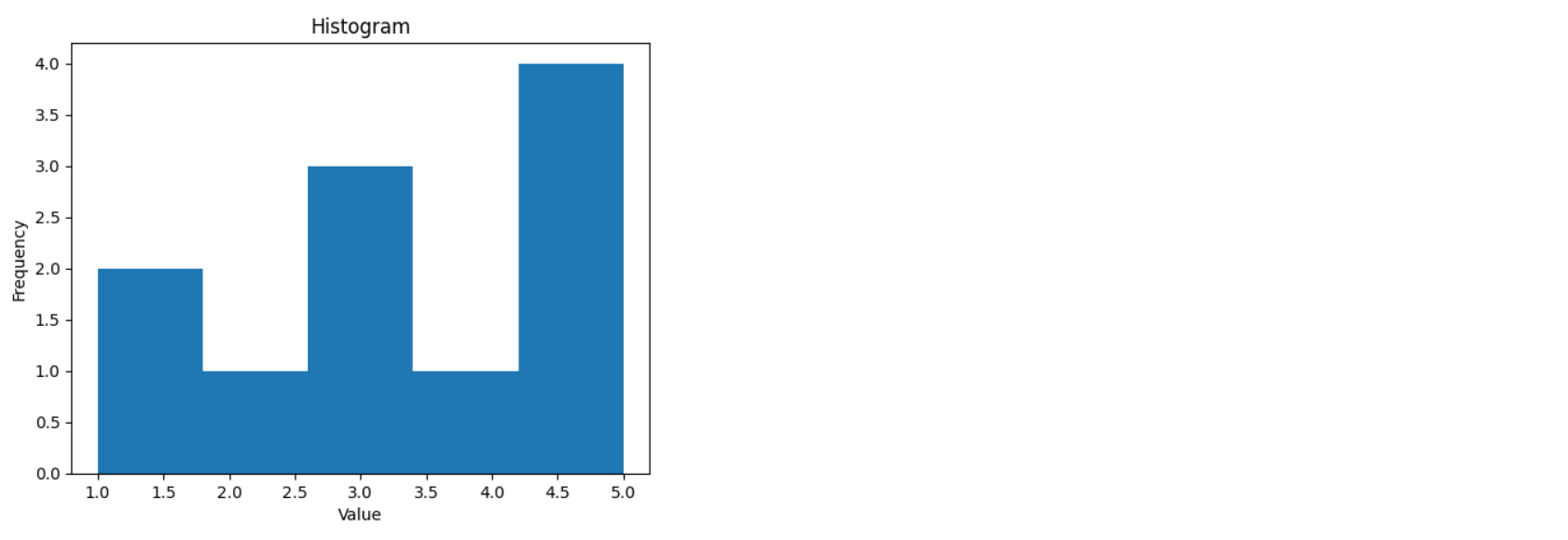
문제 5: 히스토그램(Histogram) 그리기
data = [1, 1, 2, 3, 3, 3, 4, 5, 5, 5, 5]

plt.hist(data, bins=5)
plt.xlabel('Value')
plt.ylabel('Frequency')
plt.title('Histogram')
plt.show()
문제 6: 파이 차트(Pie chart) 그리기
sizes = [215, 130, 245, 210]
labels = ['A', 'B', 'C', 'D']

plt.pie(sizes, labels=labels, autopct='%1.1f%%')
plt.title('Pie Chart')
plt.axis('equal')
plt.show()

문제 7: 박스 플롯(Box plot) 그리기
data = [2, 3, 3, 4, 4, 4, 5, 6, 6, 7, 7, 7, 8, 8, 8, 9]

plt.boxplot(data)
plt.ylabel('Value')
plt.title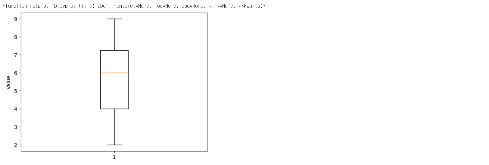

AI, Information and Communication, Electronics, Computer Science, Bio, Algorithms