시즌 2, 시즌 3 데이터로 나누기
- 게임 횟수(양) 차이가 많이 나는데 그냥 데이터 제거하면 안 되나요?
- 모수가 같지 않아도 비중으로 보완 가능하다고 함
- 막대그래프와 누적막대그래프를 통해 절대치와 상대치를 모두 보여주면 두 시즌 사이 데이터를 비교하는 것도 가능하다고 함
→ 시즌 2와 3를 분리할 수 있으면 한번 해보기로 함

- 접근 방법
- 이미 알고 있는 사실: 시즌 3의 시너지(origin, class) → TFT_Champion_CurrentVersion.csv에 있음
- 따라서 해당 시너지가 없는 경기는 시즌 2라고 유추할 수 있음
import pandas as pd
import numpy as np
import matplotlib.pyplot as plt

df = pd.read_csv("Base_df.csv")

champ = pd.read_csv("TFT_Champion_CurrentVersion.csv")

# 두 가지 시너지 중 origin만 생각하기로 함
origin = champ['origin'].unique().tolist()
origin
# Base_df에 기록된 이름과 다른 경우가 있어 수정
# 이전 시즌에도 존재한 origin과 띄어쓰기, _가 아닌 특수문자가 들어간 origin이 수정 대상
origin[0] = 'SpacePirate'
origin[1] = 'StarGuardian'
origin[2] = 'Set3_Celestial'
origin[3] = 'DarkStar'
origin[4] = 'MechPilot'
origin[8] = 'Set3_Void'

origin
# 시즌 2 경기로 의심되는 케이스 골라내기
set2 = df.copy()
num = []
for i in origin:
    idx = set2[set2['combination'].str.contains(i)].index
    num.append(idx)
    set2 = set2.drop(idx)
set2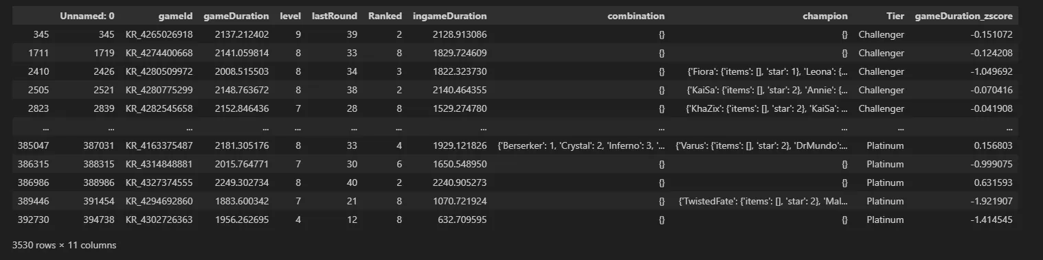
del set2['Unnamed: 0']
# 정말 시즌 2 경기라면 8명이 모여 있을 것이므로 gameId 기준 그룹화 후 개수 세기
set2.groupby('gameId').count()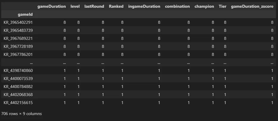
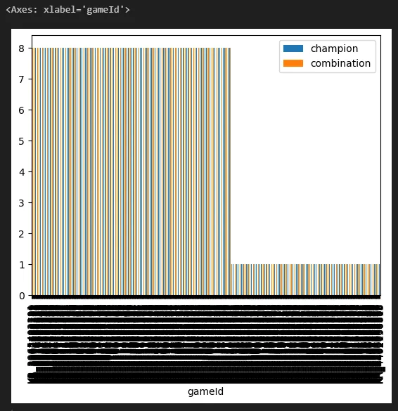
# 인원 8명인 경기만 골라내고 저장
set2_game = set2.groupby('gameId').filter(lambda x: len(x)==8)
set2_game.to_csv('C:/Users/Pigeon/Desktop/set2_game.csv')
# 인원이 8명 아닌 경기는 시즌 3 경기
# 테이블에서 시즌 2인 경기만 제거하고 저장
idx_set2 = set2_game.index
set3 = df.drop(idx_set2)
del set3['Unnamed: 0']
set3.to_csv('C:/Users/Pigeon/Desktop/set3_game.csv')시즌2, 시즌3 파이그래프
import pandas as pd
import numpy as np
import time
from PIL import Image
import altair as alt
import seaborn as sns
import matplotlib.pyplot as plt
import datapane as dp
# seaborn 팔레트 설정
palette = sns.color_palette("pastel")

# pandas 라이브러리를 활용한 csv 파일 읽기
set2 = pd.read_csv("set2_game.csv", index_col=0)
set3 = pd.read_csv("set3_game.csv", index_col=0)

del set3['gameDuration_zscore']
del set2['gameDuration_zscore']

# 합치기 전 구분자 달기
set3['Set'] = 'Set3'
set2['Set'] = 'Set2'

df = pd.concat([set3, set2], ignore_index=True)

df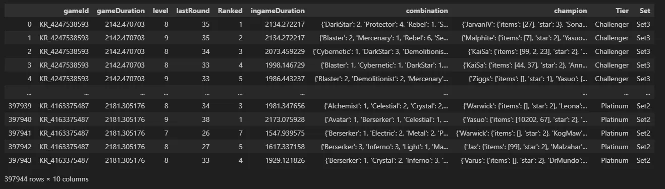
df.groupby('Set').describe()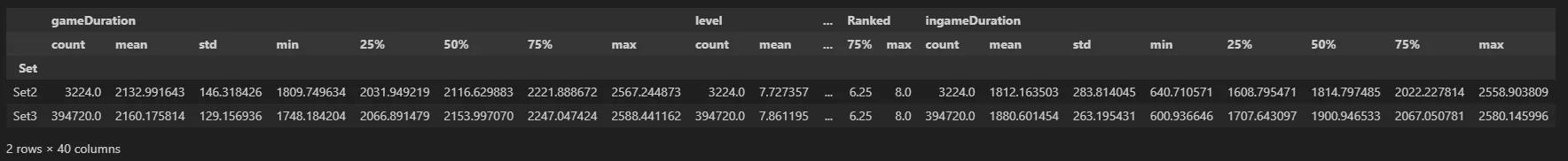
# 파이 차트 그리기
df_pie = df.groupby('Set')['gameId'].nunique().reset_index()

# matplotlib 라이브러리를 통한 그래프 그리기
# labels 옵션을 통해 그룹값을 표현해줄 수 있습니다.
dplot_pie= plt.figure(figsize=(3,3))
plt.pie(
    x=df_pie['gameId'],
    labels=df_pie['Set'],
    # 소수점 첫째자리까지 표시
    autopct='%1.1f',
    colors=['#F4D13B','#9b59b6'],
    startangle=90
)
# 범례 표시하기
plt.legend(df_pie['Set'])
# 타이틀명, 타이틀 위치 왼쪽, 타이틀 여백 50, 글자크기, 굵게 설정
plt.title("pie plot", loc="left", pad=50, fontsize=8, fontweight="bold")
plt.show()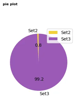

2 B R 0 2 B