
1. 라이브러리 설치
npm install react-native-paper2. TextInput 기본 사용법
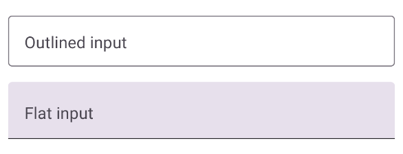
import { TextInput } from 'react-native-paper';
  <TextInput
  style={{ marginTop: 15 }}
  label='Outlined input'
  mode='outlined'
  />
  <TextInput
    style={{ marginTop: 15 }}
    label='Flat input'
    mode='flat'
  />
기본 디자인
3. TextInput 스타일 수정하는 방법
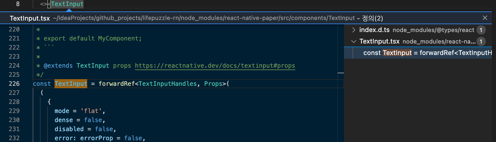
TextInput 컴포넌트가 정의된 코드를 따라가면 디자인(테두리 두께, 색상 등등)을 결정하는 값을 확인할 수 있다.
- TextInput.tsx
1) 텍스트 색상을 결정하는 코드
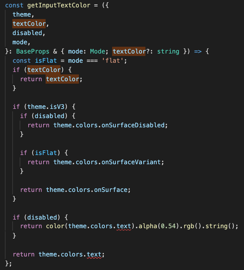
텍스트 색상값은 아래와 같이 정리할수 있다.
- textColor 우선 적용
- 비활성: theme.colors.onSurfaceDisabled
- flat 유형: theme.colors.onSurfaceVariant
- outlined 유형: theme.colors.onSurface
textColor 의 경우,
textInput의 유형, 활성여부와 관련없이 항상 같은 색상이 나오게 되므로, textColor보다 theme를 사용하는것이 더 입체적? 이다.
2) 밑줄 또는 테두리를 결정하는 코드
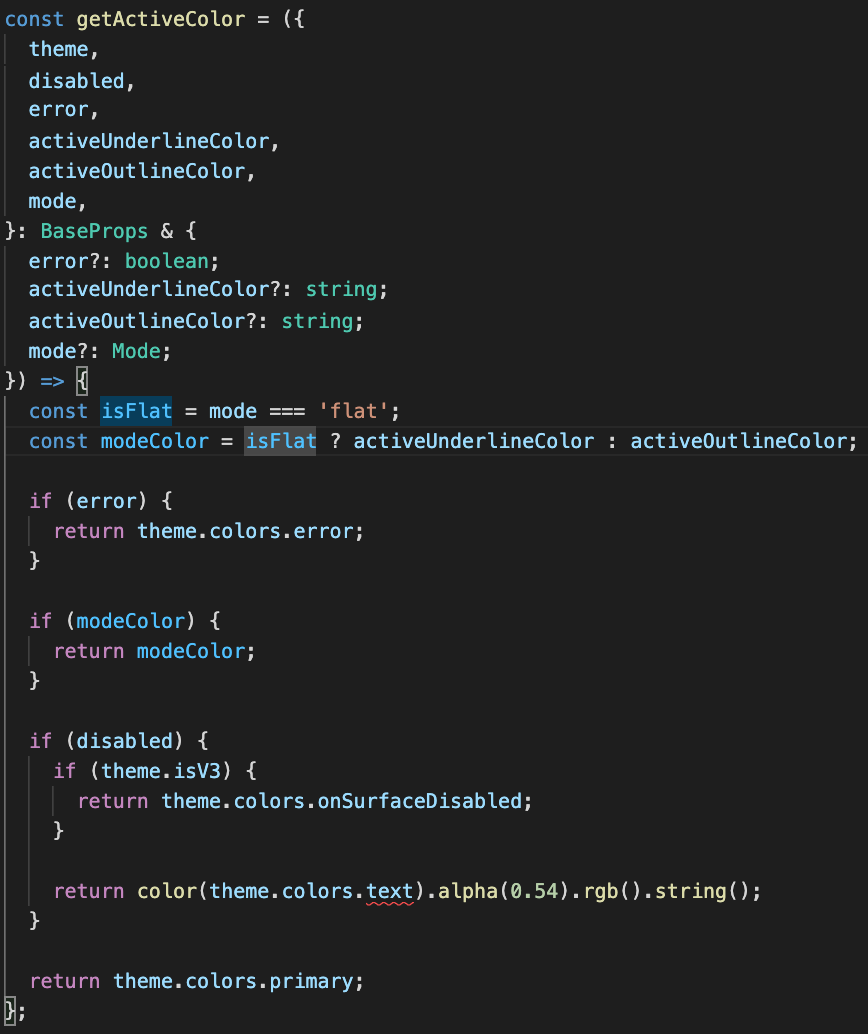
위 코드는 아래와 같이 정리할수 있다.
- flat 유형: activeUnderlineColor
- outlined 유형: activeOutlineColor
- 비활성: theme.colors.onSurfaceDisabled
- 그외: theme.colors.primary
activeUnderlineColor와 activeOutlineColor 사용시 조금 어색한 부분들이 있어, theme만을 활용해 디자인을 수정하기로 했다.
정리하면, flat와 outlined 의 주요 설정값은 아래와 같다.
const flatTheme = {
    colors: {
      /*active 밑줄*/
      primary: '',

      secondary:'',

      outline:'',

      /*disabled 배경색, 기본 밑줄*/
      onSurface: '',

      /*기본 배경색*/
      surfaceVariant: '',

      /*disabled(텍스트,밑줄,placeholder)*/
      onSurfaceDisabled:'',

      /*기본 텍스트, 기본 placeholder 색상*/
      onSurfaceVariant:'',
    }
  };
const outlinedTheme = {
    /*테두리 굴곡*/
    roundness: 4,

    colors: {
      /*active 테두리*/
      primary: '',

      secondary:'',

      /*기본 테두리*/
      outline:'',

      /*기본 텍스트*/
      onSurface: '',

      surfaceVariant: '',

      /*기본 배경색*/
      background:'',

      /*disabled 테두리*/
      surfaceDisabled:'',

      /*disabled(텍스트,placeholder)*/
      onSurfaceDisabled:'',

      /*기본 placeholder*/
      onSurfaceVariant:'',
    }
  };
4. 테마를 적용시켜보자
테마 code
const flatTheme = {
    colors: {
      primary: Color.PRIMARY_LIGHT,
      secondary:'',
      outline:'',
      onSurface: Color.LIGHT_GRAY,
      surfaceVariant: 'transparent',
      onSurfaceDisabled:Color.DARK_GRAY,
      onSurfaceVariant: Color.BLACK ,
    }
  };
const outlinedTheme = {
    roundness: 4,
    colors: {
      primary: Color.PRIMARY_LIGHT,
      secondary:'',
      outline: Color.LIGHT_GRAY,
      onSurface: Color.BLACK,
      surfaceVariant: '',
      background:isFocused == true ? '#F7FDFF' : '#FDFDFD',
      surfaceDisabled:Color.LIGHT_GRAY,
      onSurfaceDisabled:Color.DARK_GRAY,
      onSurfaceVariant:Color.BLACK,
    }
  };
적용된 TextInput
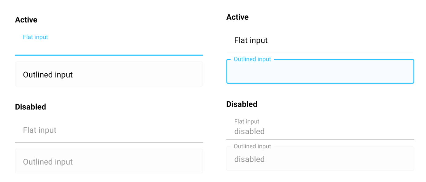
정리
테마를 활용한 디자인 수정은 사용하기만 했던 라이브러리의 코드 읽고 개발 방식을 배울수 있는 시간이었다. 다음에는 이외에 추가로 수정한 내용도 정리하고, dark/light에 따른 테마 설정법도 익혀둬야겠다.
- focus 여부에 따라, outlined 배경색 설정
- outlined의 테두리 굵기 얇게 수정
- right 아이콘 추가하기
- dark,light 테마 설정하기
be_zion