73. exercise: startup landing page 5
How bootstrap does layout
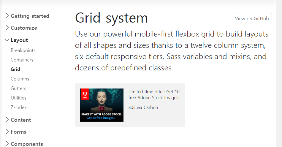
How grid works with bootstrap
  <body>
    <div class="container">
    <h1 class="text-uppercase"><strong>The biggest startup event of the year</strong></h1>
    <hr>
    <button class="btn btn-primary btn-xl">find out more</button>
    </div>
using div class="container"

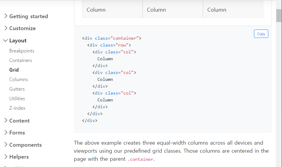
we have everything in a container.
row
We want to ideally all of these things to be in a row.
We want the "h1", the "hr" and the "button" to just be a row.
One row that we have that is in the center of the page.
<div class="container">
  <div class="row">
  <h1 class="text-uppercase"><strong>The biggest startup event of the year</strong></h1>
  <hr>
  <button class="btn btn-primary btn-xl">find out more</button>
  </div>
</div>
give it a class of "row". so once again let's close the "div"
using div class="row"

^we may have lost the "hr" we'll get back to that in a second.
<div class="row">
  <header class="text-center">
   <h1 class="text-uppercase"><strong>The biggest startup event of the year</strong></h1>
  </header>
  <hr>
  <button class="btn btn-primary btn-xl">find out more</button>
</div>
the header element will contain the "h1" over here.
and class="text-center"

<section class="text-center">
  <hr>
  <button class="btn btn-primary btn-xl">find out more</button>
</section>
Why isn't this center?
using ctrl+shift+I (window)
using CMD+OPT+I(mac)
using column to solve this problem.
Because bootstrap uses a 12 grid system
we can just say in here in the header we want the column.
<div class="container">
  <div class="row">
    <header class="text-center col-12">
     <h1 class="text-uppercase"><strong>The biggest startup event of the year</strong></h1>
    </header>
    <section class="text-center col-12">
      <hr>
      <button class="btn btn-primary btn-xl">find out more</button>
    </section>
  </div>
</div>
using column,
header class="text-center col-12"

Our text and button it's still at the top.
How can we fix this?
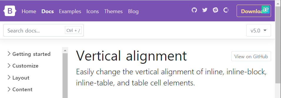
^If I actually search vertical alignment here, you'll see that Bootstrap has some vertical alignment options.
Vertical alignment has inline, inline-block, inline-table, and table cell elements.
But this is not the recommended way.
flex
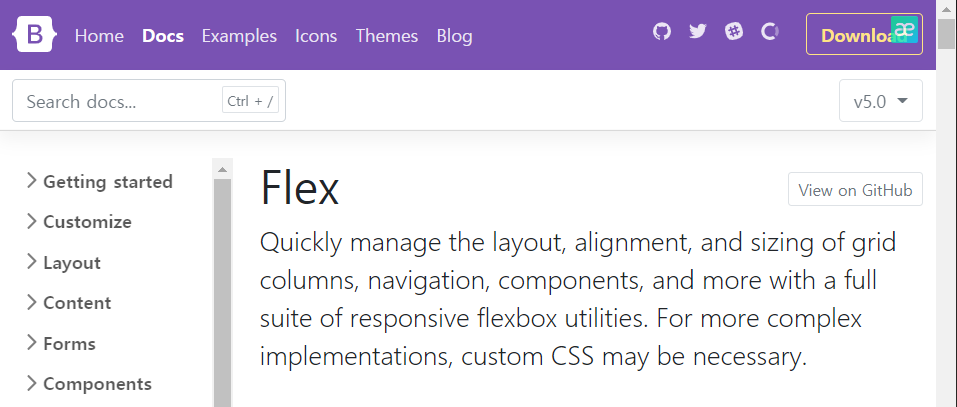
<div class="container d-flex">
using d-flex to the container,
we can enabled flexbox.
we want to make sure that we can place things vertically in the center.
and if we scroll down is what we want right here "align-items"
https://getbootstrap.com/docs/5.0/utilities/flex/
<div class="d-flex align-items-center">...</div>^which means below.
but it doesn't working.
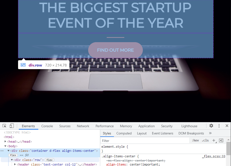
you see here how everything is in the container.
As a matter of fact, if we look at the container we're actually aligning items in the center.
But the container is actually not the full page. it's only the top part.
You see how we have height of 100%
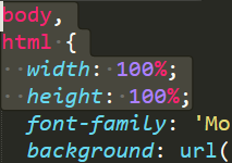
all we need to do is tell the container that I want you to span the entire height of the page.
<div class="container d-flex align-items-center h-100">we can do that by saying "h-100" instead of adding the CSS stuff.


^You'll see that my container is now the full length of the page
and our writing is right in the middle.


^everything is centered whatever the screen size is
I want to another section in between these two to hopefully buffer them away from each other so we can
 </header>
        <div class="buffer"></div>
We can just add a new div and we'll give it a class here of "buffer" that we'll have to write ourselves.
and this buffer class will be in between the header and then the horizontal line.
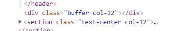
You'll see here that I have the buffer but the buffer doesn't have anything.
.buffer{
	height: 50px;
}
/*style.css*/

(before/after)
now I have a 50px height buffer.
I always like using "rem" instead of "px"s so let's do "rem".


^(5rem/10rem)

A Startup Tech Consultant helps new businesses navigate the complexities of technology. They provide guidance on selecting the right tools and implementing systems that support the startup's growth and success.