justify-items
https://css-tricks.com/almanac/properties/j/justify-items/
.container{
    display: grid;
    grid-gap: 20px;
    grid-template-columns: 1fr 1fr 2fr;
    grid-template-rows: 1fr;
    justify-items: stretch;
}
Default is stretch.
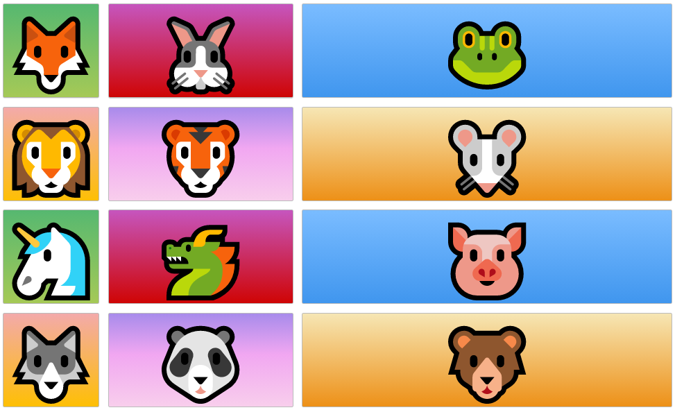
justify-items: start;
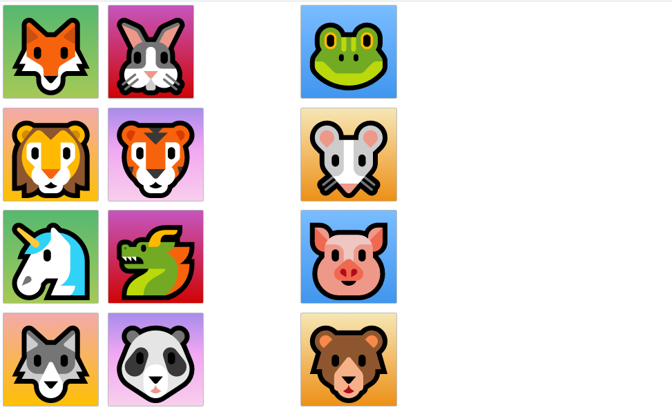
^ it aligns the contents in a grid item along what we call the row axes.
justify-items: end;

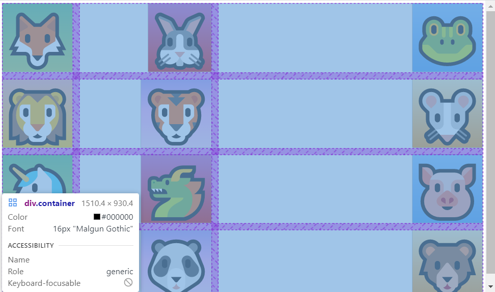
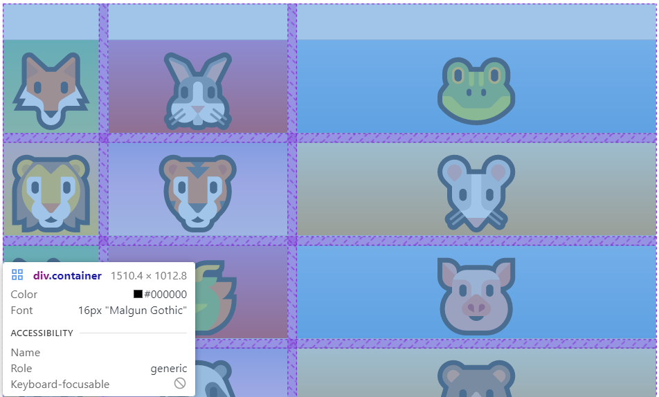
.container{
    display: grid;
    grid-gap: 20px;
    grid-template-columns: auto 1fr 2fr;
    grid-template-rows: 300px;
    align-items: end;
}
repeat(3,1fr)
.container{
    display: grid;
    grid-gap: 20px;
    grid-template-columns: repeat(3,1fr);
    grid-template-rows: 1fr;
}
But as soon as we make it too small or too big it's just it's not extremely responsive or it's not 100.
auto-fill
.container{
    display: grid;
    grid-gap: 20px;
    grid-template-columns: repeat(auto-fill, 300px);
    grid-template-rows: 1fr;
}

Our grid system or the column system adjusts auto fills according to the size of Our viewport which is really really nice.
But right now I just said 300px.
So again it's not super super responsive.
minmax()
.container{
    display: grid;
    grid-gap: 20px;
    grid-template-columns: repeat(auto-fill, minmax(200px,1fr));
    grid-template-rows: 1fr;
}
We'll see by doing this they'll will automatically adjust to the size of the view port.
If the viewport is really very small and goes below 200px, it adjust like third one.


cf. fr means fraction
