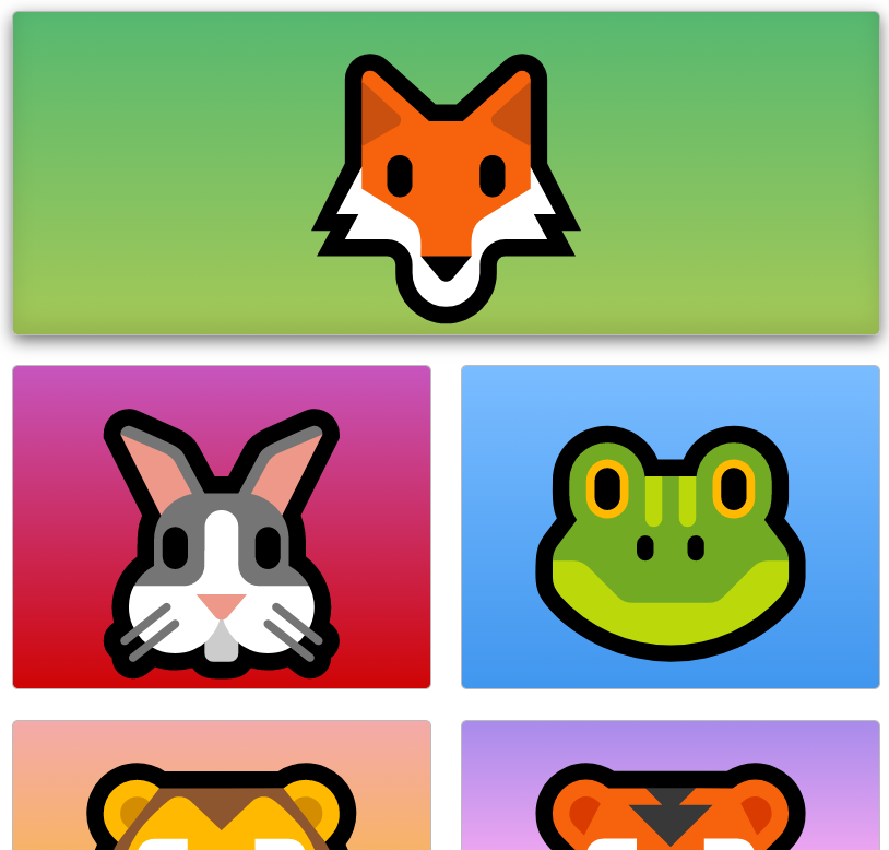
grid-column
.green{
    grid-column-start:1;
    grid-column-end:3;
}
Fox grid starts from 1 and ends at 3.
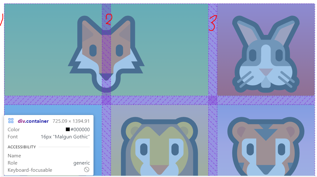
if grid-column-end:4; then fox ends 4.
If we make it smaller, this is not that responsive because we said one to four it doesn't actually make it as responsible as it was before and it actually extends to make sure that it fills in one to four.
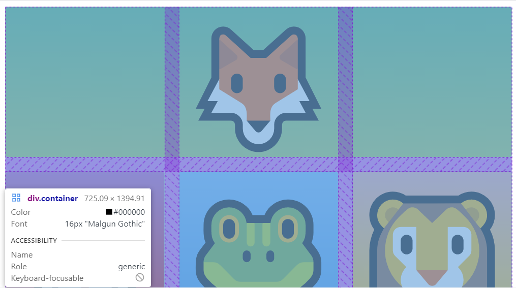
And there's a shorthand way of doing this.
Instead of saying grid-column-start:1;
grid-column-end:3;
.green{
    grid-column:1/4;
}
^this is same thing.
.green{
    grid-column:1/-1;
}
^which means all the way till the end.
CSS grid -1 signifies the end of the viewport.
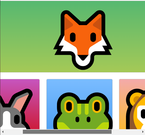
span
default is span 1.
.green{
    grid-column:span 2;
}
span across two grids.
^You see that green is spanning across two grids.
.green{
    grid-column:span 2;
    grid-row: 1/3;
}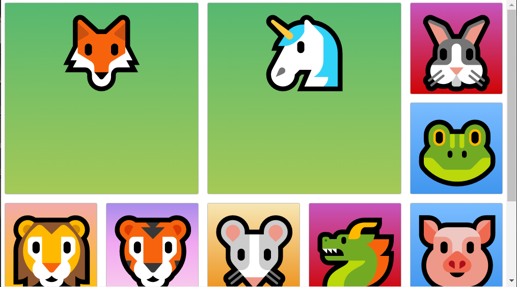
unicorn automatically moved it all the way up because we wanted to start at one as well.
