95. Solution: Navigation bar 2
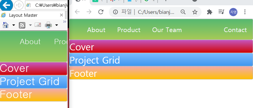
^left:Explorer, right:Chrome
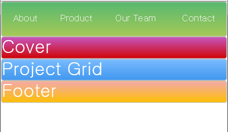
In Explorer, there's a problem of the view getting a little bit ugly with our navigation as we became smaller and smaller with our viewport.
But in Chrome, there insn't the problem because chrome makes the view limit which is not going to be too small.
Anyway, I'm going to figure out the problem in the Explorer.
Media Query
https://css-tricks.com/snippets/css/media-queries-for-standard-devices/
Depends on devices that have different screen sizes Media Query tells it how to display our web page based on those sizes.
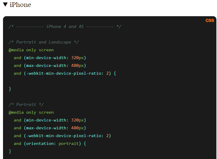
^For example here it shows us what our viewports will be for iPhone4 and iPhone4s and using this syntax of @ media only screen and giving it some min-device-width and max-device-width.
We can tell it how to display our page or have CSS properties specific to just this view size
that is minimum view size is going to be 320 pixel and max is 480 pixels.
let's create our own media query for our navigation.
In order to do that, all we need to do is say '@media' we say 'only screen' and this is saying what do we want our media query for.
@media only screen and (max-width: 600px){
    .main-nav{
        font-size: 0.5em;
        padding: 0;
    }
}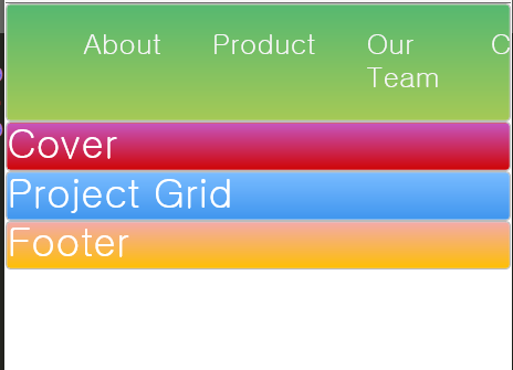
^before
^after
Everything fits in because our font size is smaller and we've removed any extra padding that we may have.
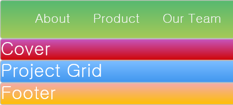
^But notice here as I make thins bigger you see that as soon as I pass 600px we restore our defaults with larger font size.
