
📖 학습한 내용
- iris 데이터 분류하기
- 데이터 가져오기 및 전처리
- EDA
- sklearn - 서울시 범죄 분석
📖 핵심내용
📌 iris 데이터 분류하기
데이터 전처리
- 마스킹으로 원하는 정보 가져오기
iris["Species"]=='Iris-setosa'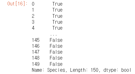
-> 이렇게 컬럼 Species 의 bool값이 반환된다.
iris[iris["Species"]=='Iris-setosa']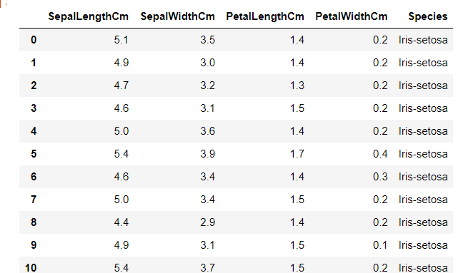
-> 데이터 프레임 안에 반환된 값을 넣으면 자동으로 그 컬럼의 알맞는 값만 추려진 전체 데이터프레임이 출력된다.
-> 데이터프레임 전체가 출력된다는게 잘 상상이 안가므로 꼭 기억해야하는 점
EDA
- 가져온 데이터프레임을 살펴보고 대략적으로 파악 -> 결측치가 없다는 것을 알게됨
- 데이터별로 그래프를 그려가면서 어떻게 분석을 할지 구상 -> 사람이 구분하기 쉬운 것은 컴퓨터도 구분하기 쉬울 확률이 높다!
세팔길이 - 세팔폭
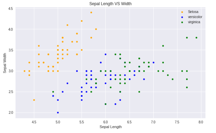
-> 노란색은 사람이 봐도 구분하기 쉬워보여도, 파란색/초록색은 어려워보임
페팔길이 - 페팔폭
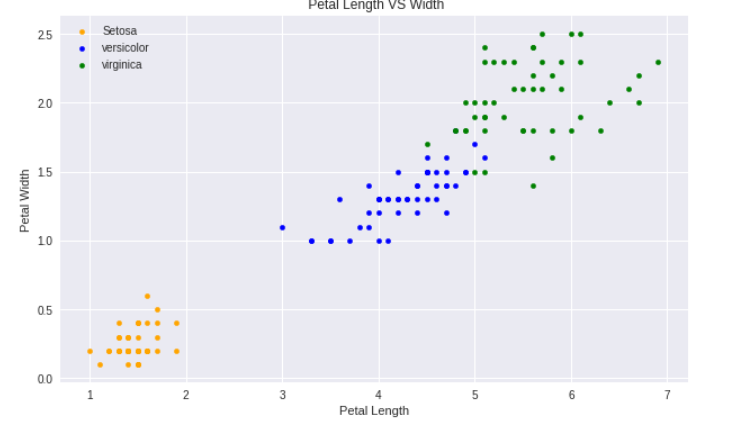
-> 위와 마찬가지
matplotlib의 서브플랏 기능을 활용하여서 한번에 여러개보기 (바이올릿 플랫)
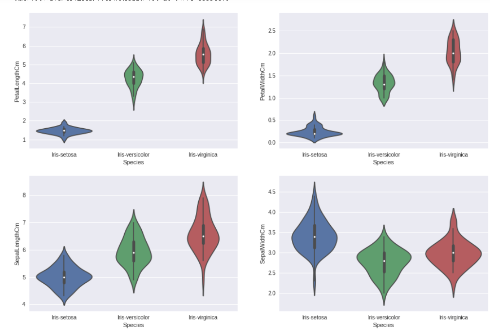
-> 종의 분포를 보니, 그래프의 상단처럼 세팔로 구분 지었을때 상당히 겹치는 부분이 없는 것을 앎
※ EDA 결론
페팔길이-페팔폭으로 하면 정확도가 올라갈 것이라고 기대!
sklearn
- '사이키런 라이브러리'라고 불린다
- 머신 러닝에 필요한 기능과, 머신러닝 모델이 많이 들어가있다.
corr()
- 값은 -1 ~ 1 사이
- 1에 가깝다는 하나의 값이 커지면 다른 하나의 값이 커진다
- -1에 가깝다는 하나의 값이 커지면 다른 하나의 값이 작아진다
- 1과 -1에 가까울 수록 관계가 있다는 것을 판단할 수 있다.
- iris 데이터에서 상관관계 찾아보기
## 맨 마지막 것 제외하고 마스킹
iris[iris.columns[:-1]].corr()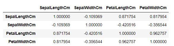
-> 데이터가 얼마 없어서 바로 0.96이 눈에 띈다. 데이터가 매우 많을 때를 대비하여 더 눈에 띄게 히트맵으로 바꿔보자
plt.figure(figsize=(7,4))
sns.heatmap(iris[iris.columns[:-1]].corr(),annot=True,cmap='cubehelix_r')
plt.show()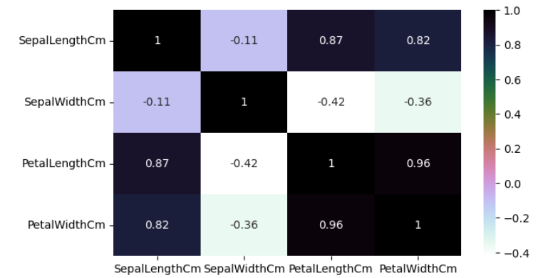
-> 원래 0이 흰색이고 위아래로갈 수록 극명한 색이면 좋은데.. 어쨌든 아주 검정이거나 아주 파랑일 수록 좋다
- train_test_split()
보통 총 데이터를 나눌때 비율 : ( 훈련할 데이터 : 테스트할 데이터 = 7 : 3 )
train, test = train_test_split(iris, test_size = 0.3, random_state=42)
-> iris 데이터프레임 학습,테스트데이터 비율 0.3, 랜덤한 값 42로 고정
random_state을 어떤 값으로 정하면, 다음에 해도 동일한 랜덤값을 얻을 수 있다.
-> 모델에 넣는 데이터에 따라서 결과값이 달라지기 때문에 비교할때 필요하거나, 남들과 같은 값으로 넣을 때 필요하다
머신러닝
- 보통 x에는 피처만 넣고, y에는 맞춰야할 라벨을 넣는다.
- 모델 데이터 변수 잡을때 테스트 데이터와 트레인 데이터를 지정해준다
train_X = train[['SepalLengthCm','SepalWidthCm','PetalLengthCm','PetalWidthCm']]# taking the training data features
train_y=train.Species# output of our training data
test_X= test[['SepalLengthCm','SepalWidthCm','PetalLengthCm','PetalWidthCm']] # taking test data features
test_y =test.Species   #output value of test data
-> 있는 데이터를 다 지정해서 넣어봄: 세팔길이,세팔폭,페탈길이,페탈폭
- 여러 모델을 생성할때 모델이름을 다 다르게 설정해주는 것이 좋다.
여러가지 모델
SVM, Logistic Regression, Decision Tree, K-Nearest Neighbours
- 형태
model = 원하는 머신러닝
model.fit(train_X,train_y)
prediction=model.predict(test_X)
-> 결국은 원하는 머신러닝 형태 지정하고, 학습값을 넣고, 테스트값을 넣어서 정확도를 출력하는 과정이다.
머신러닝 결과 비교 (SVC)
EDA 했을때 페탈길이, 페탈폭 데이터가 들어가면 좋을 것이라고 생각됨
-> (세팔길이, 세팔폭)을 넣었을때와, (페탈길이, 페탈폭) 넣었을 때를 비교
-> 이때 random_state를 고정하여 똑같은 랜덤한 입력값으로 비교할 수 있다!
model=svm.SVC() # 페탈만 했을때 결과?
model.fit(train_x_p,train_y_p)
prediction=model.predict(test_x_p)
print('The accuracy of the SVM using Petals is:',metrics.accuracy_score(prediction,test_y_p))

model=svm.SVC() # 세팔만 했을때 결과?
model.fit(train_x_s,train_y_s)
prediction=model.predict(test_x_s)
print('The accuracy of the SVM using Sepal is:',metrics.accuracy_score(prediction,test_y_s))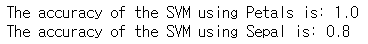
-> EDA에서 본것처럼 페팔끼리 비교한 것은 더 높은 정확도, 페팔끼리 비교한 것은 더 낮은 정확도인 것을 확인 할 수 있다.
- 그렇다면 피처를 있는데로 다 넣는 것이 좋나?
그렇지 않다. 이번 결과에서는 모두 맞추는 것으로 나와서, 페팔만 넣었을때와 차이가 없었다. 하지만, 데이터양이 많을 수록 잘못된 결과가 나오기 더 쉬워진다. 이런것을 차원의 저주라고 한다.
📌 서울시 범죄 분석
데이터 불러오기 및 전처리
데이터를 불러온 뒤, 항상 어떤 데이터인지 파악해야한다.
DF객체.info()
원하는 데이터 선택과 데이터프레임 조작을 할 수 있어야한다.
마스킹
슬라이싱
columns 키워드
loc
iloc
at
iat
in
mean()
& , |
json에서 필요한 정보 가져오기
json.load() 제이슨 파일을 읽어오는 함수
읽어온 제이슨 파일의 데이터를 확인해서 기존의 데이터프레임과 활용한 부분을 찾아야한다.
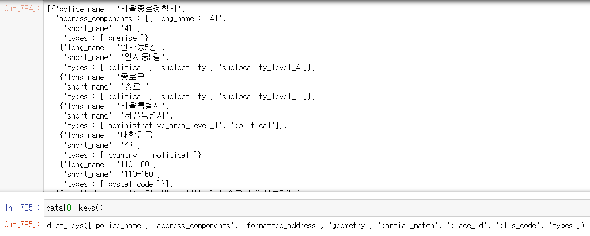
-> 서 이름으로 데이터프레임과 연결할 수 있을 것 같다.
-> 그외에도 주소값과, 위도 경도를 알 수 있어서 지도에 표기해 볼 수 있을 것 같다는 것을 파악!
데이터병합
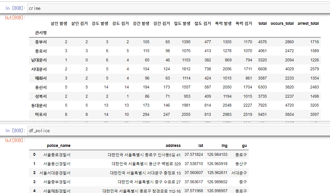
-> 두개의 데이터프레임의 공통점은 경찰서명이 있다는것.
-> crime DF의 관서명을 변경하여 df_police와 똑같이 만들어주자
station_name = []

for name in crime.index:
    station_name.append("서울" + str(name[:-1] +"경찰서"))

crime["police_name"] = station_name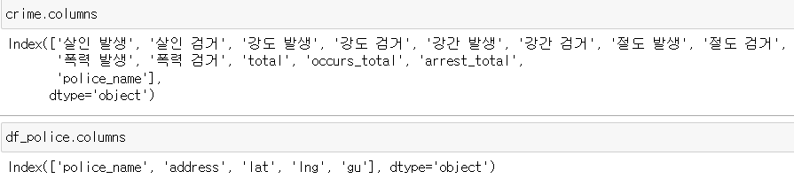
-> 컬럼명이 동일해졌으므로, 서로 병합해본다 ( merge() )
# inner조인
crime_police_inner = pd.merge(left=crime,
                              right = df_police,
                              how = 'inner',
                              on=None)
# outer조인
crime_police_outer = pd.merge(left=crime,
right = df_police,
how = 'outer',
on=None)-> inner조인은 공통된 데이터만 병합되고, outer조인은 공통된게 없어도 NaN으로 채우면서 새로운 행을 만든다.
지도시각화
-
iterrows()
데이터프레임의 각 행마다 데이터를 시리즈로 가져오고, 그 행의 인덱스를 같이 반환한다. -
맵에 표현할 수 있는 함수
folium.Marker() : 마커를 띄운다.
folium.Circle() : 원을 그린다.
📖 흥미로운 점 / 새로 알게된 점
- axis
어떨때는 가로, 어땔때는 세로 여서 너무 헷갈렸지만, 완벽한 구분 방법을 깨우쳤다.
1. axis = 0 -> 행 또는 행 방향
행이나 열을 선택해야할 때는 0 이고, 어떤 방향으로 뭔가를 한다면 행 방향(세로)이다.
2. axis = 1 -> 열 또는 열방향
행이나 열을 선택해야할 때는 1 이고, 어떤 방향으로 뭔가를 한다면 열 방향(가로)이다.
- 히스토그램은 막대그래프와 다르다.
막대그래프 - 범위가 없어서 떨어진 형태가 될 수 있다.
히스트그램 - 범위가 있어서 쭉 붙어진 형태만 된다.
-
그래프를 그리면 그래프 위에 간단한 설명이 붙게되는데 이것을 없애는 방법
- plt.show()
- pass
- 마지막문구;
-
트레인 데이터와 테스트 데이터 나누기
테스트 데이터는 훈련에 절대 넣으면 안된다
train_test_split -
train_test_split의 random_state=42 가 많이 쓰인다..
-
제이슨 파일의 데이터를 활용하기 위해서 형태를 변경할때, 리스트에 담긴 딕셔너리 형태로 제작하자.
데이터 프레임에 넣을 때 매우 편하기 때문이다.
-> 관리포인트 하나 줄여주기
police_info_list = []
for i in data:
    inner_dict = {}
    inner_dict["police_name"] = i["police_name"]
    inner_dict['address'] = i["formatted_address"]
    inner_dict['lat'] = i["geometry"]['location']['lat']
    inner_dict['lng'] =i["geometry"]['location']['lng']
    inner_dict['gu'] =i['formatted_address'].split(" ")[2]

police_info_list.append(inner_dict)- 병합할때 컬럼명이 같다면(또는 공통으로할 컬럼을 지정해준다면) 그 컬럼의 이 알아서 공통된 것은 자동으로 맞춰진다. 좌우순서가 알아서 공통된 값 기준으로 바뀌며 중복되지 않게 만들어진다.
📖 이후 학습 계획
- 머신러닝의 알고리즘에 대해 공부
📖 기타
- 머신러닝 알고리즘이 언제 쓰이고 왜 쓰이고 어떤 것인지만 알면, 데이터를 전처리하는데 시간이 쓰이는 것을 알았다.
데이터 수집과 전처리 능력 그리고 알고리즘의 대한 이해를 늘려가면 될 것 같다.
그리곤 이젠 오늘 배웠던 내용만 복습하고 소화하기도 힘들어졌다. 다른 것을 추가로 하기가 너무 어렵다. 마음은 바쁜데 능력이 되질 않아 슬프다..
