해당 내용은 Udemy 강의 'Pandas 및 Python을 이용한 데이터 분석:마스터 클래스'를 수강 후 정리한 내용입니다.
Section1
BASIC SINGLE LINE PLOT
# The plot method on Pandas Series and DataFrames is just a simple wrapper around plt.plot():

import matplotlib.pyplot as plt
import pandas as pd
# Use matplotlib on the Pandas DataFrame to plot the data
investment_df.plot(x='Date', y='BTC-USD Price', label='Bitcoin Price', linewidth=3, figsize=(14, 6))
# label의 위치 수정
plt.ylabel('Price [$]')
plt.xlabel('Date')
plt.title('My First Data Visualization Code!')
plt.legend(loc='lower right')
plt.grid()MINI CHALLENGE #1:
- Plot similar kind of graph for Ethereum instead
- Change the line color to red
investment_df.plot(x='Date', y='ETH-USD Price', label='Ethereum Price', linewidth=2, figsize=(14, 6), color='r')
plt.xlabel('Date')
plt.ylabel('Price [$]')
plt.title('MINI CHALLENGE #1')
plt.grid()
plt.legend(loc='lower right')
plt.show()
Section2
DOWNLOAD DATA DIRECTLY FROM YAHOO FINANCE
# yfinance library offers an easy, reliable and Pythonic way to download market data from Yahoo finance
! pip install yfinance
import yfinance as yf
# List all Ticker Symbols in the list below, let's start with one!
investments_list = ['BTC-USD']
# Specify the start and end dates
start = datetime.datetime(2010, 1, 1)
end = datetime.datetime(2021, 5, 16)
# Download the data from Yahoo Finance, make sure to reset index!
df = yf.download(investments_list, start=start, end=end)# Reset index as follows:
df.reset_index(inplace=True)
dfMINI CHALLENGE #2:
- Use Yahoo Finance to download Ethereum data instead of BTC
- USe Yahoo Finance to download BTC, ETH, and LTC
# ETH data

investments_list = ['ETH-USD']

start = datetime.datetime(2010, 1, 1)
end = datetime.datetime(2021, 5, 16)

eth_df = yf.download(investments_list, start=start, end=end)
eth_df
# BTC, ETH and LTC
investments_list = ['BTC-USD','ETH-USD', 'LTC-USD']
start = datetime.datetime(2010, 1, 1)
end = datetime.datetime(2021, 5, 16)
finance_df = yf.download(investments_list, start=start, end=end)
finance_dfSection3
MULTIPLE PLOTS
investment_df.plot(x='Date', y=['BTC-USD Price', 'ETH-USD Price'], linewidth=2, figsize=(14,6))
plt.ylabel('Price')
plt.title('Crypto Prices')
plt.grid()
MINI CHALLENGE #3:
- Add Litecoin (LTC) to the list and plot similar kind of graph showing all three crypto currencies
investment_df.plot(x='Date', y=['BTC-USD Price', 'ETH-USD Price', 'LTC-USD Price'], linewidth=1, figsize=(14,6))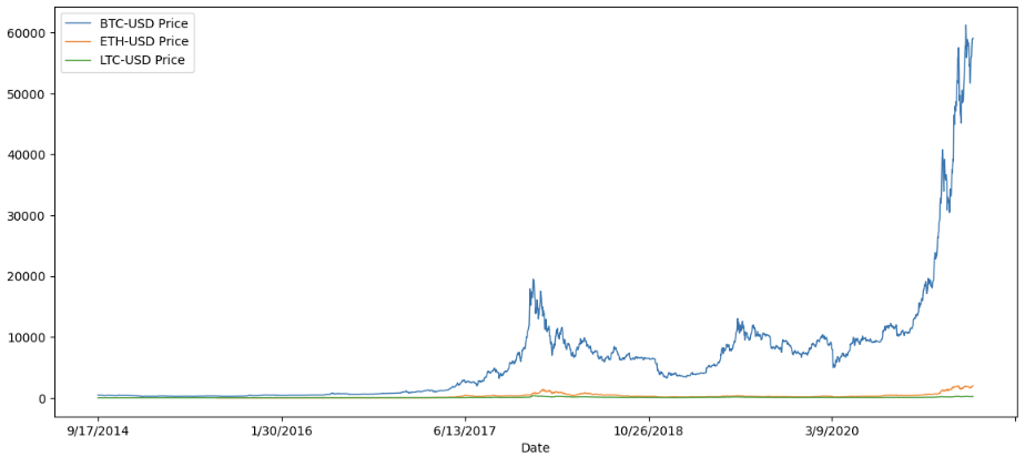
Section4
SUBPLOTS
investment_df.plot(x='Date', title='Crypto Prices', subplots=True, grid=True, figsize=(15,25))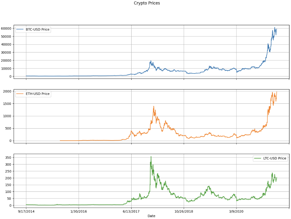
MINI CHALLENGE #4:
- Try to set subplots = False and examine the output.
investment_df.plot(x='Date', title='Crypto Prices', subplots=False, grid=True, figsize=(15,25))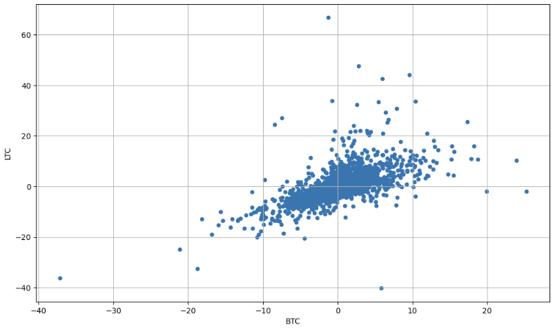
investment_df.plot(x='Date', y=['BTC-USD Price', 'ETH-USD Price', 'LTC-USD Price'], linewidth=1, figsize=(14,6))결과와 동일
Section5
SCATTERPLOT
# Read daily return data using pandas

daily_return_df = pd.read_csv('crypto_daily_returns.csv')
daily_return_df
# Plot Daily returns of BTC vs. ETH
daily_return_df.plot.scatter('BTC', 'ETH', grid=True, figsize=(12,7))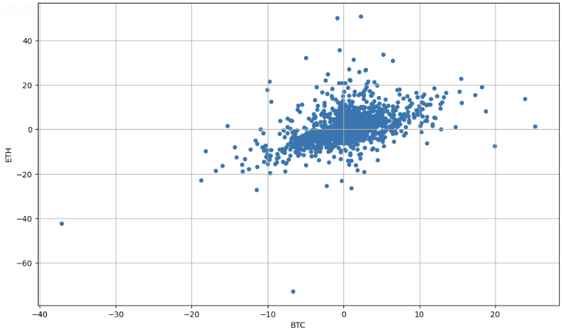
MINI CHALLENGE #5:
- Plot the daily returns of BTC vs. LTC
# Plot Daily returns of BTC vs. LTC

daily_return_df.plot.scatter('BTC', 'LTC', grid=True, figsize=(12,7))
Section6
PIE CHART
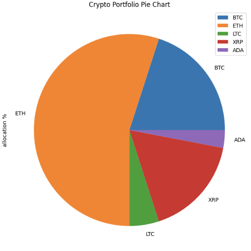
# Define a dictionary with all crypto allocation in a portfolio
# Note that total summation = 100%

my_dict = {'allocation %': [20, 55, 5, 17, 3]}
my_dict
crypto_df = pd.DataFrame(data=my_dict, index=['BTC', 'ETH', 'LTC', 'XRP', 'ADA'])
crypto_df# Use matplotlib to plot a pie chart
crypto_df.plot.pie(y='allocation %', figsize=(8,8))
plt.title('Crypto Portfolio Pie Chart')pie chart의 경우 y의 인자 필요
MINI CHALLENGE #6:
- Assume that you became bullish on XRP and decided to allocate 60% of your assets in it. You also decided to equally divide the rest of your assets in other coins (BTC, LTC, ADA, and ETH). Change the allocations and plot the pie chart.
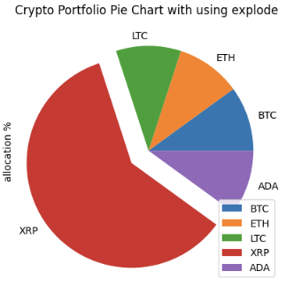
- Use 'explode' to increase the separation between XRP and the rest of the portfolio (External Research is Required)
my_dict = {'allocation %': [10, 10, 10, 60, 10]}
crypto_df = pd.DataFrame(data=my_dict, index=['BTC', 'ETH', 'LTC', 'XRP', 'ADA'])
crypto_df.plot.pie(y='allocation %')
plt.title('Crypto Portfolio Pie Chart')explode = (0, 0, 0, 0.2, 0)
crypto_df.plot.pie(y='allocation %', explode=explode)
plt.title('Crypto Portfolio Pie Chart')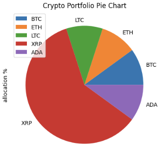
Section7
HISTOGRAMS
# A histogram represents data using bars with various heights
# Each bar groups numbers into specific ranges
# Taller bars show that more data falls within that specific range
daily_return_df = pd.read_csv('crypto_daily_returns.csv')
daily_return_df# Find the statistical value of the distribution
mu = daily_return_df['BTC'].mean()
sigma = daily_return_df['BTC'].std()
# Visualization
plt.figure(figsize=(12, 6))
# alpha는 graph의 투명도
daily_return_df['BTC'].plot.hist(bins=50, alpha=0.5)
plt.grid()
plt.title('Histogram: mu=' + str(mu) + ', sigma=' + str(sigma))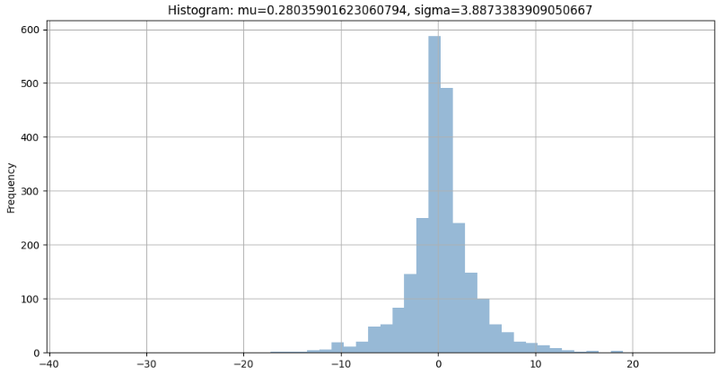
MINI CHALLENGE #7:
- Plot the histogram for ETH returns using 30 bins with red color
# Find the statistical value of the distribution

mu = daily_return_df['ETH'].mean()
sigma = daily_return_df['ETH'].std()

# Visualization

plt.figure(figsize=(12, 6))
daily_return_df['ETH'].plot.hist(bins=30, alpha=0.5, color='r')

plt.grid()
plt.title('Histogram: mu=' + str(mu) + ', sigma=' + str(sigma))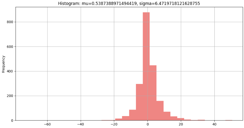

데이터를 향해, 한 걸음씩 천천히.