요소 정렬1
<!DOCTYPE html>
<html>
<head>
<meta charset="UTF-8">
<title>요소 정렬</title>
<style type="text/css">
.picture1 {
width: 200px;
height: 150px;
background-color: tomato;
float: left;
margin-right: 10px;
margin-bottom: 10px;
}
.text1 {
clear: left;
}
.picture2 {
width: 200px;
height: 150px;
background-color: skyblue;
float: right;
margin-left: 10px;
margin-bottom: 10px;
}
.text2 {
clear: right;
}
</style>
</head>
<body>
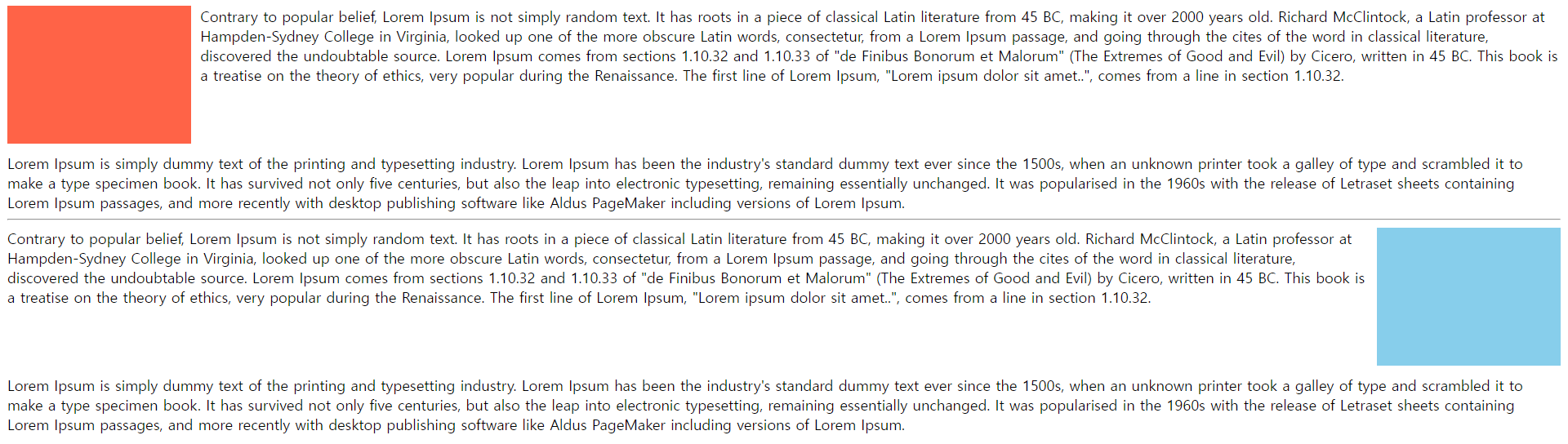
<div class="picture1"></div>
Contrary to popular belief, Lorem Ipsum is not simply random text. It has roots in a piece of classical Latin literature from 45 BC, making it over 2000 years old. Richard McClintock, a Latin professor at Hampden-Sydney College in Virginia, looked up one of the more obscure Latin words, consectetur, from a Lorem Ipsum passage, and going through the cites of the word in classical literature, discovered the undoubtable source. Lorem Ipsum comes from sections 1.10.32 and 1.10.33 of "de Finibus Bonorum et Malorum" (The Extremes of Good and Evil) by Cicero, written in 45 BC. This book is a treatise on the theory of ethics, very popular during the Renaissance. The first line of Lorem Ipsum, "Lorem ipsum dolor sit amet..", comes from a line in section 1.10.32.<br/>
<div class="text1"></div>
Lorem Ipsum is simply dummy text of the printing and typesetting industry. Lorem Ipsum has been the industry's standard dummy text ever since the 1500s, when an unknown printer took a galley of type and scrambled it to make a type specimen book. It has survived not only five centuries, but also the leap into electronic typesetting, remaining essentially unchanged. It was popularised in the 1960s with the release of Letraset sheets containing Lorem Ipsum passages, and more recently with desktop publishing software like Aldus PageMaker including versions of Lorem Ipsum.
<hr/>
<div class="picture2"></div>
Contrary to popular belief, Lorem Ipsum is not simply random text. It has roots in a piece of classical Latin literature from 45 BC, making it over 2000 years old. Richard McClintock, a Latin professor at Hampden-Sydney College in Virginia, looked up one of the more obscure Latin words, consectetur, from a Lorem Ipsum passage, and going through the cites of the word in classical literature, discovered the undoubtable source. Lorem Ipsum comes from sections 1.10.32 and 1.10.33 of "de Finibus Bonorum et Malorum" (The Extremes of Good and Evil) by Cicero, written in 45 BC. This book is a treatise on the theory of ethics, very popular during the Renaissance. The first line of Lorem Ipsum, "Lorem ipsum dolor sit amet..", comes from a line in section 1.10.32.<br/>
<div class="text2"></div>
Lorem Ipsum is simply dummy text of the printing and typesetting industry. Lorem Ipsum has been the industry's standard dummy text ever since the 1500s, when an unknown printer took a galley of type and scrambled it to make a type specimen book. It has survived not only five centuries, but also the leap into electronic typesetting, remaining essentially unchanged. It was popularised in the 1960s with the release of Letraset sheets containing Lorem Ipsum passages, and more recently with desktop publishing software like Aldus PageMaker including versions of Lorem Ipsum.
</body>
</html>
요소 정렬2
<!DOCTYPE html>
<html>
<head>
<meta charset="UTF-8">
<title>요소 정렬</title>
<style type="text/css">
.box1 {
width: 150px;
height: 100px;
background-color: tomato;
font-size: 30px;
color: white;
margin: 10px;
float: left;
}
.box2 {
width: 150px;
height: 100px;
background-color: green;
font-size: 30px;
color: white;
margin: 10px;
clear: both;
}
.box3 {
width: 150px;
height: 100px;
background-color: yellowgreen;
font-size: 30px;
color: white;
margin: 10px;
float: right;
}
.box4 {
width: 150px;
height: 100px;
background-color: aqua;
font-size: 30px;
color: white;
margin: 10px;
clear: both;
}
.float-box1 {
width: 150px;
height: 100px;
background-color: hotpink;
font-size: 30px;
color: white;
margin: 10px;
float: left;
}
.new-box1 {
width: 700px;
height: 30px;
background-color: skyblue;
}
.clearfix1 {
overflow: auto;
}
.float-box2 {
width: 150px;
height: 100px;
background-color: red;
font-size: 30px;
color: white;
margin: 10px;
float: left;
}
.new-box2 {
width: 700px;
height: 30px;
background-color: blue;
}
.clearfix2::after {
content: "";
clear: both;
display: block;
}
</style>
</head>
<body>
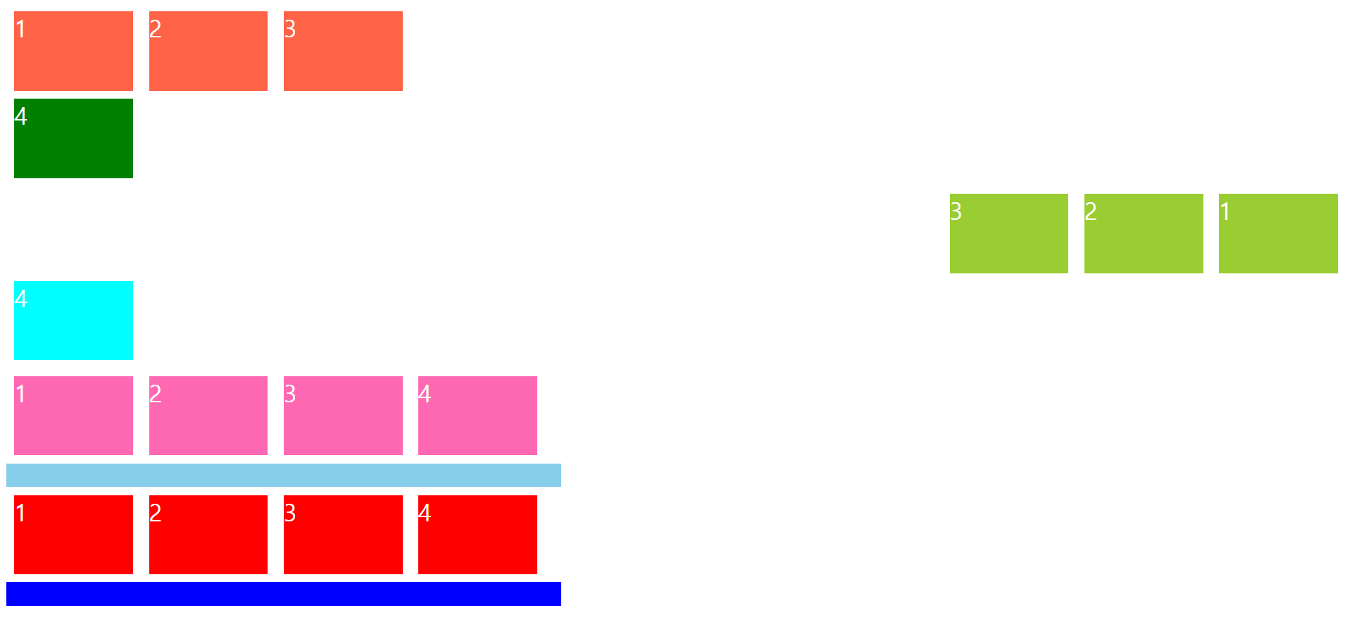
<div class="box1">1</div>
<div class="box1">2</div>
<div class="box1">3</div>
<div class="box2">4</div>
<div class="box3">1</div>
<div class="box3">2</div>
<div class="box3">3</div>
<div class="box4">4</div>
<div class="clearfix1">
<div class="float-box1">1</div>
<div class="float-box1">2</div>
<div class="float-box1">3</div>
<div class="float-box1">4</div>
</div>
<div class="new-box1"></div>
<div class="clearfix2">
<div class="float-box2">1</div>
<div class="float-box2">2</div>
<div class="float-box2">3</div>
<div class="float-box2">4</div>
</div>
<div class="new-box2"></div>
</body>
</html>
요소 정렬3
<!DOCTYPE html>
<html>
<head>
<meta charset="UTF-8">
<title>요소 정렬</title>
<style type="text/css">
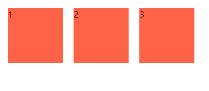
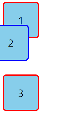
span {
width: 100px;
height: 100px;
background-color: tomato;
float: left;
display: block;
margin: 10px;
}
</style>
</head>
<body>
<span>1</span>
<span>2</span>
<span>3</span>
</body>
</html>
요소 정렬4
<!DOCTYPE html>
<html>
<head>
<meta charset="UTF-8">
<title>요소 정렬</title>
<style type="text/css">
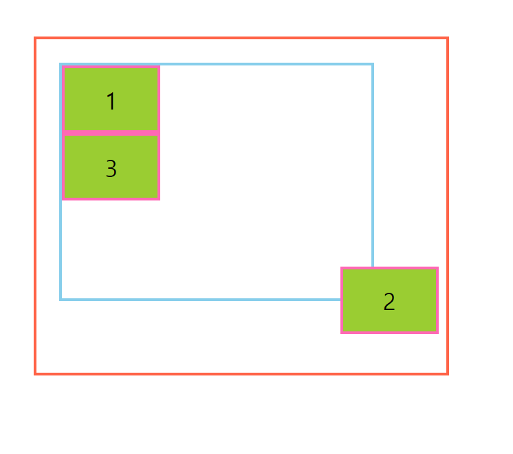
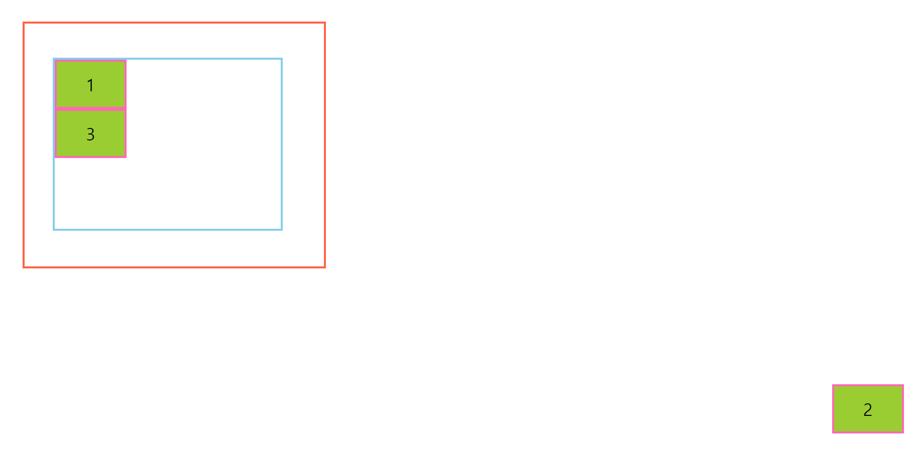
.parent {
width: 400px;
height: 300px;
border: 4px solid lightgray;
position: relative;
top: 40px;
left: 60px;
}
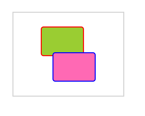
.child1 {
width: 150px;
height: 100px;
background-color: yellowgreen;
border: 4px solid red;
border-radius: 10px;
position: absolute;
top: 50px;
left: 100px;
}
.child2 {
width: 150px;
height: 100px;
background-color: hotpink;
border: 4px solid blue;
border-radius: 10px;
position: absolute;
bottom: 50px;
right: 100px;
}
</style>
</head>
<body>
<div class="parent">
<div class="child1"></div>
<div class="child2"></div>
</div>
</body>
</html>
요소 정렬5
<!DOCTYPE html>
<html>
<head>
<meta charset="UTF-8">
<title>요소정렬</title>
<style type="text/css">
.box {
width: 100px;
height: 100px;
background-color: skyblue;
font-size: 30px;
border: 4px solid red;
border-radius: 10px;
display: flex;
justify-content: center;
align-items: center;
}
.relative {
border: 4px solid blue;
position: relative;
bottom: 40px;
right: 30px;
}
</style>
</head>
<body>
<div class="box">1</div>
<div class="box relative">2</div>
<div class="box">3</div>
</body>
</html>
요소 정렬6
<!DOCTYPE html>
<html>
<head>
<meta charset="UTF-8">
<title>요소 정렬</title>
<style type="text/css">
.grand-parent {
width: 400px;
height: 300px;
border: 4px solid tomato;
padding: 30px 100px 100px 30px;
position: relative;
top: 50px;
left: 100px;
}
.parent {
width: 400px;
height: 300px;
border: 4px solid skyblue;
top: 30px;
left: 20px;
}
.child {
width: 120px;
height: 80px;
border: 4px solid hotpink;
background-color: yellowgreen;
font-size: 30px;
display: flex;
justify-content: center;
align-items: center;
}
.absolute {
position: absolute;
bottom: 50px;
right: 10px;
}
</style>
</head>
<body>
<div class="grand-parent">
<div class="parent">
<div class="child">1</div>
<div class="child absolute">2</div>
<div class="child">3</div>
</div>
</div>
</body>
</html>
요소 정렬7
<!DOCTYPE html>
<html>
<head>
<meta charset="UTF-8">
<title>요소 정렬</title>
<style type="text/css">
body {
height: 4000px;
}
.grand-parent {
width: 400px;
height: 300px;
border: 4px solid tomato;
padding: 30px 100px 100px 30px;
position: relative;
top: 50px;
left: 100px;
}
.parent {
width: 400px;
height: 300px;
border: 4px solid skyblue;
position: relative;
top: 30px;
left: 20px;
}
.child {
width: 120px;
height: 80px;
border: 4px solid hotpink;
background-color: yellowgreen;
font-size: 30px;
display: flex;
justify-content: center;
align-items: center;
}
.fixed {
position: fixed;
bottom: 50px;
right: 20px;
}
</style>
</head>
<body>
<div class="grand-parent">
<div class="parent">
<div class="child">1</div>
<div class="child fixed">2</div>
<div class="child">3</div>
</div>
</div>
</body>
</html>
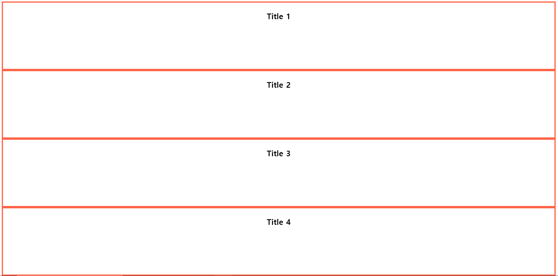
요소 정렬8
<!DOCTYPE html>
<html>
<head>
<meta charset="UTF-8">
<title>요소 정렬</title>
<style type="text/css">
.section {
height: 200px;
border: 4px solid tomato;
}
.section > h1 {
text-align: center;
line-height: 2;
font-size: 24px;
font-weight: bold;
position: sticky;
top: 0px;
}
.container {
width: 400px;
height: 400px;
border: 4px solid blue;
margin-top: 50px;
overflow: auto;
}
</style>
</head>
<body>
<div class="section">
<h1>Title 1</h1>
</div>
<div class="section">
<h1>Title 2</h1>
</div>
<div class="section">
<h1>Title 3</h1>
</div>
<div class="section">
<h1>Title 4</h1>
</div>
<div class="section">
<h1>Title 5</h1>
</div>
<div class="section">
<h1>Title 6</h1>
</div>
<div class="section">
<h1>Title 7</h1>
</div>
<div class="section">
<h1>Title 8</h1>
</div>
<div class="container">
<div class="section">
<h1>Title 1</h1>
</div>
<div class="section">
<h1>Title 2</h1>
</div>
<div class="section">
<h1>Title 3</h1>
</div>
<div class="section">
<h1>Title 4</h1>
</div>
<div class="section">
<h1>Title 5</h1>
</div>
<div class="section">
<h1>Title 6</h1>
</div>
<div class="section">
<h1>Title 7</h1>
</div>
<div class="section">
<h1>Title 8</h1>
</div>
</div>
</body>
</html>
요소 정렬9
<!DOCTYPE html>
<html>
<head>
<meta charset="UTF-8">
<title>요소 정렬</title>
<style type="text/css">
.box-group {
display: flex;
}
.box-group > .box {
width: 100px;
height: 100px;
background-color: tomato;
border: 4px solid red;
border-radius: 10px;
font-size: 30px;
display: flex;
justify-content: center;
align-items: center;
box-shadow: 0px 0px 10px rgba(255, 0, 0, 0.7);
margin-right: -30px;
}
.box-group > .box:nth-child(2n) {
margin-top: 30px;
}
.box-group > .box1 {
position: relative;
}
.box-group > .box2 {
position: relative;
z-index: 2;
}
.box-group > .box3 {
position: relative;
z-index: 3;
}
.box-group > .box4 {
position: relative;
z-index: 1;
}
.box-group > .box5 {
position: relative;
}
</style>
</head>
<body>
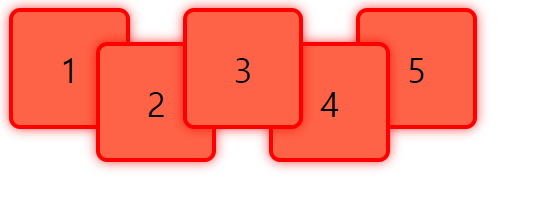
<div class="box-group">
<div class="box box1">1</div>
<div class="box box2">2</div>
<div class="box box3">3</div>
<div class="box box4">4</div>
<div class="box box5">5</div>
</div>
</body>
</html>