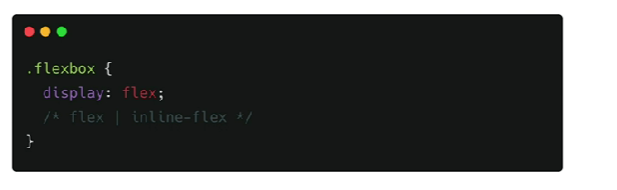
flex 나 flex사용한다! 선언하기
정렬하고자 하는 요소를 감싸는 부모에게 display:flex를 줘야한다.
ㅤ
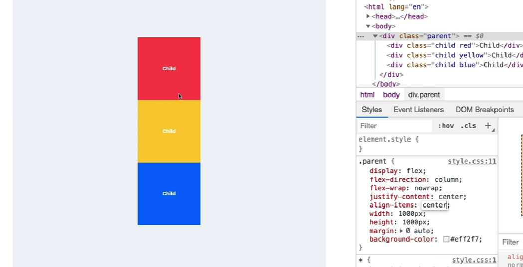
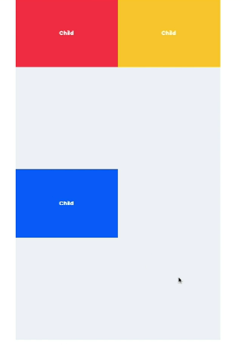
flex-direction 가로정렬? 세로정렬?
가로 방향 정렬
flex-direction: row;
flex-direction: row-reverse;
세로 방향 정렬
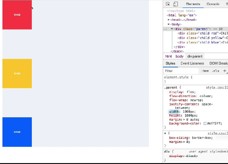
flex-direction: colum;
flex-direction: colum-reverse;
ㅤ
flex-wrap 무조건 한 줄 안에 정렬?
nowrap
감싸지 않고 자식 사이즈를 줄여서라도 한 줄로 정렬하겠다.
flex-wrap:nowrapwrap
한 줄에 모두 정렬하기에 공간이 넉넉하지 않으면 여러 줄을 만든다.
flex-wrap:wrapㅤ
flex-box 정렬 방법- 정리의 끝판왕!
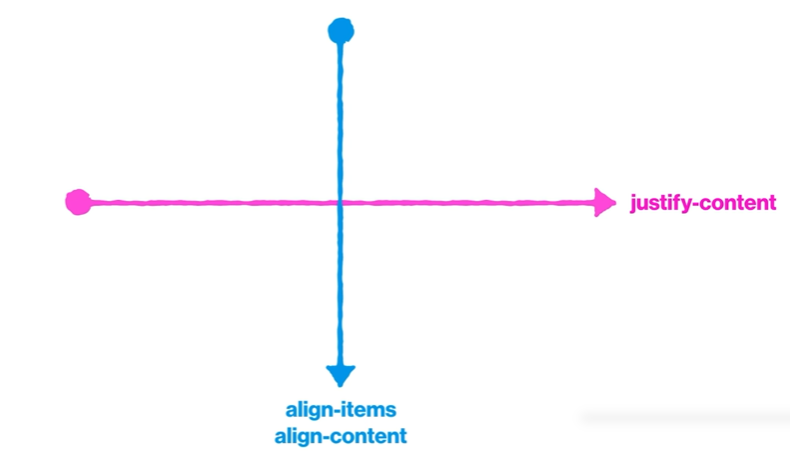
justify-content
justify-content: center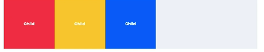
ㅤ
justify-content : flex-start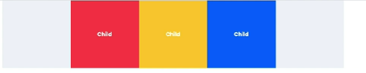
ㅤ
justify-content : flex-end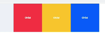
ㅤ
justify-content : space-between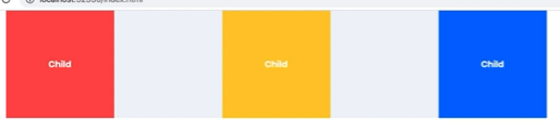
ㅤ
justify-content : space-around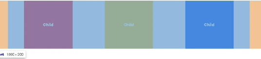
ㅤ
align-items (수직방향 정렬)
align-items: center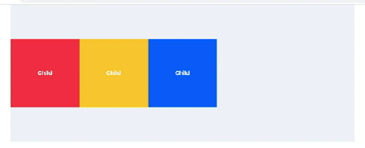
ㅤ
align-items: flex-start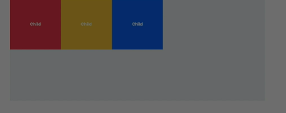
ㅤ
align-items: flex-end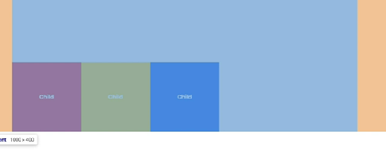
ㅤ
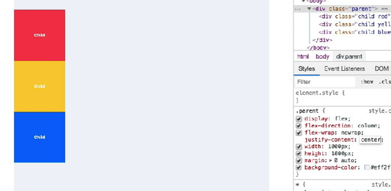
가운데 정렬하기
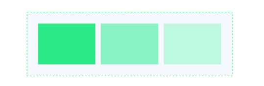
align-content
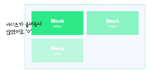
flex-wrap: wrap을 사용할 때 위에 이미지처럼 이렇게 될 때가 있는데
그때 align-content를 사용하면 좋다.
align-content:center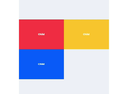
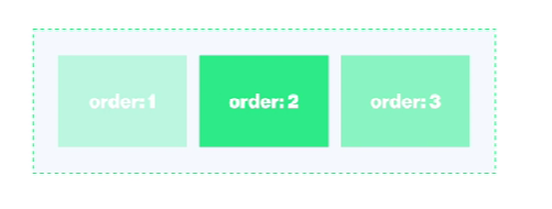
order
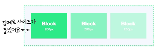
진한 박스부터 연한 박스 순서로 1,2,3 정렬되어 있는데 거기에 order로 순서를 주면
아래 이미지처럼 order에 따라 배열이 변경된다.

정말 잘 정리된 내용이네요!