RaisedButton
RaisedButton 속성
const RaisedButton({
Key key,
VoidCallback onPressed,
VoidCallback onLongPress,
ValueChanged<bool> onHighlightChanged,
MouseCursor mouseCursor,
ButtonTextTheme textTheme,
Color textColor,
Color disabledTextColor,
Color color,
Color disabledColor,
Color focusColor,
Color hoverColor,
Color highlightColor,
Color splashColor,
Brightness colorBrightness,
double elevation,
double focusElevation,
double hoverElevation,
double highlightElevation,
double disabledElevation,
EdgeInsetsGeometry padding,
VisualDensity visualDensity,
ShapeBorder shape,
Clip clipBehavior = Clip.none,
FocusNode focusNode,
bool autofocus = false,
MaterialTapTargetSize materialTapTargetSize,
Duration animationDuration,
Widget child,
})RaisedButton 예제
import 'package:flutter/material.dart';
class TextExample extends StatefulWidget {
_TextExampleState createState() => _TextExampleState();
}
class _TextExampleState extends State<TextExample> {
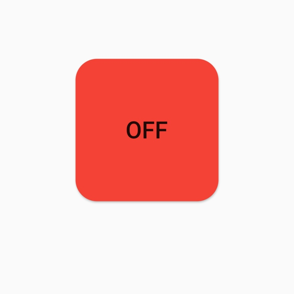
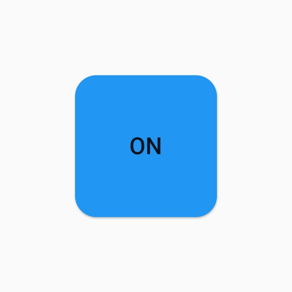
String _buttonState='OFF';
var _color=Colors.red;
Widget build(BuildContext context) {
return Scaffold(
body: Center(
child: Column(
mainAxisAlignment: MainAxisAlignment.center,
children: <Widget>[
Container(
width: 200,
height: 200,
child: RaisedButton(
child: Text('$_buttonState',style: TextStyle(fontSize: 30),),
onPressed: changeText,
color: _color,
shape: RoundedRectangleBorder(
borderRadius: BorderRadius.circular(30)
),
),
),
],
),
),
);
}
void changeText(){
setState(() {
if(_buttonState=='OFF'){
_buttonState='ON';
_color=Colors.blue;
}
else{
_buttonState='OFF';
_color=Colors.red;
}
});
}
}-
StatefulWidget
버튼이 눌렸을 때 버튼 이벤트에 따라 화면을 갱신하기 위해서 Stateless가 아닌 Stateful을 사용한다. -
String _buttonState='OFF';
-
var _color=Colors.red;
버튼 클릭시 바꿔줄 것 변수 선언 -
onPressed: changeText
onPressed는 버튼클릭시 이벤트 처리인데 changeText메소드를 호출한다 -
void changeText()
_buttonState가 OFF이면 ON으로 색상은 blue로 바꿔주고
ON이면 OFF으로 색상은 red로 바꿔주는 메소드 -
Container
RaisedButton을 Container로 wrap한 다음에 width와 height를 설정하면 버튼 크기를 조정 할수 있다. -
shape: RoundedRectangleBorder
모서리가 둥근 사각형 모양으로 shape 변경 -
borderRadius: BorderRadius.circular(30)
border은 모서리로 모서리를 둥근모양으로 만든다 둥글기 정도는 30이다 -
결과
FlatButton
RaisedButton과 속성등이 거의 동일하여 따로 예제는 안만들겠습니다.
IconButton
IconButton 속성
const IconButton({
Key key,
this.iconSize = 24.0,
this.visualDensity,
this.padding = const EdgeInsets.all(8.0),
this.alignment = Alignment.center,
this.splashRadius,
this.icon,
this.color,
this.focusColor,
this.hoverColor,
this.highlightColor,
this.splashColor,
this.disabledColor,
this.onPressed,
this.mouseCursor = SystemMouseCursors.click,
this.focusNode,
this.autofocus = false,
this.tooltip,
this.enableFeedback = true,
this.constraints,
})IconButton 예제
import 'package:flutter/material.dart';
class TextExample extends StatefulWidget {
_TextExampleState createState() => _TextExampleState();
}
class _TextExampleState extends State<TextExample> {
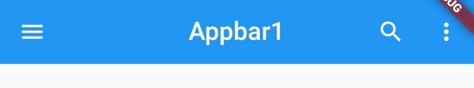
String appBarState='Appbar1';
Widget build(BuildContext context) {
return Scaffold(
appBar: AppBar(
title: Text('$appBarState'),
centerTitle: true,
elevation: 0.0,
actions: [
IconButton(icon: Icon(Icons.search),onPressed: (){},),
IconButton(icon: Icon(Icons.more_vert),onPressed: (){},),
],
leading: IconButton(
icon: Icon(Icons.menu),
onPressed: changeText
),
),
);
}
void changeText(){
setState(() {
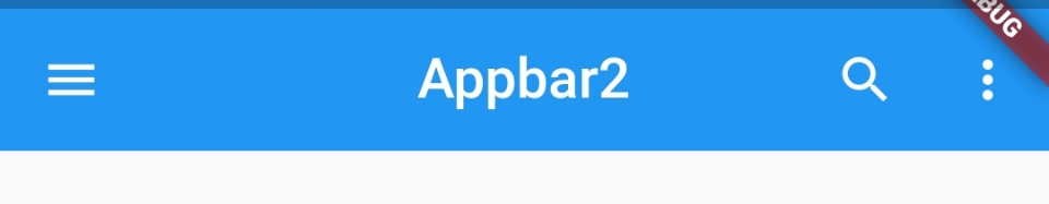
if(appBarState=='Appbar1'){
appBarState='Appbar2';
}
else{
appBarState='Appbar1';
}
});
}
}-
actions:[ ]
복수의 아이콘 버튼 등을 오른족에 배치할 때 사용 -
leading:
아이콘 버튼이나 간단한 위젯을 왼쪽에 배치할 때 사용 -
onPressed: changeText
위와 같이 클릭시 appbar의 title text를 변경함 -
결과
클릭 후
FloatingActionButton
FloatingActionButton 속성
const FloatingActionButton({
Key key,
this.child,
this.tooltip,
this.foregroundColor,
this.backgroundColor,
this.focusColor,
this.hoverColor,
this.splashColor,
this.heroTag = const _DefaultHeroTag(),
this.elevation,
this.focusElevation,
this.hoverElevation,
this.highlightElevation,
this.disabledElevation,
this.onPressed,
this.mouseCursor,
this.mini = false,
this.shape,
this.clipBehavior = Clip.none,
this.focusNode,
this.autofocus = false,
this.materialTapTargetSize,
this.isExtended = false,
})FloatingActionButton 예제
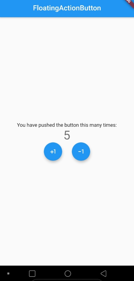
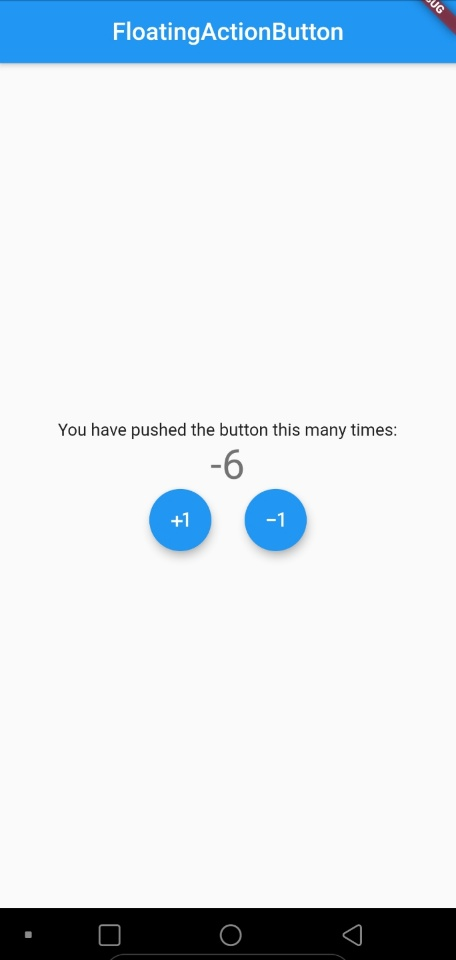
처음에 프로젝트 생성시 자동생성되는 데모 앱에 FloatingActionButton버튼이 있다
거기서 FloatingActionButton은 클릭시 숫자를 1씩 플러스해서 보여줬다
조금만 바꿔서 마이너스 1도 되는 FloatingActionButton을 하나 더만들어 보겠습니다.
import 'package:flutter/material.dart';
void main() {
runApp(MyApp());
}
class MyApp extends StatelessWidget {
Widget build(BuildContext context) {
return MaterialApp(
title: 'Flutter Demo',
theme: ThemeData(
primarySwatch: Colors.blue,
visualDensity: VisualDensity.adaptivePlatformDensity,
),
home: MyHomePage(title: 'FloatingActionButton',)
);
}
}
class MyHomePage extends StatefulWidget {
MyHomePage({Key key, this.title}) : super(key: key);
final String title;
_MyHomePageState createState() => _MyHomePageState();
}
class _MyHomePageState extends State<MyHomePage> {
int _counter = 0;
void _incrementCounter() {
setState(() {
_counter++;
});
}
void _decrementCounter() {
setState(() {
_counter--;
});
}
Widget build(BuildContext context) {
return Scaffold(
appBar: AppBar(
centerTitle: true,
title: Text(widget.title),
),
body: Center(
child: Column(
mainAxisAlignment: MainAxisAlignment.center,
children: <Widget>[
Text(
'You have pushed the button this many times:',
),
Text(
'$_counter',
style: Theme.of(context).textTheme.headline4,
),
Row(
mainAxisAlignment: MainAxisAlignment.center,
children: <Widget>[
FloatingActionButton(onPressed: _incrementCounter,child: Icon(Icons.plus_one),),
SizedBox(width: 30,),
FloatingActionButton(onPressed: _decrementCounter,child: Icon(Icons.exposure_minus_1),),
],
)
],
),
),
);
}
}
-
void _incrementCounter() , void _decrementCounter()
전자는 _counter변수를 1씩 높여주고 후자는 _counter변수를 하나씩 줄이는 메소드
상태가 변하기 때문에 setState에 _counter++이나 _counter--을 넣는다 -
FloatingActionButton(onPressed: _incrementCounter,child: Icon(Icons.plus_one),),
FloatingActionButton 생성, 클릭시 _counter를 1올려주는 메소드 호출
child에 icon을 줘서 icon모양 결정 -
결과