
🖌️ 파이썬에서 데이터 시각화하기: 무슨 라이브러리를 쓰던 큰 틀은 같다!
1️⃣ 그래프를 그릴 화면 만들기
2️⃣ 축 설정하기
3️⃣ 그래프로 표현할 데이터, 표현 방법 선택하기
4️⃣ 그래프 정보 입력: 그래프 제목, x・y축 이름, 범례
5️⃣ plt.show()
📈 기본 그래프 그리기
📚 라이브러리 임포트
파이썬에서 그래프를 그릴 때 가장 많이 사용되는 pyplot 라이브러리와 seaborn 라이브러리를 임포트 한다
import matplotlib.pyplot as plt
import seaborn as sns
📀 데이터 불러오기
seaborn 라이브러리에서 제공하는 1949년부터 1960년까지 월별 승객수 데이터셋을 불러온다.
load_dataset() 메소드를 이용하여 불러올 수 있다.
flight = sns.load_dataset('flights')
flight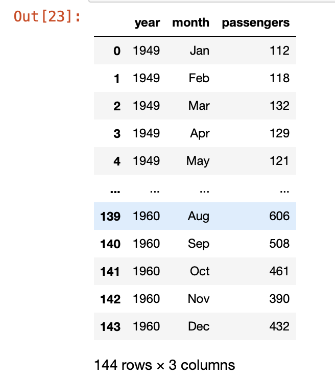
📎 1949년 데이터만 추출하기
"마스크(mask)"를 통해서 특정 조건에 부합하는 데이터만 추출할 수 있다
m = flight['year'] == 1949 #mask 만들기
m
flight['year']가 1949인 행은 True, 그 외 행은 False를 반환
f_1949 = flight[m]
f_1949
m이 True인 값만 추출됨
위의 코드를 합쳐서 한번에 써도 된다.
f_1949 = flight[flight['year'] == 1949]📉 기본 그래프 그리기(plot)
첫번째 그래프: 1949년 월별 승객수
# 화면 만들기, 화면 크기: (7,7)
fig = plt.figure(figsize=(7,7))

#축 만들기
ax1 = fig.add_subplot(1,1,1) #세로 1칸, 가로 1칸으로 화면을 분할할건데 그 중 첫번째 분할 화면에 그래프를 그리겠다!
'''
x 축: f_1949의 month열의 앞 3글자, 줄임말임을 나타내기 위해 .추가
	ex) January -> Jan.
y 축: f_1949의 passengers열
'''
ax1.plot(f_1949['month'].str[:3]+'.', f_1949['passengers'])
# 그래프 제목, x축, y축 이름 설정
ax1.set(title='1949', xlabel='month', ylabel='# of passengers')
# x축 눈금 설정: 45도 회전
ax1.tick_params('x', rotation=45)

plt.show()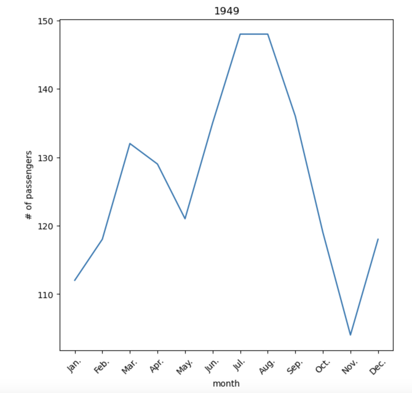
〰️ Matplotlib 눈금 관련 메소드
1️⃣ 눈금 표시하기: plt.xticks(), plt.yticks()
ex)xticks(array(숫자 눈금 또는 눈금 개수), label=[눈금 이름])
2️⃣ 눈금 스타일: tick_params()
두번째 그래프: 1949년부터 1960까지 월별 승객수 합
groupby함수를 통해 월별로 데이터를 묶어 월별 승객수의 합을 먼저 구한다.
f_all = flight.groupby('month').sum()
'''
dataframe.groupby(기준칼럼).통계함수() 형태로 많이 씀
'''
f_all
year도 모두 더해졌지만 그래프를 그리는데에 지장이 없으므로 넘어간다
위의 그래프를 그리는 코드를 약간 수정하고 두번째 그래프를 그리는 코드를 작성하면 다음과 같다.
fig = plt.figure(figsize=(7,7))

#첫번째 그래프
ax1 = fig.add_subplot(1,2,1)
# 그래프를 2개 그려야하므로 subplot 개수 변경
ax1.set(title='1949', xlabel='month', ylabel='# of passengers')
ax1.plot(f_1949['month'].str[:3]+'.', f_1949['passengers'])
ax1.tick_params('x', rotation=45)

#두번째 그래프
ax2 = fig.add_subplot(1,2,2)
ax2.set(title='1949~1960', xlabel='month', ylabel='# of passengers')
ax2.plot(f_all.index.str[:3]+'.', f_all['passengers'])
'''
groupby()함수를 사용하면서 month는 더이상 칼럼이 아닌 인덱스가 됨
f_all['month']를 사용하면 오류 발생함
f_all.index.str[:3]+'.'를 사용하면 첫번째 그래프와 같은 형태로 만들 수 있음
'''
ax2.tick_params('x', rotation=45)

plt.tight_layout() #figsize 자동 조정
plt.show()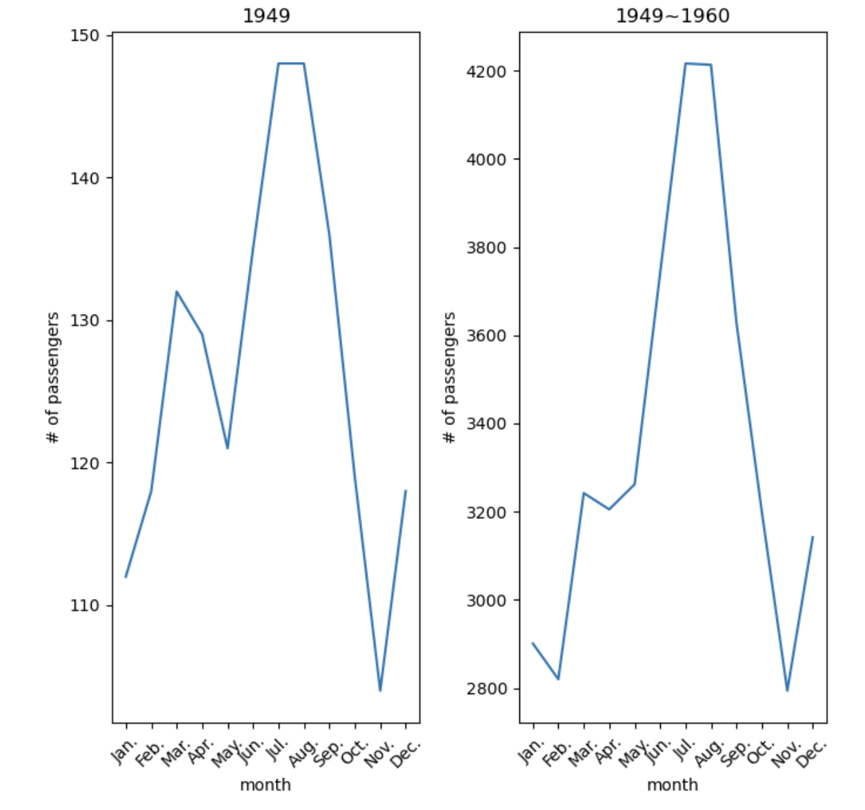
📊 히스토그램 그리기
📚 라이브러리 임포트
import matplotlib.pyplot as plt
import seaborn as sns
📀 데이터 불러오기
seaborn 라이브러리에 저장되어 있는 붓꽃 데이터인 iris 데이터를 불러온다
iris = sns.load_dataset('iris')
iris
개체별로 groupby()한 iris_g 데이터도 준비
iris_g = iris.groupby('species')📶 히스토그램 그리기(hist)
첫번째 히스토그램: 꽃잎 길이 분포
fig = plt.figure()

ax1 = fig.add_subplot(1,2,1)
ax1.hist(iris['petal_length'])
ax1.set(title='petal length')

plt.show()
* x 축을 더 자세하게 나눠서 세밀한 분포를 보고 싶음!
* 히스토그램 확인 결과 x축 범위: 0~8
x축의 범위 재설정한다.
b = []
for i in range(40):
	b.append(0.2 * i)
x축 범위를 수정하여 첫번째 그래프 수정 및 두번째 히스토그램 그리기
두번째 히스토그램: 개체별 꽃잎 길이 분포
fig = plt.figure()

#첫번째 히스토그램
ax1 = fig.add_subplot(1,2,1)
ax1.hist(iris['petal_length'], bins=b)
ax1.set(title='petal lenght')

#두번째 히스토그램
ax2 = fig.add_subplot(1,2,2)
for name, group in iris_g: #name: species 이름, group: group_data
    ax2.hist(group['petal_length'], bins=b, label=name)
ax2.set(title='petal length: species')

ax2.legend() #범례 추가

plt.show()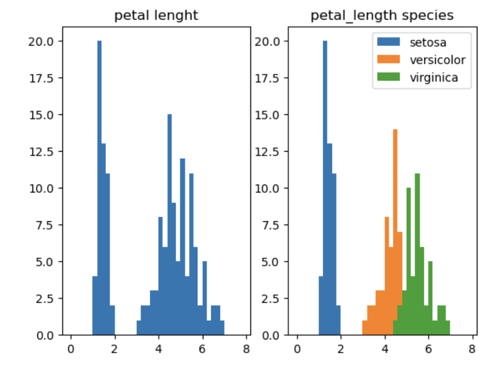
🔵 산점도 그리기
📚 라이브러리 임포트
import matplotlib.pyplot as plt
import seaborn as sns
📀 데이터 불러오기
iris = sns.load_dataset('iris')
iris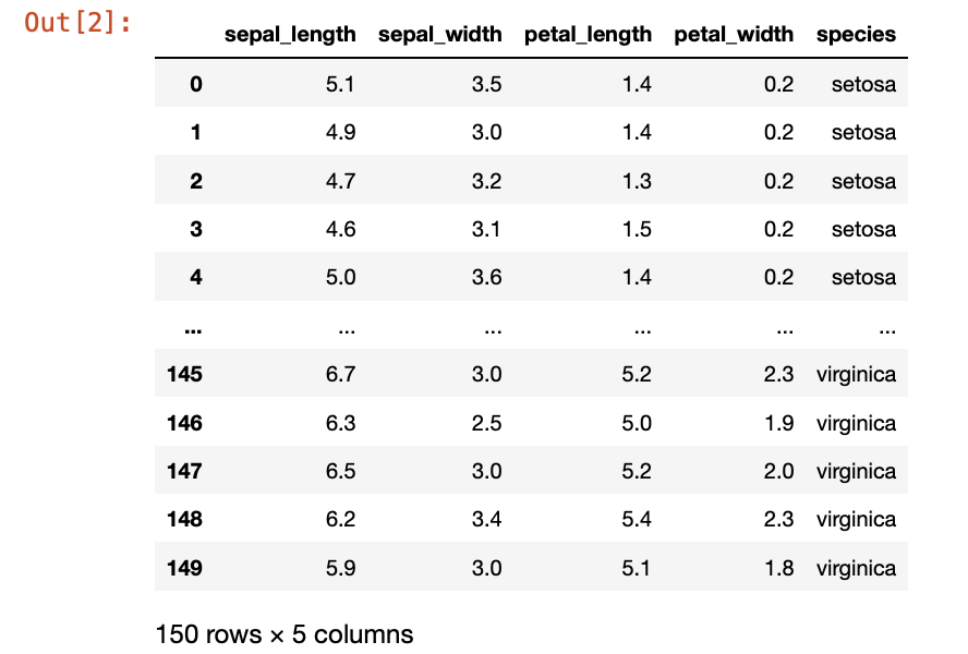
species를 기준으로 group으로 묶기
iris_g = iris.groupby('species')

for group_name, group_data in iris_g:
    print(group_name)
    print(group_data[:5])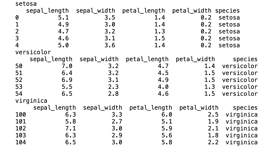
🔴 산점도 그리기(scatter)
산점도 목표: 붓꽃 종별로 꽃잎 길이와 너비의 상관관계 경향 파악
fig = plt.figure()

ax = fig.add_subplot(1,1,1)
for name, group in iris_g:
    ax.scatter(group['petal_length'], group['petal_width'], label=name) #label: 범례 추가 시 필요
ax.set(title='petal_length vs petal_width',
       xlabel='petal_length',
       ylabel='petal_width')

ax.legend() #범례 추가
plt.show()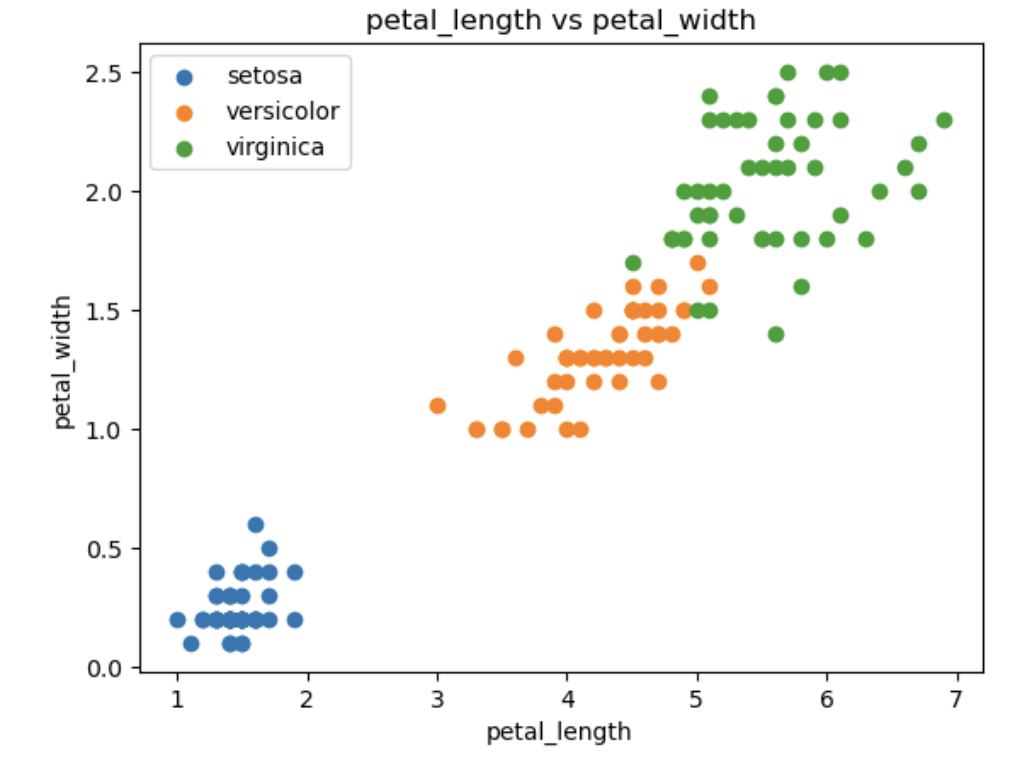
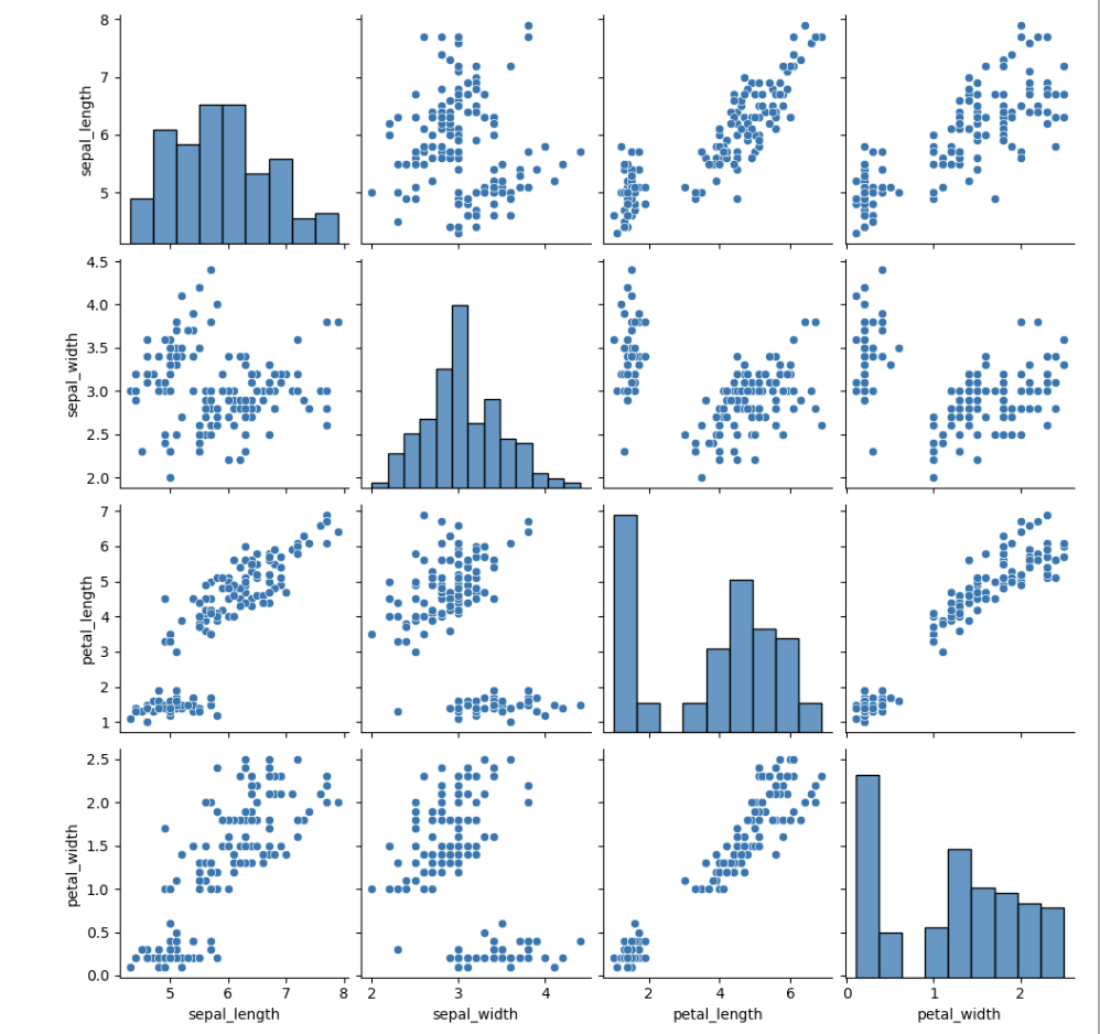
🕸️ 칼럼간 관계성 한번에 파악하기
sns.pairplot(iris)
plt.show()
pairplot()을 이용하여 dataframe내 모든 칼럼간 경향성을 한눈에 볼 수 있다.
먼저 대략적인 분포를 확인하고 특이점이 있는 분포만 뽑아서 다시 그래프를 그리는 순서로 시각화를 진행하면 된다.
📗 reference
해당 내용은 신기술분야융합디자인전문인력양성 교육센터의 빅데이터 서비스 강좌를 수강한 내용을 바탕으로 작성되었습니다.