transition?
transition 은 CSS property의 값이 변화할 때, property 값의 변화가 일정 시간(duration)에 걸쳐 일어나도록 하는 것이다.
아래 예제의 경우, <div> element에 마우스가 올라가서 hover 상태가 되면 <div> element의 border-radius, background property의 값이 즉시 변경된다.
즉, 상태 변화에 따라 CSS property가 변경되면, property 변경에 따른 표시의 변화(transition)는 지체없이 즉시 발생한다.
<!DOCTYPE html>
<html>
<head>
  <style>
    div {
      width: 100px;
      height: 100px;
      background: red;
    }
    div:hover {
      border-radius: 50%;
      background: blue;
    }
  </style>
</head>
<body>
  <div></div>
</body>
</html>
transition property는 변경되는 CSS property value에 의한 표시의 변화를 부드럽게 하기 위해 애니메이션 속도를 조절한다.
즉, property value의 변경이 표시의 변화에 즉시 영향을 미치게 하는 대신 그 property value의 변화가 일정 시간(duration)에 걸쳐 일어나도록 하는 것이다.
위 예제에 transition 효과를 부여해 보자.
<!DOCTYPE html>
<html>
<head>
  <style>
    div {
      width: 100px;
      height: 100px;
      background: red;
      /* 트랜지션 효과: 모든 프로퍼티의 변화를 2초에 걸쳐 전환한다. */
      transition: all 2s;
    }
    div:hover {
      border-radius: 50%;
      background: blue;
    }
  </style>
</head>
<body>
  <div></div>
</body>
</html>
위 예제에서는 <div> element에 마우스가 올라갔을 때와 내려갔을 때 border-radius, background property 값의 변화가 발생한다. 그리고 이들 property 값의 변화를 2초에 걸쳐 이루어지도록 설정한 것이다.
transition은 자동으로 발동되지 않는다. :hover와 같은 pseudo-class selector 또는 JavaScript의 부수적인 액션에 의해 발동한다. 위 예제의 div element에 적용된 transition은 이와 같은 부수적 액션 없이는 어떤 효과도 볼 수 없다.
transition과 관련된 property들은 아래와 같다.
transition-property property
transition의 대상이 되는 CSS property name을 지정한다.
지정하지 않는 경우에는 모든 property가 transition의 대상이 된다. 또, 다수의 property name을 지정하는 경우에는 쉼표(,)로 구분한다.
<!DOCTYPE html>
<html>
<head>
  <style>
    div {
      width: 100px;
      height: 50px;
      background-color: red;
      margin-bottom: 10px;
      transition-property: width, background-color;
      transition-duration: 2s, 2s;
    }
    div:hover {
      width: 300px;
      background-color: blue;
    }
  </style>
</head>
<body>
  <div></div>
</body>
</html>
주의해야할 점은 모든 CSS property가 transtion의 대상이 될 수 없다는 점이다. 예를 들어 width, font-size property 등은 크기라는 범주 안에서 값이 변화하지만, display property는 그렇지 않다.
transition의 대상이 될 수 있는 CSS property는 다음과 같다.
// Box model
width height max-width max-height min-width min-height
padding margin
border-color border-width border-spacing
// Background
background-color background-position
// 좌표
top left right bottom
// 텍스트
color font-size font-weight letter-spacing line-height
text-indent text-shadow vertical-align word-spacing
// 기타
opacity outline-color outline-offset outline-width
visibility z-index
또한, element의 property value가 변화하면 브라우저는 property value의 변화에 영향을 받는 모든 element의 위치와 크기를 계산하여 레이아웃 작업을 수행한다. 이것은 브라우저의 성능 저하의 요인이 될 수 있다. 따라서, 레이아웃에 영향을 주는 transition 효과는 지양하는 것이 좋다.
레이아웃에 영향을 주는 property는 다음과 같다.
width height padding margin border
display position float overflow
top left right bottom
font-size font-family font-weight
text-align vertical-align line-height
clear white-space
transition-duration property
transition이 일어나는 지속시간을 초 단위 또는 밀리 초 단위로 지정한다.
값을 지정하지 않을 경우 기본값 0s이 적용되어, transition 효과가 발생하지 않는다.
transition-duration property의 값은 transition-property property의 값과 일대일 대응한다.
<!DOCTYPE html>
<html>
<head>
<style>
div {
width: 100px;
height: 50px;
padding: 10px;
color: white;
background-color: red;
margin-bottom: 10px;
transition-property: width, opacity;
}
div:nth-child(1) {
transition-duration: 0.5s;
}
div:nth-child(2) {
transition-duration: 2s, 1s;
}
div:nth-child(3) {
transition-duration: 5s, 2.5s;
}
div:hover {
width: 300px;
opacity: .1;
}
</style>
</head>
<body>
<div>0.5s</div>
<div>2s, 1s</div>
<div>5s, 2.5s</div>
</body>
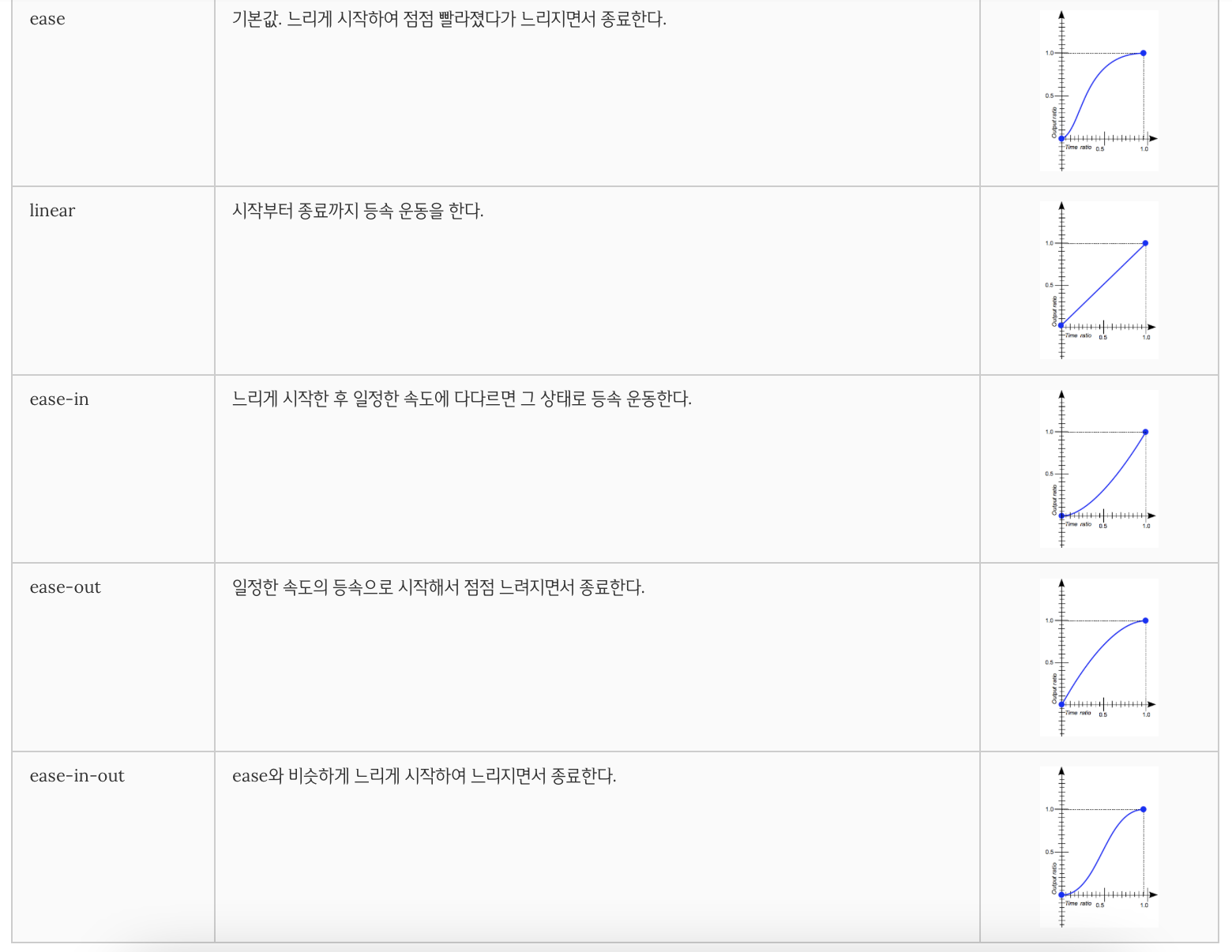
</html>transition-timing-function property
transition 효과의 변화 흐름, 시간에 따른 변화 속도와 같은 일종의 변화의 리듬을 지정한다.
대부분의 timing function은 cubic bezier를 정의하는 네 점에 의해 정의되므로, 상응하는 함수의 그래프로 제공해서 명시할 수 있다.
property value로 미리 정해두 5개의 키워드가 제공된다. 기본값은 ease이다.
<!DOCTYPE html>
<html>
<head>
  <style>
    div {
      font: bold 16px/50px "Open Sans";
      color: white;
      text-align: center;
      width: 100px;
      height: 50px;
      background-color: red;
      margin-bottom: 10px;
      transition: width 2s;
    }
    div:nth-child(1) {
      transition-timing-function: ease;
    }
    div:nth-child(2) {
      transition-timing-function: linear;
    }
    div:nth-child(3) {
      transition-timing-function: ease-in;
    }
    div:nth-child(4) {
      transition-timing-function: ease-out;
    }
    div:nth-child(5) {
      transition-timing-function: ease-in-out;
    }
    div:hover {
      width: 300px;
    }
  </style>
</head>
<body>
  <h3>transition-timing-function</h3>
  <div>ease</div>
  <div>linear</div>
  <div>ease-in</div>
  <div>ease-out</div>
  <div>ease-in-out</div>
</body>
</html>
transition-delay property
property가 변화한 시점과 transition이 실제로 시작되는 사이에 대기하는 시간을 초 단위 또는 밀리 초 단위로 지정한다.
즉, 대기시간을 지정하여 property의 값이 변화해도 즉시 transition이 실행되지 않고, 일정 시간 대기한 후 transition이 실행되도록 한다.
<!DOCTYPE html>
<html>
<head>
  <style>
    div {
      font: bold 16px/50px "Open Sans";
      color: white;
      text-align: center;
      width: 100px;
      height: 50px;
      background-color: red;
      margin-bottom: 10px;
      transition: width 1s;
    }
    div:nth-of-type(1) {
      transition-delay: 0s;
    }
    div:nth-of-type(2) {
      transition-delay: 1s;
    }
    div:nth-of-type(3) {
      transition-delay: 3s;
    }
    div:hover {
      width: 300px;
    }
  </style>
</head>
<body>
  <h3>transition-delay</h3>
  <div>0s</div>
  <div>1s</div>
  <div>3s</div>
</body>
</html>
transition property
앞 서 살펴본 모든 transition 관련 property를 한 번에 지정할 수 있는 property이다.
값을 지정하지 않은 property에는 기본값이 지정된다.
selector { transition: property duration function delay; }

기본값은 all 0 ease 0
transition-duration 의 값은 반드시 지정해야 한다. 지정하지 않는 경우 기본값이 0이 세팅되어 어떠한 transition도 실행되지 않는다.
<!DOCTYPE html>
<html>
<head>
  <style>
    div {
      font: bold 0.5em/50px "Open Sans";
      color: white;
      text-align: center;
      width: 100px;
      height: 50px;
      margin-bottom: 10px;
      background-color: red;
    }
    div:nth-of-type(1) {
      /* property duration function delay */
      transition: width 1s ease-in 1s;
    }
    div:nth-of-type(2) {
      /* duration */
      transition: 1s
    }
    div:nth-of-type(3) {
      /* property duration */
      transition: width 1s
    }
    div:nth-of-type(4) {
      /* duration function */
      transition: 1s ease-in;
    }
    div:nth-of-type(5) {
      /* duration delay*/
      transition: 1s 1s;
    }
    div:hover {
      width: 300px;
    }
  </style>
</head>
<body>
  <div>width 1s ease-in 1s</div>
  <div>1s</div>
  <div>width 1s</div>
  <div>1s ease-in</div>
  <div>1s 1s</div>
</body>
</html>
참고문헌
