Animation?
animation 효과는 HTML element에 적용되는 CSS 스타일을 다른 CSS 스타일로 부드럽게 변화시킨다.
animation은 animation을 나타내는 CSS 스타일과 animation의 흐름(sequence)을 나타내는 복수의 @keyframes 들로 이루어진다.
transition으로도 어느 정도의 animation 효과를 표현할 수 있으나, animation 보다는 제한적이다. 일반적으로 transition 효과는 element의 CSS property 값이 다른 값으로 변화할 때 주로 사용하며, element가 로딩되면서 자동으로 발동되지 않는다. :hover와 같은 pseudo-class selector 또는 JavaScript의 이벤트와 같은 부수적인 액션에 의해 발동된다.
즉, transition property는 단순히 element의 CSS property 변화에 주안점을 뒀다면, animation property는 하나의 스토리를 구성해서 스토리 내에서 세부 움직임을 시간 흐름 단위로 제어할 수 있고, 전체 스토리의 재생과 정지, 반복까지 제어할 수 있다.
일반적으로 CSS animation을 사용하면 기존의 JavaScript 기반 animation 실행과 비교하여 더 나은 렌더링 성능을 제공한다고 알려져 있다. 그러나 경우에 따라서는 JavaScript를 사용하는 것이 나을 수도 있다.
- 비교적 작은 효과들은 CSS를 사용한다. 예를 들어 element의 width 변경 animation은 JavaScript를 사용하는 것보다 훨씬 간편하며 효과적이다.
- 세밀한 제어를 위해서는 JavaScript 사용이 바람직하다. 예를 들어 바운스, 중지, 일시 중지, 되감기 또는 감속과 같은 고급 효과는 JavaScript로의 구현이 훨씬 좋다.
이러나저러나 가장 중요한 것은 브라우저에서 animation 효과가 부드럽게 실행되는 것이다.
@keyframes
CSS animation과 transition 방식의 주된 차이는 @keyframes rule에 있다.
이 rule을 사용하면 animation의 흐름(sequence) 중의 여러 시점(breakpoint)에서 CSS property value를 지정할 수 있다.
여기서 각각의 시점을 keyframe으로 정의할 수 있는데, animation 중에 특정 CSS property에 값을 지정하는 지점이다.
<!DOCTYPE html>
<html>
<head>
  <style>
    div {
      position: absolute;
      width: 100px;
      height: 100px;
      background-color: red;
      animation-name: move;
      animation-duration: 5s;
      animation-iteration-count: infinite;
    }
    /* @keyframes rule */
    @keyframes move {
      /* keyframe */
      from {
        left: 0;
      }
      /* keyframe */
      to {
        left: 300px;
      }
    }
  </style>
</head>
<body>
  <div></div>
</body>
</html>
@keyframes rule은 시간의 흐름에 따라 animation을 정의하는데, 위 예시로 순서를 살펴보자.
@keyframes뒤에 animation을 대표하는 임의의 이름(move)을 부여했다.- 그리고
from과to키워드를 사용하여 animation의 시작과 끝 시점을 정의했다. - animation의 시작 시점을 의미하는 from keyframe 내에는 left property에 값 0을, animation의 끝 시점을 의미하는 to keyframe 내에는 left property에 값 300px을 지정하였다.
- 그 결과, 정지 상태에서 오른쪽으로 300px 이동하는 animation이 실행된다.
from과 to 키워드 대신 %를 단위로 keyframe을 삽입할 수 있다.
@keyframes move {
  0%   { left: 0; }
  50%  { left: 100px; }
  100% { left: 300px; }
}
animation-name property
앞 선 예제를 보면 @keyframes 뒤에 animation을 대표하는 임의의 이름을 부여했다.
이 이름을 animation-name property의 값으로 지정하여 사용하고자 하는 @keyframes rule을 선택한다. 하나 이상의 animation 이름을 지정할 수 있다.
<!DOCTYPE html>
<html>
<head>
  <style>
    div {
      position: absolute;
      width: 100px;
      height: 100px;
      animation-name: move, fadeOut, changeColor;
      animation-duration: 5s;
      animation-iteration-count: infinite;
    }
    @keyframes move {
      from { left: 0; }
      to   { left: 300px; }
    }
    @keyframes fadeOut {
      from { opacity: 1; }
      to   { opacity: 0; }
    }
    @keyframes changeColor {
      from { background-color: red; }
      to   { background-color: blue; }
    }
  </style>
</head>
<body>
  <div></div>
</body>
</html>
animation-duration property
한 cycle의 animation에 소요되는 시간을 초 단위 또는 밀리초 단위로 지정한다.
반드시 지정해야 하는 property이고, 지정하지 않는 경우 기본값 0s가 설정되어 animation이 실행되지 않는다.
animation-duration: .5s;
animation-duration: 500ms;
animation-timing-function property
animation 효과를 위한 수치 함수를 지정한다.
animation-delay property
element가 로딩되는 시점과 animation이 실제로 시작하는 사이에 대기하는 시간을 초 단위 또는 밀리초 단위로 지정한다.
animation-delay: 2s;animation-iteration-count property
animation cycle의 재생 횟수를 지정한다. 기본값은 1이고, infinite로 무한반복할 수 있다.
animation-iteration-count: 3;
animation-iteration-count: infinite;
animation-direction property
animation이 종료된 이후, 반복될 때 진행하는 방향을 지정한다.
property value마다 다음의 기능을 한다.
normal: from에서 to 혹은 0%에서 100% 방향으로 진행한다. 기본값reverse: to에서 from 방향으로 진행한다.alternate: 홀수번째는 normal, 짝수번째는 reverse로 진행한다.alternate-reverse: 홀수번째는 reverse, 짝수번째는 normal로 진행한다.
<!DOCTYPE html>
<html>
<head>
<style>
div {
width: 100px;
height: 100px;
background: red;
position: relative;
animation: myAnimation 5s infinite;
/*홀수번째는 normal로, 짝수번째는 reverse로 진행*/
animation-direction: alternate;
}
@keyframes myAnimation {
0% { background: red; left: 0px; top: 0px; }
25% { background: yellow; left: 200px; top: 0px; }
50% { background: blue; left: 200px; top: 200px; }
75% { background: green; left: 0px; top: 200px; }
100% { background: red; left: 0px; top: 0px; }
}
</style>
</head>
<body>
<div></div>
</body>
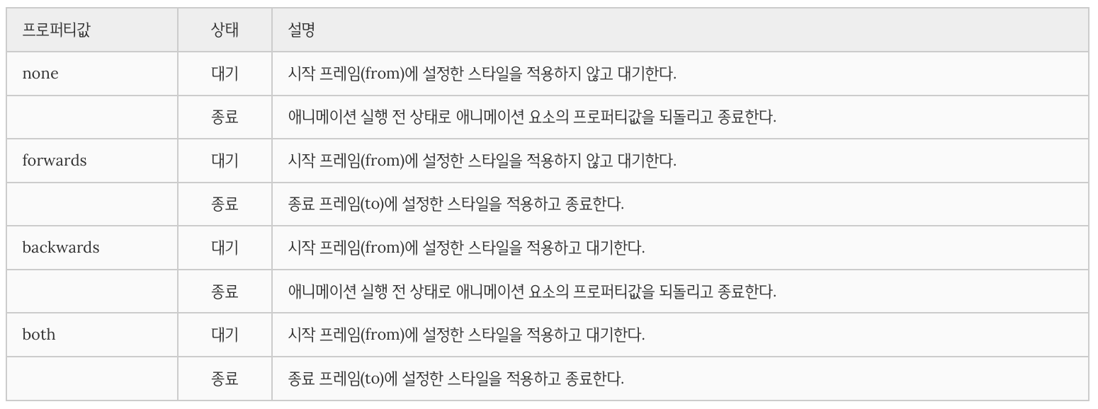
</html>animation-fill-mode property
대기 또는 종료로 인해 animation 미실행 시 element의 스타일을 지정한다.
<!DOCTYPE html>
<html>
<head>
  <style>
    div {
      width: 100px;
      height: 100px;
      font: bold 1em/100px san-serif;
      text-align: center;
      color: #fff;
      background: red;
      margin-bottom: 10px;
      position: relative;
      /*name duration timing-function delay iteration-count direction fill-mode play-state*/
      animation: myAnimation 2s linear 2s;
    }
    div:nth-of-type(1) {
      animation-fill-mode: none;
    }
    div:nth-of-type(2) {
      animation-fill-mode: forwards;
    }
    div:nth-of-type(3) {
      animation-fill-mode: backwards;
    }
    div:nth-of-type(4) {
      animation-fill-mode: both;
    }
    @keyframes myAnimation {
      0%   { left: 0px;   background: yellow; }
      100% { left: 200px; background: blue; }
    }
  </style>
</head>
<body>
  <h1>animation-fill-mode</h1>

  <div>none</div>
  <p>대기 : 시작 프레임(from)에 설정한 스타일을 적용하지 않고 대기한다.</p>
  <p>종료 : 애니메이션 실행 전 상태로 애니메이션 요소의 프로퍼티값을 되돌리고 종료한다.</p>

  <div>forwards</div>
  <p>대기 : 시작 프레임(from)에 설정한 스타일을 적용하지 않고 대기한다.
  <p>종료 : 종료 프레임(to)에 설정한 스타일을 적용하고 종료한다.

  <div>backwards</div>
  <p>대기 : 시작 프레임(from)에 설정한 스타일을 적용하고 대기한다.
  <p>종료 : 애니메이션 실행 전 상태로 애니메이션 요소의 프로퍼티값을 되돌리고 종료한다.

  <div>both</div>
  <p>대기 : 시작 프레임(from)에 설정한 스타일을 적용하고 대기한다.
  <p>종료 : 종료 프레임(to)에 설정한 스타일을 적용하고 종료한다.
</body>
</html>
animation-play-state
animation의 재생 상태(재생 또는 중지)를 지정한다. 기본값은 running 이다.
<!DOCTYPE html>
<html>
<head>
  <style>
    div {
      width: 100px;
      height: 100px;
      background: red;
      position: relative;
      /*name duration timing-function delay iteration-count direction fill-mode play-state*/
      animation: move 5s infinite;
    }
    div:hover {
      background: blue;
      animation-play-state: paused;
    }
    div:active {
      background: yellow;
      animation-play-state: running;
    }
    @keyframes move {
      from { left: 0px; }
      to   { left: 200px; }
    }
  </style>
</head>
<body>
  <h1>animation-play-state</h1>
  <div></div>
</body>
</html>
animation property
animation 관련 property를 한 번에 지정한다. 값을 지정하지 않은 property에는 기본값이 지정된다.
selector { animation: name duration timing-function delay iteration-count direction fill-mode play-state; }

기본값 none 0 ease 0 1 normal none running
참고문헌
