1.학습한 내용
Pandas2
import pandas as pd
from pandas import Series, DataFrame
판다스를 pd로 지정
Series, DataFrame을 판다스에 불러온다
미국출생률 데이터
births = pd.read_csv
-연대 순으로 만들기
-나누기 할 때 /를 두개 쓰면 소수점 자리를 버리고 표시한다
-간단한 연산으로 decade라는 새로운 칼럼을 만들어냈다
-피쳐 엔지니어링이라고 한다
births['decade'] = births['year'] // 10 * 10
births
-0000년대 남자 출생률, 여자출생률의 새로운 구조로 만들기
-데이터를 틀어서 볼 때 pivot 사용
-aggrigation function => aggfunc
births.pivot_table('births',index='decade',columns='gender',aggfunc='sum')
-그래프 만들기
import matplotlib.pyplot as plt
births.pivot_table('births',index='decade',columns='gender',aggfunc='sum').plot()
-새로 만든 데이터 구조에 plot을 추가해 쉽해 그래프를 만들 수 있다
Matplotlib(데이터 시각화)
-파이썬을 위한 pyplot
import matplotlib.pyplot as plt
import numpy as np
-linspace(시작점, 끝점, 개수), 100개의 숫자가 들어있는 배열
x = np.linspace(0,10,100)
sin cos 그래프의 차이 = 위상차이
np.sin(x)
plt.plot(x,np.sin(x)) sin(x) 그래프
plt.plot(x, np.cos(x)) cos(x) 그래프
#동시에 그리는 것도 가능하다
-선의 타입 지정
- 는 실선, -- 는 대쉬가 연결된 실선
-그래프를 이미지로 저장
-그림판을 준비 figure
fig = plt.figure()
plt.plot(x, np.sin(x), '-')
plt.plot(x, np.cos(x), '--')
fig.savefig('my_figure.png')
- 는 실선, -- 는 대쉬가 연결된 실선
-IPython을 통해 저장된 이미지 불러오기 가능
from IPython.display import Image
Image('my_figure.png')
fig.canvas.get_supported_filetypes()
-지원하는 파일 포멧 종류 확인 가능
-svg는 좌표계로 벡터값을 표현
-그림을 그리는 몇 가지 종류
-그림판에 두 개의 그래프 이미지 상하
plt.figure()
-그림판 새로 만들고
-x개의 그림을 만들건데 축은 y개고 z번째 그림이야
plt.subplot(2,1,1)
plt.plot(x, np.sin(x))
plt.subplot(2,1,2)
plt.plot(x, np.cos(x))
-그래프 선 색상 지정
-g=green b=blue k=black
-1은 흰색, 0은 검정, 0~1사이 음영 지정가능
-#은 16진수의 빛의 삼원색을 섞은 색깔들 지정 가능
-RGB의 조합을 16진수로 나타낸 것
-RGB조합을 10진수로도 표현 가능
-색상에 각기 정해진 이름을 불러와서 표현 가능
plt.plot(x, np.sin(x-0), color='blue')
plt.plot(x, np.sin(x-1), color='g')
plt.plot(x, np.sin(x-2), color='0.75')
plt.plot(x, np.sin(x-3), color='#FFDD44')
plt.plot(x, np.sin(x-4), color=(1.0,0.2,0.3))
plt.plot(x, np.sin(x-5), color='chartreuse')
-선 지정
-solid = 직선 dashed = 대쉬선 dashdot = 점+대쉬 선 dotted = 점선
plt.plot(x, x+0, linestyle='solid')
plt.plot(x, x+1, linestyle='dashed')
plt.plot(x, x+2, linestyle='dashdot')
plt.plot(x, x+3, linestyle='dotted')
-단축으로 표현
plt.plot(x, x+4, linestyle='-')
plt.plot(x, x+5, linestyle='--')
plt.plot(x, x+6, linestyle='-.')
plt.plot(x, x+7, linestyle=':')
-선 형태 색깔 지정 한꺼번에!
plt.plot(x, x+0, '-g')
plt.plot(x, x+1, '--c')
plt.plot(x, x+2, '-.k')
plt.plot(x, x+3, ':r')
-범례, 색인, 범주를 나타내는 법
plt.plot(x, np.sin(x))
-그래프의 범위 조절 lim
-숫자 크기를 역으로 해도 그려진다(그래프가 뒤집어진다)
plt.xlim(10, 0)
plt.ylim(1.2,-1.2)
-x,y 한꺼번에
-axis 는 축지정
plt.plot(x, np.sin(x))
plt.axis([-1,11,-1.5,1.5])
-가로 세로 딱 맞춰서 tight
plt.plot(x, np.sin(x))
plt.axis('tight')
-equal 양쪽이 똑같은 기준으로 맞춰진다(1씩 늘어나는)
plt.plot(x, np.sin(x))
plt.axis('equal')
-라벨을 붙이는 법
plt.plot(x, np.sin(x))
plt.title('A Sine Curve')
plt.xlabel('x')
plt.ylabel('sin(x)')
-범례, 각주 다는 법
plt.plot(x, np.sin(x),'-g',label='sin(x)')
plt.plot(x, np.cos(x),':b',label='cos(x)')
plt.axis('equal')
plt.legend()
-산점도(점으로 그리는 그래프)
-알파벳 O 사용
x = np.linspace(0,10,30)
plt.plot(x,np.sin(x),'o',color='black')
-파이썬 랜덤 객체
rng = np.random.RandomState(0)
#점 = marker, 모양이 다양
#그림판에 산점도를 무작위로
for marker in['o','v',',','x','+','v','^','<','>','s','d']:
plt.plot(rng.rand(5),rng.rand(5),marker, label='marker={0}'.format(marker))
plt.legend()
y = np.sin(x)
plt.plot(x, y, '-ok')
-p=pentagon
-markersize로 크기 조절 가능
-linewidth로 라인굵기 조절 가능
-markerfacecolor로 마커 색상 조절 가능
-markeredgewidth, markeredgecolor로 마커 엣지컬러 굵기 조절 가능
plt.plot(x, y, '-p', color='gray', markersize=15, linewidth=4,
markerfacecolor='white', markeredgecolor='gray', markeredgewidth='2')
-100개의 난수를 생성, 별다른 지정하지 않으면 +3-3안의 숫자들이 지정됨
-색상, 크기가 다른 원들을 만들기
-rand = 양수만 생성, randn = 음수도 생성
rng = np.random.RandomState(0) <=난수를 만들어 내지만 시드를 같이하면 결과는 같다.
x = rng.randn(100)
y = rng.randn(100)
color = rng.rand(100)
sizes = 1000 * rng.rand(100)
-s=sizes 랜덤 크기 alpha = 투명도
-색상이 미리 지정되어있는 칼라표가 있는데 c=color 사용시 자동으로 적용된다
-숫자에 따라 저장된 색상들이 존재, 현재 사용하는 viridis가 적용 중
-컬러표를 바꾸면 색상을 바꿀 수 있다.
plt.scatter(x, y, c=color, s=sizes, alpha=0.3, cmap='viridis')
plt.colorbar()
-사이킥런을 이용, iris데이터 불러오기
from sklearn.datasets import load_iris
iris = load_iris()
features = iris.data.T
-array 배열 => numpy 배열로 저장된 데이터
-alpha 투명도, s=사이즈, cmap=컬러맵, c=iris.target => iris 종류
plt.scatter(features[0], features[1], alpha=0.2, s=features[3]*100, cmap='viridis',
c=iris.target)
plt.xlabel(iris.feature_names[0])
plt.ylabel(iris.feature_names[1])
-오차범위의 시각화
-errorbar
x = np.linspace(0,10,50)
dy = 0.8
y = np.sin(x) + dy * np.random.randn(50)
plt.errorbar(x, y, yerr=dy, fmt='.k')
-y의 error라는 의미 = yerr
plt.style.use('seaborn-whitegrid') #일반적으로 많이 사용 seaborn-whitegrid
plt.errorbar(x, y, yerr=dy, fmt='o', color='black',
ecolor='lightgray', elinewidth=3)
-style 적용하기
plt.style.use('classic')
sckit-learn
-머신러닝을 위해 사용되는 대표적인 라이브러리
-일관되고 간결한 API가 강점, 문서화가 잘되어있다
import sklearn
from sklearn.datasets import load_iris
iris_dataset = load_iris()
-f를 붙이면 파이썬 객체로 인식
print(f'iris_dataset key:{iris_dataset.keys()}')
-iris 데이터 값 중 key값들
print(iris_dataset['data'])
print(iris_dataset['data'].shape)
-데이터 모양
print(iris_dataset['feature_names'])
-꽃잎 길이,폭 꽃받침 길이,폭 4가지의 데이터
print(iris_dataset['target'])
-3종류의 꽃에 대한 답
print(iris_dataset['target_names'])
-3종류 꽃의 이름
print(iris_dataset['DESCR'])
-데이터에 대한 설명
-데이터 쪼개기
from sklearn.model_selection import train_test_split
-train용 데이터 xy, test용 데이터의 xy
train_input,test_input,train_label,test_label = train_test_split(iris_dataset['data'],iris_dataset['target'],test_size=0.25,random_state=42)
print(train_input.shape)
print(test_input.shape)
print(train_label.shape)
print(test_label.shape)
(112, 4)
(38, 4)
(112,)
(38,)
-총150개의 데이터 중 75% 25%
-구별하는 알고리즘 중 최근접 알고리즘(어떤게 근처에 있는가, 몇 개를 기준)
from sklearn.neighbors import KNeighborsClassifier
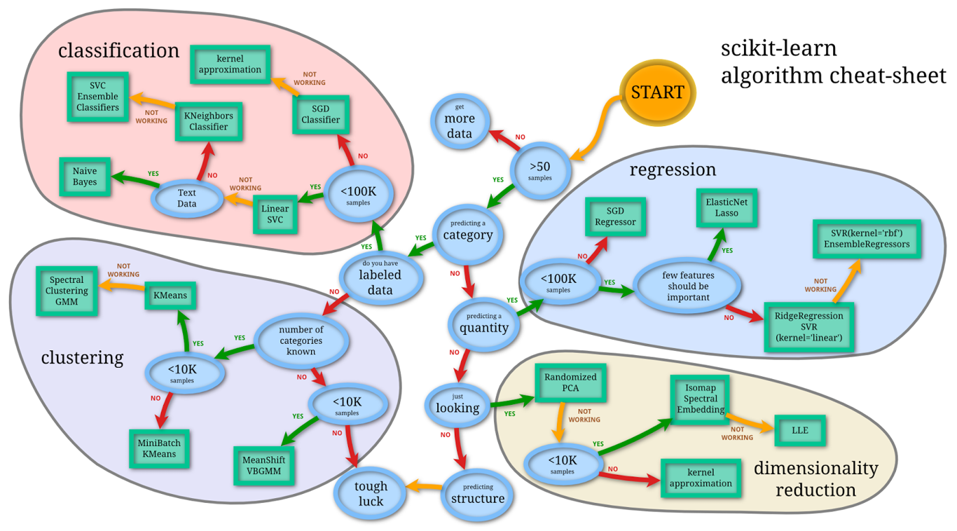
-구별하는 알고리즘에서 어떻게 KNeighbors에 도달하게 되었나를 알려주는 알고리즘치트시트
knn = KNeighborsClassifier(n_neighbors=1)
-fit = 학습
knn.fit(train_input,train_label)
predict_label = knn.predict(test_input)
-예측값의 predict label과 test label의 차이를 통해 정확도를 예측
-100%가 나오면 너무 과접합된 문제가 있다고 생각해야 한다
print(predict_label)
print(test_label)
import numpy as np
print(f'test accuracy: {np.mean(predict_label == test_label)}')
test accuracy: 1.0
2.학습내용 중 어려웠던 점
-어제 학습양을 겪고 나서인지 조금은 적응이 된 느낌이지만 역시나 방대한 양
-학습량이 많아서 쉽지않다
3.해결방법
-메모장에 설명해주시는 여러가지 부분들에 대해 따로 설명을 적으며 공부를 하니 훨씬 적응하기 쉬운것 같다.
4.학습소감
-다음주부터는 더 양이 많아지고 어려워진다니 걱정이 된다. 또 마이크로소프트 자격증에 대해 소개해주셔서 알게되었는데 준비할 수 있다면 해보고 싶어서 찾아봐야 할 것 같다. 할게 많아진다. 지치지말자.