저번에 구상했던대로 간단한 자기소개 페이지를 만들어보았다.
Structure

- 메인페이지인 index.html을 제외한 나머지는 src 폴더를 따로 만들어서 분리시켰다.
- image에는 자기소개 페이지에서 사용할 모든 사진들이 들어있다.
reset css를 사용하여 여백이 나타나지 않게하였다.
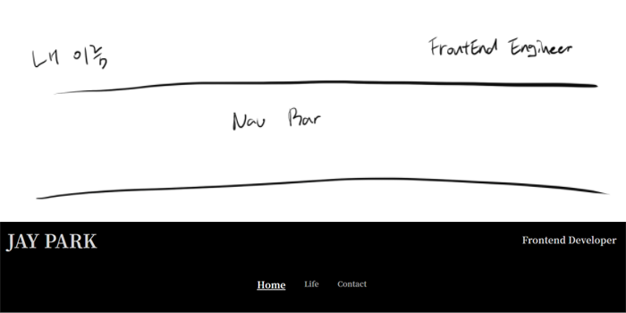
Header
body {
  height: 100vh;
  width: 100%;
  display: flex;
  justify-content: center;
  background-color: rgb(0, 0, 0);
  font-family: 'Noto Serif KR', serif;
}

main {
  width: 100%;
  margin-top: 5vmin;
  display: flex;
  flex-direction: column;
  align-items: center;
}

header {
  width: 80%;
  font-size: 5vmin;
  font-weight: 700;
  color: rgba(255, 255, 255, 0.8);
  display: flex;
  justify-content: space-between;
  align-items: center;
}

header > p:not(:first-child) {
  font-size: 2.5vmin;
}

nav {
  height: 5vmin;
  margin-top: 7vmin;
  display: flex;
  justify-content: center;
  align-items: center;
}

ul {
  width: 50%;
  display: flex;
  justify-content: center;
}

ul > li:not(:last-child) {
  margin-right: 5vmin;
}

a {
  text-decoration: none;
  font-size: 2vmin;
  font-weight: 700;
  color: rgba(255, 255, 255, 0.6);
}

a:hover {
  font-size: 2.5vmin;
  color: rgba(255, 255, 255, 1);
}- Header는 페이지마다 공통으로 들어가는지라
common.css라는 이름으로 따로 분리해주었다. - 계획했던대로 이름과 직업명 그리고 메뉴는
flex를 사용하여 정렬하였다. - 반응형을 위해서 px은 최대한 지양했다.
Home

@import './common.css';

li:nth-child(1) > a {
  text-decoration: underline;
  font-size: 2.5vmin;
  color: rgba(255, 255, 255, 1);
}

.profile_photo {
  width: 100%;
  height: 40vmin;
  margin-top: 5vmin;
  background-color: rgba(255, 255, 255, 0.9);
  display: flex;
  flex-direction: column;
  align-items: center;
  justify-content: center;
}

.profile_photo > img {
  width: 35vmin;
  height: 35vmin;
  border-radius: 40%;
}

.profile_content {
  width: 100%;
  height: 33vmin;
  background-color: rgba(55, 55, 55);
  display: flex;
  flex-direction: column;
  justify-content: center;
  align-items: center;
}

.profile_content > article {
  width: 40%;
  margin-top: 3vmin;
}

.profile_content > article h3 {
  margin-bottom: 2vmin;
  font-size: 4vmin;
  font-weight: 700;
  color: rgb(223, 255, 255);
  text-align: center;
}- 가운데 사진을 배치하고
border-radius를 사용하여 동그랗게 만들어 보았다. - 가장 아래쪽엔 유명한 문구나 괜찮은 문장을 넣어볼까했지만 더 조잡한거 같아서 짧게 한마디를 넣었다.
Life

@import './common.css';

li:nth-child(2) > a {
  text-decoration: underline;
  font-size: 2.5vmin;
  color: rgba(255, 255, 255, 1);
}

section {
  width: 60vmax;
  height: 70vmin;
  margin-top: 3vmin;
  display: grid;
  grid-auto-flow: row;
  grid-template-columns: repeat(2, 1fr);
  justify-items: center;
  align-items: center;
}

article {
  width: 15vmax;
  height: 30vmin;
  border: 1px solid white;
}

article:nth-child(1) > .picture {
  background-image: url('../image/cisco.png');
  background-position: center center;
  background-repeat: no-repeat;
  background-size: 80%;
}

article:nth-child(2) > .picture {
  background-image: url('../image/surf.jpg');
  background-position: center center;
  background-repeat: no-repeat;
  background-size: cover;
}

article:nth-child(3) > .picture {
  background-image: url('../image/note.png');
  background-position: center center;
  background-repeat: no-repeat;
  background-size: cover;
}

article:nth-child(4) > .picture {
  background-image: url('../image/flowerload.jpg');
  background-position: center center;
  background-repeat: no-repeat;
  background-size: cover;
}

.title {
  background-color: rgba(255, 255, 255, 1);
}

.picture {
  height: 20vmin;
  border-bottom: 1px solid black;
}

.about {
  height: 10vmin;
  background-color: rgba(255, 255, 255, 1);
  padding: 0 1.5vmin;
  display: flex;
  flex-direction: column;
  justify-content: space-around;
}

.about-title {
  font-size: 1.5vmin;
  font-weight: 600;
  text-decoration: underline;
}

.about-content {
  font-size: 80%;
  line-height: 15px;
}- 소개 틀은 인스타그램의 모양대로 하고싶었지만 내 의도대로 되진 않았다. 그래도
grid를 연습해보기엔 좋은 과정이었다.
@import './common.css';

li:nth-child(3) > a {
  text-decoration: underline;
  font-size: 2.5vmin;
  color: rgba(255, 255, 255, 1);
}

section {
  width: 50vmin;
  margin-top: 10vmin;
  display: grid;
  grid-auto-flow: column;
}

article {
  display: flex;
  flex-direction: column;
  justify-content: center;
  align-items: center;
}

article > a > i {
  color: rgba(255, 255, 255, 0.9);
  background-color: (0, 0, 0, 1);
  border-radius: 50%;
  font-size: 10vmin;
  text-align: center;
}

article > span {
  margin-top: 3vmin;
  color: rgba(255, 255, 255, 1);
  font-weight: 700;
  text-align: center;
}

article > a > img {
  width: 10vmin;
  height: 10vmin;
  border-radius: 50%;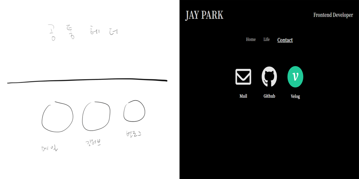
}- main과 github 아이콘은 fontawesome을 이용했고, velog는 아쉽게도 fontawesome에 존재하지 않기 때문에 background-image를 이용해서 처리했다.
- 모든 아이콘들은 a 태그(_blank)가 걸려있어서 새로운 창이 열리며 링크가 연결된다.
후기
- 디자인을 좀 더 오래 생각해볼 필요성이 있다.
flex는 사용하는데있어서 수월해졌는데grid는 grid-templates-(columns, row) 를 이용해 배치하는게 익숙치 않아서 좀 더 다양한 예제를 경험해 볼 필요성이 있다.