스타벅스 이벤트 관련 고객 설문 데이터
- 스타벅스 고객들의 이벤트 관련 설문에 응답한 데이터의 일부
- 해당 데이터에서 고객들이 이벤트에 대한 응답을 어떻게 하는지. 찾고 고객 프로모션 개선방안에 대한 인사이트를 찾는다
Data Description
profile table
- profile 데이터는 설문에 참여한 스타벅스 회원에 관련된 정보가 담겨있다
transcript
- 이벤트에 참여한 실제 유저들의 응답이 기록되어 있다
portfolio
- 이벤트 관련 정보들
라이브러리 및 데이터 로드
- 분석에 필요한 데이터와, 라이브러리를 불러온다
# 데이터 분석 필수 라이브러리 4종 세트 불러오기
import numpy as np
import pandas as pd
import matplotlib.pyplot as plt
import seaborn as sns
# 스타벅스 데이터 3개 불러오기
transcript = pd.read_csv('transcript.csv').drop(columns=["Unnamed: 0"])
profile = pd.read_csv('profile.csv').drop(columns=["Unnamed: 0"])
portfolio = pd.read_csv('portfolio.csv').drop(columns=["Unnamed: 0"])
데이터 전처리
- 결측치가 존재하는 데이터를 찾아서, 결측치를 처리해준다
# 각 데이터에 결측치가 잇는지 확인
profile.info() # 17000 -14825 = 2175 null-count
# 결측치를 포함하는 데이터들은 어떤 데이터들인지 확인
nulls = profile[profile.isnull().any(axis=1)]
nulls.gender.value()
# 결측치를 처리해준다.
# 평균과 같은 통계량으로 채워주거나 버린다
profile = profile.dropna()
profile.info()
profile 데이터 분석
- 설문에 참여한 사람 중, 정상적인 데이터로 판단된 데이터에 대한 분석을 수행한다
- 각 column마다 원하는 통계량을 찾은 뒤, 해당 통계량을 멋지게 시각화해 줄 plot을 seaborn에서 가져와 구현한다.
# profile의 became_member_on 데이터를 시간 정보로 변환
profile.became_member_on = pd.to_datetime(profile.became_member_on.astype(str), format='%Y%m%d')
profile.info()
성별에 관한 분석
# 성별 확인
profile.gender.value_counts()
plt.figure(figsize=(8,6))
sns.countplot(data=profile, x="gender", palette="Set2")
plt.show()
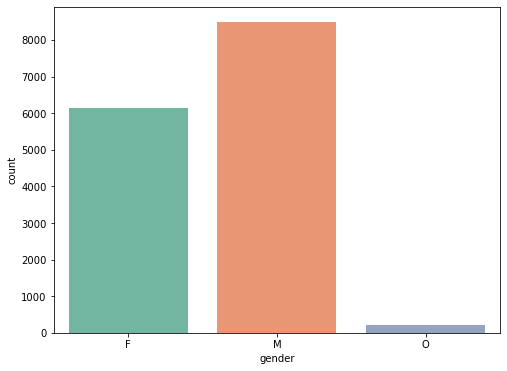
pd.pivot_table(data=profile, index='gender', values="income")
나이에 대한 분석
plt.figure(figsize=(20,6))
# sns.countplot(data=profile, x="age")
sns.histplot(data=profile, x="age", bins=15, hue="gender", multiple='stack')
plt.show()
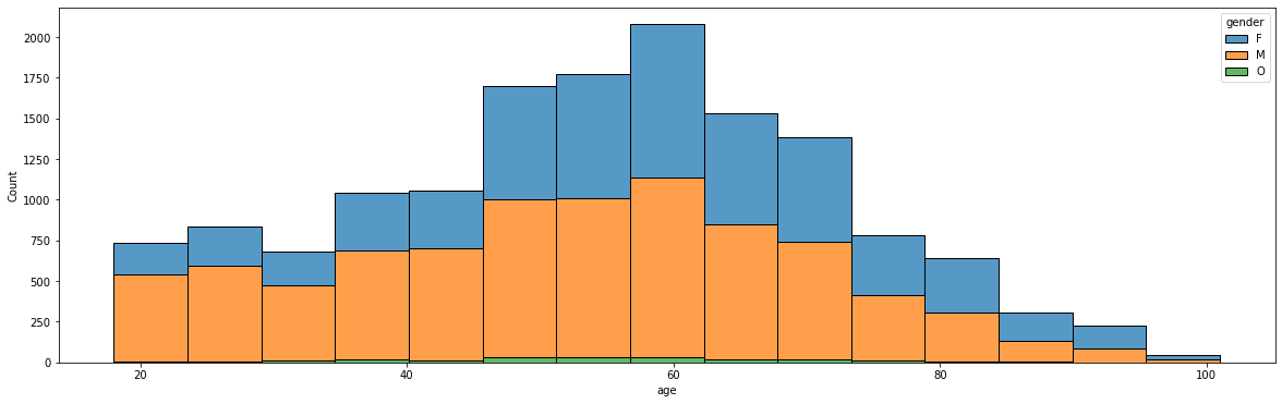
pd.pivot_table(data=profile, index="gender", values=["age", "income"])
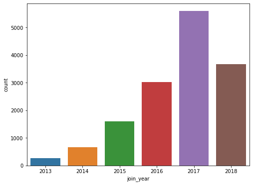
회원이 된 날짜에 대한 분석
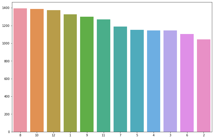
profile["join_year"] = profile.became_member_on.dt.year
profile["join_mth"] = profile.became_member_on.dt.month
profile
# join year countplot
plt.figure(figsize=(8,6))
sns.countplot(data=profile, x="join_year")
plt.show()
x = profile.join_mth.value_counts().index
y = profile.join_mth.value_counts().values
# join month countplot
plt.figure(figsize=(12, 8))
sns.barplot(x=x, y=y, order=x)
#sns.countplot(data=profile, y = "join_mth")
plt.show()
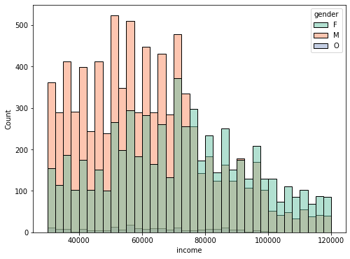
수입에 대한 분석
plt.figure(figsize=(8,6))
sns.histplot(data=profile, x="income", palette="Set2", hue="gender",)
plt.show()
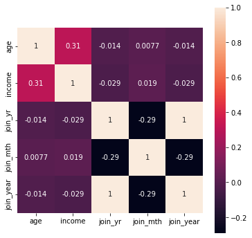
profile 데이터에 대한 상관관계 분석
plt.figure(figsize=(6, 6))
sns.heatmap(data=profile.corr(), square=True, annot=True)
plt.show()
transcript에 대한 분석
- 각 column마다 원하는 통게량을 찾은 뒤, 해당 통계량을 멋지게 시각화해줄 plot을 seaborn에서 가져와 구현
- person과 values column은 분석 대상에서 제외
event에 대한 분석
plt.figure(figsize=(8, 6))
sns.countplot(data=transcript, x="event", palette="spring")
plt.show()
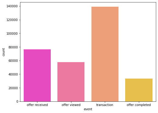
pd.pivot_table(data=transcript, index="event", values="time")
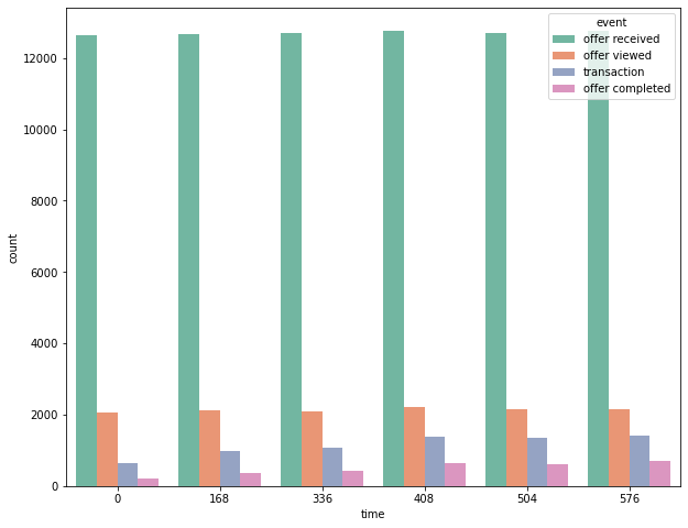
time에 대한 분석
temp = sorted(transcript.time.value_counts()[:6].index)
print(temp)
for i in range(len(temp)-1):
    print(temp[i+1] - temp[i], end=" ")
plt.figure(figsize=(8, 6))
sns.histplot(data=transcript, x="time")
plt.show()
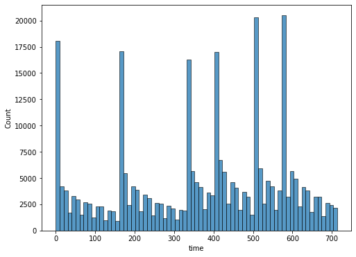
temp_df = transcript.loc[transcript.time.isin(temp), :]
temp_df
plt.figure(figsize=(10,8))
#sns.countplot(data=temp_df, x="event", palette="Set2", hue="time")
sns.countplot(data=temp_df, x="time", palette="Set2", hue="event")
plt.show()

가보자가보자~