기본 import문
import numpy as np
import pandas as pd
PREVIOUS_MAX_ROWS = pd.options.display.max_rows
pd.options.display.max_rows = 20
np.random.seed(12345)
import matplotlib.pyplot as plt
import matplotlib
plt.rc('figure', figsize=(10, 6))
np.set_printoptions(precision=4, suppress=True)

# magic 명령어: 일반적인 작업이나 ipython 시스템 동작을 제어
%matplotlib notebook
기본 matplotlib
import matplotlib.pyplot as plt
import numpy as np

data = np.arange(10)
data
plt.plot(data)  #1~10의 data를 넣음.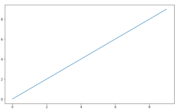
💡 Figures and Subplots
- figure : 이 안에 한 개 혹은 복수 개의 plot을 그리고 관리할 수 있도록 하는 기능
- 이 때, figure 안에 들어가는 plot 공간 하나를 'subplot(서브플롯)'
- subplot() : 여러 개의 그래프를 하나의 그림에 나타내도록 함.
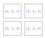
# 새로운 figure 객체 생성
fig = plt.figure()

# fig 안에 2 x 2로 subplot 구성
# 그중 첫번째(좌상단, index=1) subplot 선택
ax1 = fig.add_subplot(2, 2, 1)  #ax1 = 해당 subplot의 빈 좌표 평면(여기에 plot을 그림.)

ax2 = fig.add_subplot(2, 2, 2)
# 가장 최근의 figure와 subplot에 plot을 그림.
plt.plot([1.5, 3.5, -2, 1.6])

ax3 = fig.add_subplot(2, 2, 3)
plt.plot(np.random.randn(50).cumsum(), 'k--')  #cumsum : 행, 열의 누적합 구함.
- 특정 axes에 plot을 그림. (hist, scatter)
# hist: histogram(bar chart), bins: 구간수, color: 색상, alpha: 투명도
a = ax1.hist(np.random.randn(100), bins=20, color='k', alpha=0.3)
print(a)
# scatter: 2차원 데이터 즉, 두 개의 실수 데이터 집합의 상관관계 표시
ax2.scatter(np.arange(30), np.arange(30) + 3 * np.random.randn(30))
plt.close('all')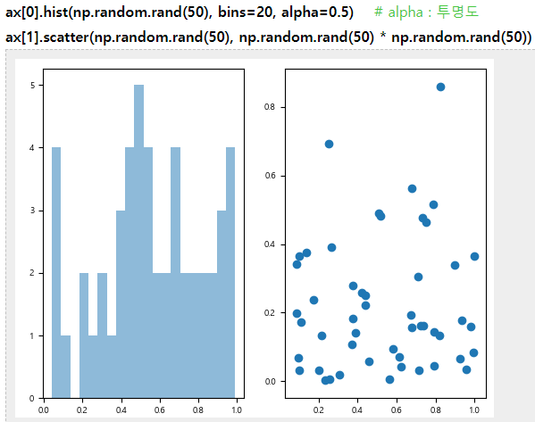
- fig와 subplot 직관적으로 그리기 (subplot)
fig, axes = plt.subplots(2, 3)
plt.tight_layout()  #자동으로 레이아웃 설정
axes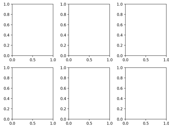
- subplot 간 간격 조정
- subplots_adjust(left=None, bottom=None, right=None, top=None, wspace=None, hspace=None)
- wspace: 좌우 subplot간의 너비에 대한 비율 조절
- hspace: 위아래 subplot 간의 높이에 대한 비율 조정
fig, axes = plt.subplots(2, 2, sharex=True, sharey=True) #축을 공유(범위, tick, 크기가 동일하게)
for i in range(2):
    for j in range(2):
        axes[i, j].hist(np.random.randn(500), bins=50, color='k', alpha=0.5)

plt.subplots_adjust(wspace=0, hspace=0)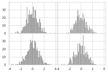
💡 Colors, Markers, and Line Styles
- plot()으로 plot을 그릴 때 color, marker, linestyle를 인자로 줌.
- ax.plot(x, y, 'g--') : 녹색 점선
- ax.plot(x, y, linestyle='--', color='g') : 녹색 점선
plt.figure()  #figure 생성

from numpy.random import randn
plt.plot(randn(30).cumsum(), 'rx--')  #빨간색, x 마크, 점선'

plt.close('all')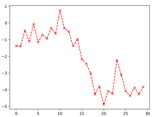
data = np.random.randn(30).cumsum()
plt.plot(data, 'k--', label='Default')
plt.plot(data, 'k-', drawstyle='steps-post', label='steps-post') #계단 형태의 그래프
plt.legend(loc='best')  #best: 범례 위치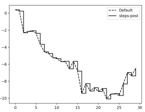
💡 Ticks(눈금), Labels, and Legends(범례)
#일단 plot 하나 그리고
fig = plt.figure()
ax = fig.add_subplot(1, 1, 1)
ax.plot(np.random.randn(1000).cumsum())

plt.xlim() # x축 표시되는 범위 출력
- 눈금(ticks) 위치 지정
# 눈금 위치 지정
ticks = ax.set_xticks([0, 250, 500, 750, 1000])

# 눈금 이름/형태/폰트
labels = ax.set_xticklabels(['one', 'two', 'three', 'four', 'five'],
                            rotation=30, fontsize='small')

# 그림 title
ax.set_title('My first matplotlib plot')

# X 축 이름
ax.set_xlabel('Stages')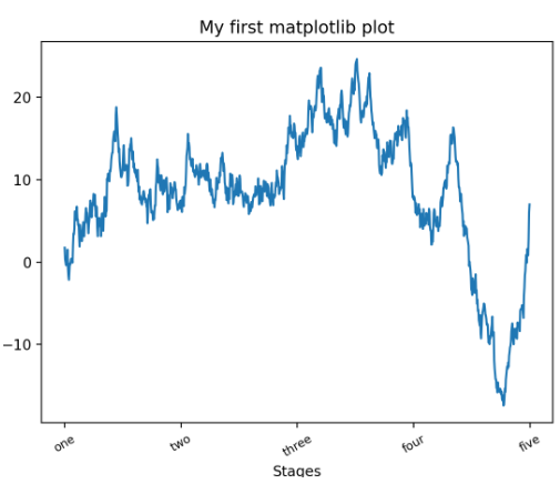
- 범례(legends) 넣기
from numpy.random import randn
fig = plt.figure();
ax = fig.add_subplot(1, 1, 1)

ax.plot(randn(1000).cumsum(), 'y', label='one')
ax.plot(randn(1000).cumsum(), 'r--', label='two')
ax.plot(randn(1000).cumsum(), 'b.', label='three')

ax.legend(loc='best')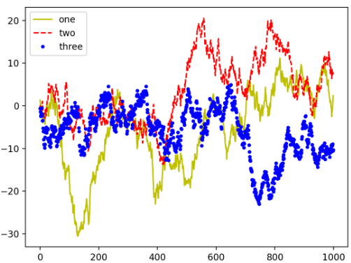
- 주석/화살표 추가 (csv 데이터를 plot에)
- text: 그림에 추가할 주석, 주석 위치(x,y) 좌표
- arrow: 그림에 추가할 화살표
- annotate:
from datetime import datetime

fig = plt.figure()
ax = fig.add_subplot(1, 1, 1)

data = pd.read_csv('examples/spx.csv', index_col=0, parse_dates=True)
spx = data['SPX']

data  spx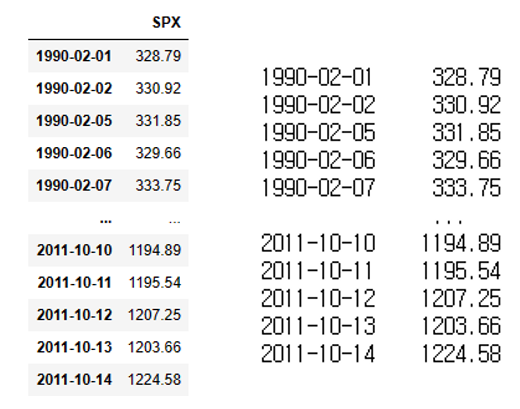
spx.plot(ax=ax, style='k-')  #black, 실선

crisis_data = [
    (datetime(2007, 10, 11), 'Peak of bull market'),
    (datetime(2008, 3, 12), 'Bear Stearns Fails'),
    (datetime(2008, 9, 15), 'Lehman Bankruptcy')
]


# 화살표와 주석 그리기
for date, label in crisis_data:
    #주석내용, xy:좌표(xytext 있으면 의미 x), xytext:주석 좌표, arrowprops:화살표 특성,
    #horizontalalignment:주석의 수평정렬, verticalalignment:수직정렬(top or bottom)
    ax.annotate(label, xy=(date, spx.asof(date) + 75),
                xytext=(date, spx.asof(date) + 225),
                arrowprops=dict(facecolor='black', headwidth=4, width=2,
                                headlength=4),
                horizontalalignment='left', verticalalignment='top')
- x축 y축 범위 지정 및 제목 쓰기 (위랑 이어짐.)
ax.set_xlim(['1/1/2007', '1/1/2011'])
ax.set_ylim([600, 1800])

ax.set_title('Important dates in the 2008-2009 financial crisis')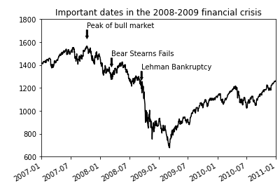
💡 도형 그리기
fig = plt.figure(figsize=(12, 6));
ax = fig.add_subplot(1, 1, 1)

rect = plt.Rectangle((0.2, 0.75), 0.4, 0.15, color='k', alpha=0.3)   #(x,y) 좌표, x 폭, y 높이
circ = plt.Circle((0.7, 0.2), 0.15, color='b', alpha=0.3)   # 원 중심 (x, y), 반지름
pgon = plt.Polygon([[0.15, 0.15], [0.35, 0.4], [0.2, 0.6]], # 다형의 각 점
                   color='g', alpha=0.5)
ax.add_patch(rect)
ax.add_patch(circ)
ax.add_patch(pgon)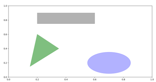
💡 plot을 파일로 저장
- plt.savefig(fname, dpi, facecolor, format, bbox_inches, transparent)
fname : 파일 경로, dpi : figure의 인치당 도트 해상도, facecolor : 배경색, format : 명시적 파일 포맷(png, svg, pdf...), bbox_inches : figure에서 저장할 부분,transparent : 그림 배경을 투명하게 지정(True를 넘기면.) - ex) plt.savefig('figpath.svg')
plt.savefig('figpath.png', dpi=400, bbox_inches='tight')💡 Line Plots (series와 df를 plot으로)
- index: x 축
plt.close('all')- seires
s = pd.Series(np.random.randn(10).cumsum(), index=np.arange(0, 100, 10))
print(s)
s.plot()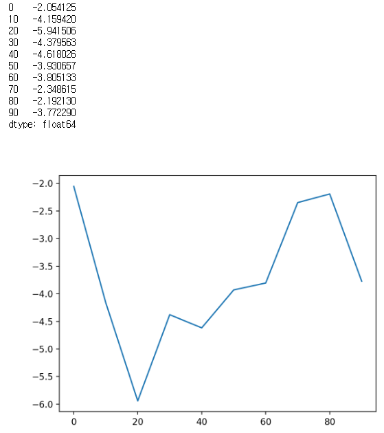
- dataframe
- 각 column별로 선 그래프를 그리고, 범례는 자동 생성
df = pd.DataFrame(np.random.randn(10, 4).cumsum(0),
                  columns=['A', 'B', 'C', 'D'],
                  index=np.arange(0, 100, 10))
df.plot()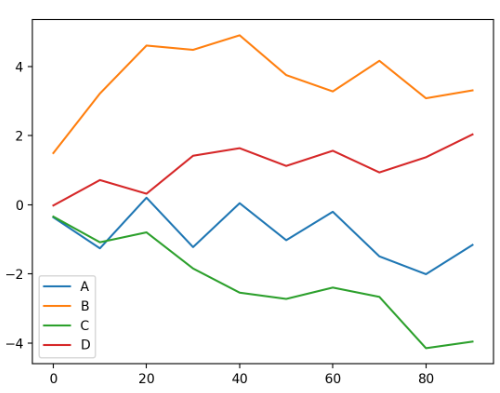
💡 Bar Plots (막대 그래프)
- Series의 막대그래프
- plot(kind='bar') or plot.bar()
- plot(kind='barh') or plot.barh()
fig, axes = plt.subplots(2, 1)

data = pd.Series(np.random.rand(16), index=list('abcdefghijklmnop'))
data.plot(kind='bar', ax=axes[0], color='k', alpha=0.7, rot=0)  #alpha:투명도
# data.plot.bar(ax=axes[0], color='k', alpha=0.7, rot=0)

data.plot.barh(ax=axes[1], color='k', alpha=0.7)
# data.plot(kind='barh' ax=axes[1], color='k', alpha=0.7)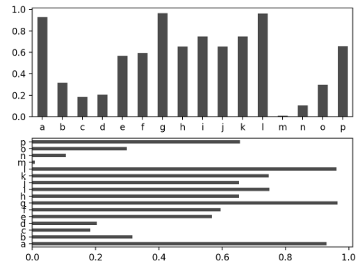
- DataFrame의 막대그래프
- DataFrame은 각 row의 값을 함께 묶어서 하나의 그룹으로 막대그래프
- name 이름이 범례의 제목
np.random.seed(12348)\

df = pd.DataFrame(np.random.rand(6, 4),
                  index=['one', 'two', 'three', 'four', 'five', 'six'],
                  columns=pd.Index(['A', 'B', 'C', 'D'], name='Genus'))
print(df)
Genus A B C D
one 0.370670 0.602792 0.229159 0.486744
two 0.420082 0.571653 0.049024 0.880592
three 0.814568 0.277160 0.880316 0.431326
four 0.374020 0.899420 0.460304 0.100843
five 0.433270 0.125107 0.494675 0.961825
six 0.601648 0.478576 0.205690 0.560547
df.plot.bar()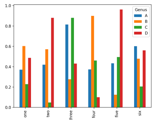
= 쌓인 막대 그래프 (stacked=True option)
df.plot.barh(stacked=True, alpha=0.5)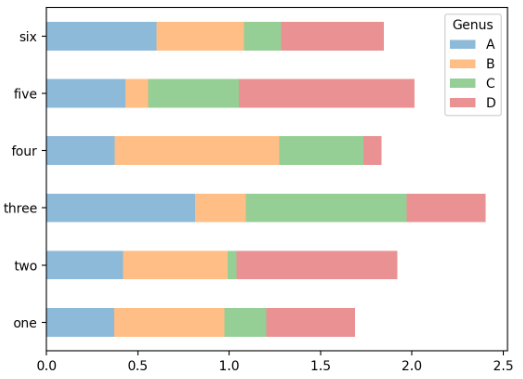
- crosstab - csv 가지고 data 개수(빈도수) 파악
plt.close('all')

tips = pd.read_csv('examples/tips.csv')
tips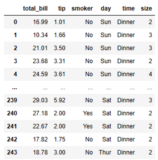
party_counts = pd.crosstab(tips['day'], tips['size'])  #day가 index, size가 열(col)
party_counts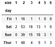
party_counts = party_counts.loc[:, 2:5]  #인덱스는 수 그대로
party_counts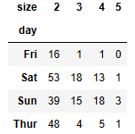
- 각 row의 합이 1이 되게 Normalize
# 각 row의 합이 1이 되게 Normalize
party_pcts = party_counts.div(party_counts.sum(1), axis=0)
party_pcts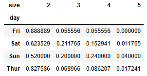
party_pcts.plot.bar(rot=0) # 글씨 회전 (ex) 45, 90,,,)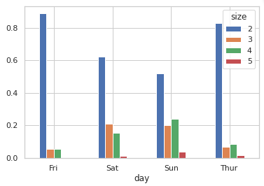
- tip
plt.close('all')

import seaborn as sns

tips = sns.load_dataset("tips")

# tip을 제외한 party 비용 대비 tip 비율
tips['tip_pct'] = tips['tip'] / (tips['total_bill'] - tips['tip'])
tips.head()

sns.barplot(x='tip_pct', y='day', data=tips, orient='h')
#sns.barplot(y='tip_pct', x='day', data=tips, orient='v')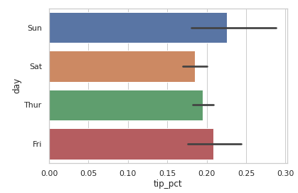
plt.close('all')
sns.barplot(x='tip_pct', y='day', hue='time', data=tips, orient='h')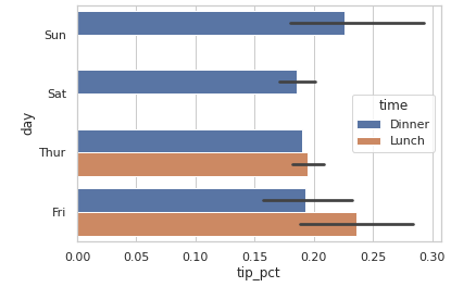
💡 Histograms and Density Plots
- Histogram(빈도) - plot.hist()
- tip 자료에서 전체 tip에 대한 tip 백분율 : tips['tip_pct']
plt.figure()

import seaborn as sns

tips = sns.load_dataset("tips")
tips['tip_pct'].plot.hist(bins=50)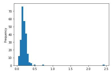
- Density plot - plot.density()
- 연속 확률 분포의 추정치
plt.figure()
tips['tip_pct'].plot.density()
# tips['tip_pct'].plot(kind='kde') 도 동일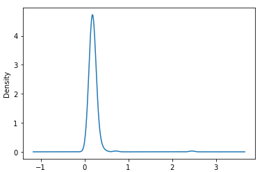
- Histogram과 Density(밀도) plot을 동시에 그리기 - 두 개의 정규분포를 한 그래프에
import numpy as np

plt.figure()

#두 개의 정규분포 자료
comp1 = np.random.normal(0, 1, size=200)   # N(0,1): 평균 0, 표준편차 1
comp2 = np.random.normal(10, 2, size=200)  # N(10,2)

values = pd.Series(np.concatenate([comp1, comp2])) #배열들을 하나로 합침.
values
0 0.203887
1 -2.213737
2 0.315042
3 -0.137200
4 0.036238
...
395 10.636197
396 9.259458
397 10.182617
398 10.686063
399 10.864287
sns.distplot(values, bins=100, color='k')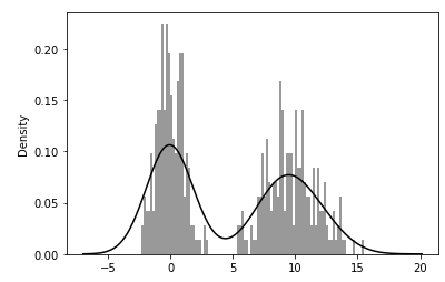
💡 Scatter(산점도) or Point Plots
- 두 개의 1차원 Series Data 간의 관계 분석
- plt.scatter()
- seaborn의 regplot 메소드를 이용해서 선형회귀선 및 산점도 그림.
macro = pd.read_csv('examples/macrodata.csv')

data = macro[['cpi', 'm1', 'tbilrate', 'unemp']]  #열(col)을 지정
trans_data = np.log(data).diff().dropna()  #로그 차이를 계산
trans_data[: 5]  #5개 행만 출력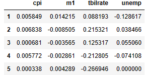
plt.figure()

sns.regplot('m1', 'unemp', data=trans_data) #x축은 'm1' 열, y축은 'unemp' 열
plt.title('Changes in log %s versus log %s' % ('m1', 'unemp'))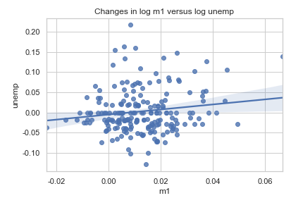
- seabon을 이용한 각 변수에 대한 산점도(산점도 행렬) - pairs plot
sns.pairplot(trans_data, diag_kind='kde', plot_kws={'alpha': 0.2})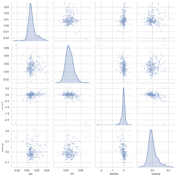
- pandas를 이용한 산점도 행렬
from pandas.plotting import scatter_matrix
plt.figure()

scatter_matrix(trans_data,
               alpha=1, ## 데이터 포인트의 투명도 1 = 가장진함, 0 = 완전투명
               figsize=(10,10), ## 캔버스 사이즈 조절
               diagonal=None) ## 대각 원소에는 아무것도 그리지 않는다.
plt.show()
- scatter 함수로 산점도 그리기
plt.figure()
plt.scatter(trans_data['m1'], trans_data['unemp'])
plt.title('Changes in log %s vs. log %s' % ('m1', 'unemp'))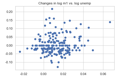
- scatter_matrix를 이용한 산점도 행렬
from pandas.plotting import scatter_matrix

pd.plotting.scatter_matrix(trans_data, diagonal='kde', color='k', alpha=0.3)
plt.show()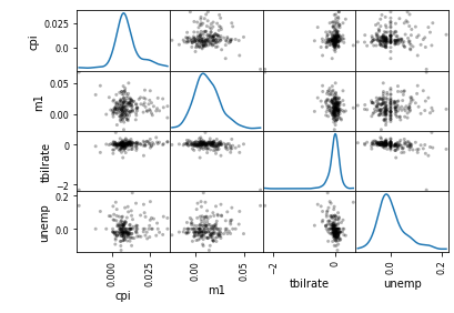
💡 Facet Grids and Categorical Data
- 다양한 범주형 값을 가지는 데이터를 시각화
- seaborn의 factorplot : 다양한 면을 나타내는 그래프 그릴 수 있음.
- 행, 열 방향으로 서로 다른 조건을 적용하여 여러 개의 서브 플롯 제작
- 요일/시간/흡연 여부에 따른 tip 비율 그래프
sns.factorplot(x='day', y='tip_pct', hue='time', col='smoker',
               kind='bar', data=tips[tips.tip_pct < 1])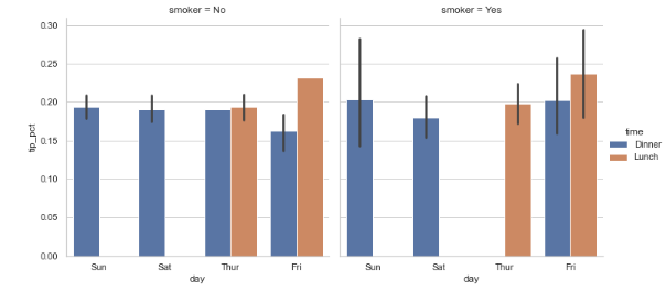
- 요일/시간/흡연 여부에 따른 팁 비율을 그래프 (hue없이)
sns.factorplot(x='day', y='tip_pct', row='time',
               col='smoker',
               kind='bar', data=tips[tips.tip_pct < 1])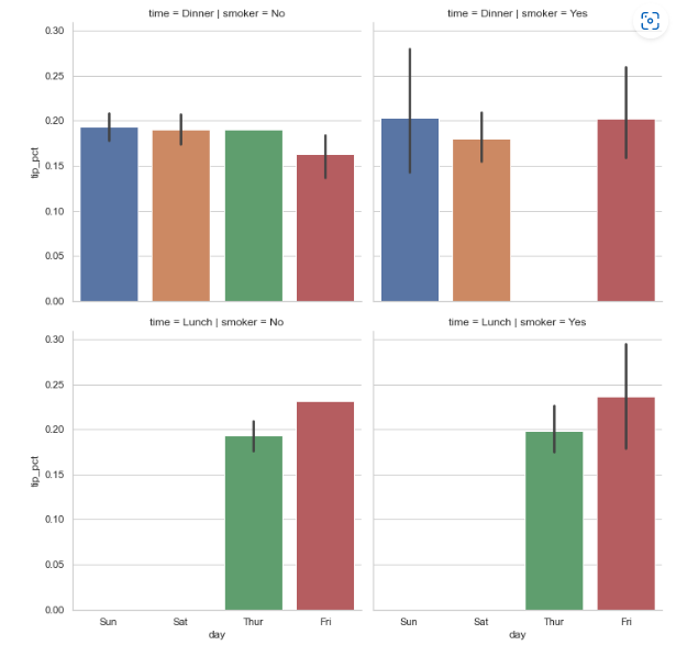
- 중간값, 사분위값, 특잇값을 보여주는 상자그림(box plot)
sns.factorplot(x='tip_pct', y='day', kind='box',
               data=tips[tips.tip_pct < 0.5])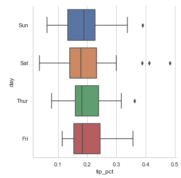

공부 기록용