position
absolute가 되면 block-element도 내용의 크기만큼 너비를 갖게 된다.
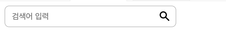
출처 위코드 문제 예시
* {
  box-sizing: border-box;
}

div{
  position: relative;
  width: 300px;
}

input {
  width:100%;
  border: 1px solid #bbb;
  border-radius: 8px;
  padding:10px 12px 10px 12px;
  font-size:14px;
}

img {
  position: absolute;
  width: 17px;
  top:10px;
  right:12px;
  margin: 0;
}
부모인 div의 가로 크기를 input이 가져가고 img는 absolute로 부모 위에서 겹치게 한다.
fixed
fixed는 부모가 필요없이 눈에 보이는 화면 내부에서만 움직인다. 주로 heaer를 만들 때 사용하는데
 position: fixed;
 left: 0;
 right: 0;
 top:0;
 height: 48px;
이런 식으로 상단에 고정시키고 자식 요소에 absolute를 주어서 스타일링한다.
position 정리 with 예시
모든 태그는 기본적으로 position: static이다. 이제 태그를 옮기고 싶을 때 position: relative 를 사용하게 된다.
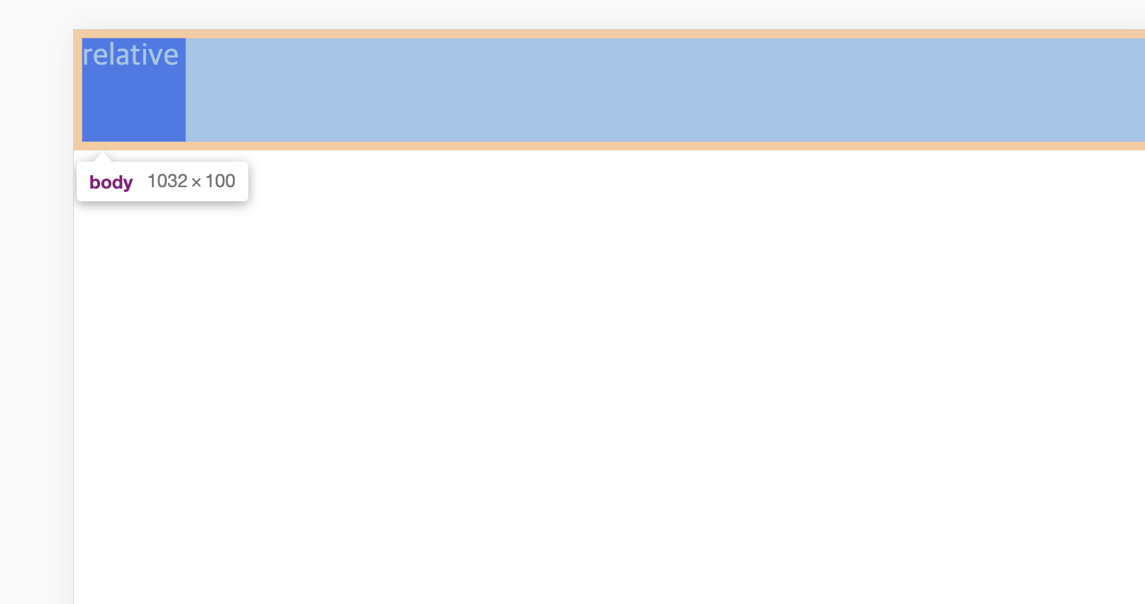
앙증맞은 relative 박스가 홀로 있다. 여기에 position: relative 를 첨가하여 left:50px 을 주어야겠다.
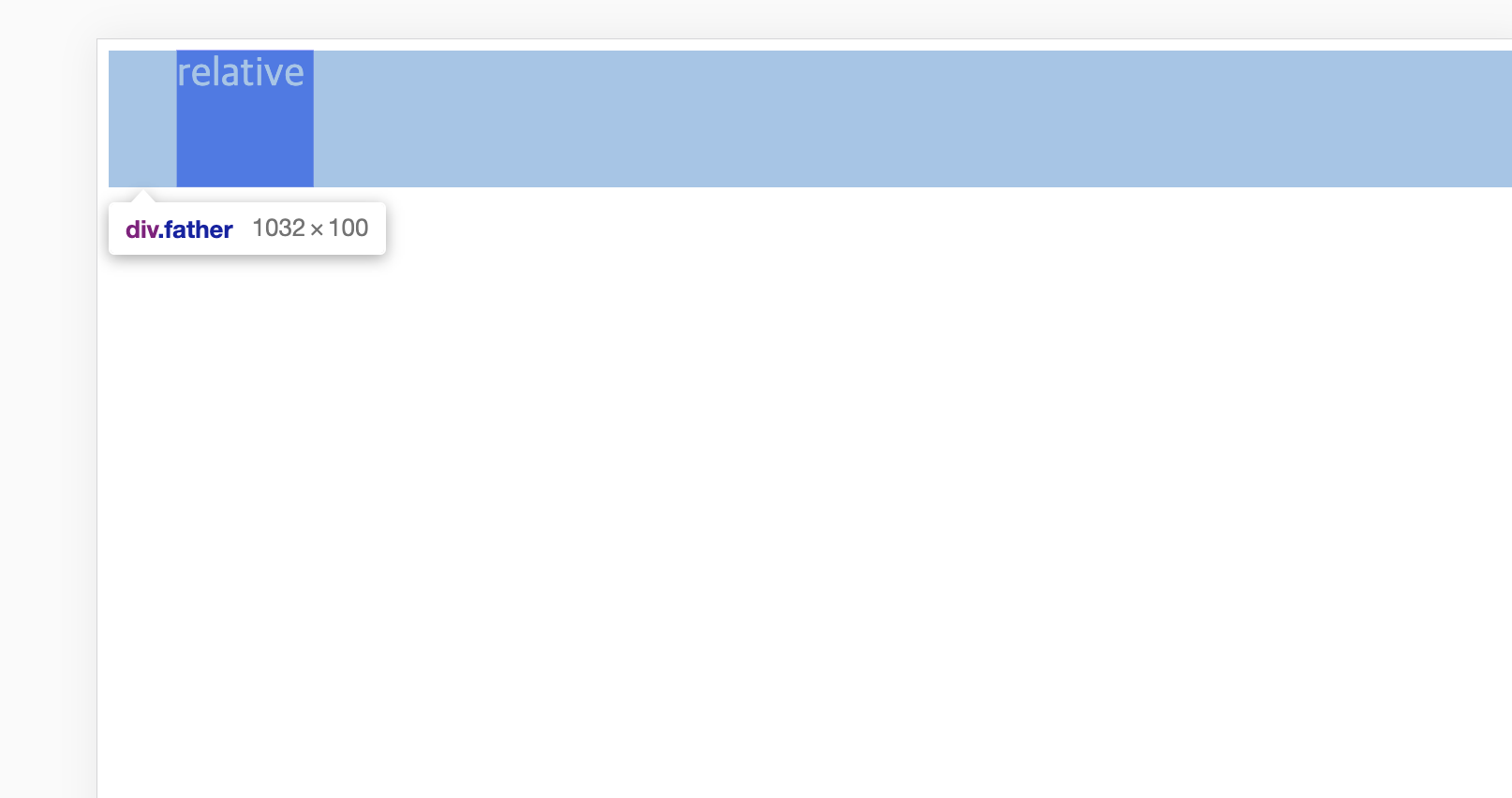
left 에서 50px 만큼 떨어진 것을 육안으로 확인할 수 있다. 반대로 left 쪽으로 50px 만큼 가게 만들고 싶으면 음수를 사용하면 된다.
position: relative 가 static인 상태를 기준으로 px만큼 움직였으면 이름부터 멋진 position: absolute는 절대적인 권능을 주체하지 못해 parent의 position을 기준으로 한다(static은 제외)
html
<div>
  <div class="absolute">absolute</div>
</div>
<div class="parent">
  <div class="child">child</div>
</div>
독고다이 absolute div과 parent가 있는 child div이 있다.
css
.absolute {
  background: red;
  position: absolute;
  right: 0;

}

.parent {
  position: relative;
  width: 100px;
  height: 100px;
  background: blue;
}

.child {
  background:black;
  position: absolute;
  right: 0;
  color:yellow;
}
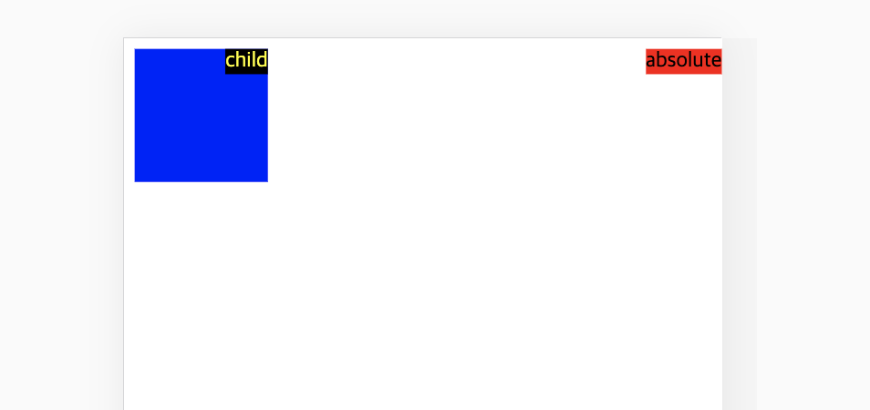
.absolute 는 부모 태그 중 position: relative 가 없기 때문에 body 를 기준으로 오른쪽에 붙었다. 반면 .child 는 position을 가진 parent가 있기 때문에 파란 박스 안에서 오른쪽으로 붙어버린 것을 알 수 있다.
<div class="parent">
    <div class="fixed">fixed</div>
    <div class="child">child</div>
</div>
.fixed {
background: red;
position: fixed;
right: 0;
}
.parent {
position: relative;
width: 100px;
height: 100px;
background: blue;
}
.child {
background:black;
position: absolute;
right: 0;
color:yellow;
}absolute에게도 parent가 생겼다. 이름을 fixed로 개명하고 새로운 삶을 꿈꾸었으나 삶의 관성은 쉽게 잊도록 만들어지지 않았음을 그는 몰랐다.
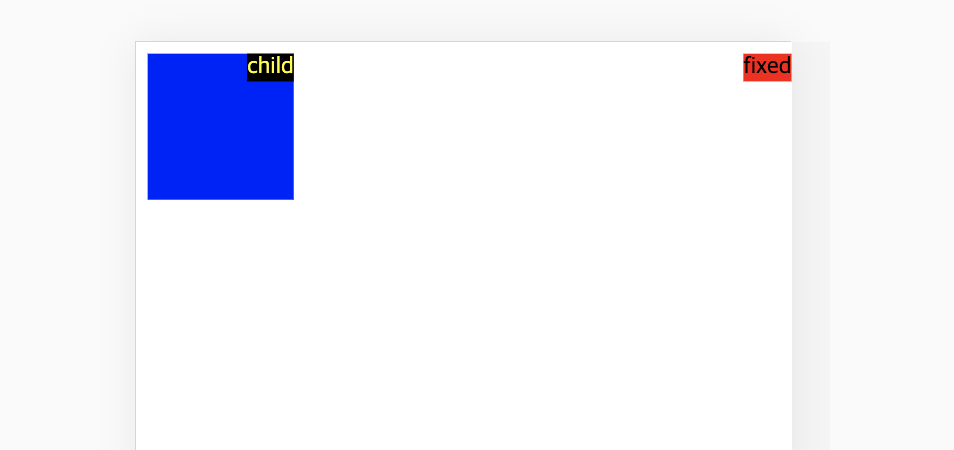
position이 있는 parent가 생겼음에도 여전히 오른쪽 벽에 붙어있다. 주어진 관습을 따르지 않고 자신의 길을 가는 position: fixed 는 이 시대 마지막 아나키스트라 불릴만하다.
float
주로 이미지 주변에 텍스트를 감싸기 위해 만들어진 프로퍼티다. clear라는 속성이 필요한데 왜냐면 부모 요소의 높이를 인지할 수 없어서 부모를 벗어나기도 하기 때문이다. clear는 float 요소 옆에 채워지는 요소들에게 적용된다. img가 튀어나오면 hidden으로 해결!
Layout 수평 & 수직 정렬
수평 정렬
- div처럼 block인 친구들 width가 있는 경우, margin으로 수평 정렬이 가능하다.
.div {
  margin: auto;
  width: 50%
}
width가 없어나 100%면 가운데 정렬이 되지 않는다
- text는 text-align으로
.text {
  text-align:center;
}- Image는 display:block으로 성정하고 margin으로
img {
  display: block;
  margin-left: auto;
  margin-right: auto;
  width: 40%;
}- position absolute를 주고 right/left값으로
.right {
  position: absolute;
  right: 0px;
  width: 300px;
}
수직 정렬
- padding으로 가운데 정렬하기
div {
  padding: 10px 0
}- line-height와 height의 값을 동일하게 설정하자
.something {
  line-height:200px
  height: 200px
}
만약 text가 여러 줄이라면
.something p {
 line-height: 1.5
 display: inline-block;
 vertical-align: middle;
}
반응형
모바일 같은 작은 화면에서 접근했을 때 가로폭이 줄어들면서 가시성의 문제가 생긴다. 그래서 반응형으로 최적화 해야한다.
viewport란 웹페이지의 가시영역이다. viewport meta tag는 모바일 디바이스에만 적용된다.
반응형 웹디자인의 핵심 기술은 @media다. @media을 사용하여 미디어 별로 style을 지정하는 것을 Media Query라고 한다. 아래는 문법!
@media screen and (min-width: 480px) {
  body {
    background-color: lightgreen;
  }
}
min-width처럼 범위를 정한 것을 breakpoint라고 하는데 아래 그림처럼 디바이스에 따라 달리 가능하다.
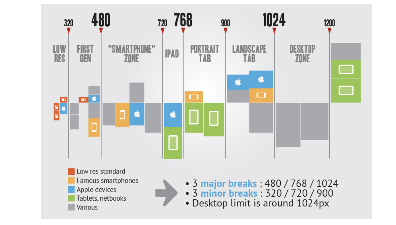
출처 :
위코드 문제
