프로젝트 진행중의 기록...
-
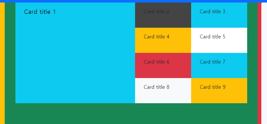
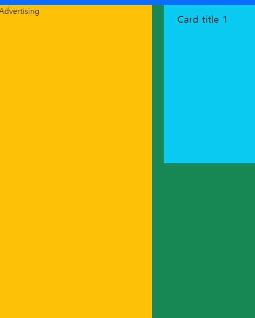
양 끝점의 aside 구역을 빈 박스로 구현할지 아님 css로 center로 지정할지 고민했는데 나중에 광고 또는 비슷한 내용을 추가하기 좋고 반응형을 구현하기 수월하게 진행해야 할 걸 감안해서 빈박스를 (사진의 노란박스) 넣는걸로 결정
-
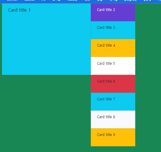
부모노드에 justify-content-center 를 적용하면 컨텐츠들이 CSS의 법칙대로 가운데로 정렬되는걸 확인할 수 있다.

<div class="col-5 bg-success ">
    <container class="row justify-content-center card_container">
      <div class="cards_main_image col-8 bg-info" style="width: 380px; height: 320px;">
        <div class="card-body">
          <h5 class="card-title">Card title 1</h5>
        </div>
      </div>
      <div class="row cardAside col-4" style="width: 380px; height: 320px;">
        <div class="bg-dark  " style="width: 50%; height: 80px;">
          <div class="card-body">
            <p class="card-title">Card title 2</p>
.
.
.
.
다만 justify-content-center를 적용하더라도 부모노드가 row로 지정되어 있으면 완전한 중간구역으로 못 이동하는 경우가 생긴다.
<div class="**row** col-5 bg-success ">
          <container class="row justify-content-center card_container">
            <div class="cards_main_image col-8 bg-info" style="width: 380px; height: 320px;">
              <div class="card-body">
                <h5 class="card-title">Card title 1</h5>
              </div>
            </div>
.
.
.
.
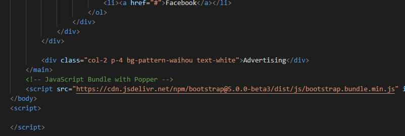
script 태그의 최적의 위치는 어디일까???
보통은 자바스크립트의 코드를 담거나 링크를 지정해 주는 "script" 태그를 어디에 두어야 할지 고민인 경우가 많다. 그것에 관한 각종 글들을 봤었는데 위치에 따라서 웹페이지 동작의 성질이 다르고 어떤 프로그램을 구현하는냐에 따라서 head 안에 둘 수도 있고 body 안에 둘 수도 있고 한 가지의 정답은 없었던 걸로 기억이 난다.
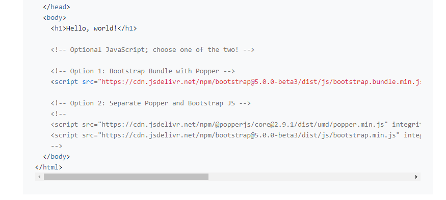
부트스트랩 버전5의 공식문서에서 보면 body 테그 안에 넣으라고 권장한다. 특별한 일이 없는 한 공식 문서대로 작업하는게 좋다고 보았다.
공식문서대로 이 위치에 집어넣고 다시 컴파일링 작동시키면
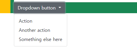
이렇게 JS파일을 인식해야만 쓸 수있는 '드롭다운' 도 잘 작동하는 걸 확인 할 수있다.
텍스트 콘텐츠를 한 줄로 유지하고 싶다면???
<div class="bottom_list col-12 gamenews_section">
   <a href="#" class="list-group-item list-group-item-action text lh-tight text-start" aria-current="true">
      <div class="col-10 mb-1 small text-truncate">[QHD] '디아블로 2: 레저렉션' 테크니컬 알파 테스트</div>
   </a>
   <a href="#" class="list-group-item list-group-item-action  lh-tight text-start" aria-current="true">
       <div class="col-10 mb-1 small text-truncate">[FHD] '송버드 심포니' 한국어판 플레이 동영상</div>
   </a>
   <a href="#" class="list-group-item list-group-item-action  lh-tight text-start" aria-current="true">
        <div class="col-10 mb-1 small text-truncate">[FHD] '유루캠Δ 버추얼 캠프 ~산기슭 캠핑장 편~'</div>
   </a>
   <a href="#" class="list-group-item list-group-item-action  lh-tight text-start" aria-current="true">
        <div class="col-10 mb-1 small text-truncate">[FHD] '스미코구라시 모여 봐요! 스미코 타운'</div>
   </a>
   <a href="#" class="list-group-item list-group-item-action  lh-tight text-start" aria-current="true">
        <div class="col-10 mb-1 small text-truncate">[FHD] '사망여각' 한국어판 플레이 동영상</div>
   </a>
</div>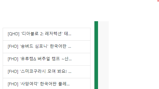
' text-truncate' 를 class에 추가하면 줄임표(...)를 써서 컨텐츠를 한 줄로 유지해준다.
브라우저의 width을 줄어들어도 거기에 맞춰서 잘라준다.
구현과정에서 어려웠던 점들...
커스텀이 어려운 카드섹션
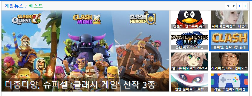
-
이런 컴포넌트를 부트스트랩의 카드섹션으로 재현 할려했지만 이용하기 너무 까다로워 일반 박스로 만들기로 결정
-
폰트사이즈를 커스텀 하고자하는 경우 따로 파일을 생성하고 $utilities 부분을 수정하면 기본적인 설정을 유지하면서 커스텀한 사이즈도 이용할 수 있다.
// scss/_utilities.scss

$utilities: () !default;
$utilities: map-merge(
  (
    "custom-font-size": (
      property: font-size,
      class: cfs,
      values: (
        2: 0.5rem,
        3: 0.7rem,
        3n: 12px,
        4: 1rem,
        5: 1.5rem,
        6: 2rem,
        7: 2.5rem,
        8: 3rem,
      ),
    ),
  ),
  $utilities
);
// index.html

<ul class="nav justify-content-center fw-bold cfs-3n headerNav bg-primary">
        <li class="nav-item">
          <a class="nav-link active" aria-current="page" href="#">PS4/5</a>
        </li>
        <li class="nav-item">
          <a class="nav-link" href="#">SWITCH</a>
        </li>
        <li class="nav-item">
          <a class="nav-link" href="#">XBO/SX</a>
        </li>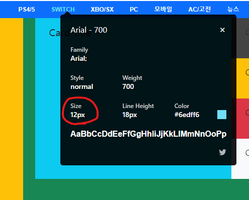
다른 속성도 이렇게 쓰고 싶었지만 응용이 안되는 중이다.
부트스트랩 5 자체 내에서 SASS가 있으나 기존 색상 명만 커스텀이 가능하고 직접 만든 변수명이 적용이 되지 않았었다.
해결방법은 우선 "$커스텀색상네임: 원하는색상" 이렇게 만들고
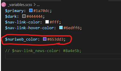
클래스이름을 정하고 바꿔줄 속성에 "$커스텀색상네임" 을 적용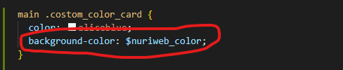
HTML파일로 가서 class네임을 작성하고 저장한다.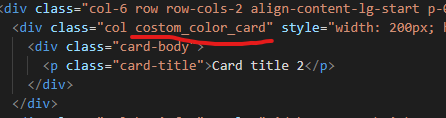
컴파일링 이후 잘 적용된걸 확인했다.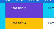
마진(margin)과 패딩(padding)의 기본설정을 주의
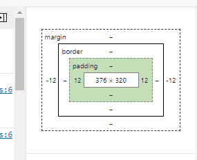
grid 배치하는 작업하는 동안에도 생각대로 배치가 안되는 경우가 종종 생긴다. 부모박스안에서의 grid 작업을 분명 딱 맞게 하는것 같은데 의도한데로 박스가 움직여주질 않는 것이다.
-
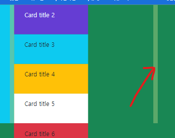
원인은 부모박스의 padding에 있었다. 본래 부모박스의 width값은 400px인데 376px로 브라우저가 인식하고 있다. 본래있던 부모박스의 padding값 때문에 계산대로 작동하지 않은 것이다.
사진에서 보듯이 배치할 박스들의 width의 합이 부모박스가 가지고있는 width값에 부모의 padding까지 뺀 값보다 크면 자식박스들이 내려가게 된다.
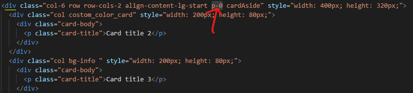
즉 부모박스의 padding값을 없애줘야 하는데 부트스트랩에서는 class에 "p-0" 이라고 쓰면 된다.
보통 프로젝트 할때는 reset.css 파일을 만들어 썻는데 부트스트랩에서는
전체에 적용되는게 따로 있는지는 좀 더 조사해봐야 할 것 같다.
여전히 까다로운 중앙정렬 ( justify-content-center)
```html
<section class="  button_wrapper ">
  <div class="row **justify-content-center**" >
     <button type="button" class="btn btn-outline-secondary col-4 m-0 cfs-4 m-1 ">유머</button>
     <button type="button" class="btn btn-outline-secondary col-4 m-0 cfs-4 m-1 ">피규어</button>
     <button type="button" class="btn btn-outline-secondary col-4 m-0 cfs-4 m-1 ">애니</button>
  </div>
  <div class="row **justify-content-center**">
      <button type="button" class="btn btn-outline-secondary col-4 m-0 cfs-4 m-1 ">만화</button>
      <button type="button" class="btn btn-outline-secondary col-4 m-0 cfs-4 m-1 ">프라</button>
      <button type="button" class="btn btn-outline-secondary col-4 m-0 cfs-4 m-1 ">고전기종</button>
  </div>
</section>
```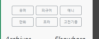
row justify-content-center 클래스 조합이 단순 버튼 6개를 모두 품는 부모노드 section에는 통하지 않았다. 단순 테그 문제는 아닌 것 같은데 이유를 몰라서 노드안에 다시 자식노드를 생성, 따로 적용해 해결했다.