flexbox에 이어서 같이 유용하게 사용할 수 있는 grid를 정리합니다.
flexbox만으로도 많은 레이아웃을 구상할 수 있지만 grid를 사용하여 좀 더 복잡한 레이아웃을 편하게 사용할 수 있습니다.
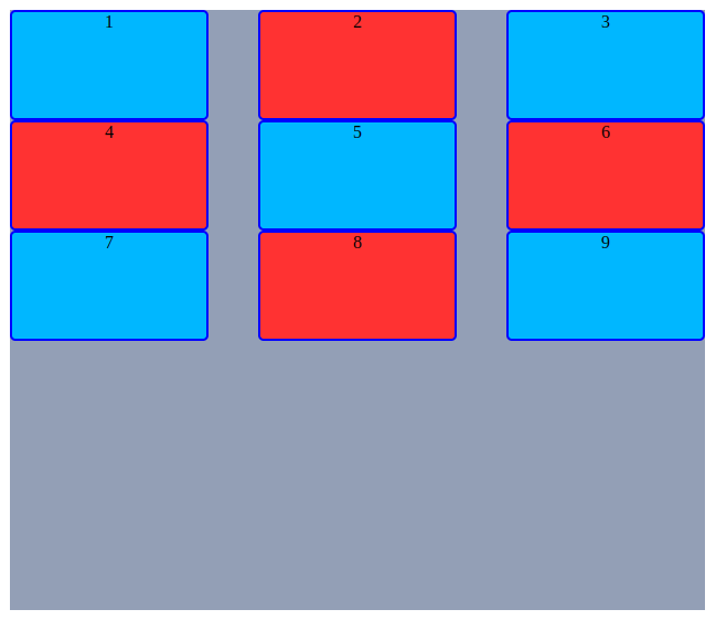
<div class="container">
<div class="item">1</div>
<div class="item">2</div>
<div class="item">3</div>
<div class="item">4</div>
<div class="item">5</div>
<div class="item">6</div>
<div class="item">7</div>
<div class="item">8</div>
<div class="item">9</div>
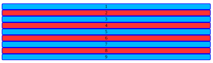
</div>html 코드의 기본 구조는 위와 같으며 코드에 따라 아이템의 개수가 줄어들거나 늘어날 수 있습니다. 👆
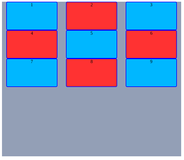
container
flexbox와 마찬가지로 container에 "display: grid;"를 적용 하는 것으로 시작합니다.
.container {
  display: grid;
}
"display: block" 속성의 아이템들에게 적용하면 변화가 없습니다.
행/열의 크기 정의
grid-template-rows / grid-template-columns
fr(fraction) 단위는 공간에 대한 비율이라고 생각할 수 있습니다.
.container {
  grid-template-rows: 1행의 크기 2행의 크기 3행의 크기...
  grid-template-rows: 30px 50px 100px...
  grid-template-rows: repeat(3, 1fr);
  grid-template-rows: 1fr  2fr auto

  grid-template-columns: 1열의 크기 2열의 크기 3열의 크기...
}
다양한 단위를 사용할 수 있고 섞어서 사용할 수도 있습니다.
각각 따로 설정할 수 있지만 repeat() 함수를 이용할 수 있습니다
Example
넓이가 1000px인 컨테이너안에 10개의 아이템들에게 각각 100px씩 공간을 준다고 했을 때 아래의 코드는 모두 같은 결과를 만듭니다.
grid-template-columns: 100px 100px 100px 100px 100px 100px 100px 100px 100px;
grid-template-columns: repeat(10, 100px);
grid-template-columns: repeat(10, 1fr);
.container {
  /* 1, 2, 3행 모두100px */
  grid-template-rows: repeat(3, 100px);

  /* 1열은 100px, 2열과 3열은 1:2 비율 */
  grid-template-columns: 100px 1fr 2fr;
}
만약 컨테이너의 크기가 늘어난다면
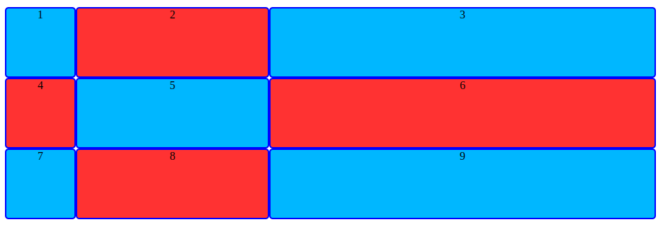
위와 같이 1열은 100px, 2열과 3열은 1:2 비율을 유지합니다.
혹은 행/열의 개수를 지정하지 않고 사용할 수 있습니다.
.container {
  grid-template-rows: repeat(auto-fill, minmax(50%, auto));
  grid-template-columns: repeat(auto-fill, minmax(10%, auto));
}

  grid-template-rows: repeat(auto-fit, minmax(50%, auto));
grid-template-columns: repeat(auto-fit, minmax(10%, auto));| auto-fill | auto-fit | minmax |
|---|---|---|
| 행을 50% 열은 10%을 설정 | 같은 50% / 10%지만 너비와 높이를 가득 채웁니다. | minmax(200px, auto) |
 |  | 최소 / 최대값을 지정합니다. 최소 200px을 유지하고 최대는 자동으로 늘어납니다. |
행/열 외부의 아이템 설정
grid-auto-rows/column
.container {
  display: grid;
  grid-template-rows: repeat(2, 100px);
  grid-template-columns: repeat(3, 1fr);
}
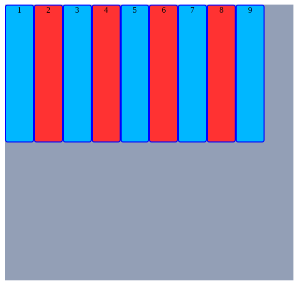
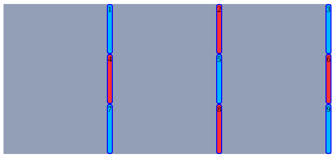
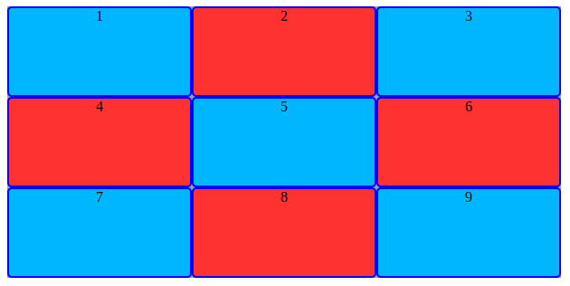
위와 같이 1, 2행은 100px / 1, 2, 3열은 각 1배율로 설정했지만 아이템 7, 8, 9의 행은 설정된것이 없습니다.
.container {
  display: grid;
  grid-template-rows: repeat(2, 100px);
  grid-template-columns: repeat(3, 1fr);
  grid-auto-rows: 50px;
}
이렇때 grid-auto-rows: 50px을 설정해서 명시적으로 외부에 배치된 아이템에게 크기를 설정할 수 있습니다.
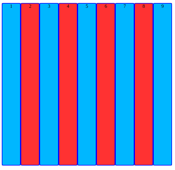
혹은 열/행의 개수를 알 수 없을 경우에는 아래와 같이 사용할 수 있습니다.
이는 명시적으로 설정된 값이 없기 때문에 "모든 열에 대해 외부에 배치되었다"라고 생각할 수 있습니다..container { display: grid; grid-template-columns: repeat(3, 1fr); grid-auto-rows: 100px; }
*글에서 다루지 않았지만 원한다면 라인에 이름을 정의할 수도 있습니다.
아이템 간격 정의
행/열의 간격을 설정한다고 생각하면 됩니다.
| row-gap | column-gap | gap |
|---|---|---|
| row 간격 설정 | column 간격 설정 | row/column 간격 단축 설정 |
.container{
  /* row 20px  / column 30px */
  gap: 20px 30px;

  /* row / column 10px */
  gap: 10px;
}
정렬
정렬의 기본적인 동작은 flexbox를 생각하면 됩니다.
align-items: 세로 방향 정렬
| 속성 | 값 | 의미 |
|---|---|---|
| align-items | stretch | 기본값 컨테이너에 맞춰 늘어난다. |
| align-items | start | 시작지점에서 정렬 |
| align-items | center | 가운데 정렬 |
| align-items | end | 끝에 정렬 |
- Example
align-items: end;
justify-items: 가로 방향 정렬
| 속성 | 값 | 의미 |
|---|---|---|
| justify-items | stretch | 기본값 컨테이너에 맞춰 늘어난다. |
| justify-items | start | 시작지점에서 정렬 |
| justify-items | center | 가운데 정렬 |
| justify-items | end | 끝에 정렬 |
- Example
justify-items: end;
단축 속성 place-items
align-items와 justify-items 단축 속성
/* align-items: end / justify-items: end */
place-items: end end;

/* align-items: center / justify-items: center */
place-items: center;
그룹 세로 정렬 align-content
grid 컨테이너의 크기보다 모든 아이템들의 크기가 더 작을 때 사용합니다.
| 속성 | 값 | 의미 |
|---|---|---|
| align-content | stretch | 기본값 컨테이너의 크기에 맞게 늘어납니다. |
| align-content | start | 모든 아이템 시작지점에 정렬 |
| align-content | center | 모든 아이템 가운데 정렬 |
| align-content | end | 모든 아이템 끝에 정렬 |
| align-content | space-between | 이미지 참고 |
| align-content | space-around | 이미지 참고 |
| align-content | space-evenly | 이미지 참고 |
| space-between | space-around | space-evenly |
|---|---|---|
 |  |  |
그룹 가로 정렬 justify-content
grid 컨테이너의 크기보다 모든 아이템들의 크기가 더 작을 때 사용합니다.
| 속성 | 값 | 의미 |
|---|---|---|
| justify-content | stretch | 기본값 컨테이너의 크기에 맞게 늘어납니다. |
| justify-content | start | 모든 아이템 시작지점에 정렬 |
| justify-content | center | 모든 아이템 가운데 정렬 |
| justify-content | end | 모든 아이템 끝에 정렬 |
| justify-content | space-between | 이미지 참고 |
| justify-content | space-around | 이미지 참고 |
| justify-content | space-evenly | 이미지 참고 |
| space-between | space-around | space-evenly |
|---|---|---|
 |  |  |
단축 속성 place-content
align-content / justify-content 단축 속성
/* align-content: end / justify-content: end */
place-content: end end;

/* align-content: space-between / justify-content: space-between */
place-content: space-between;
Item
다음은 flexbox와 가장 비교되는 grid의 아이템에 부여할 수 있는 속성입니다.
아이템 개별 정렬
| align-self 개별 세로 정렬 | justify-self 개별 가로 정렬 | 개별 의미 |
|---|---|---|
| stretch | stretch | 세로 / 가로 컨테이너 맞춰 늘림 |
| start | start | 세로 / 가로 시작 정렬 |
| center | center | 세로 / 가로 가운데 정렬 |
| end | end | 세로 / 가로 끝 정렬 |
아이템 개별 정렬 단축 속성 place-self
아이템 순서 | order
시각적으로 아이템의 순서를 변경합니다.
flexbox와 마찬가지로 html이 변경되는 것은 아님에 주의
값이 작은 순으로 먼저 정렬합니다.
.item:nth-child(1) { order: 2; }
.item:nth-child(2) { order: 1; }
Z축 정렬 | z-index
숫자가 큰 아이템이 위로 올라옵니다.
.item:nth-child(1) { z-index: 99; }아이템 영역 설정
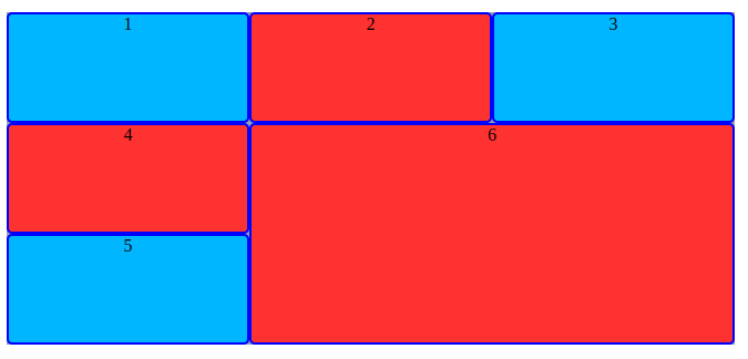
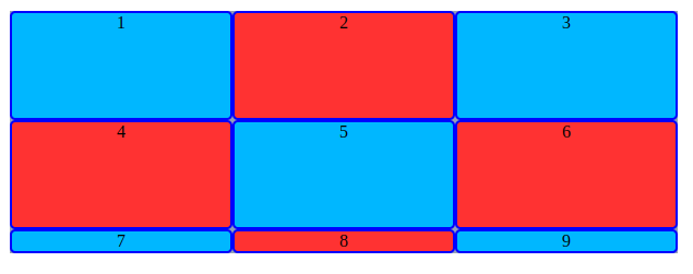
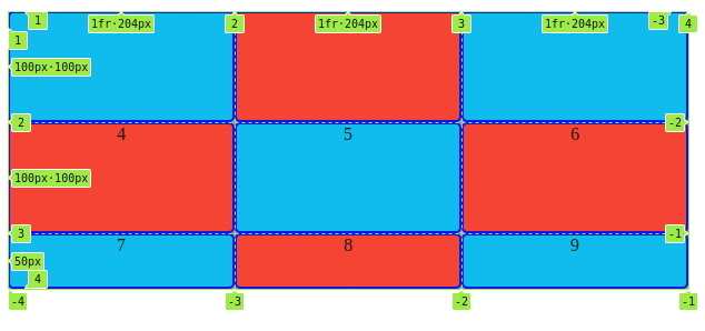
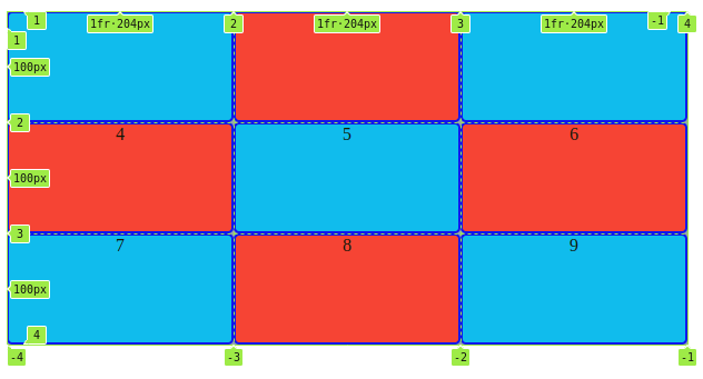
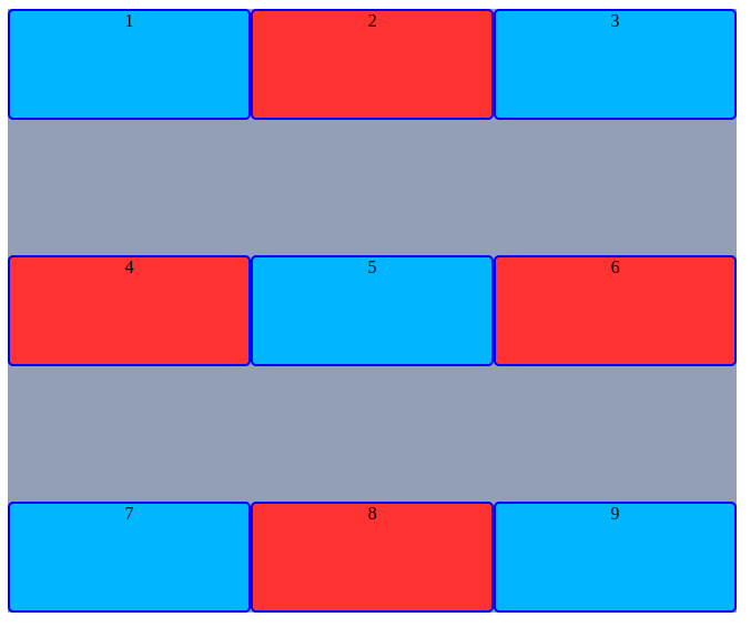
위 그림에서 1번 박스와 2번 박스를 합쳐봅니다.
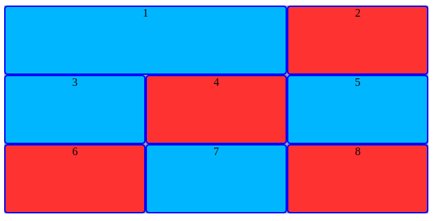
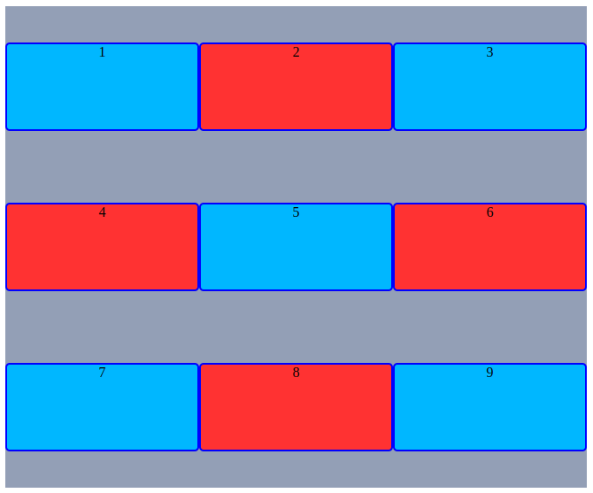
이번엔 가운데 영역만 모두 합쳐봅니다.
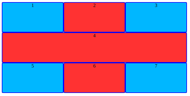
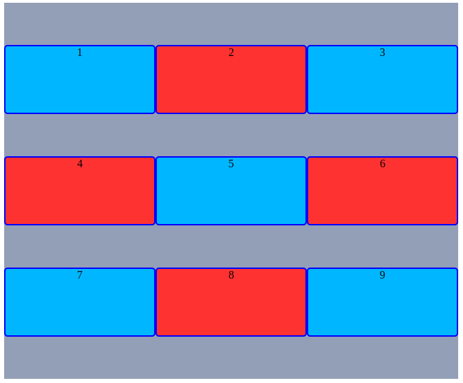
위와 같이 각 셀의 영역을 지정해서 다양한 레이아웃을 할 수 있습니다.
활용법
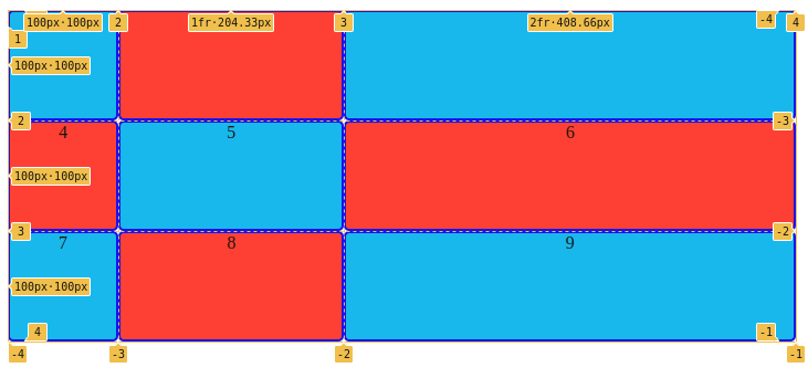
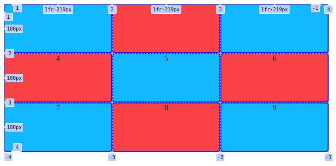
개발자 도구에서 container에 있는 grid를 클릭하면 아래와 같은 표가 나옵니다.
해당 표의 행/열의 시작 / 끝줄을 선택해서 원하는 크기를 설정할 수 있습니다.
Example
.item:nth-child(6) {
  /* 열의 2번째 줄부터 4번재 줄까지 */
  grid-column: 2 / 4;

  /* 행의 2번째 줄부터 4번째 줄까지 */
  grid-row: 2 / 4;
}