1. 데이터 개요
- 데이터셋: Credit Card Fraud Detection
- 배경 설명
- 신용카드사는 비정상적인 고객의 카드 거래를 인지하여 피해를 최소화핲 필요가 있다.
- 신용카드 사기를 탐지할 수 있는 모델을 생성하여 건전한 금융서비스에 기여하고자 한다.
2. 데이터 불러오기
- 데이터 로드
import pandas as pd
fpath = "./data/creditcard.csv"
df = pd.read_csv(fpath)- 데이터 정보 확인
# 약 28만개 행 X 31개 컬럼으로 구성, 결측치는 없음
df.info()

## 출력 결과
# <class 'pandas.core.frame.DataFrame'>
# RangeIndex: 284807 entries, 0 to 284806
# Data columns (total 31 columns):
#  #   Column  Non-Null Count   Dtype
# ---  ------  --------------   -----
#  0   Time    284807 non-null  float64
#  1   V1      284807 non-null  float64
#  2   V2      284807 non-null  float64
#  3   V3      284807 non-null  float64
# (중략)
#  26  V26     284807 non-null  float64
#  27  V27     284807 non-null  float64
#  28  V28     284807 non-null  float64
#  29  Amount  284807 non-null  float64
#  30  Class   284807 non-null  int64
# dtypes: float64(30), int64(1)
# memory usage: 67.4 MB- 첫 5행 확인
# V1 ~ V28 컬럼은 개인정보 보호 차 수치형 변수로 비식별화되어 있음
df.head()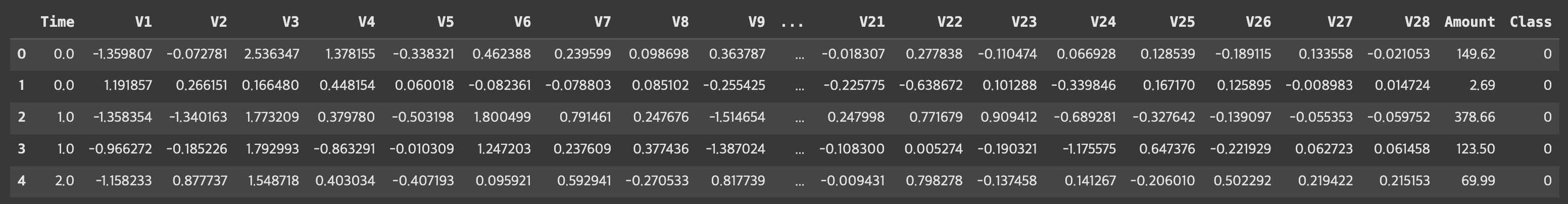
- 종속변수 확인
# 사기(1; Fraud)에 해당하는 데이터가 0.2% 정도 밖에 되지 않음
# 극심한 불균형 상태에 해당되어 향후 분석작업 유의 필요
df["Class"].value_counts(normalize=True).round(3)

## 출력 결과
# Class
# 0    0.998
# 1    0.002
# Name: proportion, dtype: float64

# 시각화
import matplotlib.pyplot as plt
import seaborn as sns
from matplotlib.ticker import FuncFormatter
import warnings
warnings.filterwarnings("ignore")
plt.rcParams["font.family"] = "Liberation Sans"

count_info = df["Class"].value_counts()
class_mapper = {"0": "Normal", "1": "Fraud"}

fig, ax = plt.subplots(figsize=(4,4))
sns.barplot(count_info, ax=ax, palette={"0": "forestgreen", "1": "darkred"})

for p in ax.patches:
  ax.annotate(f"{int(p.get_height()):,d}",
              xy=((p.get_x()+p.get_width()/2), p.get_height()+10_000),
              ha="center",
              color="forestgreen" if p.get_height() > 150_000 else "darkred",
              weight="bold",
              size=12)

ax.set_title("Class Distribution")
ax.set_xticklabels([class_mapper.get(label.get_text()) for label in ax.get_xticklabels()])
ax.set_xlabel(None)
ax.set_ylabel(None)
ax.set_ylim(0, 320_000)
ax.yaxis.set_major_formatter(FuncFormatter(lambda val, pos: f"{int(val):,d}"))

plt.show()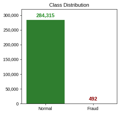
3. 데이터 들여다보기
- 독립변수와 종속변수 분리
X = df.drop(["Time", "Class"], axis=1) # Time 변수도 불필요하여 제거
y = df["Class"]
print(X.shape, y.shape)

## 출력 결과
# (284807, 29) (284807,)- 데이터 요약정보 확인
# V1~V28 변수간에는 최소-최대값 간 편차가 심한 편으로 확인
# Amount 변수의 중위수-최대값의 차이가 상당히 커 이상치가 존재하는 것으로 보임
X.describe().round(2)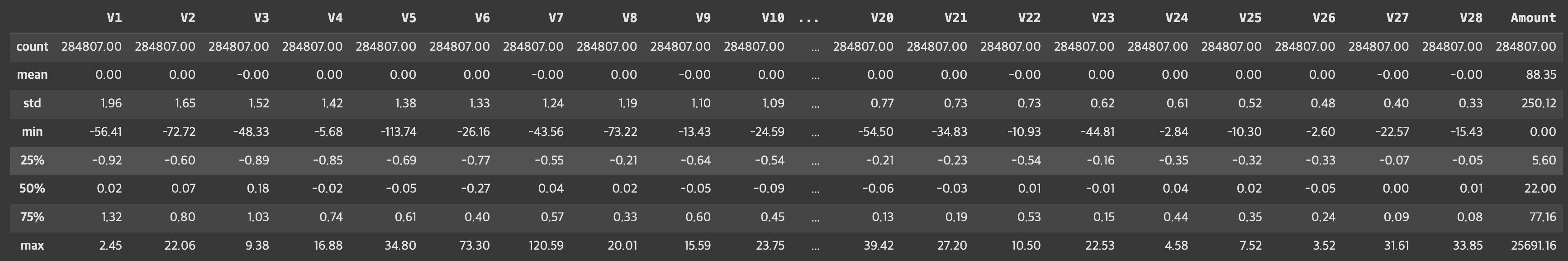
- V1~V28 컬럼의 박스플롯 시각화
# 일부 이상치 확인되었으나, 향후 트리 기반 모델링 수행 예정으로 감안 가능한 수준으로 판단
fig, ax = plt.subplots(figsize=(20, 6))
sns.boxplot(X.loc[:,"V1":"V28"], ax=ax)
plt.show()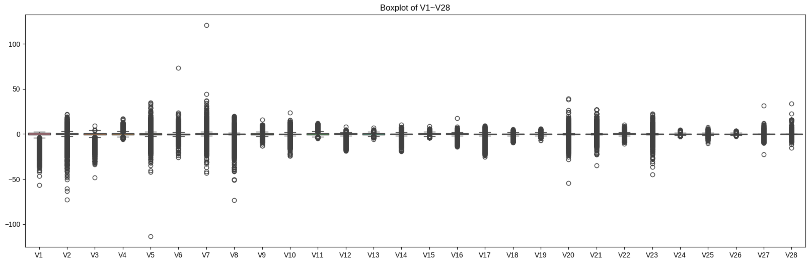
- Amount 컬럼의 박스플롯 시각화
# 분포가 상당히 왜곡되어 있음을 알 수 있음
fig, ax = plt.subplots(figsize=(3, 6))
sns.boxplot(X["Amount"], ax=ax)
ax.set_title("Boxplot of Amount")
ax.set_xlabel(None)
ax.set_ylabel(None)
plt.show()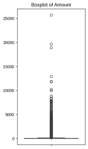
- Amount 컬럼 대상 로그 변환 수행 후 재 시각화
import numpy as np

X["Amount_Log"] = np.log1p(X["Amount"])

# 분포가 개선되었음을 확인
fig, ax = plt.subplots(figsize=(3, 6))
sns.boxplot(X["Amount_Log"], ax=ax)
ax.set_title("Boxplot of Amount (Log-Trans)")
ax.set_xlabel(None)
ax.set_ylabel(None)
plt.show()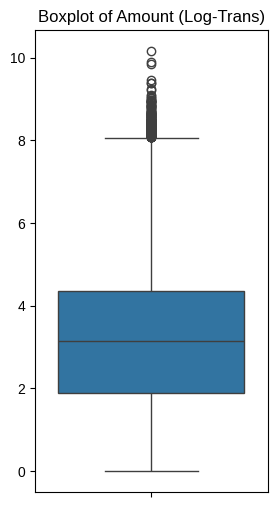
- 기존 Amount 컬럼은 삭제
X.drop("Amount", axis=1, inplace=True)4. 데이터 분리하기
- Train 데이터셋과 Test 데이터셋 분리
from sklearn.model_selection import train_test_split
X_train, X_test, y_train, y_test = train_test_split(X, y, test_size=.3, random_state=42, stratify=y)- Train, Test 데이터셋의 종속변수 비율 재확인
print("TRAIN\n", y_train.value_counts(normalize=True).round(3))
print("\nTEST\n", y_test.value_counts(normalize=True).round(3))

## 출력 결과
# TRAIN
#  Class
# 0    0.998
# 1    0.002
# Name: proportion, dtype: float64
#
# TEST
#  Class
# 0    0.998
# 1    0.002
# Name: proportion, dtype: float64
6. 모델 생성하기
- 분류기 평가용 함수 정의
# 모델 평가용 함수
from sklearn.metrics import accuracy_score, precision_score, recall_score, f1_score, roc_auc_score, confusion_matrix
from time import time

# 지표 반환
def get_eval(y_test, pred):
  acc = accuracy_score(y_test, pred)
  prec = precision_score(y_test, pred)
  rec = recall_score(y_test, pred)
  f1 = f1_score(y_test, pred)
  auc = roc_auc_score(y_test, pred)

  return acc, prec, rec, f1, auc

# 지표 출력
def print_eval(y_test, pred):
  acc, prec, rec, f1, auc = get_eval(y_test, pred)
  conf = confusion_matrix(y_test, pred)

  print("\n=== Confusion Mtx. ===")
  print(conf)

  print("\n=== Metrics ===")
  print(f"Accuracy: {acc:.3f}")
  print(f"Precision: {prec:.3f}")
  print(f"Recall: {rec:.3f}")
  print(f"F1-score: {f1:.3f}")
  print(f"AUC: {auc:.3f}")

# 모델 적합 + 지표 출력 + 지표 반환 자동화
def auto_eval(estimator, X_train, y_train, X_test, y_test):
  s_time = time()
  estimator.fit(X_train, y_train)
  e_time = time()
  print(f"=== Fit Time ===\n{e_time-s_time:.2f}sec")

  pred = estimator.predict(X_test)
  print_eval(y_test, pred)

  nm = estimator.__class__.__name__
  acc, prec, rec, f1, auc = get_eval(y_test, pred)
  res = pd.DataFrame([[acc, prec, rec, f1, auc]], columns=["Acc.", "Prec.", "Rec.", "F1", "AUC"], index=[nm])

return res- 의사결정나무 모델 생성
from sklearn.tree import DecisionTreeClassifier

dt = DecisionTreeClassifier(random_state=42)
dt.fit(X_train, y_train)
pred = dt.predict(X_test)
print_eval(y_test, pred)

## 출력 결과
# === Fit Time ===
# 15.36sec
#
# === Confusion Mtx. ===
# [[85281    14]
#  [   39   109]]
#
# === Metrics ===
# Accuracy: 0.999
# Precision: 0.886
# Recall: 0.736
# F1-score: 0.804
# AUC: 0.868- 랜덤포레스트 모델 생성
from sklearn.ensemble import RandomForestClassifier

# n_estimators 조정을 통한 학습 시간 단축 (default=100)
rf = RandomForestClassifier(random_state=42, n_estimators=10, max_depth=10, n_jobs=-1)
rf_res = auto_eval(rf, X_train, y_train, X_test, y_test)

## 출력 결과
# === Fit Time ===
# 16.99sec
#
# === Confusion Mtx. ===
# [[85289     6]
#  [   34   114]]
#
# === Metrics ===
# Accuracy: 1.000
# Precision: 0.950
# Recall: 0.770
# F1-score: 0.851
# AUC: 0.885- LightGBM 모델 생성
from lightgbm import LGBMClassifier

lgbm = LGBMClassifier(random_state=42, verbose=0)
lgbm_res = auto_eval(lgbm, X_train, y_train, X_test, y_test)

## 출력 결과
# === Confusion Mtx. ===
# [[85119   176]
#  [   66    82]]

# === Metrics ===
# Accuracy: 0.997
# Precision: 0.318
# Recall: 0.554
# F1-score: 0.404
# AUC: 0.776- 세 모델의 결과 취합
# 세 모델 중에서는 랜덤 포레스트의 성능이 전반적으로 우수함
all_res = pd.concat([dt_res, rf_res, lgbm_res,], axis=0)
all_res.round(3)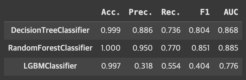
7. 오버샘플링 해보기
- SMOTE 적용 후 세 모델의 결과 비교: 연산량 대비 성능 개선의 효과가 있다고 보기는 어려움
# SMOTE와 같은 오버샘플링 기법은 데이터 중복, 겹침 문제를 유발할 수 있어 실무 적용 시에는 신중해야 함
from imblearn.over_sampling import SMOTE

smt = SMOTE(random_state=42)
X_train_smt, y_train_smt = smt.fit_resample(X_train, y_train)

dt_res_smt = auto_eval(dt, X_train_smt, y_train_smt, X_test, y_test)
rf_res_smt = auto_eval(rf, X_train_smt, y_train_smt, X_test, y_test)
lgbm_res_smt = auto_eval(lgbm, X_train_smt, y_train_smt, X_test, y_test)

## 출력 결과: 생략

all_res_smt = pd.concat([dt_res_smt, rf_res_smt, lgbm_res_smt,], axis=0)
all_res_smt.round(3)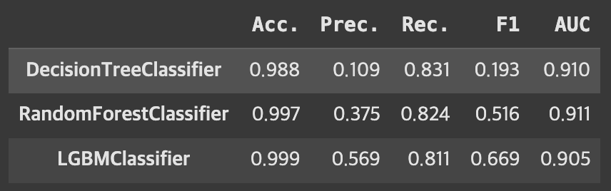
8. 변수별 중요도 확인
- 가장 나은 성능을 보인 RF 모델 기준 변수 중요도 추출
# 가장 나은 성능을 보인 RF 기준 변수 중요도 추출
rf.fit(X_train, y_train)
rf_fi = pd.DataFrame({"feature": X_train.columns, "importance": rf.feature_importances_})
rf_fi.sort_values(by="importance", ascending=False).head(10)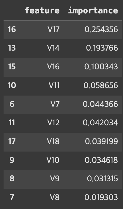
- 변수 중요도 시각화
rf_fi.sort_values(by="importance", ascending=False, inplace=True)

fig, ax = plt.subplots(figsize=(20,4))
sns.barplot(x=rf_fi["feature"],
            y=rf_fi["importance"],
            hue=rf_fi["feature"],
            ax=ax,
            palette="RdBu")
ax.set_title("Feat. Imp. (Random Forest Model)")
ax.set_ylabel(None)
ax.set_xlabel(None)
plt.show()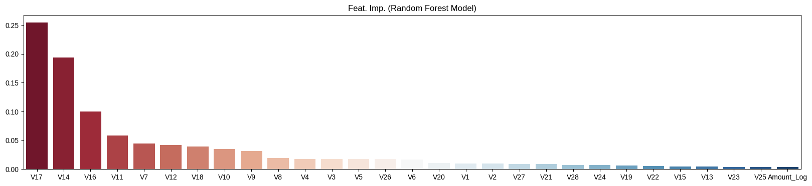
9. 결론
- 트리 기반 모델 중에서는 Random Forest 모델이 지표 전반적으로 가장 강건한 성능을 보임
- 특히, V17, V14, V16 세 컬럼이 의사결정에 가장 큰 영향을 끼쳤음
- 오버샘플링 기법 중 하나인 SMOTE 기법은 큰 효과가 없었음
- 하이퍼파라미터 튜닝을 통해 성능개선을 시도해보거나, 다른 분류모델을 사용해보거나, 변수 중요도가 낮은 변수들을 제외하여 모델 경량화 등을 시도해 볼 수 있음
*이 글은 제로베이스 데이터 취업 스쿨의 강의 자료 일부를 발췌하여 작성되었습니다.

데이터 분석, 데이터 사이언스 학습 저장소