1. 데이터 개요
- 데이터셋: Health Insurance Data
- 배경 설명
- 새로 출시한 보험 상품에 대한 고객의 반응 예측은 보험사 운영에 상당히 중요한 역할을 수행한다.
- 설문조사 데이터를 분석하여 어떤 고객을 중점으로 보험 타겟팅을 해야할지 등의 인사이트 발굴을 목표로 한다.
2. 데이터 불러오기
- train.csv 로드 및 데이터 개요 확인
import pandas as pd
insu = pd.read_csv("./data/train.csv")
insu.info()
## 출력 결과
# Data columns (total 12 columns):
# # Column Non-Null Count Dtype
# --- ------ -------------- -----
# 0 id 381109 non-null int64
# 1 Gender 381109 non-null object
# 2 Age 381109 non-null int64
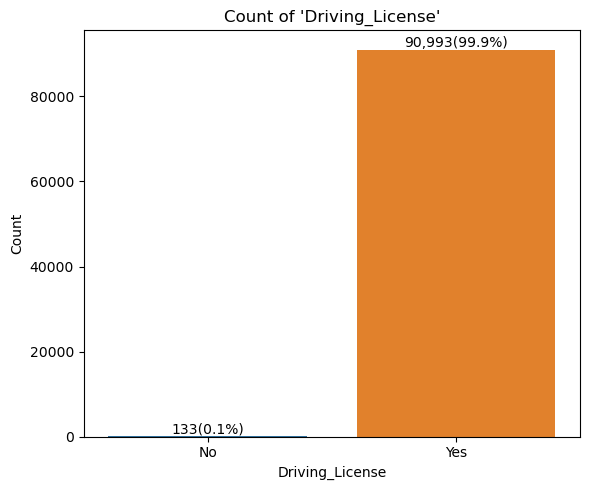
# 3 Driving_License 381109 non-null int64
# 4 Region_Code 381109 non-null float64
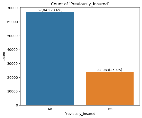
# 5 Previously_Insured 381109 non-null int64
# 6 Vehicle_Age 381109 non-null object
# 7 Vehicle_Damage 381109 non-null object
# 8 Annual_Premium 381109 non-null float64
# 9 Policy_Sales_Channel 381109 non-null float64
# 10 Vintage 381109 non-null int64
# 11 Response 381109 non-null int64
# dtypes: float64(3), int64(6), object(3)
# memory usage: 34.9+ MB3. 데이터 들여다보기
- object 타입 데이터 확인
obj_cols = insu.select_dtypes("object").columns
for col in obj_cols:
print(insu[col].value_counts(), end="\n\n")
## 출력 결과
# Gender
# Male 206089
# Female 175020
# Name: count, dtype: int64
#
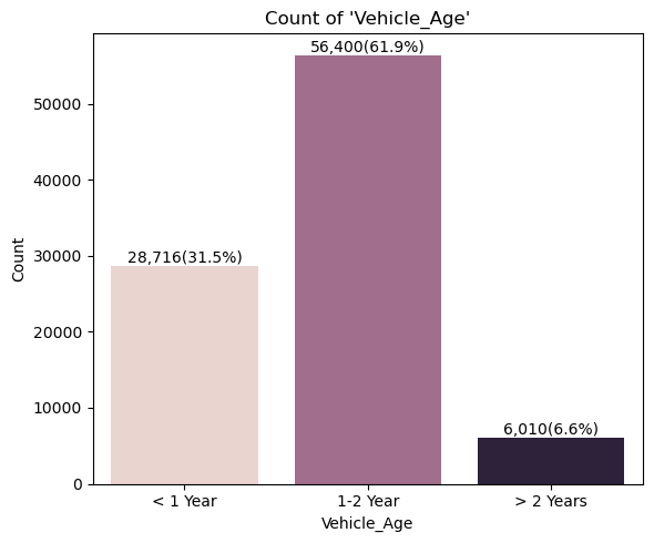
# Vehicle_Age
# 1-2 Year 200316
# < 1 Year 164786
# > 2 Years 16007
# Name: count, dtype: int64
#
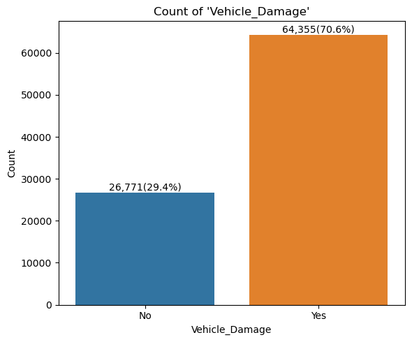
# Vehicle_Damage
# Yes 192413
# No 188696
# Name: count, dtype: int64- object 타입 데이터를 숫자형으로 변환
insu["Gender"] = insu["Gender"].\
    map({"Female": 0, "Male": 1})
insu["Vehicle_Age"] = insu["Vehicle_Age"].\
    map({"< 1 Year": 0, "1-2 Year": 1, "> 2 Years": 2})
insu["Vehicle_Damage"] = insu["Vehicle_Damage"].\
    map({"No": 0, "Yes": 1})

for col in obj_cols:
    print(insu[col].value_counts(), end="\n\n")

## 출력 결과
# Gender
# 1    206089
# 0    175020
# Name: count, dtype: int64
#
# Vehicle_Age
# 1    200316
# 0    164786
# 2     16007
# Name: count, dtype: int64
#
# Vehicle_Damage
# 1    192413
# 0    188696
# Name: count, dtype: int64
- 종속변수(Response) 확인
print(insu["Response"].value_counts(normalize=True).round(2))

## 출력 결과
# Response
# 0    0.88
# 1    0.12
# Name: proportion, dtype: float64

# 고객 대부분이 해당 상품에 관심이 없다고 볼 수 있음- 종속변수 Bar Plot
import matplotlib.pyplot as plt
import seaborn as sns
from matplotlib.ticker import FuncFormatter
fig, ax = plt.subplots(figsize=(4,3))
sns.countplot(data=insu, x="Response", hue="Response", ax=ax)
fig.suptitle("Count by Response")
ax.set_ylabel(None)
ax.legend(labels=["Not Interested", "Interested"])
ax.yaxis.set_major_formatter(FuncFormatter(lambda x, p: format(int(x), ',')))
for idx, bar in enumerate(ax.patches):
    ax.text(x=bar.get_x() + bar.get_width()/2,
            y=bar.get_height()-20_000,
            s=f"{int(bar.get_height()):,}",
            color="white",
            ha="center", va="center")
plt.show()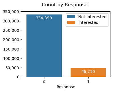
- 종속변수 Pie Plot
fig, ax = plt.subplots(figsize=(4,3))
fig.suptitle("Percentage of Response")
p, t, at = plt.pie(insu["Response"].value_counts(),
                   labels=["Not Interested", "Interested"],
                   autopct="%d%%",
                   colors=["grey", "forestgreen"])
for elem in at:
    elem.set_color("white")
plt.show()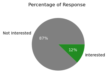
4. 데이터 변형하기
- 종속변수가 상당한 불균형을 이루고 있어, Undersampling 적용
X = insu.drop(["Response"], axis=1)
y = insu["Response"]
X_res, y_res = runder.fit_resample(X, y)

insu_res = pd.concat([X_res, y_res], axis=1).reset_index(drop=True)

print(insu_res["Response"].value_counts())

## 출력 결과
# Response
# 0    46710
# 1    46710
# Name: count, dtype: int64
5. 시각화
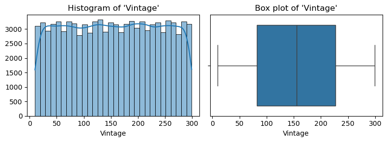
- 수치형 변수 시각화
for col in num_cols:
    plt.figure(figsize=(8, 3))

    plt.subplot(1, 2, 1)
    sns.histplot(data=insu_res, x=col, bins=30, kde=True, alpha=.5)
    plt.title(f"Histogram of '{col}'")
    plt.xlabel(col)
    plt.ylabel(None)

    plt.subplot(1, 2, 2)
    sns.boxplot(data=insu_res, x=col)
    plt.title(f"Box plot of '{col}'")
    plt.xlabel(col)
    plt.ylabel(None)

    plt.tight_layout()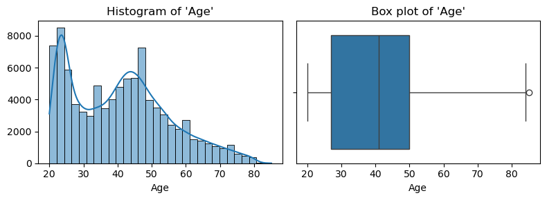
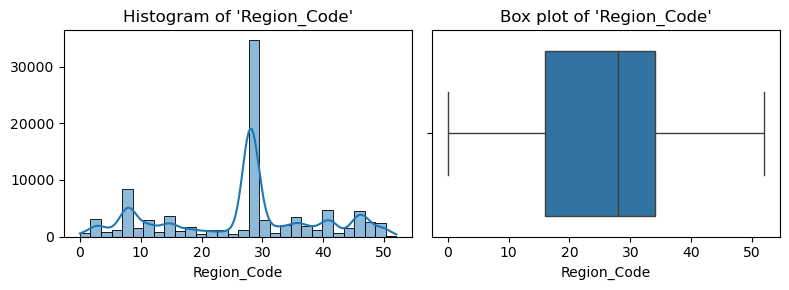
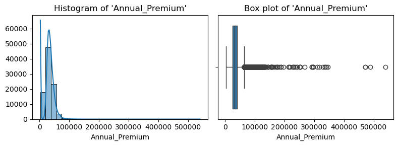
- Annual Premium 컬럼 내 이상치 다수 존재하여 필터링 실시
q1 = insu_res["Annual_Premium"].quantile(.25)
q3 = insu_res["Annual_Premium"].quantile(.75)
iqr = q3 - q1
ll = q1 - iqr*1.5
ul = q3 + iqr*1.5
out = insu_res[(insu_res["Annual_Premium"] < ll) | (insu_res["Annual_Premium"] > ul)]
print(f"{len(out):,d} outliers ({round(len(out)/len(insu_res)*100, 2)}%)")

## 출력 결과
# 2,294 outliers (2.46%)

insu_res = insu_res[(insu_res["Annual_Premium"] >= ll) & (insu_res["Annual_Premium"] <= ul)]

for col in ["Annual_Premium"]:
    plt.figure(figsize=(8, 3))

    plt.subplot(1, 2, 1)
    sns.histplot(data=insu_res, x=col, bins=30, kde=True, alpha=.5)
    plt.title(f"Histogram of '{col}'")
    plt.xlabel(col)
    plt.ylabel(None)

    plt.subplot(1, 2, 2)
    sns.boxplot(data=insu_res, x=col)
    plt.title(f"Box plot of '{col}'")
    plt.xlabel(col)
    plt.ylabel(None)

    plt.tight_layout()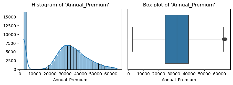
- 범주형 변수 시각화
for idx in range(len(cat_cols)):
    col = cat_cols[idx]
    mapper = cat_cols_mapper[idx]

    plt.figure(figsize=(6, 5))
    sns.countplot(insu_res, x=col, hue=col, legend=False)
    plt.title("Count of '{}'".format(col))
    plt.xlabel(col)
    plt.ylabel("Count")
    plt.xticks(ticks=range(len(mapper)), labels=mapper.keys())

    tot = len(insu_res)
    for patch in plt.gca().patches:
        h = patch.get_height()
        plt.text(
            x=patch.get_x() + patch.get_width() / 2,
            y=h-1_000,
            s=f"{int(h):,}({h/tot*100:.1f}%)",
            ha="center",
            va="top"
        )

    plt.tight_layout()
    plt.show()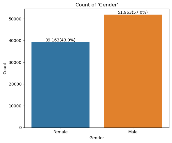
- 상관계수 시각화
insu_res_corr = insu_res.corr()

fig, ax = plt.subplots(figsize=(8,6))
sns.heatmap(insu_res_corr,
            vmin=-1, vmax=1,
            cmap="RdBu_r",
            annot=True, fmt=".1f", ax=ax)
plt.show()

# Response와 Vehicle_Damage, Previously_Insured 간
# 상당한 상관관계가 있는 것으로 확인
# Vehicle_Damage와 Previously_Insured 간에는 강한 음의 상관관계 존재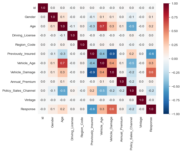
- Response vs. Vehicle_Damage
fig, ax = plt.subplots(figsize=(6,4))
sns.countplot(insu_res, x="Vehicle_Damage", hue="Response", ax=ax,
              palette=["grey", "orange"])
ax.set_title("Response vs. Vehicle_Damage")
ax.yaxis.set_major_formatter(FuncFormatter(lambda x, p: format(int(x), ",")))
ax.set_ylim(0, 50_000)
for patch in ax.patches:
    if patch.get_height() != 0:
        plt.text(
        x=patch.get_x() + patch.get_width() / 2,
        y=patch.get_height()+1_000,
        s=f"{int(patch.get_height()):,}",
        ha="center",
        va="bottom",
        color="grey"
        )
plt.show()

# 과거 차량 사고 이력이 있는 고객이 압도적으로 상품에 관심이 많음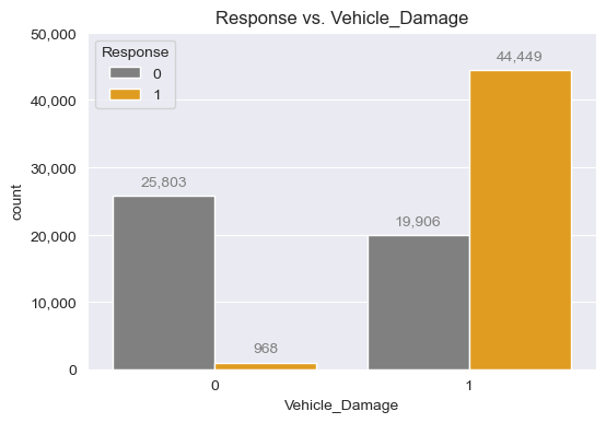
- Response vs. Previously_Insured
fig, ax = plt.subplots(figsize=(6,4))
sns.countplot(insu_res, x="Previously_Insured", hue="Response", ax=ax,
              palette=["grey", "orange"])
ax.set_title("Response vs. Vehicle_Damage")
ax.yaxis.set_major_formatter(FuncFormatter(lambda x, p: format(int(x), ",")))
ax.set_ylim(0, 50_000)
for patch in ax.patches:
    if patch.get_height() != 0:
        plt.text(
        x=patch.get_x() + patch.get_width() / 2,
        y=patch.get_height()+1_000,
        s=f"{int(patch.get_height()):,}",
        ha="center",
        va="bottom",
        color="grey"
        )
plt.show()

# 당연하게도, 현재 보험을 이미 들고 있는 사람은 상품에 관심이 없음 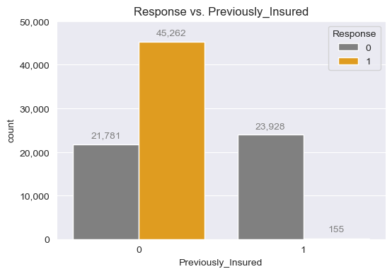
- Response vs. Vehicle_Age
fig, ax = plt.subplots(figsize=(6,4))
sns.countplot(insu_res, x="Vehicle_Age", hue="Response", ax=ax,
              palette=["grey", "orange"])
ax.set_title("Response vs. Vehicle_Age")
ax.yaxis.set_major_formatter(FuncFormatter(lambda x, p: format(int(x), ",")))
ax.set_ylim(0, 50_000)
for patch in ax.patches:
    if patch.get_height() != 0:
        plt.text(
        x=patch.get_x() + patch.get_width() / 2,
        y=patch.get_height()+1_000,
        s=f"{int(patch.get_height()):,}",
        ha="center",
        va="bottom",
        color="grey"
        )
plt.show()

# 차량 연령이 "1-2 Year" 사이인 경우에 가장 상품에 관심이 있음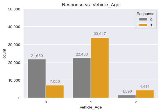
- Reponse vs. Annual_Premium
fig, ax = plt.subplots(figsize=(4,6))
sns.boxplot(insu_res, x="Response", y="Annual_Premium", hue="Response", ax=ax,
            palette=["grey", "orange"], legend=False)
ax.set_title("Response vs. Annual_Premium")
ax.yaxis.set_major_formatter(FuncFormatter(lambda x, p: format(int(x), ",")))
plt.show()

# 연간 보험료는 크게 상품의 관심도에 영향을 주지 않는 것으로 확인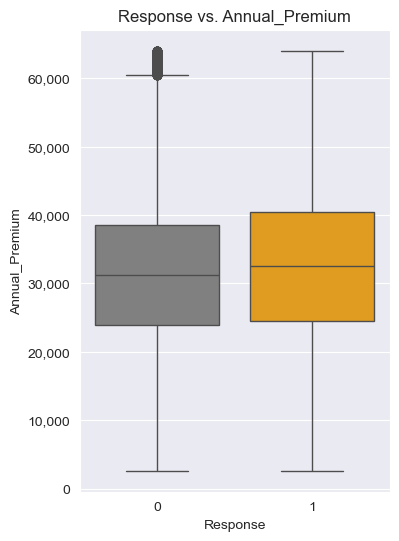
- Response vs. Policy_Sales_Channel
response_mean_by_channel = insu_res.groupby("Policy_Sales_Channel")["Response"].mean().reset_index()

fig, ax = plt.subplots(figsize=(4,3))
sns.lineplot(response_mean_by_channel,
             x="Policy_Sales_Channel",
             y="Response",
             ax=ax)
ax.set_title("Response vs. Policy_Sales_Channel")
plt.show()

# Policy_Sales_Channel은 Response에 크게 영향을 미치지 못함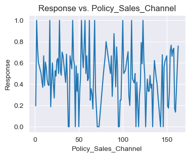
- Response vs. Age
response_mean_by_age = insu_res.groupby("Age")["Response"].mean().reset_index()

fig, ax = plt.subplots(figsize=(4,3))
sns.lineplot(response_mean_by_age,
             x="Age",
             y="Response",
             ax=ax)
ax.set_title("Response vs. Age")
plt.show()

# Age 역시 Response에 크게 영향을 미치지 못함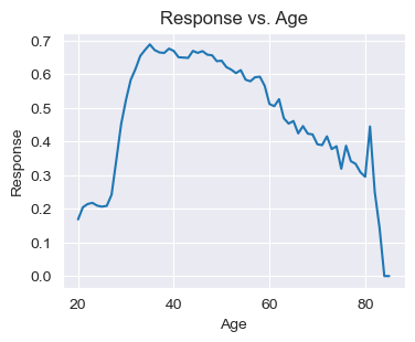
6. 결론
- 해당 보험상품에 대해서는 나이와 보험료가 관심을 끄는데 큰 영향을 미치지 못하고 있음
- 보험료를 더 낮추거나 특정 나이대에 특화된 특약을 추가한다면 고객 세그멘테이션 타게팅이 가능할 것으로 예상
- 또한, 현재 보험이 있는 고객은 거의 관심이 없는 만큼 기존 고객을 끌어들일 수 있는 전략을 마련할 필요도 있음
- 이와 더불어, 차량 연령이 '1년 이상 2년 이하'인 고객과 과거 차량사고 이력이 있는 고객들을 집중공략하여 전환율을 높이는 전략도 취할 수 있을 것으로 예상됨
*이 글은 제로베이스 데이터 취업 스쿨의 강의 자료 일부를 발췌하여 작성되었습니다.

데이터 분석, 데이터 사이언스 학습 저장소