<!DOCTYPE html>
<html lang="en">
<head>
  <meta charset="UTF-8">
  <meta name="viewport" content="width=device-width, initial-scale=1.0">
  <title>Document</title>
  <link rel="stylesheet" href="./css/layout5.css">
</head>
<body>
  <div class="cart-background">
    <h3>Your Shopping cart</h3>
    <table class="cart-table">
      <thead>
        <tr>
          <th></th>
          <th class="cell-long">Item</th>
          <th>Amount</th>
          <th>Price</th>
          <th>Total</th>
        </tr>
      </thead>
      <tbody>
        <tr>
          <td><img src="./img/item1.png" alt="" width="50px"></td>
          <td>카메라</td>
          <td>1</td>
          <td>7000</td>
          <td>7000</td>
        </tr>
        <tr>
          <td colspan="5" style="text-align: right;">총가격 : 7000</td>
        </tr>
      </tbody>
    </table>
    <button class="btn">구매하기</button>
  </div>
</body>
</html>
td, th {
/* border: 1px solid black; */
}
.cart-table td, .cart-table th{
padding: 15px;
border-bottom: 1px solid #c2d3de;
}
table{
border-collapse: collapse;
}
.cart-background{
width: 100%;
background-color: #c2dede;
padding: 30px;
}
.cart-table{
width: 100%;
max-width: 700px;
margin: auto;
background: white;
border-radius: 10px;
}
.cart-table th:nth-child(2){
width: 400px;
}
/* .cell-long{
width: 700px;
} */
.btn{
padding: 15px;
font-size: 20px;
border: none;
border-radius: 10px;
background-color: coral;
color: white;
cursor: pointer;
}
.btn:hover{
background-color: chocolate;
}
.btn:focus {
background-color: gray;
}
.btn:active {
background-color: brown;
}
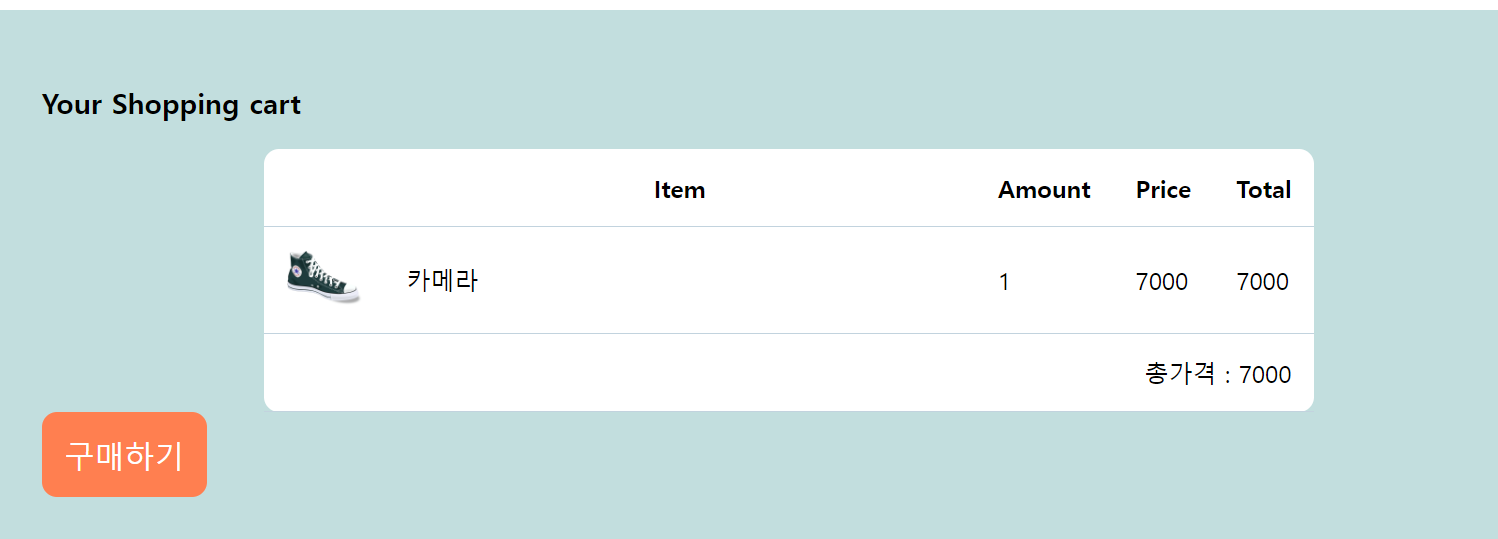
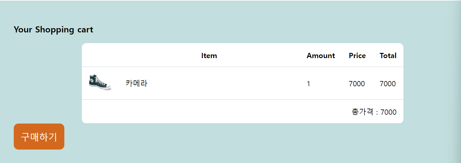
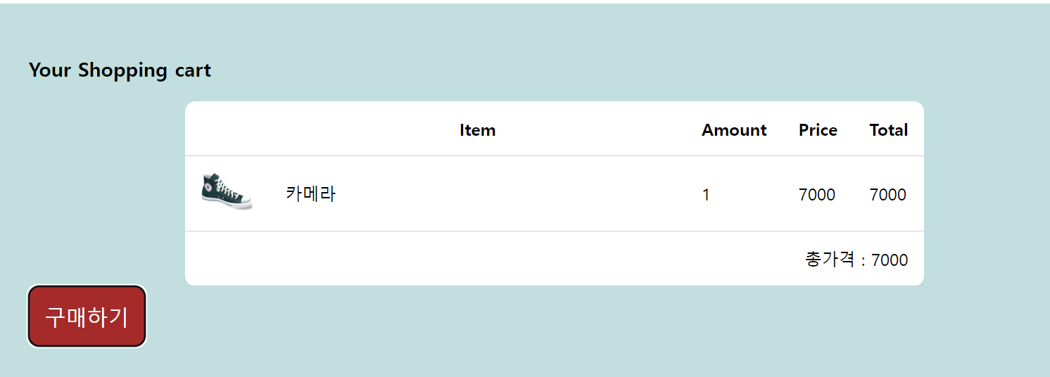
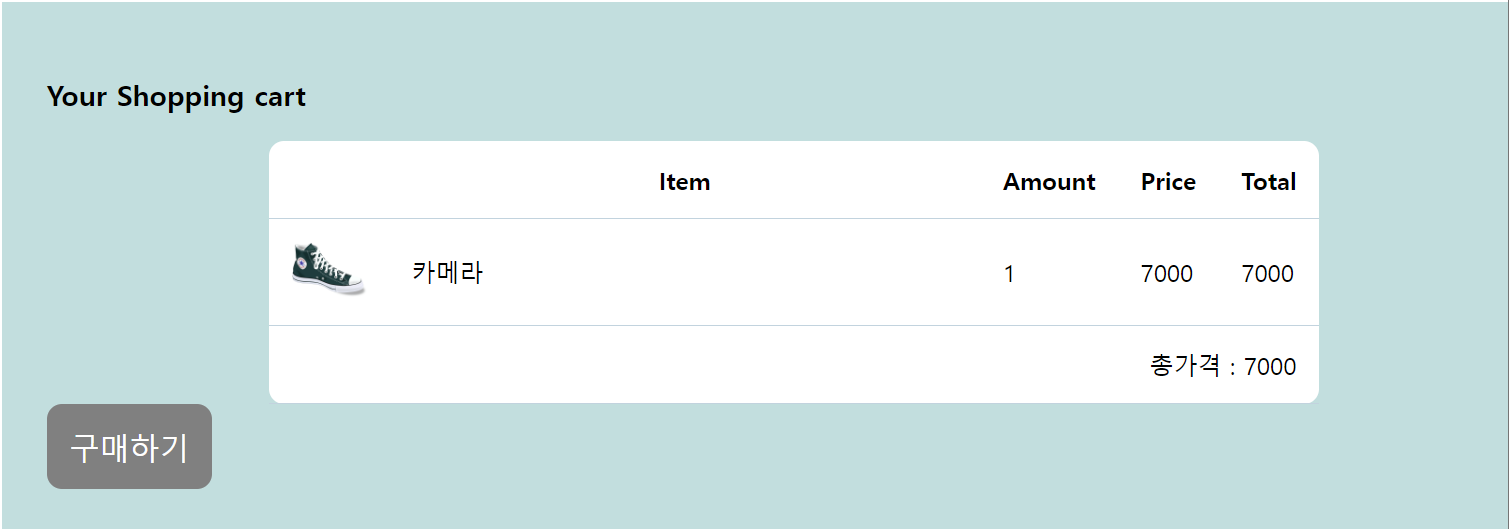
버튼을 예로 들어서 Pseudo-class 셀렉터를 진행해봤다.
평상시, 마우스 오버, 누르고 있을 시, 눌렀을 시의 색을 위 사진에서 보이는 것처럼 구현할 수가 있었다.
이를 이용하기 위해서는 순서가 매우 중요하다.
:hover
:focus
:active
순으로 넣어야지만 올바르게 작동한다.
button 태그 뿐만 아니라, input과 a태그에도 사용하기 좋은 셀렉터이다.
    <input type="text" class="input-test">
    <a href="https://www.naver.com" class="custom-link">네이버</a>
이런 input과 a 태그가 있을 때 아래처럼 css를 적용시켜준다면, 더 시각적으로 좋아 보일 것이다.
.input-test{
  font-size: 20px;
}
.input-test:focus{
  border: 2px solid red;
}

.custom-link{
  text-decoration: none;
}
.custom-link:link{
  color: violet;
}
.custom-link:visited{
  color: black;
}
이런식으로 말이다.

반드시 결승점을 통과하는 개발자