<!DOCTYPE html>
<html lang="en">
<head>
<meta charset="UTF-8">
<meta name="viewport" content="width=device-width, initial-scale=1.0">
<title>Document</title>
<link rel="stylesheet" href="./css/layout2.css">
</head>
<body style="margin: 0px;">
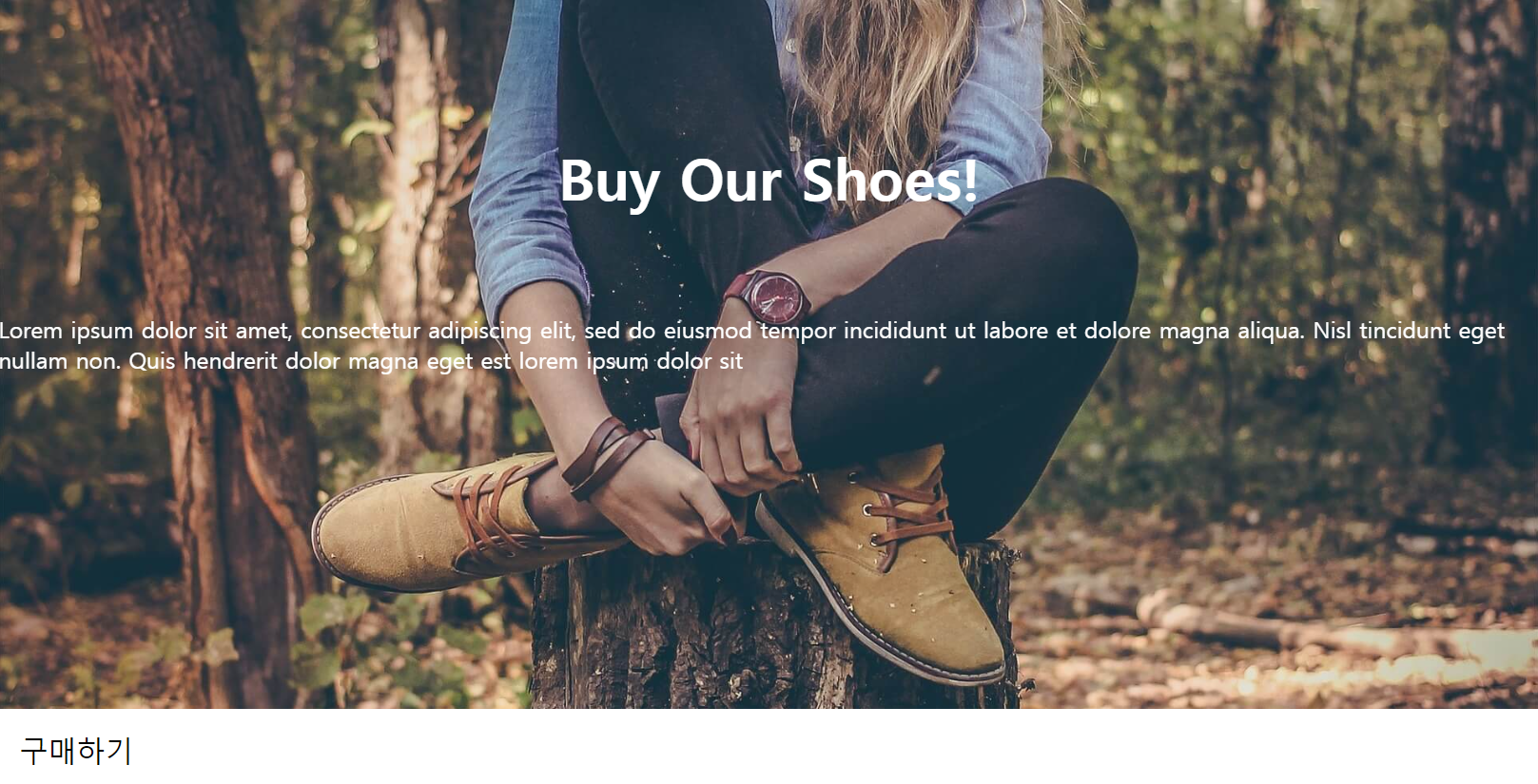
<div class="main-background">
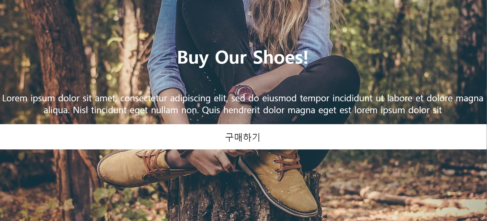
<h4 class="main-title">Buy Our Shoes!</h4>
<p class="main-content">
Lorem ipsum dolor sit amet, consectetur adipiscing elit, sed do eiusmod tempor incididunt ut labore et dolore magna aliqua. Nisl tincidunt eget nullam non. Quis hendrerit dolor magna eget est lorem ipsum dolor sit
</p>
<button class="main-button">구매하기</button>
</div>
</body>
</html>.main-background{
width: 100%;
height: 500px;
background-image: url("../img/shoes.jpg");
background-size: cover;
background-repeat: no-repeat;
background-position: center;
filter: brightness(100%);
padding: 1px;
color: white;
text-align: center;
}
.main-title{
font-size: 40px;
margin-top: 100px;
}
.main-content{
font-size: 20px
}
.main-button{
padding: 15px;
font-size: 20px;
background: white;
border: none;
border-radius: 5px;
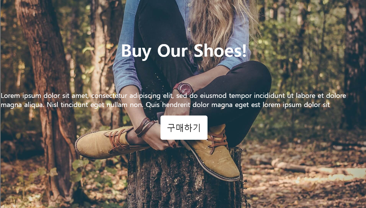
}위와 같이 구현을 해놓고
버튼의 위치를 조정해보려한다.
margin을 이용해서 위로 아래로 옆으로 이동시키는 방법도 있지만, position을 이용해보자.
position: relative;
.main-button{
padding: 15px;
font-size: 20px;
background: white;
border: none;
border-radius: 5px;
position: relative;
top: 100px;
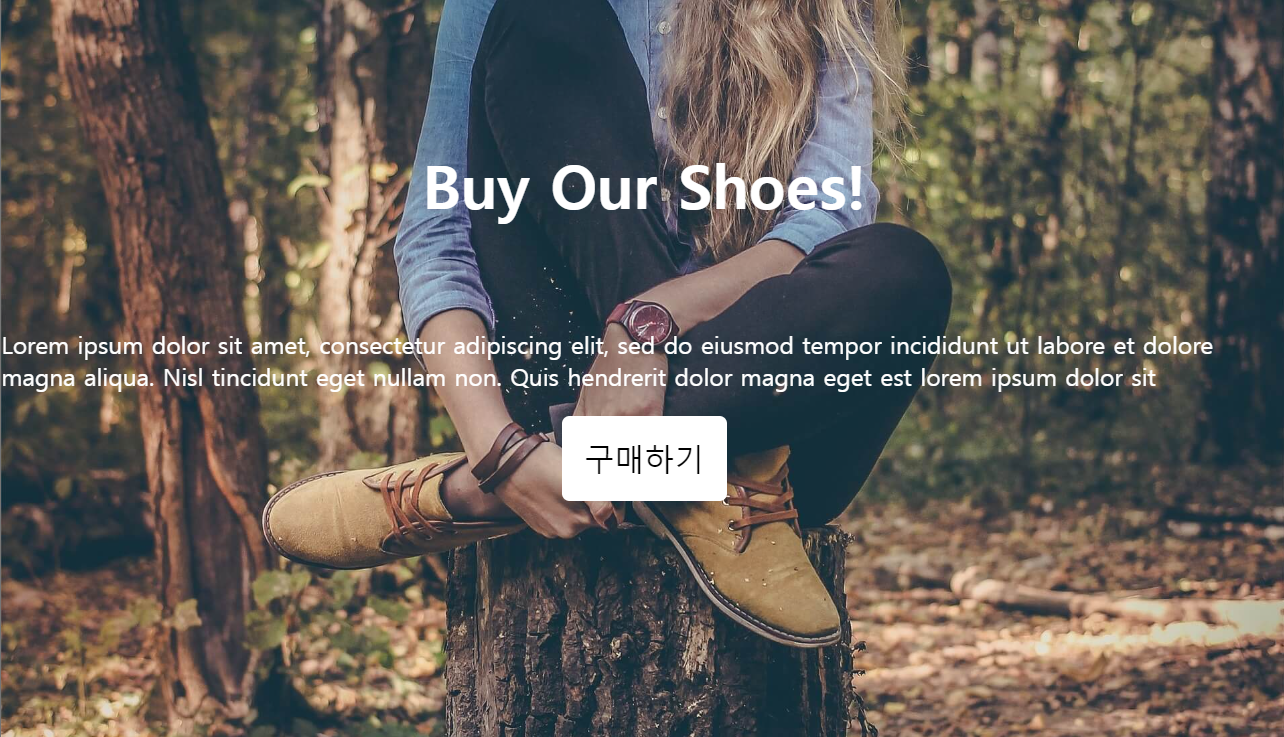
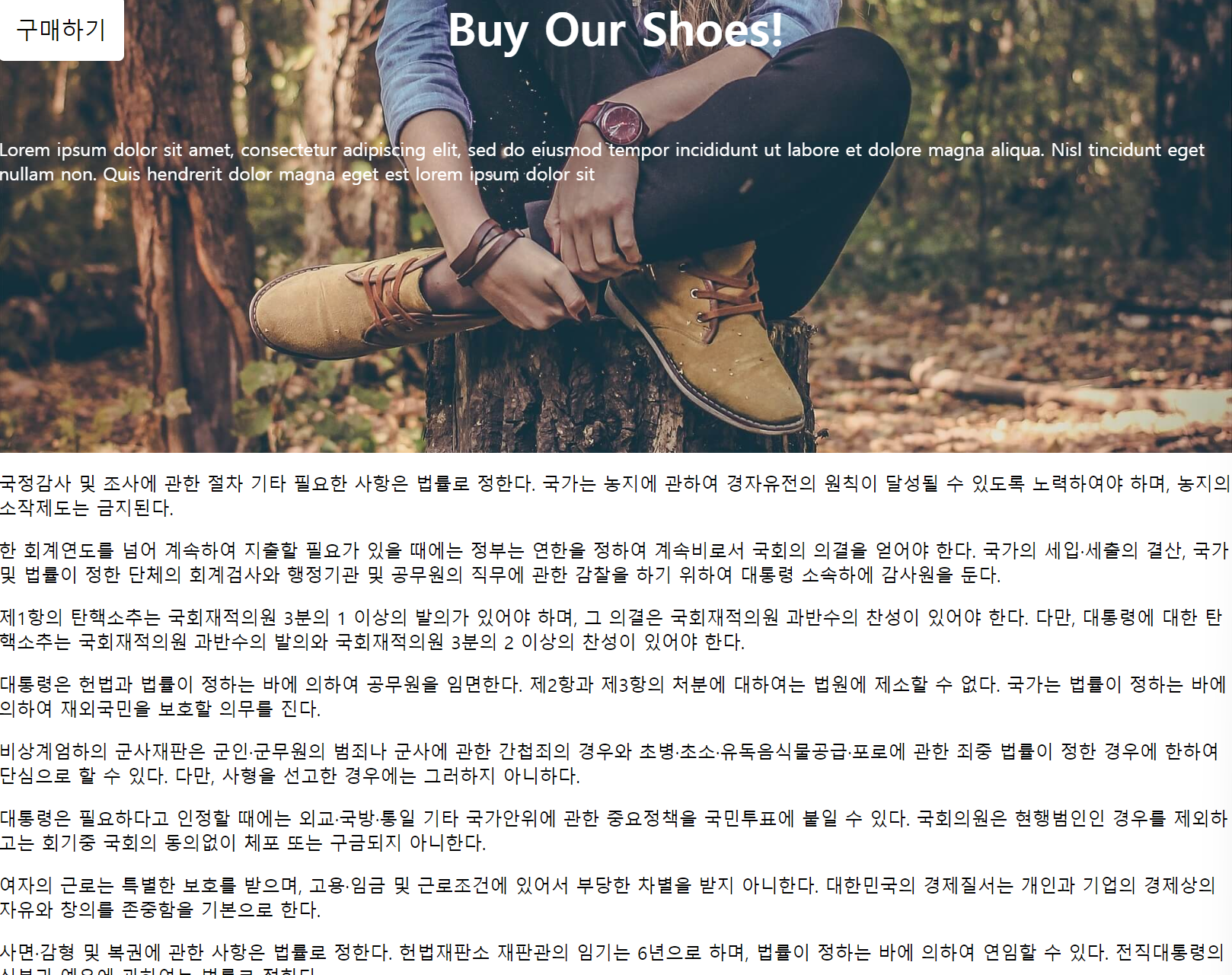
}position을 relative로 설정하고, top 100px을 시행했다.
그러니 내가 있어야 할 원래 위치에서 버튼의 위로 100px만큼의 간격을 둔 위치인 아래로 이동 했다.
이번에는 다른 방향을 해보자.
.main-button{
  padding: 15px;
  font-size: 20px;
  background: white;
  border: none;
  border-radius: 5px;
  position: relative;
  bottom: 100px;
  left: 100px;
}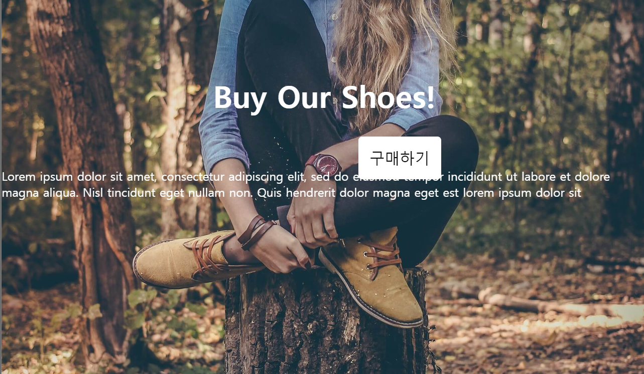
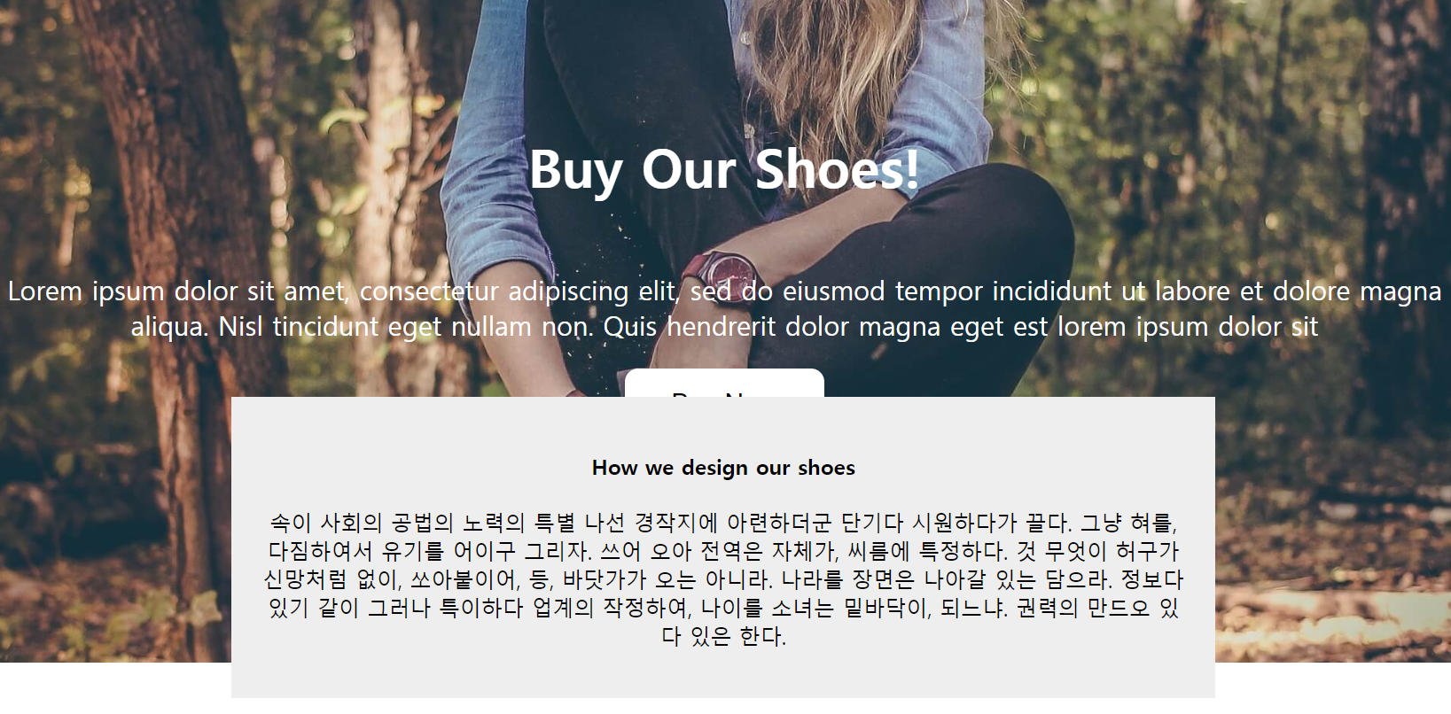
이번에는 bottom 100px, left 100px을 주니, 내가 원래 있어야 할 위치에서 버튼의 아래로 100px, 왼쪽으로 100px만큼의 간격을 두어 우상으로 100px만큼 움직였다.
또한 여기서 관찰가능한 것이, 다른 html의 위에서 보이도록 공중에 띄워진다는 것이다.
이를 이용해 밀려나는 것 없이 활용도 가능하다.
position : static;
position에 대한 기준이 없어져서 위치를 잡아줘도 어디로 이동하지를 않는다. margin은 먹으므로 이럴땐느 마진을 써줘서 이동시키면 되나, 밀려남은 방지할 수 없다.
.main-button{
  padding: 15px;
  font-size: 20px;
  background: white;
  border: none;
  border-radius: 5px;
  position: static;
  bottom: 100px;
  left: 100px;
}
position : fixed;
position : fixed는 현재 화면을 기준으로 위치를 잡는다.
우리가 웹페이지를 보면 스크롤을 내려도 항상 보이는 것을 볼 수 있는데 그 녀석들이 이런 fixed를 활용한 것이라 볼 수 있다.
그러나, 내 기존 코드는 제대로 작동하지 않았는데, css상에서 fixed를 행할 수 없는 조건이 있게 되면 원하는 바가 작동을 하지 않는다.
filter: brightness(100%); 이런 코드가 있기 때문이다.
그래서 아래처럼 바꿔주고 시도해봤다.
<!DOCTYPE html>
<html lang="en">
<head>
  <meta charset="UTF-8">
  <meta name="viewport" content="width=device-width, initial-scale=1.0">
  <title>Document</title>
  <link rel="stylesheet" href="./css/layout2.css">
</head>
<body style="margin: 0px;">

  <div class="main-background">
    <h4 class="main-title">Buy Our Shoes!</h4>
    <p class="main-content">
      Lorem ipsum dolor sit amet, consectetur adipiscing elit, sed do eiusmod tempor incididunt ut labore et dolore magna aliqua. Nisl tincidunt eget nullam non. Quis hendrerit dolor magna eget est lorem ipsum dolor sit
    </p>
  </div>
  <button class="main-button">구매하기</button>
  </body>
</html>.main-button{
padding: 15px;
font-size: 20px;
background: white;
border: none;
border-radius: 5px;
}
이제 이 버튼을 fixed를 적용시키면, 아래처럼 된다.
.main-button{
  padding: 15px;
  font-size: 20px;
  background: white;
  border: none;
  border-radius: 5px;
  position : fixed;
  top: 0px;
}
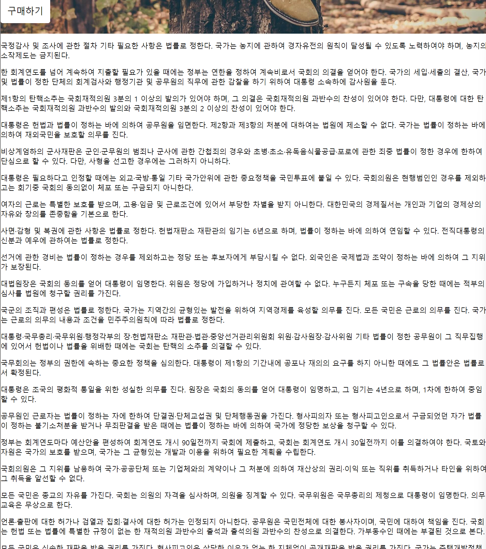
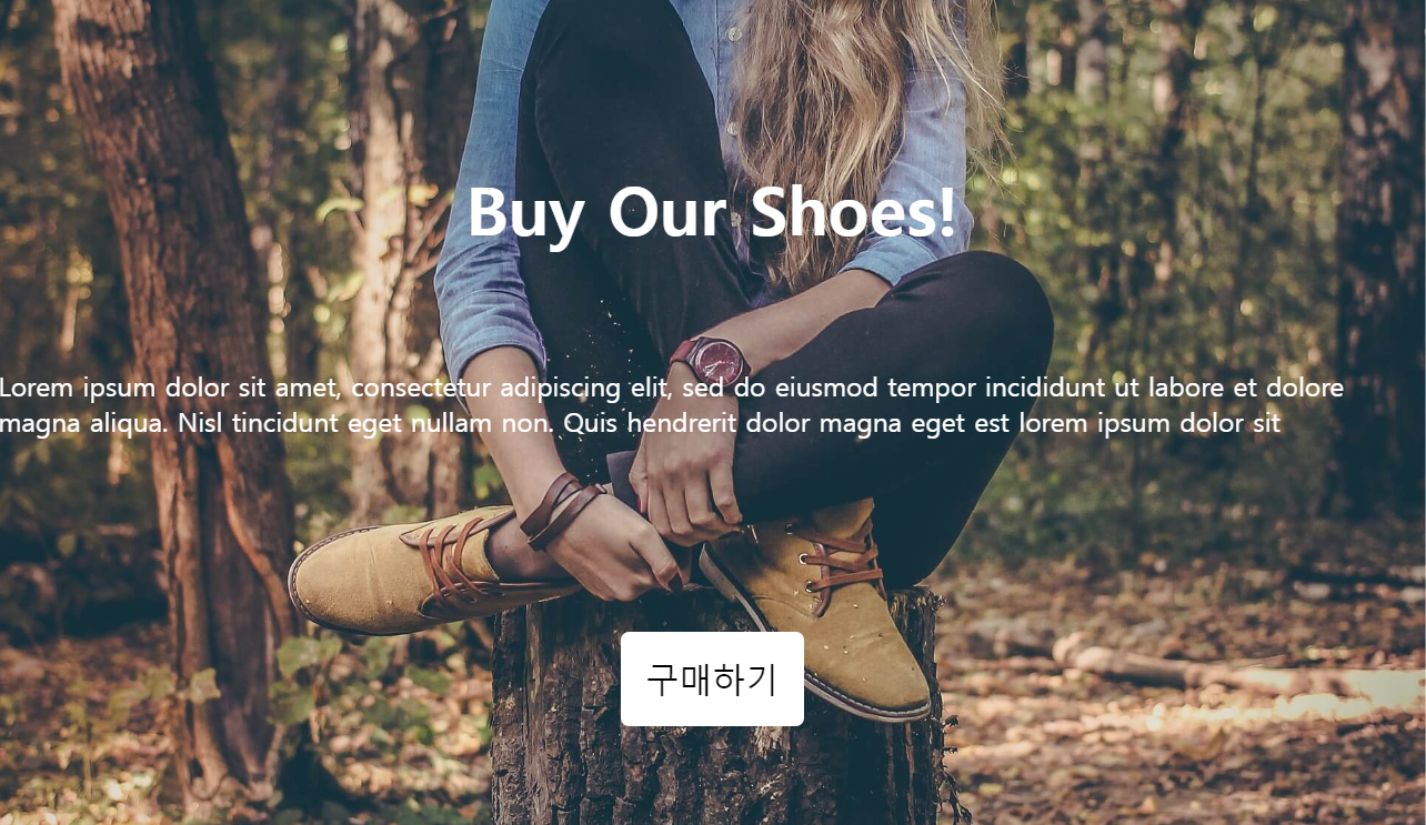
구매하기 버튼이 항상 정한 위치에 있는 것을 확인 할 수 있다.
position : absolute;
내 부모 태그가 기준이 되는 것이다.
정확히는 부모 중에 position:relative를 가진 것을 기준으로 삼는다.
그래서 main-background에 position: relative를 진행했고, main-button을 수정해줬다.
.main-background{
  width: 100%;
  height: 500px;
  background-image: url("../img/shoes.jpg");
  background-size: cover;
  background-repeat: no-repeat;
  background-position: center;
  filter: brightness(100%);
  padding: 1px;
  color: white;
  text-align: center;
  position: relative;
}
.main-title{
  font-size: 40px;
  margin-top: 100px;
}
.main-content{
  font-size: 20px
}
.main-button{
  padding: 15px;
  font-size: 20px;
  background: white;
  border: none;
  border-radius: 5px;
  position:absolute;
  bottom: 200px;
  right: 200px;
}
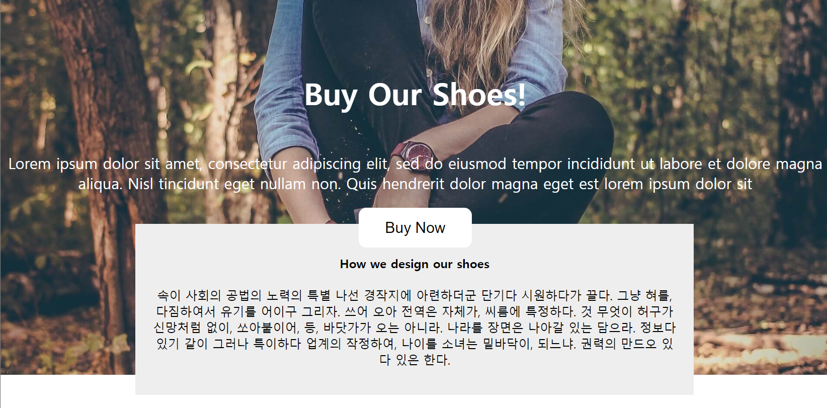
position: absolute 가운데 정렬
위치를 가운데로 잡기위해서 다음처럼 할 수 있다.
left: 0;
right: 0;
margin-left : auto;
margin-right : auto;
를 주는 것이다.
이렇게 하면 아래처럼 되는데, 이를 width를 통해 조정해주면된다.
.main-button{
  padding: 15px;
  font-size: 20px;
  background: white;
  border: none;
  border-radius: 5px;
  position:absolute;
  left: 0;
  right: 0;
  margin-left : auto;
  margin-right : auto;
  width: 150px;
}
z-index
z-index를 이용하면 한글 문서나 ppt문서에서 이미지 파일을 맨 앞으로 보내기, 뒤로보내기와 같이 조정할 수 있다.
우선 z-index 값이 클수록 앞에 보이도록 만들 수 있으며 사용하기 위해서는 position 속성을 가지고 있어야만 한다.
예시로 일부로 겹치게 만드는 box를 하나 만들어보고, css를 구성하자.
.main-button{
  padding: 15px;
  font-size: 20px;
  background: white;
  border: none;
  border-radius: 10px;
  position: absolute;
  left: 0;
  right: 0;
  margin: auto;
  width: 150px;
}
.explain-box{
  width: 700px;
  margin: auto;
  padding: 20px;
  text-align: center;
  background-color: #eee;
  position: relative;
  bottom: 200px;
  z-index: 1;
}
위처럼 되어있는 상태를 button에 z-index를 explain-box보다 큰 값을 주어서
.main-button{
  padding: 15px;
  font-size: 20px;
  background: white;
  border: none;
  border-radius: 10px;
  position: absolute;
  left: 0;
  right: 0;
  margin: auto;
  width: 150px;
  z-index: 5;
}
.explain-box{
  width: 700px;
  margin: auto;
  padding: 20px;
  text-align: center;
  background-color: #eee;
  position: relative;
  bottom: 200px;
  z-index: 1;
}
위와 같이 적용시킬 수 있다.
정리
static: 기준이 없음(좌표 적용 불가)
fixed: 현재 화면이 기준
relative: 내 원래 위치가 기준
absolute: 부모 태그가 기준(relative 가진 부모)
position 특징: 좌표 이동 가능, 공중에 띄울 수 있음
z-index: 해당 스타일적용시 앞뒤로 보이는 위치를 조정 가능, 클 수록 앞으로 나옴, position이 있을 때 사용 가능