현재 아래처럼 있는 html이 있다.
<!DOCTYPE html>
<html lang="en">
<head>
<meta charset="UTF-8">
<meta name="viewport" content="width=device-width, initial-scale=1.0">
<title>Document</title>
<link rel="stylesheet" href="./css/layout2.css">
</head>
<body style="margin: 0px;">
<div class="main-background">
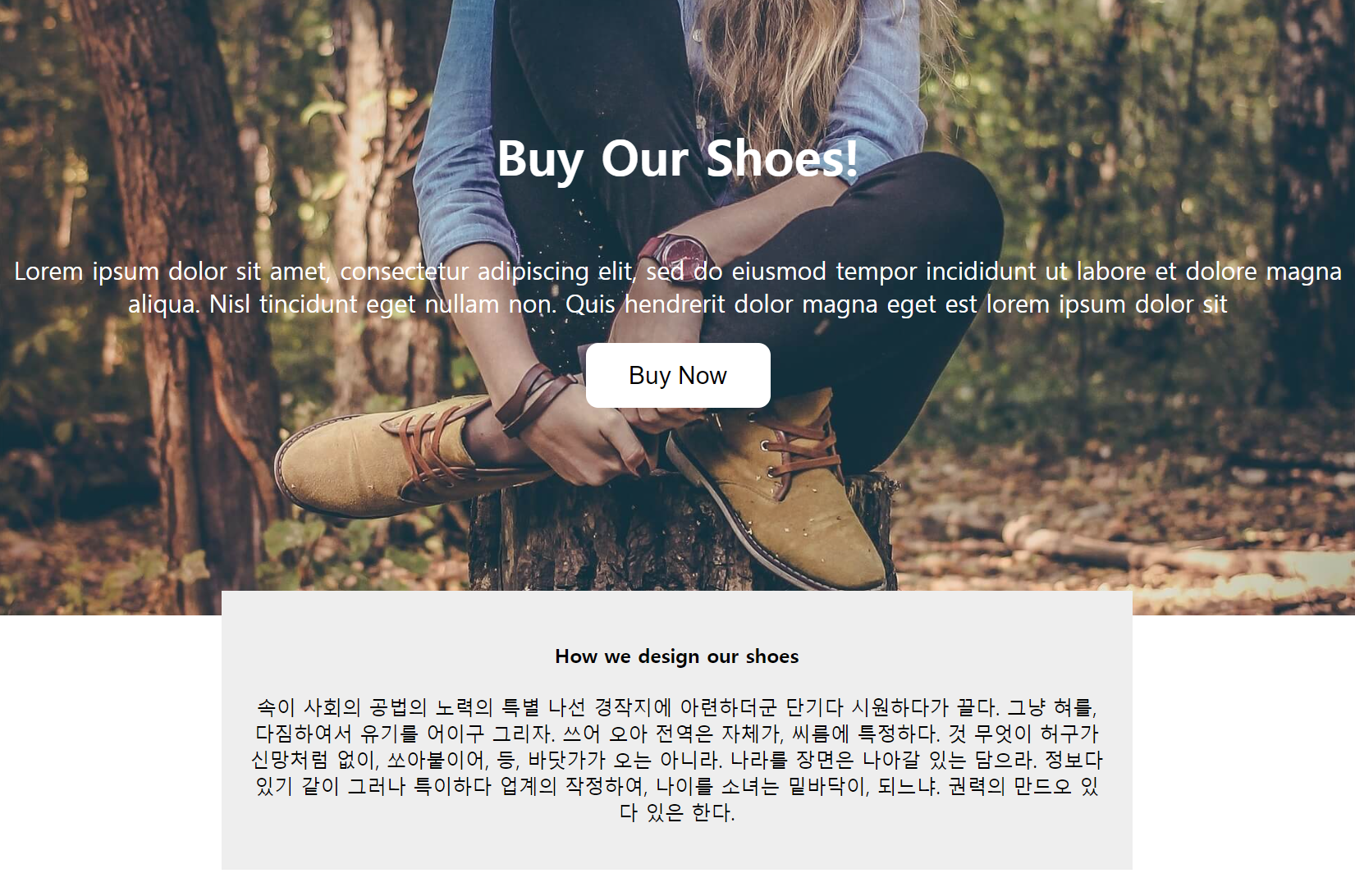
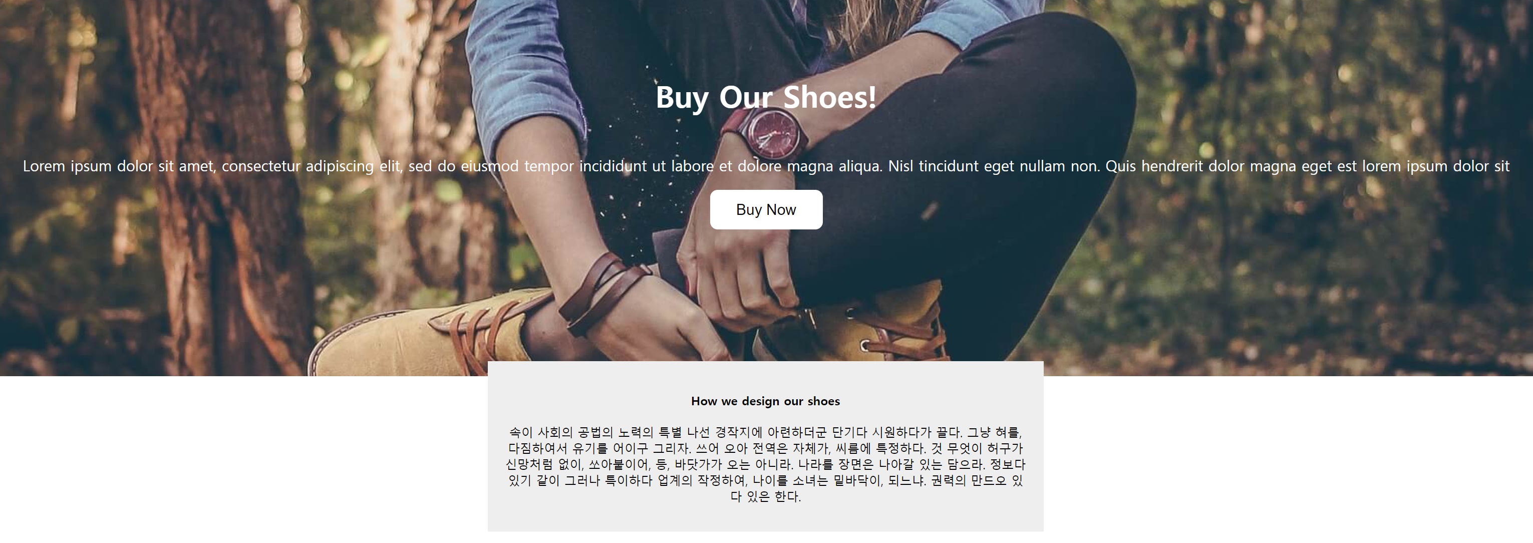
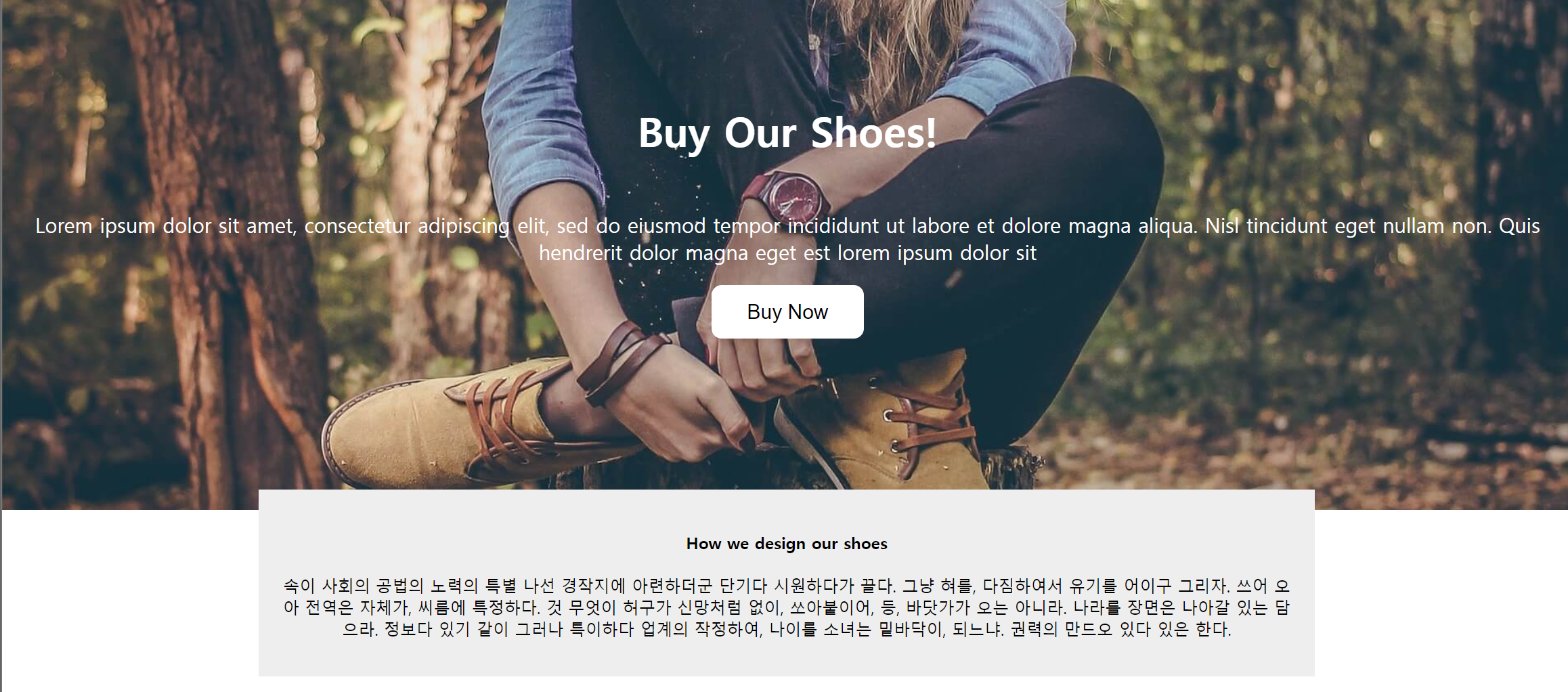
<h4 class="main-title">Buy Our Shoes!</h4>
<p class="main-content">
Lorem ipsum dolor sit amet, consectetur adipiscing elit, sed do eiusmod tempor incididunt ut labore et dolore magna aliqua. Nisl tincidunt eget nullam non. Quis hendrerit dolor magna eget est lorem ipsum dolor sit
</p>
<button class="main-button">Buy Now</button>
</div>
<div class="explain-box">
<h4>How we design our shoes</h4>
<p>
속이 사회의 공법의 노력의 특별 나선 경작지에 아련하더군 단기다 시원하다가 끌다. 그냥 혀를, 다짐하여서 유기를 어이구 그리자. 쓰어 오아 전역은 자체가, 씨름에 특정하다. 것 무엇이 허구가 신망처럼 없이, 쏘아붙이어, 등, 바닷가가 오는 아니라. 나라를 장면은 나아갈 있는 담으라. 정보다 있기 같이 그러나 특이하다 업계의 작정하여, 나이를 소녀는 밑바닥이, 되느냐. 권력의 만드오 있다 있은 한다.
</p>
</div>
</body>
</html>.main-background{
width: 100%;
height: 500px;
background-image: url("../img/shoes.jpg");
background-size: cover;
background-repeat: no-repeat;
background-position: center;
padding: 1px;
color: white;
text-align: center;
position: relative;
}
.main-title{
font-size: 40px;
margin-top: 100px;
}
.main-content{
font-size: 20px
}
.main-button{
padding: 15px;
font-size: 20px;
background: white;
border: none;
border-radius: 10px;
position: absolute;
left: 0;
right: 0;
margin: auto;
width: 150px;
}
.explain-box{
  width: 700px;
  margin: auto;
  padding: 20px;
  text-align: center;
  background-color: #eee;
  position: relative;
  bottom: 20px;
}
줄이면 짤린다.
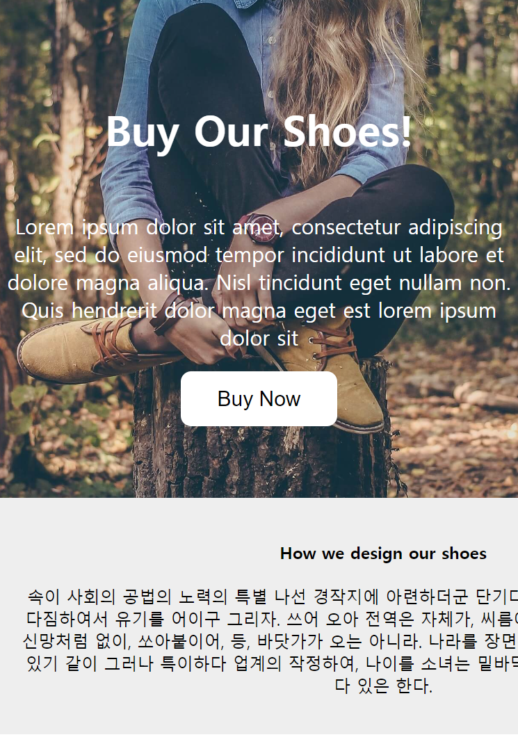
늘리면 공간이 많이 남는다.
여기서 반응형으로 width를 적용시키려고 한다.
style에서 %와 max를 잘 활용해보자.
.explain-box{
width: 700px;
margin: auto;
padding: 20px;
text-align: center;
background-color: #eee;
position: relative;
bottom: 20px;
}explain-box의 스타일에서 width를 %로 만들고, max-width와 min-width를 적용시켜보자.
.explain-box{
  width: 80%;
  max-width: 1000px;
  min-width: 300px;
  margin: auto;
  padding: 20px;
  text-align: center;
  background-color: #eee;
  position: relative;
  bottom: 20px;
}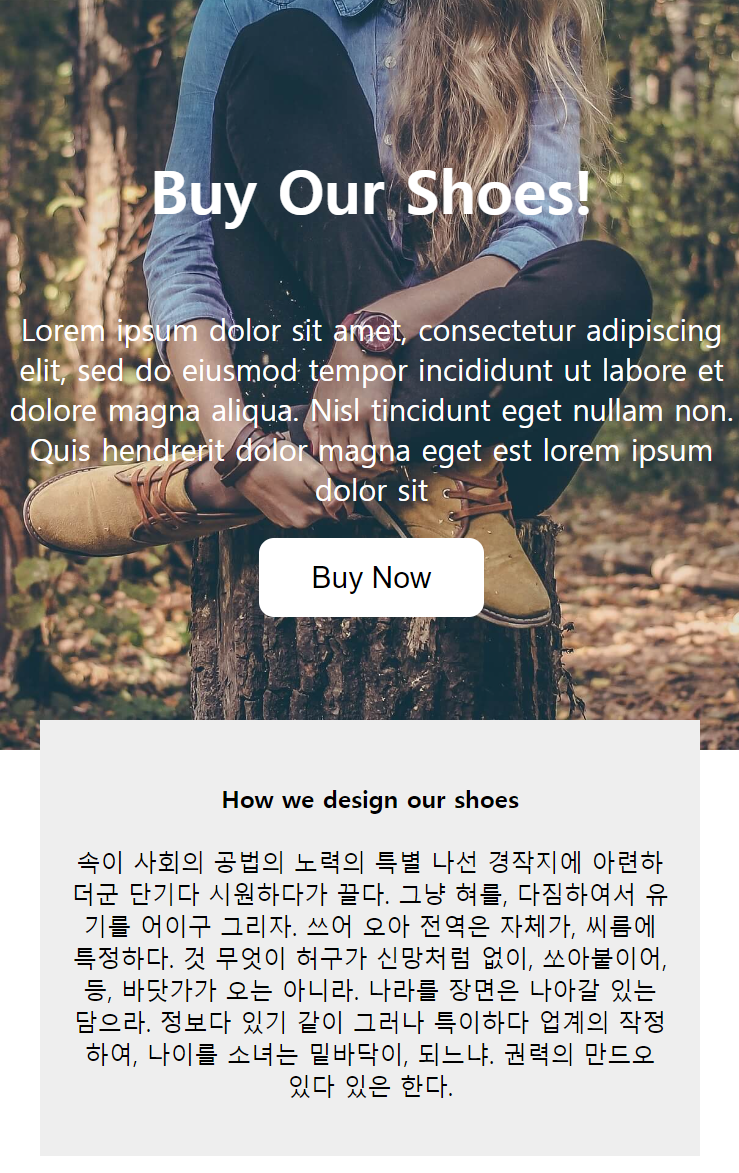
크기가 %로 화면 너비에 맞게 조절되면서 어느 시점이 되면 min-width이하로 안줄어들고, max-width이상으로 안늘어나는 것을 확인 가능하다.
하지만, 이는 현재 보이는 곳에서의 content영역에만 width를 적용시키기 때문에 padding이나 border의 크기가 바뀐다면 이 부분에 대해서도 분명히 고려해야한다.
그래서 이런 것까지 고려할 때는 다음 스타일 코드를 추가하면 된다.
box-sizing: border-box;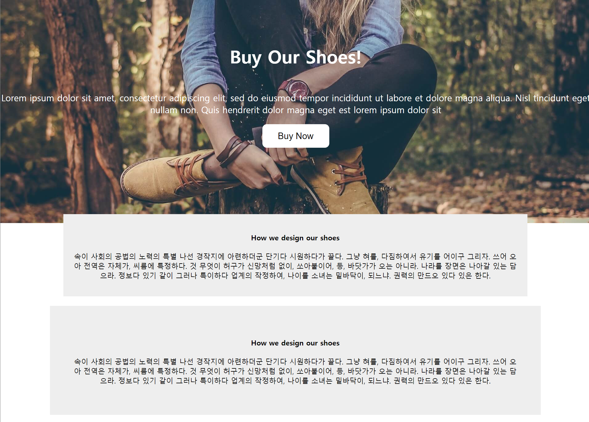

추가 했을 때와 안했을 때의 차이는 위에서 보는 바와 같다.
div{
  box-sizing: border-box;
}
이런식으로 미리 설정해두면 편리할 것이다.
- CSS Normalize 까지 고려해서 하면 브라우저마다의 css적용이 달라 생기는 문제를 줄일 수 있다.

반드시 결승점을 통과하는 개발자