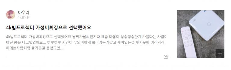
강의를 듣던 중 아래와 같이 블로그 글 목록의 1개의 형태를 잡아야 하는 게 있었다.
html과 css를 이용해서 하는데, css는 할 때마다 적응이 안된다.
이런 것은 당연히 큰 틀을 잡고 하는게 편해서
초기에 div태그로 큰틀, 왼쪽 오른쪽, 왼쪽에서의 상하, 또 그 안에서 나누기와 같은 방법을 사용했다.
그리고 큰 것부터 먼저 새겨놓고 진행했다.
그래서, 난 아래처럼 코드를 구성했다.
<!DOCTYPE html>
<html lang="en">
<head>
  <meta charset="UTF-8">
  <meta name="viewport" content="width=device-width, initial-scale=1.0">
  <title>Document</title>
  <link rel="stylesheet" href="./css/homework1.css">
</head>
<body>
  <div class="container">
    <div class="left-container">
      <div class="profile">
        <img src="./lion.png" alt="" class="profile-image">
        <div class="profile-name">
          <strong class="">아우리</strong>
          <p class="profile-time">1시간 전</p>
        </div>
      </div>
      <div class="content">
        <div class="content-title">
          <strong>4k 빔프로젝터 가성비최강으로 선택했어요.</strong>
        </div>
        <div class="content-content">
          <p>
            4k 빔프로젝터 가성비최강으로 선택했어요. 날씨가 날씨인지라 요즘 마음이 싱숭생숭한게 가을 타는 사람이 아닌 봄을 타고 있었어요... 하루 하루 시간이 무의미하게 흘러가는 것 같고 재미있는걸 찾지못해 이리저리 헤메는 사람처럼 즐거운 걸 못찾고 있...
          </p>
        </div>
      </div>
      <div class="content-botton">
        <a href="https://www.naver.com">
          <img src="./lion.png" alt="" class="share-button">
        </a>
      </div>
    </div>
    <div class="right-container">
      <a href="https://www.google.com" class="thumbnail-image">
        <div class="image-box">
          <div class="plus-button">
            <p>+</p>
          </div>
        </div>
      </a>
    </div>
  </div>
</body>
</html>.container{
width: 100%;
height: 200px;
padding-bottom: 20px;
border-bottom: 1px solid gray;
}
.left-container{
width: 80%;
height: 200px;
float: left;
}
.profile{
width: 100%;
height: 30%;
display: flex;
align-items: center;
}
.profile-image{
height: 90%;
width: auto;
}
.profile-name{
height: 100%;
margin-left: 20px;
display: flex;
flex-direction: column;
justify-content: center;
}
.profile-time{
font-size: 13px;
color: gray;
}
.content{
width: 100%;
height: 60%;
}
.content-title{
height: 30%;
display: flex;
align-items: center;
font-size: 18px;
}
.content-content{
height: 70%;
color: gray;
}
.content-botton{
width: 100%;
height: 10%;
display: flex;
justify-content: flex-end;
}
.share-button{
height: 100%;
}
.right-container{
width: 20%;
height: 200px;
float: left;
}
.thumbnail-image{
width: 90%;
height: 90%;
justify-content: center;
align-content: center;
text-decoration: none;
}
.image-box{
width: 100%;
height: 100%;
background-image: url("../food1.png");
background-repeat: no-repeat;
background-position: center center;
background-size: contain;
display: flex;
justify-content: flex-end;
align-items: flex-end;
}
.plus-button{
width: 20%;
height: 20%;
background: black;
opacity: 50%;
color: white;
font-size: 25px;
text-align: center;
}
p{
margin: 0px;
}그랬더니 아래처럼 보이게 되어주었다.
아주 깔끔하진 않지만, 일단 급한대로 틀잡기 정도는 그래도 금방하는 수준이 되었다.
내가 듣는 강의의 강사는 틀만 잡는 법을 알려주었다. 아래처럼 했다.
<!DOCTYPE html>
<html lang="en">
<head>
  <meta charset="UTF-8">
  <meta name="viewport" content="width=device-width, initial-scale=1.0">
  <title>Document</title>
  <link rel="stylesheet" href="./css/homeworksolve.css">
</head>
<body>
  <div class="container">
    <div class="blog-content">
      <div>
        <img src="./lion.png" alt="" class="blog-profile">
        <div class="blog-name">
          <h4 style="margin: 8px;">이름</h4>
          <p style="margin: 8px;">날짜</p>
        </div>
      </div>
      <div class="" style="clear:both">
        <h4>블로그글</h4>
        <p>가성비 맛집 발견</p>
      </div>
    </div>
    <div class="blog-img">
      <img src="./food1.png" alt="" width="100%">
    </div>
  </div>

</body>
</html>.container{
width: 800px;
margin-left: auto;
margin-right: auto;
}
.blog-content{
width: 80%;
height: 200px;
float: left;
}
.blog-img{
width: 20%;
height: 200px;
float: left;
}
.blog-profile{
width: 50px;
float: left;
}
.blog-name{
float:left;
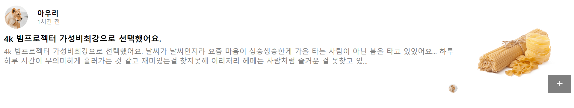
}그랬더니 이런 형태가 나왔다.
float를 사용하는 연습을 더 해봐야할 듯하다. 아직 안 익숙하다.
반드시 결승점을 통과하는 개발자