그래프를 시각화하는 방법은 여러가지가 있다.
저번 포스트에선 matplotlib를 소개했으니,
이번 포스트에선 seaborn을 소개한다.
Seaborn
Seaborn에서는 기본적인 자체 데이터 셋을 가지고 있다.
load_dataset()을 이용하여 tips 데이터를 가져올 것이다.
import seaborn as sns

tips = sns.load_dataset("tips")
tips는 종업원들의 tip에 관련한 데이터이다. 밑에 링크를 첨부하겠다.
tips link
seaborn의 기본적인 사용법은 밑에와 같다.
sns.barplot(data=tips, x='sex', y='tip')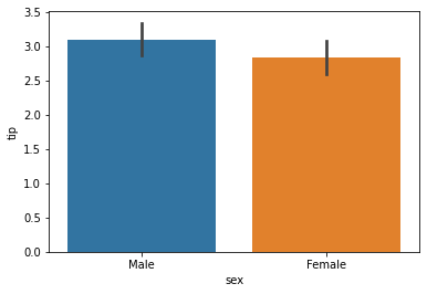
matplot과의 조합으로 figsize, title, ticks와 같은 옵션들을 조정할 수 있다.
아래는 성별에 따른 tip을 조사한 예제이다.
plt.figure(figsize=(10,6))
sns.barplot(data=df, x='sex', y='tip')
plt.ylim(0, 4) # y값의 범위 지정

plt.title('Tip by sex')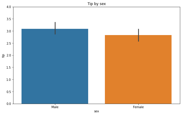
아래 코드는 요일에 다른 예제이다.
plt.figure(figsize=(10,6))
sns.barplot(data=tips, x='day', y='tip')
plt.ylim(0, 4)

plt.title('Tip by day')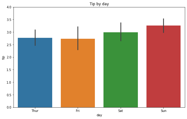
palette 옵션
palette옵션을 주어 좀더 다양한 색상의 그래프를 그릴 수 있다.
더 자세하게 알고 싶다면 여기를 클릭하면 된다.
fig = plt.figure(figsize=(10,7))

ax1 = fig.add_subplot(2,2,1)
sns.barplot(data=tips, x='day', y='tip',palette="icefire")

ax2 = fig.add_subplot(2,2,2)
sns.barplot(data=tips, x='sex', y='tip')

ax3 = fig.add_subplot(2,2,4)
sns.violinplot(data=tips, x='sex', y='tip')

ax4 = fig.add_subplot(2,2,3)
sns.violinplot(data=tips, x='day', y='tip',palette="Spectral")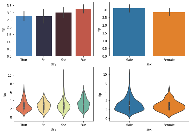
hue 옵션
hue옵션에 따른 x와 y간에 관계를 살펴볼 수 있다.
sns.scatterplot(data=tips , x='total_bill', y='tip', hue='day')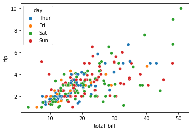
line
seaborn으로 line 그래프를 그릴 수도 있다.
x = np.linspace(0, 10, 100)

sns.lineplot(x, np.sin(x))
sns.lineplot(x, np.cos(x))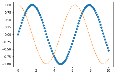
histogram
가로축은 bin이라 하며, 변수 구간이다.
세로축은 frequency라 하며, 빈도수 구간이다.
sns.distplot(tips['total_bill'], label = "total_bill")
sns.distplot(tips['tip'], label = "tip").legend()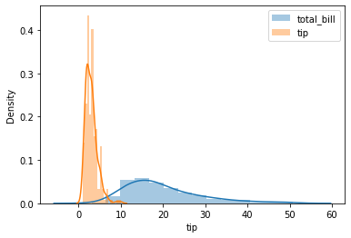
heatmap
heatmap은 데이터의 현상과 수치에 따라 색상을 달리 나타낸 그래프이다.
주의할점은 heatmap은 시각화 작업을 하기전에 pivot상태여야한다.
비행기 데이터를 가져와서 작업해볼 것이다.
flights=sns.load_dataset('flights')pivot table로 만들어주자.
pivot_table = flights.pivot(index='year', columns='month', values='passengers')
pivot_table

--------------------------------------------------------------------------------
month Jan Feb Mar Apr May Jun Jul Aug Sep Oct Nov Dec
year
1949 112 118 132 129 121 135 148 148 136 119 104 118
1950 115 126 141 135 125 149 170 170 158 133 114 140
1951 145 150 178 163 172 178 199 199 184 162 146 166
1952 171 180 193 181 183 218 230 242 209 191 172 194
1953 196 196 236 235 229 243 264 272 237 211 180 201
1954 204 188 235 227 234 264 302 293 259 229 203 229
1955 242 233 267 269 270 315 364 347 312 274 237 278
1956 284 277 317 313 318 374 413 405 355 306 271 306
1957 315 301 356 348 355 422 465 467 404 347 305 336
1958 340 318 362 348 363 435 491 505 404 359 310 337
1959 360 342 406 396 420 472 548 559 463 407 362 405
1960 417 391 419 461 472 535 622 606 508 461 390 432간단하게 사용할 수도 있고, 옵션을 줘서 색상 등을 다양하게 설정할 수도 있다.
sns.heatmap(pivot_table)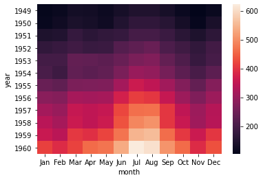
sns.heatmap(pivot_table, linewidths=.2, annot=True, fmt="d")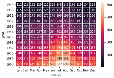
sns.heatmap(pivot_table, cmap="YlGnBu")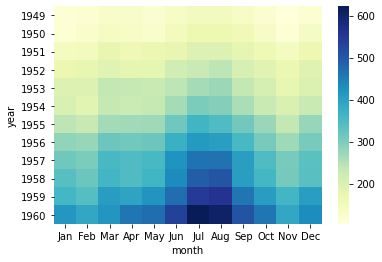
참고사이트
또 다른 시각화 패키지로는 plotly도 있다.
하지만 살짝 무겁다.... 근데 그래프는 시각적으로 이쁘다.
plotly
